Cover Stories: Guyaholic by Carolyn Mackler

Carolyn Mackler is like my YA mentor. She was the first person I talked to when I dreamed of writing a book, and she was so encouraging! It meant the world. GUYAHOLIC_pbk.jpgNow she's here to share the cover story for the paperback edition of Guyaholic. Carolyn says, "I like to be involved in the cover process. It's sort of the icing on the cake after so many months/years of cake-less writing."

Here's her Cover Story:

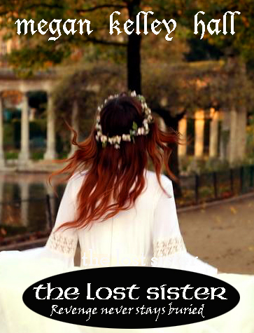
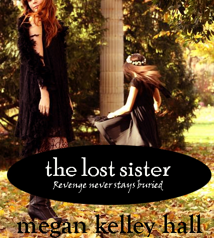
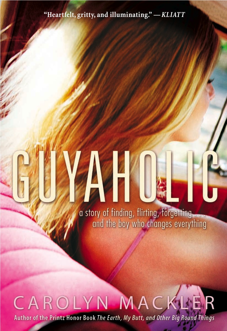
"This is the paperback cover, but it was one of the original ideas for the hardcover jacket. When I saw it on the hardcover version, early on, I said, 'Naaaah.' I remember thinking that she doesn't look like V, that it wasn't her car, wasn't her nose, weren't her eyelashes. So my publisher went back to work and came up with the image for the hardcover. I call that the leggy cover.

guyaholic hardcover.jpg
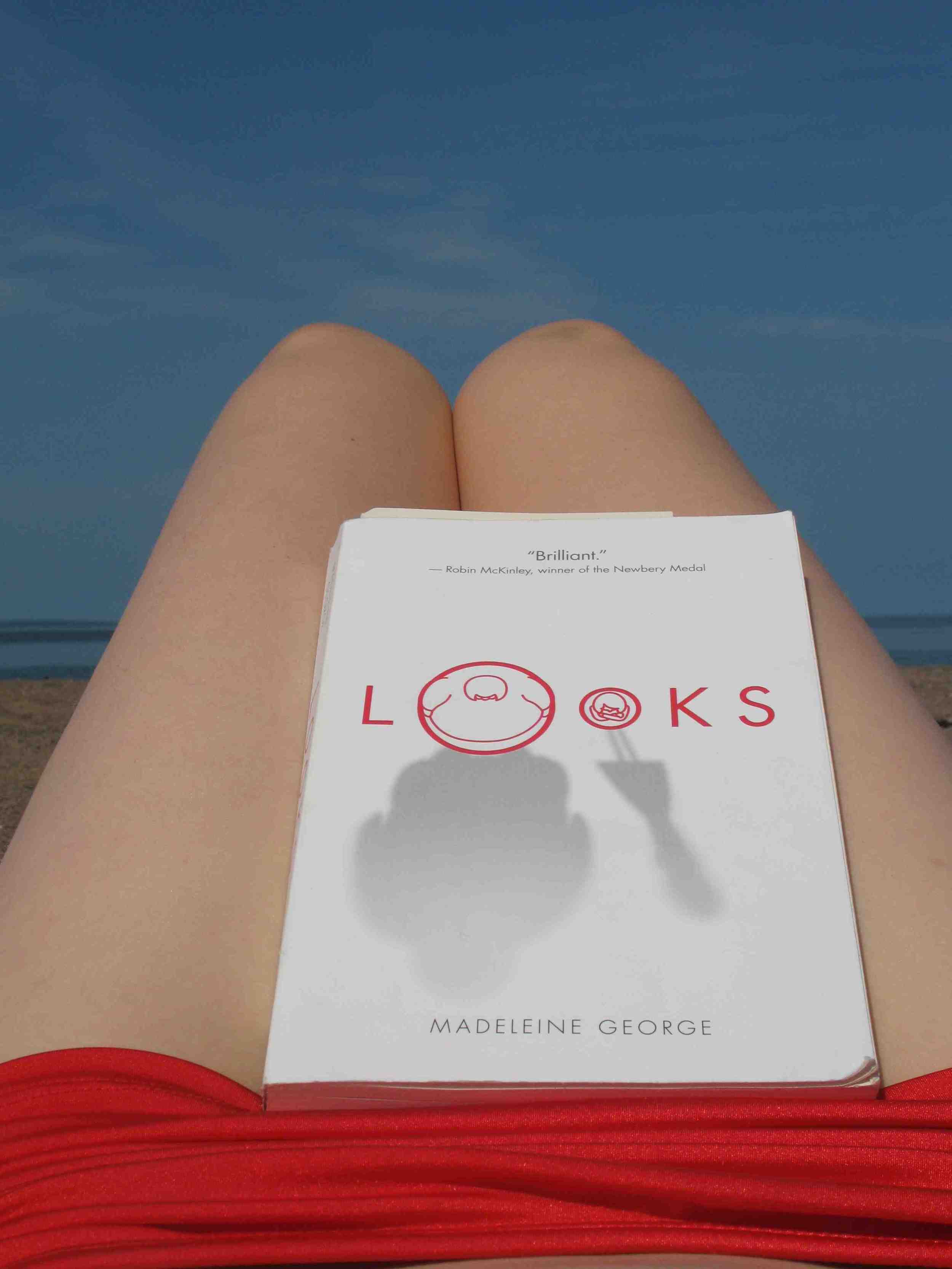
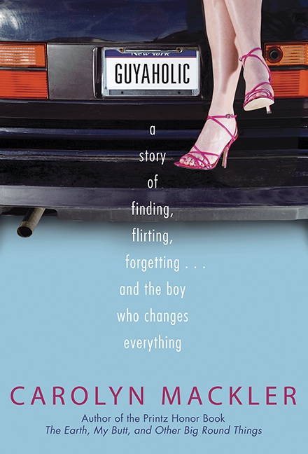
"For the hardcover, my publisher did a photo shoot - those legs actually belong to a young employee at Candlewick! I met her at an ALA event a few years ago and she confessed, 'I'm the legs on your book.' And she was. We're talking seriously enviable legs. The car belongs to another person at Candlewick - a real group effort. The hardcover looks so sunny and summery - and it is definitely a summer book. I mean, summer = roadtrips, right?

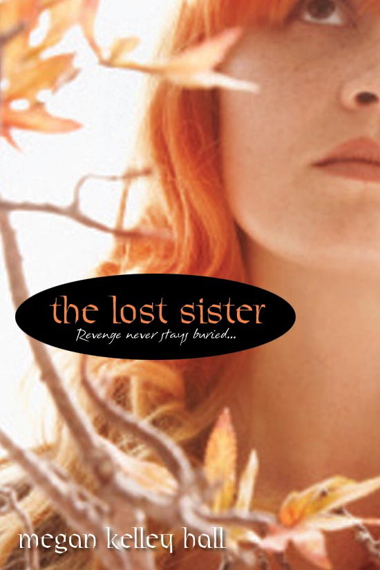
"But I think we all felt it wasn't right for paperback. Paperbacks, for me, are more casual-feeling reads. So I was delighted when Candlewick reintroduced this cover! This time around, with a few year's distance from writing the book, I wasn't so hung up on the color of the real upholstery in V's car, or whether her nose was stubby or long or ski-jumpy, and whether or not she'd be wearing mascara on this particular driving day. Now I just loved the overall FEEL of the cover. And that's what a cover is: the initial feel, how it grabs you, whether it reflects the essence of the story.

"I think this cover actually reflects the feel of the book more than the hardcover. The hardcover, while sexy and alluring, seems more static to me. But this book is about movement, speed, running away, driving cross-country to escape your demons - and maybe land in the arms of the boy of your dreams. And this paperback cover - with V's hair blowing in the wind and the scenery whizzing by the window - is just that. I believe the paperback is a stock photo, but I want to meet the person who has that car. Who doesn't want that cool pink car?

"When I was 22, I (like V) drove cross-country by myself. My ride was a seafoam green Toyota Tercel named Egg. While V's story isn't based on mine, I suppose I did have flickers of daydreams about Egg making a comeback on the Guyaholic cover. But soon after my roadtrip, I moved to New York City to become a writer. I sold Egg to a girl somewhere upstate and used the money to buy a computer. I heard through the grapevine that she wrecked Egg a few months later. She was fine, but Egg was doomed. So I guess maybe not such a great idea to have a trashed car on the cover of my book. Oh, well. Egg lives on in my dreams."

Thanks, Carolyn! I love this story. And I agree that the paperback has that fast-moving, driving-into-the-sun feel. Sigh.

What do you guys think? Which cover do you like, and if you've read the book (so good!), which fits for you?

UPDATE: Alea did a Harcover vs. Paperback post for this book, so there are tons of good insights over there!

Photo Friday: Wedding Dress #2

Those of you who tuned in last week know that for my wedding ceremony, I wore a 1930s slip that was turned into a gown by the amazing and talented Garo Sparo. For the party, though, I wanted a flouncy dress with tulle, 50s style. Once again, Garo came to the rescue, saving a doesn't-really-fit dress I bought on ebay (I had to! I loved it!) and making it mine. Here are some pics (click to enlarge if they look blurry): Two dancing shots (one clear, one I like to call "dreamy") where you can see its volume. Walker_Grossman_Rcptn_47.jpg dave melissa dreamy dancing.jpg And one more volume shot: Walker_Grossman_Rcptn_121.jpg A little shot of me and my friend Anne, and a shock of Carolina Blue! carolinablue.jpg The shoes! The shoes! I loved them. Vivienne Westwood for Melissa. They can be yours. Walker_Grossman_Rcptn_202.jpg And, of course, I had to abandon the heels later in the night (this is the after party). Bloch ballet flats work, too. Walker_Grossman_Rcptn_228.jpg For the guys, Dave's suit is Gucci. He spent the money I saved on my vintage dresses! Thanks for bearing with me through my wedding fashion timeline. So if you have a thought, tell me: Which dress do you like better? Happy Friday!

Bonus Cover Stories: The Lost Sister by Megan Kelley Hall

sisters of misery.JPGI did a Cover Story with Megan Kelley Hall almost exactly a year ago when SISTERS OF MISERY (left) came out where she talked about her hopes for the second book. And now that book is hitting shelves. So she's back to talk about the cover of THE LOST SISTER! Here's Megan:"I was so lucky with my first cover. It was amazing, beautiful, intriguing. I actually think I made a lot of sales just on the cover alone. So the bar was set pretty high. I really wanted something similar to my first cover, but when I first saw the design for THE LOST SISTER, I was upset. Nothing could ever live up to that first one. lostsister_2.JPGlostsister_3.JPG"I had sent along some mockups of covers (left and right) that I liked. I even found a French website that had these amazing pictures and contacted the girl to see if we could use her pics. She agreed, but my publisher had already purchased the stock photo and didn't want to budge. the lost sister.jpg"I didn't like the cover (right) when I saw it. I thought it was way too orange and washed out and I didn't like looking up the girl's nose, and I thought it was strange that they picked a girl who looked nothing like the girl on SISTERS OF MISERY. "I made a LOT of suggestions. Unfortunately, my editor's hands were tied. She was definitely on my side and was pulling for me, but it was a bit of an uphill battle. "The art department darkened it to make it spookier. I asked them to crop it down a bit, just so you couldn't see up the girl's nose, but they didn't do it. In the end, the darker cover stands out a lot more than the original washed out version: the lost sister final.jpg "I like it. Not in love with it. It's kind of a sore subject for me still." You know, sometimes authors are unhappy with their covers. It's hard to talk about publicly, so thanks, Megan, for being honest. Still, though I prefer the Sisters of Misery cover, I like this new one. It's soft and her lightness contrasts the gray background (I'm glad they darkened it). What do you guys think?
Shop Indie Bookstores

Win-It Wednesday: Looks by Madeleine George

The winner of E. Lockhart's The Disreputable History of Frankie Landau Banks is... Hannah S.! Send me your address, H.Looks.jpgThis week, I'm giving away a copy of Looks by Madeleine George. Here's the thing: This book felt so real that it made me uncomfortable. The way Madeleine captures the feeling of a high school classroom, the emotions that come with a friendship lost, the observations that the quiet kids make each day... all so palpable here. I loved it! That's why I read it on my honeymoon, almost without stopping. Here's me on the Sunset Coast in Nova Scotia, photographing the book instead of the romantic beach. To enter for a chance to win this book, just comment below and tell me what the best book you read this summer was... this one may be at the top of my list! Oh, and there are two covers (hardcover on left, paperback on right) that look so similar but have slight differences. I love both--I think they're really elegant. lookshardcover.jpg lookspaperback.jpg PS-Something weird is going on with my comments (sorry). So if you post and it doesn't show up, that probably just means I have to dig it out later, and I will!
Shop Indie Bookstores

Cover Stories: Libyrinth by Pearl North

Lib1JustFinalCover.jpgThis Cover Story was requested by the lovely Holly Cupala, and author Pearl North kindly obliged to answer my questions about the cover of her book Libyrinth. It's set in the future, where technology masquerades as magic and wars are fought over books! Here's Pearl:"The art departments at most publishers have their own ideas about how to package a book to make it appealing to potential customers. That's not my area of expertise so I don't even try to anticipate what the book will look like. "I am very fortunate in that my editor James Frenkel always keeps me in the loop when the cover art is being designed. He asked me for descriptions of characters and settings from the book, and even sent me samples of work from the artist under consideration. I also had the opportunity to give feedback on an early draft of the cover art. So, while the overall design and subject for the cover were decided by my editor and Tor's art department, I did have a voice in the process. "I had seen a first draft of the cover, so I knew what to expect in general terms. The first thing that hit me was how much more polished and refined it looked compared to what I had seen before, which stands to reason. And then I thought how serene and confident Haly, my main character, looked. She looked like someone with the inner strength to do what she does in the novel, and I was satisfied. It wasn't until all that sank in that I even noticed Nod the imp perched upon her shoulder. I love that about the picture, how it gives you more the longer you look at it. Finally, the last thing to emerge for me was how the picture makes visual something that is completely non-visual. Haly hears the voices of books. They speak their contents to her. On the cover of LIBYRINTH, she has her eyes closed, and her face is lifted up as pages from books flutter down around her. She's listening to them, and you can see it. "I knew from past experience with Tor's art department that they really listen to author feedback. On a previous book, they had asked for some descriptions of some of my characters. One of them was a snake and they did the pattern of his scales exactly the way I had described them, so I knew they were listening. In LIBYRINTH, the feedback I offered after the first draft was more the sort of thing anyone might point out, so I can't say if the changes were because of my input, or that of my editor or the artist's own judgment at play. "In initial conversations with my editor, he had a very different concept for the cover. It was intially going to be Haly out on the Plain of Ayor, on a horse, with the Libyrinth in the background. I suggested putting her in among the shelves of the Libyrinth, or even just libcoverFirstDraft.jpghaving some books in her saddlebag, because books are such an important part of the story. I don't know who decided what or what the reasons were behind it, but when the first draft of the cover art came, there she was, in among the books in the Libyrinth. "In the first draft of the cover, Haly's eyes are open and her expression was a bit different. And Nod was not in that picture. He came as a surprise in that final version, especially since even then, I didn't spot him right away. He's subtle. Lib1FinalCover.jpg "The artist who did the cover for LIBYRINTH is Melanie Delon. I do not know if she worked off of a model for Haly, my main protagonist. However, I can say with some degree of certainty that she did not have a live model for Nod, who is an imp. :) "I think the cover is a wonderful ambassador for my story. I'm thrilled with it." I didn't notice the imp either, at first! And I do love the covers you keep finding new things in as you look at them. I also like the soft green glow of this cover. What do you guys think?

Photo Friday: Wedding Dresses

I may keep doing this for Photo Friday for a while (forgive me, but I LOVED my wedding!). I was never a bridal girl, but man, it was fun. And if you click to enlarge, the photos get clearer (the high res makes them fuzzy on the blog--sorry!).So here's how the dress thing went: First I went to bridal shops that I found overpriced and under-stylish. So, for the ceremony, I bought a 1930s nightgown at The Family Jewels, a vintage store on 23rd Street, and had awesome designer Garo Sparo make it into a gown. Et Voila! Here you can see the detail of the top: bridesmaller.jpg And the full length: truck smaller.jpg And the back: back of gown smaller.jpg I wore sparkly London Sole flats in "multi," and a handmade flower from twistedcrystals on etsy in my hair. Next week, dress #2! (Bear with me, people.) Happy weekend!

The Music, The Passion, The Lip Syncing!

Okay, here goes. It's a lip syncing party!First, Me. I am a giant dork. This I already know. An entire video from half of the Excel Dance Company: Meanwhile, Joey's "Hopelessly Devoted": Katie wants to "Get Back," and even incorporates the Violet books in the video! Tree made a very well-themed video to a Harry and the Potters song: Denise rules, even with sibling distractions (so cute): Let's not forget the amazing Travis singing "Blue Eyes": And even Daniel tried to top himself with his friend Paris and "Pretty Rave Girl": Every one of you guys rock, and those of you who entered and kept the videos private, you rule too. Hope you had fun--I did!

Win-It Wednesday: E. Lockhart's The Disreputable History of Frankie Landau Banks

So many things to say today! I'm going to punctuate each part of this post with a glitter star.Glitter Graphics First, that was Cynthia entering the contest! She won a prize, of course, along with a bunch of other brave souls who made me fun videos to entertain me during the slow summertime. I'll be showing a few more lip syncing videos here as soon as I get permission from their makers. I just adore this game. Now, if you made me a video, email me with your address and "Lip Sync Contest" in the subject and I'll send you a prize. It'll be good. Promise. The winner of E. Lockhart's A Treasure Map of Boys, as chosen at random from everyone who made a video and/or spread the word about the contest is... Erika! Send me your address, E! Tomorrow, I promise to share my own lip sync video, along with some more of the entries from the contest. As soon as I get up the nerve. Glitter Graphics frankie.jpgfrankie2.jpgThis week's contest is for another E. Lockhart book, The Disreputable History of Frankie Landau Banks, now out in paperback. To enter, just comment below and tell me whether you prefer the hardcover (left) or paperback version (right). I think I'm partial to the hardcover, though I do love those shiny awards stickers. Go, E. Lockhart! Glitter Graphics
And lastly, but not... uh... leastly, Tonight is Teen Author Reading Night (6-7:30pm, Jefferson Market Branch of NYPL, 425 6th Ave, at 10th St.) and I'm reading! So are these awesome people. So come! Jessica Blank, Karma for Beginners Jen Calonita, Sleepaway Girls Aimee Friedman, Sea Change Paul Griffin, The Orange Houses Jennifer Sturman, And Then Everything Unraveled

Readergirlz August Pick: Kendra by Coe Booth

august_kendra.jpgThis book is fantastic. I read it on my honeymoon and probably neglected Dave because I was so engrossed. It's the readergirlz pick for August, so we'll be discussing it with author Coe Booth all month long--check it out and join in the chatter.Here's a summary: Kendra's mom, Renee, had her when she was only 14 years old. Renee and her mom made a deal -- Renee could get an education, and Kendra would live with her grandmother. But now Renee's out of grad school and Kendra's in high school . . . and getting into some trouble herself with a hot guy at school who moves pretty fast. Kendra's grandmother lays down the law: It's time for Renee to take care of her daughter. Kendra wants this badly - even though Renee keeps disappointing her. Being a mother isn't easy, but being a daughter can be just as hard. Also, this book totally reminds me of my new favorite show: 16 and Pregnant (realistic, raw, sometimes hard to watch in a good way). Did you guys see the adoption episode? I cried through like the whole thing.