The winner of last week's contest for Stephanie Kuehnert's latest, Ballads of Suburbia, is... Summer! Send me your address, S.Frank Anthony Polito is an author and actor and playwright--he's a multi-talented guy. And he's got some pretty colorful books under his belt. Here, he shares their cover stories:
"For my first novel, I originally saw the idea as being a drawing, with the words Band Fags! over top of a music staff, and the letters forming the 'notes.' The 'd' would be a quarter note, the 'F,' a bass clef, the 'g' and treble clef etc. For my second book, Drama Queers! I didn't have a real clear image in my head. Unlike band, there is no "uniform" for drama, other than the costume an actor wears in a play. I thought, maybe something with a stage and curtains?
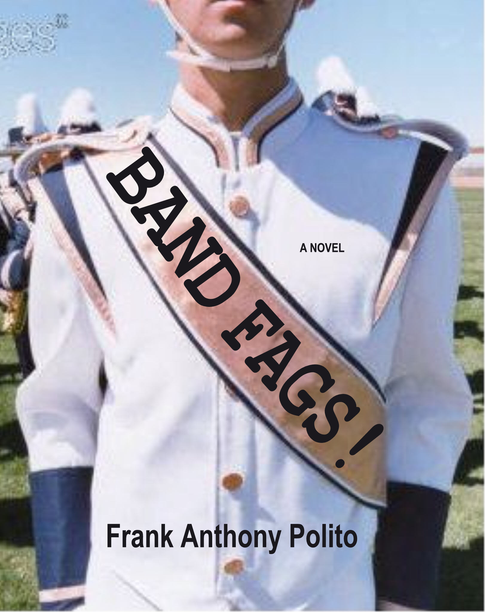 "For both books, my publisher gave me the opportunity to provide input. For Band Fags! I decided, after looking at some other Kensington titles, to use a photo (courtesy of Getty stock). I found some of various kids in a marching band uniforms. I found one where a guy was looking at another guy, almost sneaking a glimpse, and thought 'that seems gay!' A second featured a guy holding a bass drum on which I thought the title could be superimposed, and another (the one I ended up choosing) showed a kid in a band uniform with a pink sash across his chest. How much gayer could you get?!
 "In Drama Queers! the kids put on a production of Grease, so I looked online and found a really hot guy in jeans and a white t-shirt standing in front of a curtain in a spotlight. My editor didn't like it. I also found one of a guy peeking his head through a curtain, which I thought looked 'mysterious.' My editor said it was better, but not that great.
"The first time I saw the cover for Band Fags! I wasn't too excited--even though I chose the image and advised the art department on how to design it down to putting the title across the sash.
"In Drama Queers! the kids put on a production of Grease, so I looked online and found a really hot guy in jeans and a white t-shirt standing in front of a curtain in a spotlight. My editor didn't like it. I also found one of a guy peeking his head through a curtain, which I thought looked 'mysterious.' My editor said it was better, but not that great.
"The first time I saw the cover for Band Fags! I wasn't too excited--even though I chose the image and advised the art department on how to design it down to putting the title across the sash. 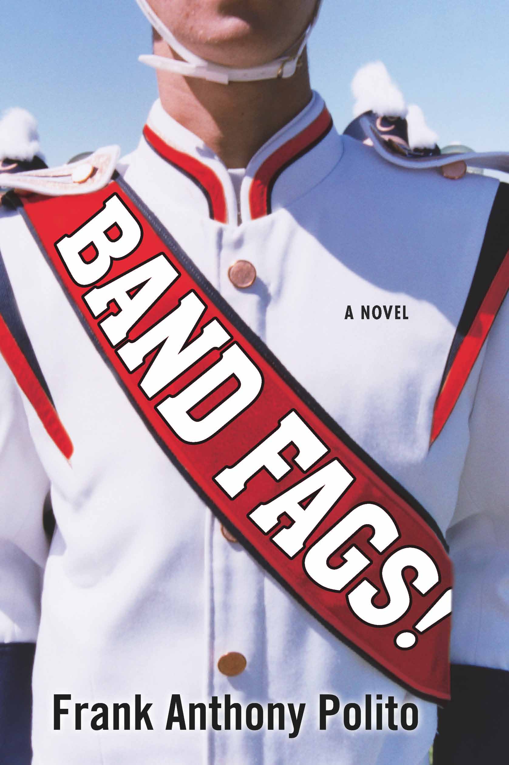 (I loved the font they used for the title.) The color of the sash had been changed to orange-red, which kind of bummed me out. But I guess the publisher didn't want to pigeon-hole the book as just being a 'gay' story, so they avoided the pink. Eventually I grew to love it, and I've gotten nothing but compliments.
"For Drama Queers! I was less impressed. I wasn't expecting what I saw at all! I had no idea where the idea of the dog's head (or is it a bear?) came from. At first, I didn't think it fit the story, and I even went back in and added a paragraph where the protagonist mentions working at an amusement park and having to dress up in costume. Then I realized, this is drama-related!
(I loved the font they used for the title.) The color of the sash had been changed to orange-red, which kind of bummed me out. But I guess the publisher didn't want to pigeon-hole the book as just being a 'gay' story, so they avoided the pink. Eventually I grew to love it, and I've gotten nothing but compliments.
"For Drama Queers! I was less impressed. I wasn't expecting what I saw at all! I had no idea where the idea of the dog's head (or is it a bear?) came from. At first, I didn't think it fit the story, and I even went back in and added a paragraph where the protagonist mentions working at an amusement park and having to dress up in costume. Then I realized, this is drama-related!  And, as a friend put it, 'it's like he's trying to hide his homosexuality,' so it does fit. Again, I've got nothing but compliments, and it's really grown on me. I also like the spine on this one, which is just a blue strip with the title. On the first one, the picture bends around to the spine, and the title gets lost a little, in my opinion.
"There was one thing that changed from the original cover that I was shown to the actual Band Fags! book. On the proof, he title was embossed (raised), which I thought was super cool. I guess due to costs, the production dept. decided to scrap it for the final. Drama Queers! stayed exactly the same.
"I like 'em both. My only regret is that the two covers aren't more similar, since the stories in both books are so connected and I think of them as a 'box-set.' (Drama Queers! is a 'companion piece' to Band Fags! and covers some of the same ground time-wise, but is told from a different protagonist POV.)"
These books sound like a lot of fun to me. Listen to this rave review:
"Band Fags! is like the gay teen flick John Hughes never got around to making."
-- Dennis Hensley, author of Misadventures in the (213) and Screening Party
Now that sounds awesome.
What do you guys think of the covers? The bear one startled me at first, like, What? But it's grown on me and I find it endearlingly funny now--I think it's my favorite!
And, as a friend put it, 'it's like he's trying to hide his homosexuality,' so it does fit. Again, I've got nothing but compliments, and it's really grown on me. I also like the spine on this one, which is just a blue strip with the title. On the first one, the picture bends around to the spine, and the title gets lost a little, in my opinion.
"There was one thing that changed from the original cover that I was shown to the actual Band Fags! book. On the proof, he title was embossed (raised), which I thought was super cool. I guess due to costs, the production dept. decided to scrap it for the final. Drama Queers! stayed exactly the same.
"I like 'em both. My only regret is that the two covers aren't more similar, since the stories in both books are so connected and I think of them as a 'box-set.' (Drama Queers! is a 'companion piece' to Band Fags! and covers some of the same ground time-wise, but is told from a different protagonist POV.)"
These books sound like a lot of fun to me. Listen to this rave review:
"Band Fags! is like the gay teen flick John Hughes never got around to making."
-- Dennis Hensley, author of Misadventures in the (213) and Screening Party
Now that sounds awesome.
What do you guys think of the covers? The bear one startled me at first, like, What? But it's grown on me and I find it endearlingly funny now--I think it's my favorite!
Sunday Reading: Girls' Life
in Other Stuff
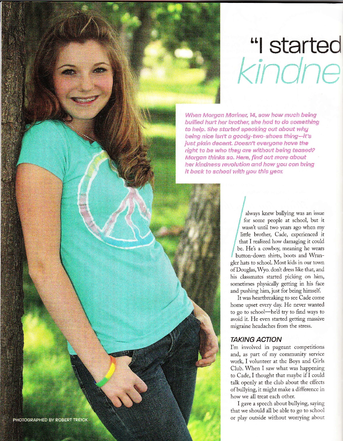
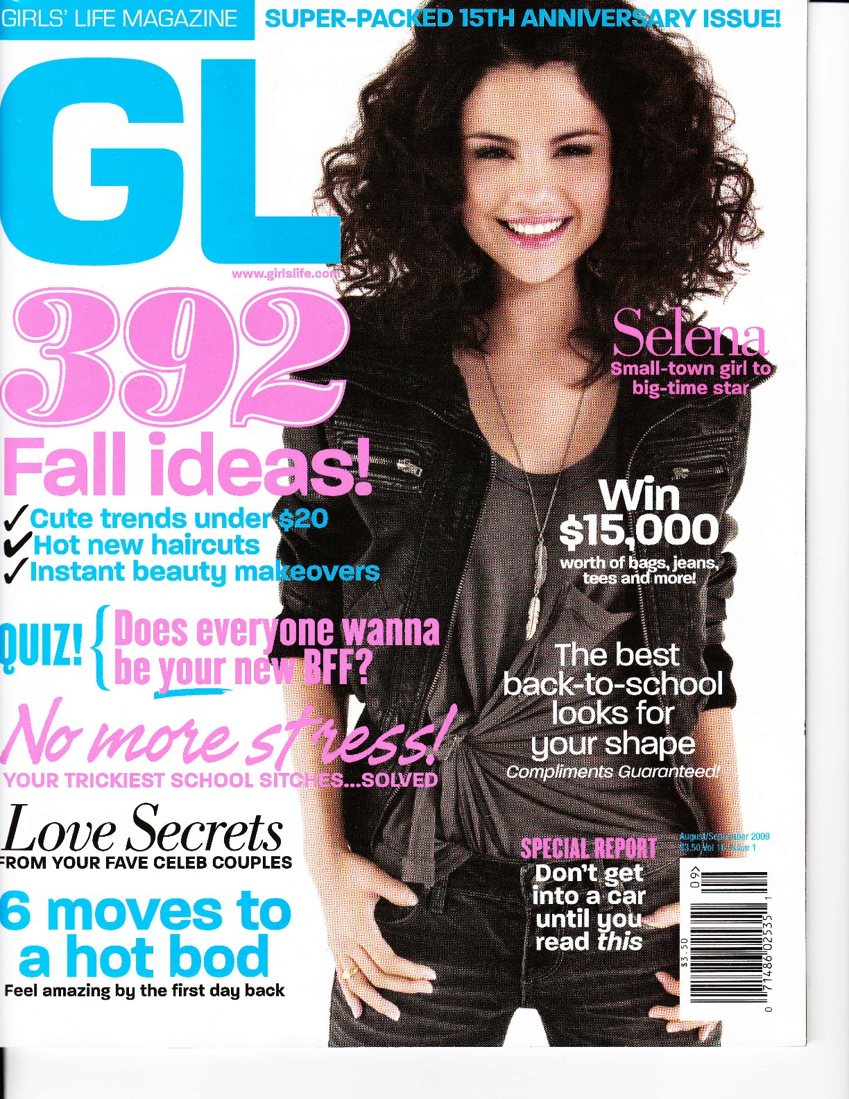 Here's the latest issue of Girls' Life magazine, which features a profile I did of a 14-year-old girl named Morgan Mariner who started a Kindness Revolution (yeah, she's pretty cool). Also, how cool does Selena look on the cover? I'm liking the curls.Here's Morgan! Click a page to see it enlarged.
 Happy Sunday!
Travis Reminds You...
in Other Stuff
to make your own lip syncing video by Wednesday to enter the Sing To Win contest (yes, I got his permission to post!). I love his passion here. Seriously awesome.Without further ado, I give you "Lip Syncing Blue Eyes by Mika":
Make Me Mad Men
in Other Stuff
This is too much fun. I can't wait for Mad Men to come back on. Here's me with Don Draper. We're old friends.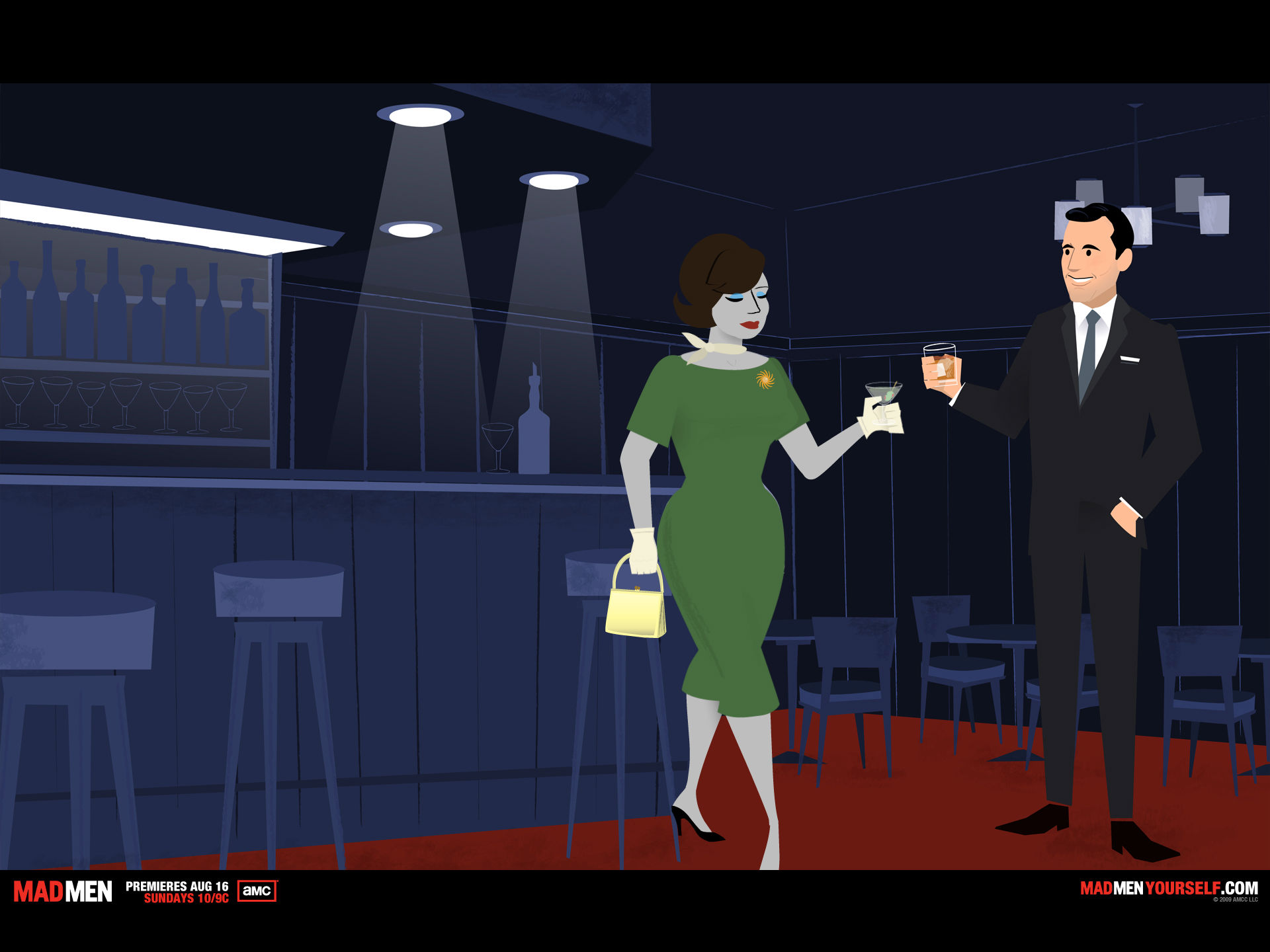 Create your own Mad Men avatar here. (It's fun! Amazing accessories!)
Photo Friday: Teensy Bit of Wedding
in Photo Friday
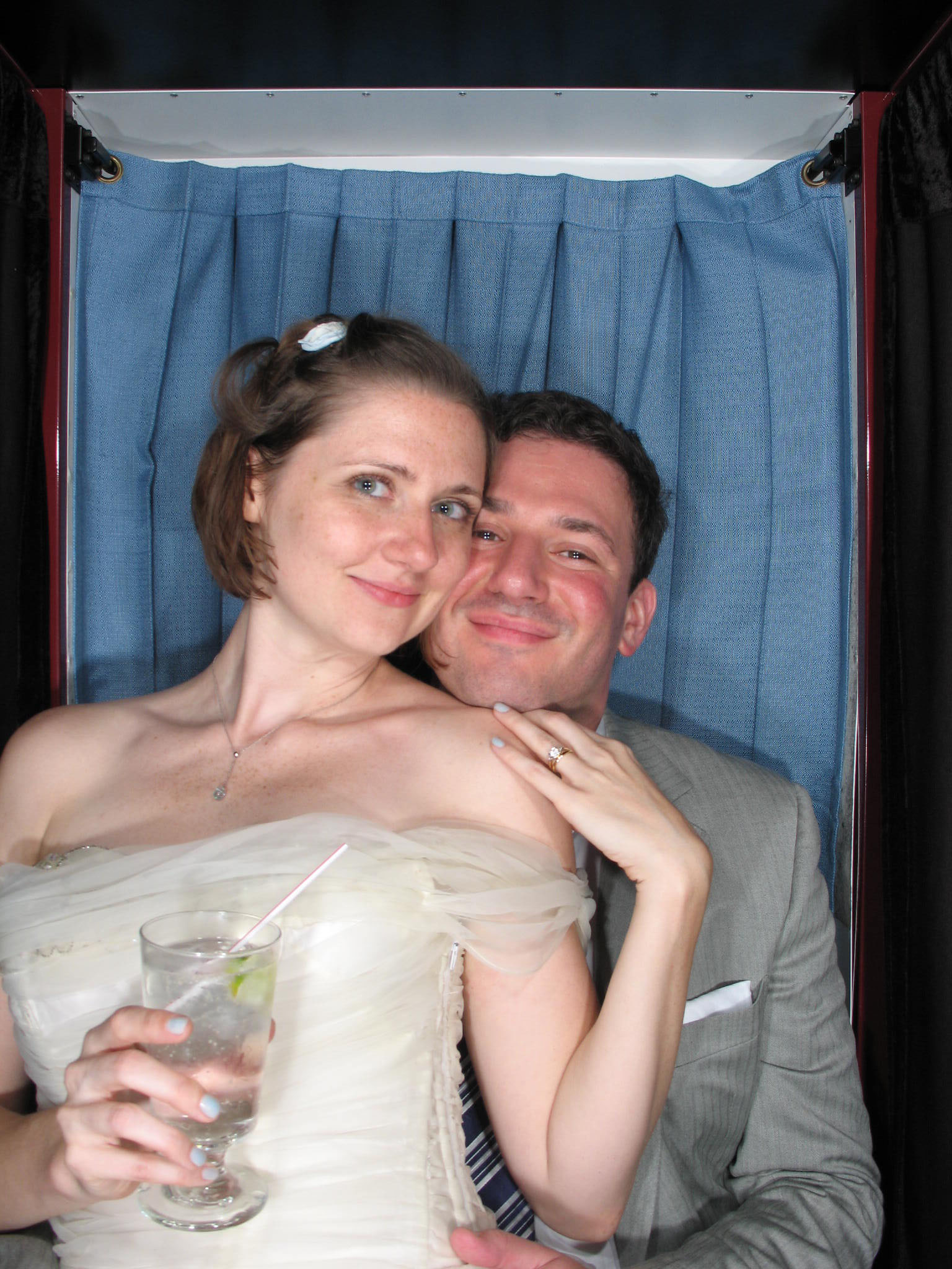
I have to wait on my real, professional wedding photos, taken by my gorgeous friend Marcie, who made everyone laugh, which is key. I'll also tell you all about dress #1 and dress #2, when I have the right photos. Promise. (I know you're waiting with baited breath--haha.)Anyway, here are two photobooth photos for your enjoyment (we had the Saratoga Photobooth Company host a booth--which was SO. MUCH. FUN. Highly recommended!):
With Dave.
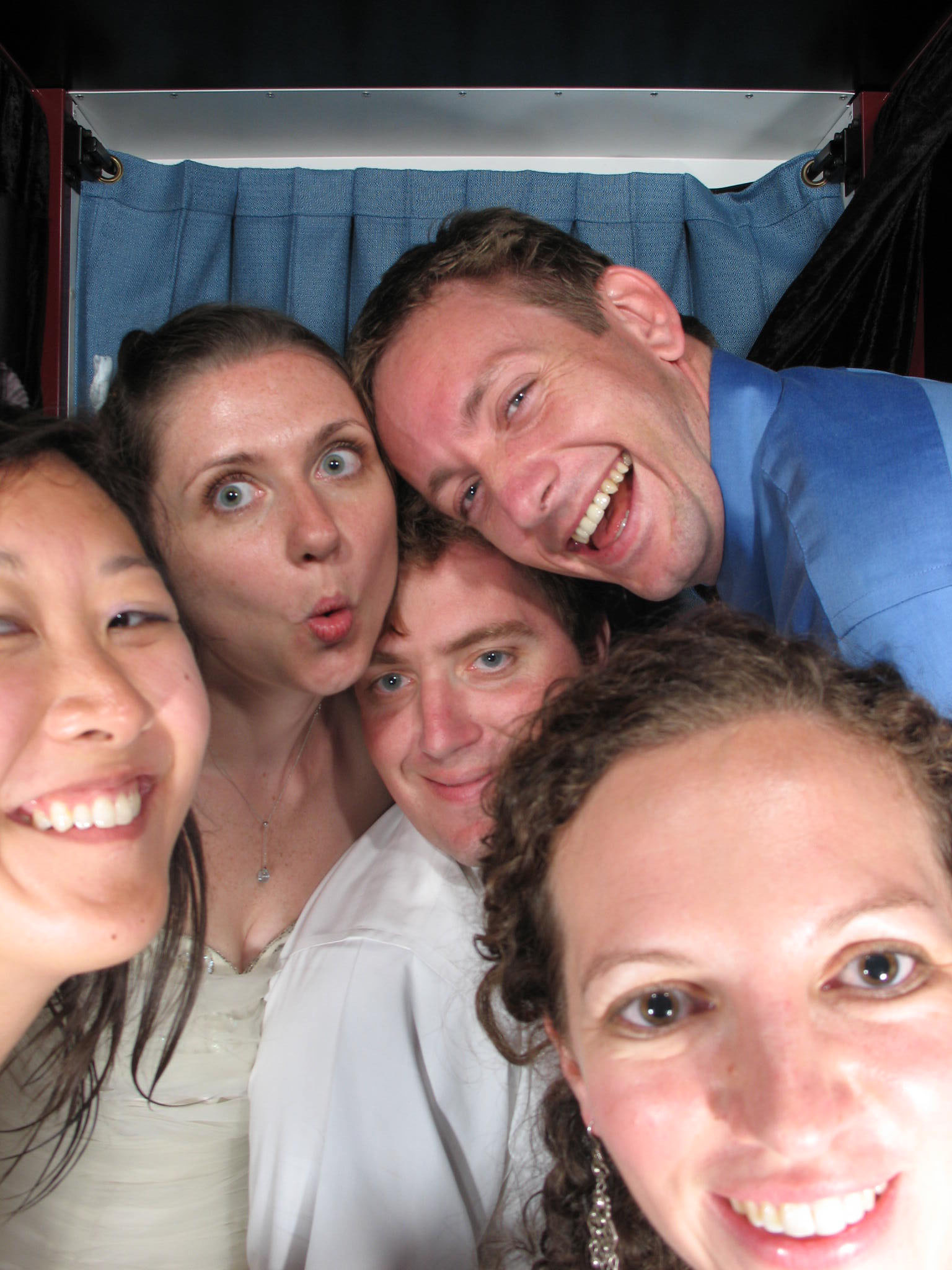
 How many high school friends can fit in the booth?
 And one dancing photo (this is dress #2).
 More soon!
PS-Here's the NY Times announcement too! Okay, yes, it's semi-douchey, but it's also a historical record, right? Cut me some slack.
PPS-More wedding coverage (and lots of shots of my ELLEgirls) from my friend Erin who blogs for glamour.com... if you're still curious.
More soon!
PS-Here's the NY Times announcement too! Okay, yes, it's semi-douchey, but it's also a historical record, right? Cut me some slack.
PPS-More wedding coverage (and lots of shots of my ELLEgirls) from my friend Erin who blogs for glamour.com... if you're still curious.
The LIAR Cover Controversy
 I've spoken with Justine Larbalestier a few times, and we've talked about her doing a Cover Story. It'll happen one day! But right now, while she's in the middle of a cover crisis, I just wanted to point anyone who hasn't read about the drama with her new LIAR cover, to her blog post about it.Basically, Justine's US publisher chose a very white-girl image for the cover, although the main character in LIAR is black. (The Australian version is a more abstract cover--see behind the controversial US cover).
The party line is that it has to do with sales and marketing, but whatever the case, it's a whitewash, and I'm so glad Justine is talking about it. That takes a brave author.
The discussion is fast and furious--page through the comments for lots of insight, and add your own thoughts. If we keep talking about this, and blogging, and spreading the word, there may be hope for a more honest paperback cover.
PS-While you're on Justine's blog, check out guest blogging Ari Miss Attitude, of Reading in Color. She rules.
I've spoken with Justine Larbalestier a few times, and we've talked about her doing a Cover Story. It'll happen one day! But right now, while she's in the middle of a cover crisis, I just wanted to point anyone who hasn't read about the drama with her new LIAR cover, to her blog post about it.Basically, Justine's US publisher chose a very white-girl image for the cover, although the main character in LIAR is black. (The Australian version is a more abstract cover--see behind the controversial US cover).
The party line is that it has to do with sales and marketing, but whatever the case, it's a whitewash, and I'm so glad Justine is talking about it. That takes a brave author.
The discussion is fast and furious--page through the comments for lots of insight, and add your own thoughts. If we keep talking about this, and blogging, and spreading the word, there may be hope for a more honest paperback cover.
PS-While you're on Justine's blog, check out guest blogging Ari Miss Attitude, of Reading in Color. She rules.
Win-It Wednesday: Sing to Win Reminder
Reminder: This contest is going on for one more week!


 So remember, here's the challenge: Make a video like Daniel's (below). Whatever song you like, a quick excerpt works. Lip Sync it up. Everyone who makes a video gets a prize, because--hello--you're providing me with major entertainment. I'll send out lip gloss, a book or two, maybe some new music, various fun stuff. Nothing boring.
If you're not up for the singing part (why not????!), you can spread the word
So remember, here's the challenge: Make a video like Daniel's (below). Whatever song you like, a quick excerpt works. Lip Sync it up. Everyone who makes a video gets a prize, because--hello--you're providing me with major entertainment. I'll send out lip gloss, a book or two, maybe some new music, various fun stuff. Nothing boring.
If you're not up for the singing part (why not????!), you can spread the word  about this contest. That counts as an entry too. Just tell me below where you posted/tweeted/talked it up, and you'll be entered to win a copy of E. Lockhart's latest, The Treasure Map of Boys. One random video-maker and/or word-spreader will win this book. And if you make a video, you have a chance to win this book and another prize because every video gets a prize!
Oh, and if you make a video, which you can totally do with the camera on your computer or a digital camera, put it on youtube and share it with me: youtube.com/melissacwalker. You don't have to make it public if you don't want to, but if you do, let me know if I can share it later. I would love to do a singing post in August.
Remember, the deadline for videos is August 5th. Good luck, and have fun!
Make Daniel proud!
PS-Just so you know, the videos are coming in--a few public, some private--and they are AMAZING. Thanks, you guys!
about this contest. That counts as an entry too. Just tell me below where you posted/tweeted/talked it up, and you'll be entered to win a copy of E. Lockhart's latest, The Treasure Map of Boys. One random video-maker and/or word-spreader will win this book. And if you make a video, you have a chance to win this book and another prize because every video gets a prize!
Oh, and if you make a video, which you can totally do with the camera on your computer or a digital camera, put it on youtube and share it with me: youtube.com/melissacwalker. You don't have to make it public if you don't want to, but if you do, let me know if I can share it later. I would love to do a singing post in August.
Remember, the deadline for videos is August 5th. Good luck, and have fun!
Make Daniel proud!
PS-Just so you know, the videos are coming in--a few public, some private--and they are AMAZING. Thanks, you guys!
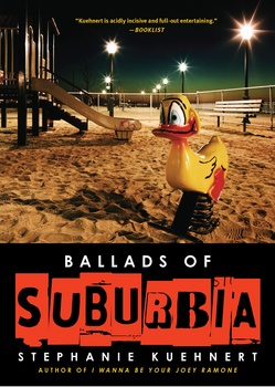
Cover Stories + Contest: Ballads of Suburbia by Stephanie Kuehnert
Author Stephanie Kuehnert has been having an amazing launch party over at her blog, which you probably know about already. Today, I'm vlogging, so go check it out and comment for a chance to win Lovestruck Summer!And, lucky us, Stephanie's here to share the Cover Story behind her new release, Ballads of Suburbia (see below for how you can win a copy). Here she is:
 "Unlike with my first book, I Wanna Be Your Joey Ramone, I never had any real cover ideas while I was writing Ballads of Suburbia. I Wanna Be Your Joey Ramone was just a book I could sum up more easily, both in words and in images. It has a certain punk spirit that I could pin down; there were pictures of rock stars that inspired me and I passed those along as cover inspiration, though none of them stuck. Ballads is moody and dark and unsettling. When people ask me to tell them about it I always end up stalling. I was able to come up with visuals for the book trailer much more easily than a cover image because the trailer gave me a lot more room to capture the tone of the book. I guess that's sort of the visual equivalent of stalling and stuttering out long-winded explanations.
"Anyway, the only thing I really wanted for the cover was ransom-note-style lettering because the notebook that the characters write in in the book has that kind of lettering on the cover. I passed this idea along to my editor and also directly to the woman designing the cover. I was lucky enough to have the same designer as I had for IWBYJR. I knew this pretty early on, which is probably the other reason I didn't think about cover design as much. I trusted Anna. IWBYJR had the perfect cover. She is a genius. I hope she designs every book cover I do.
"My editor never showed me any of the designs until they had one they were basically set on. This is what happened with IWBYJR too. I didn't see rejected covers until I found them on Anna's Flickr (oh, Google alerts), which is how I came to correspond with Anna in the first place because I had to thank her for her brilliant design. [See Stephanie's Cover story for IWBYJR here.]
"When my editor sent me the IWBYJR cover, it was love at first sight. This time, it wasn't. You see Ballads of Suburbia is set in a real place, in a park I spent much of high school hanging out in, Scoville Park -- which doesn't look like the park on the cover at all. When I imagined the setting of Ballads, I saw cigarette butts in dead grass. I saw kids sitting in a circle on a hill. I didn't see a playground, especially not that playground on the cover because the tiny playground in the corner of Scoville Park didn't have a creepy, acid-trippy looking duck in it.
"I took a deep breath and reminded myself that they would never put the real Scoville Park on the cover. It wasn't eye-catching. The duck was eye-catching. My editor and everyone at MTV Books loved the duck. I studied the cover image and focused on what I did love. The font -- that had been done exactly as I'd hoped. The eerie color of the street lamps in the sky -- that suited the mood of the book to a tee. I showed the cover to my best friend even though I wasn't really supposed to show anyone yet. She'd been at the real Scoville Park with me, if she could approve of this not-really-our-park park, I could too. She adored the duck. It made her feel unsettled, like Things Were Not Quite Right, like Danger and Bad Things would happen. And that was the sense I wanted people to get from the book after all, that the suburbs are not perfect. So eventually the duck won me over. It became as perfect a symbol of the book as the boots on the cover of I Wanna Be Your Joey Ramone.
"Unlike with my first book, I Wanna Be Your Joey Ramone, I never had any real cover ideas while I was writing Ballads of Suburbia. I Wanna Be Your Joey Ramone was just a book I could sum up more easily, both in words and in images. It has a certain punk spirit that I could pin down; there were pictures of rock stars that inspired me and I passed those along as cover inspiration, though none of them stuck. Ballads is moody and dark and unsettling. When people ask me to tell them about it I always end up stalling. I was able to come up with visuals for the book trailer much more easily than a cover image because the trailer gave me a lot more room to capture the tone of the book. I guess that's sort of the visual equivalent of stalling and stuttering out long-winded explanations.
"Anyway, the only thing I really wanted for the cover was ransom-note-style lettering because the notebook that the characters write in in the book has that kind of lettering on the cover. I passed this idea along to my editor and also directly to the woman designing the cover. I was lucky enough to have the same designer as I had for IWBYJR. I knew this pretty early on, which is probably the other reason I didn't think about cover design as much. I trusted Anna. IWBYJR had the perfect cover. She is a genius. I hope she designs every book cover I do.
"My editor never showed me any of the designs until they had one they were basically set on. This is what happened with IWBYJR too. I didn't see rejected covers until I found them on Anna's Flickr (oh, Google alerts), which is how I came to correspond with Anna in the first place because I had to thank her for her brilliant design. [See Stephanie's Cover story for IWBYJR here.]
"When my editor sent me the IWBYJR cover, it was love at first sight. This time, it wasn't. You see Ballads of Suburbia is set in a real place, in a park I spent much of high school hanging out in, Scoville Park -- which doesn't look like the park on the cover at all. When I imagined the setting of Ballads, I saw cigarette butts in dead grass. I saw kids sitting in a circle on a hill. I didn't see a playground, especially not that playground on the cover because the tiny playground in the corner of Scoville Park didn't have a creepy, acid-trippy looking duck in it.
"I took a deep breath and reminded myself that they would never put the real Scoville Park on the cover. It wasn't eye-catching. The duck was eye-catching. My editor and everyone at MTV Books loved the duck. I studied the cover image and focused on what I did love. The font -- that had been done exactly as I'd hoped. The eerie color of the street lamps in the sky -- that suited the mood of the book to a tee. I showed the cover to my best friend even though I wasn't really supposed to show anyone yet. She'd been at the real Scoville Park with me, if she could approve of this not-really-our-park park, I could too. She adored the duck. It made her feel unsettled, like Things Were Not Quite Right, like Danger and Bad Things would happen. And that was the sense I wanted people to get from the book after all, that the suburbs are not perfect. So eventually the duck won me over. It became as perfect a symbol of the book as the boots on the cover of I Wanna Be Your Joey Ramone.
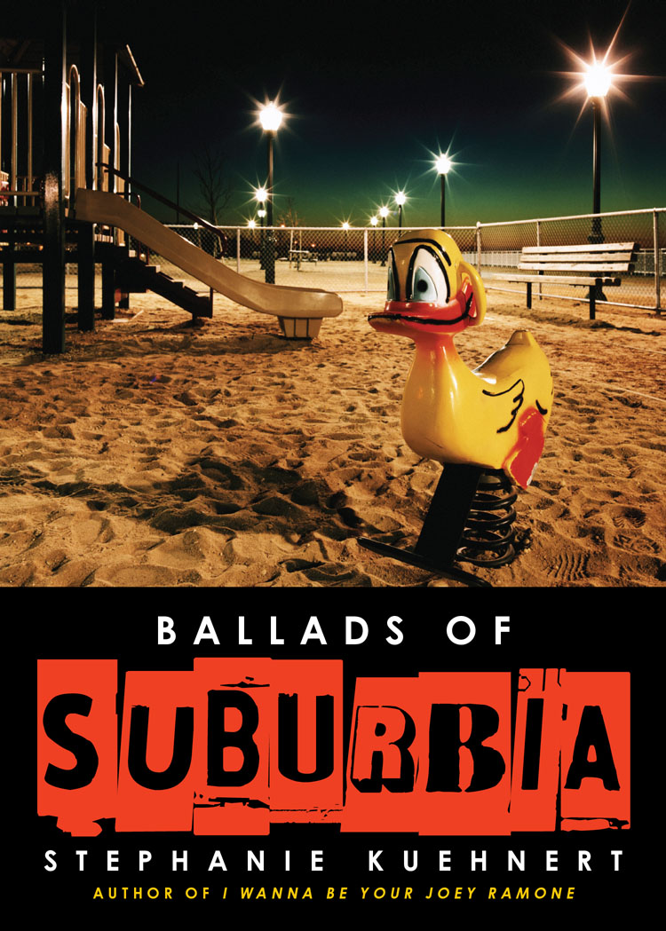
 "There was just one thing left that bothered me about the cover: the playground seemed to lack a teenage element. So I asked my editor if something could be added in -- beer cans or bottles, cigarette butts, graffiti. She said they could try it, but warned me it might look too photoshopped. The comp with the beer cans definitely did look photoshopped, but the graffiti was perfect. It's a very small touch, if you compare them side by side (above), but it is exactly the touch I felt it needed. With that and the idea that I would put pictures of the real Scoville Park on my website, I was completely pleased with the cover.
"Once again, I saw the rejected covers after the fact. I saw the first when blogger described it and since her description didn't match the duck cover I'd seen *at all*, I asked to be pointed to where she'd seen it. It turned out to be a Simon & Schuster catalog that they had to throw together before they had a final cover. That cover was another picture of feet, a girl wearing Converse style shoes and pants sitting on a bench this time. I kinda liked it, but also felt it looked like IWBYJR's ugly kid sister. My fiance said if I had another book with feet on the cover people might think I had a fetish and my editor told me that she'd never shown it to me because she'd absolutely hated that cover.
"There was just one thing left that bothered me about the cover: the playground seemed to lack a teenage element. So I asked my editor if something could be added in -- beer cans or bottles, cigarette butts, graffiti. She said they could try it, but warned me it might look too photoshopped. The comp with the beer cans definitely did look photoshopped, but the graffiti was perfect. It's a very small touch, if you compare them side by side (above), but it is exactly the touch I felt it needed. With that and the idea that I would put pictures of the real Scoville Park on my website, I was completely pleased with the cover.
"Once again, I saw the rejected covers after the fact. I saw the first when blogger described it and since her description didn't match the duck cover I'd seen *at all*, I asked to be pointed to where she'd seen it. It turned out to be a Simon & Schuster catalog that they had to throw together before they had a final cover. That cover was another picture of feet, a girl wearing Converse style shoes and pants sitting on a bench this time. I kinda liked it, but also felt it looked like IWBYJR's ugly kid sister. My fiance said if I had another book with feet on the cover people might think I had a fetish and my editor told me that she'd never shown it to me because she'd absolutely hated that cover.
 "A couple more rejected covers eventually appeared on the designer's Flickr page. One was the same as the final cover but with different font for the title (left). Not nearly as cool since I do love my font. Another was this image of a girl and guy.
 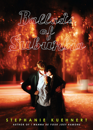 I like the suburban street they are on, that is pretty perfect for the book, but the girl only kind of looks like my image of Kara and the guy doesn't look like any of the guys in the book at all. That's why people on covers can be so challenging IMHO.
"So ultimately the duck wins out. I've gotta say, I can't imagine any other cover at this point!"
I am really into the creepy duck. What do you guys think? Leave a comment below, and you'll be entered to win a copy of Ballads of Suburbia from Stephanie herself. Good luck!
PS-Almost back from the Honeymoon! I promise many posts and pics when I return!
I like the suburban street they are on, that is pretty perfect for the book, but the girl only kind of looks like my image of Kara and the guy doesn't look like any of the guys in the book at all. That's why people on covers can be so challenging IMHO.
"So ultimately the duck wins out. I've gotta say, I can't imagine any other cover at this point!"
I am really into the creepy duck. What do you guys think? Leave a comment below, and you'll be entered to win a copy of Ballads of Suburbia from Stephanie herself. Good luck!
PS-Almost back from the Honeymoon! I promise many posts and pics when I return!
Crazy-Zen Honeymoon Photos
in Other Stuff
Just a few shots while I have a good internet connection in Baddeck, Nova Scotia! So far, I've gone a little bit crazy (as evidenced by a few crazy-eyed photos) with all the fun of a Honeymoon, but there are moments of major zen too: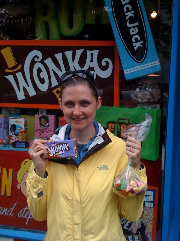 Crazy for candy in Halifax.
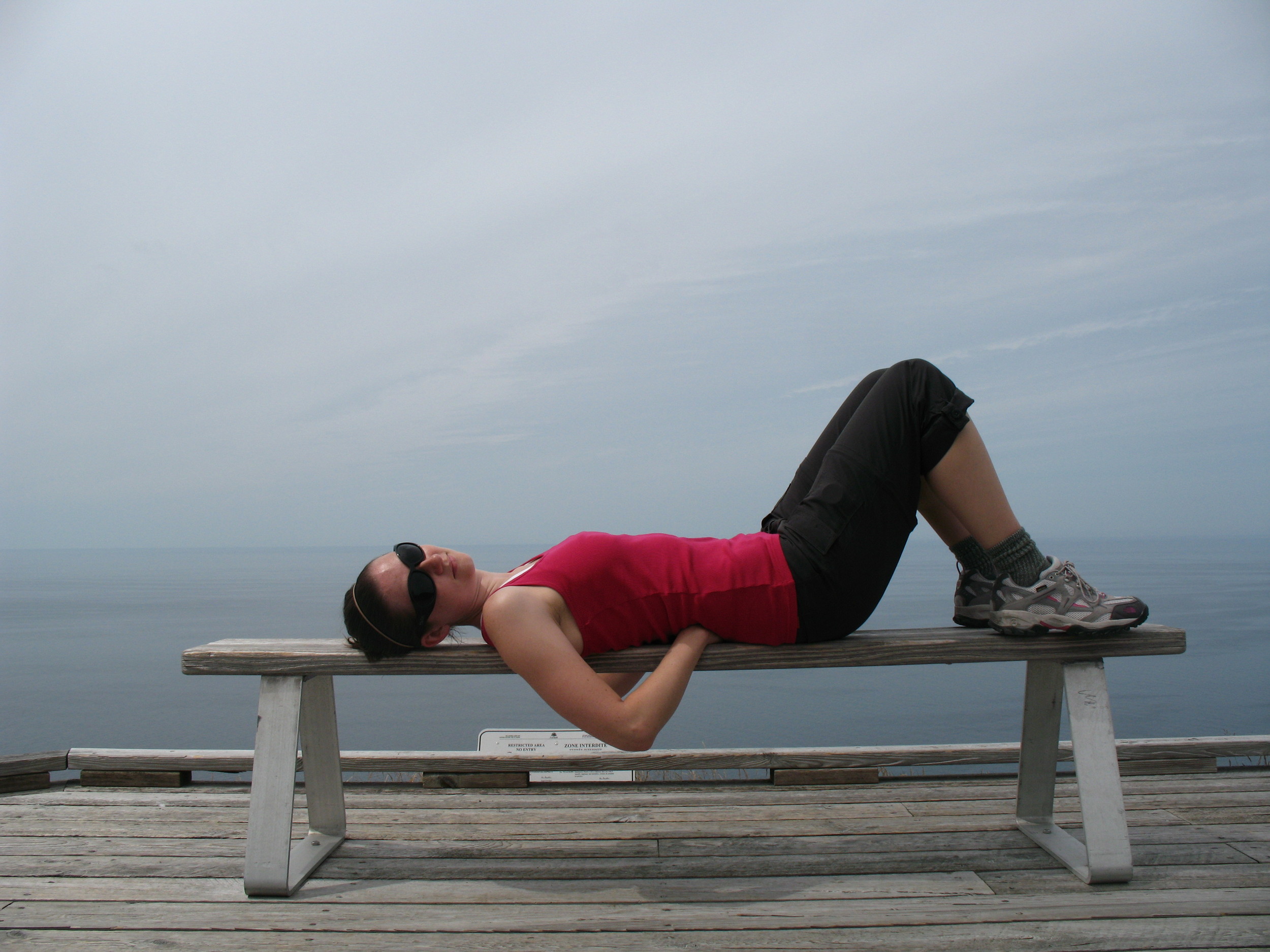 Totally blissed out in Cape Breton National Park, on the Skyline Trail (there was real hiking to get here!).
 Insane once again, this time for lobster in Baddeck.
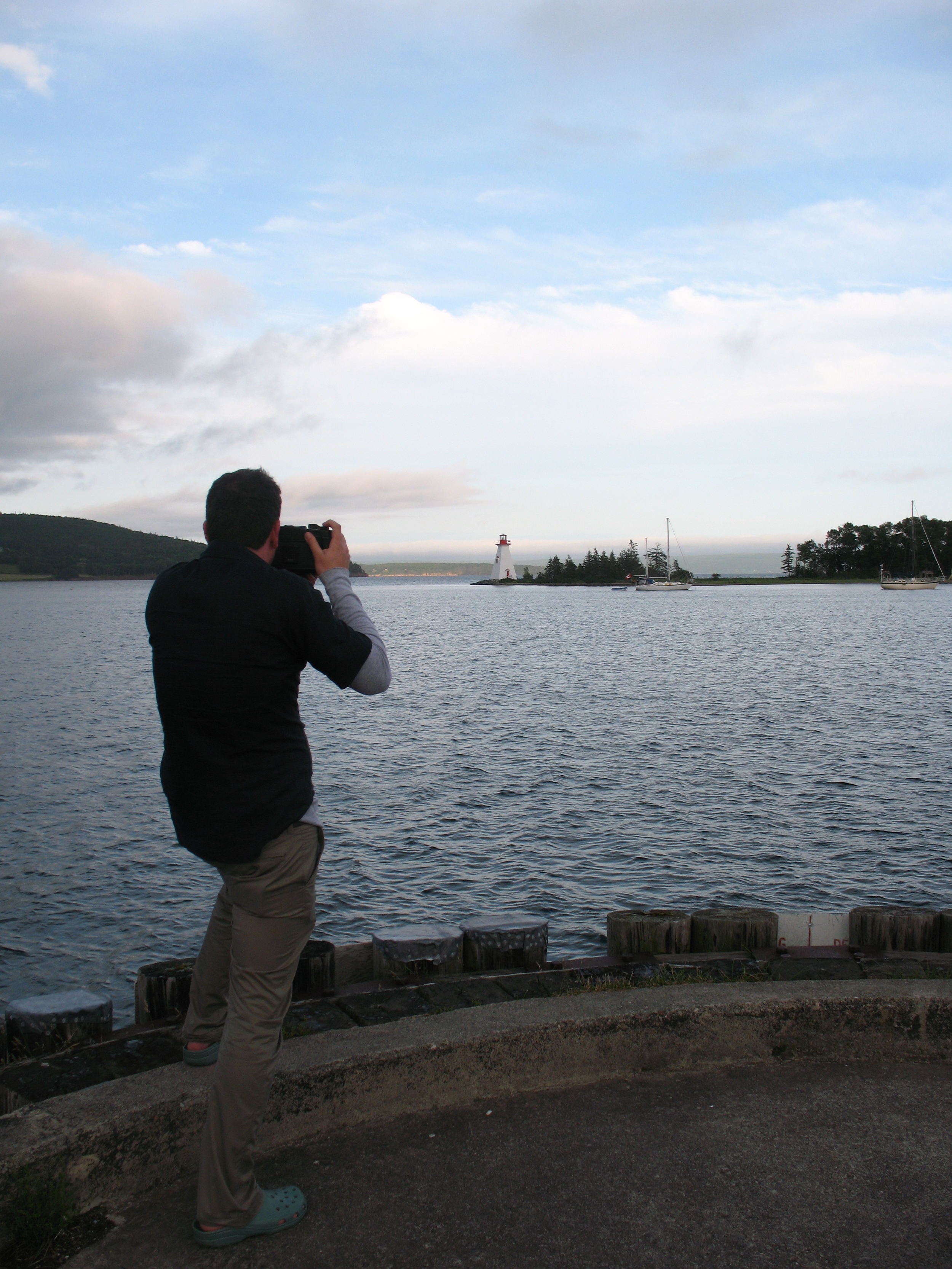 A zen moment: Dave photographing a lighthouse in Baddeck.
More soon! We're still traveling around.
Happy weekend.
A zen moment: Dave photographing a lighthouse in Baddeck.
More soon! We're still traveling around.
Happy weekend.
Cover Stories: Bug Boy by Eric Luper
 Eric Luper's just-released Bug Boy is about a young athlete who races thoroughbreds during the Great Depression. I've been into historical fiction ever since I read teen novels set during the Salem witch trials (drama! intrigue! burning at stakes!) and I'm psyched to read some more.Here's Eric's Cover Story:
"When I was writing BUG BOY, I was still in denial that I was writing historical fiction. So, the concept of a cover felt very distant, as did actually completing the manuscript. As I got closer to finishing my first draft, I started thinking about cover design. I knew it had to have horses and convey action or movement, but my specific opinion on the matter ended there.
"My publisher was stymied. They had no idea where to get either a) a horse racing photo from the 1930s that didn't look static and boring or b) a contemporary photo with no anachronisms in it. Eric Luper to the rescue! I spent several days pawing through the photo archives at the National Museum of Racing and the Saratoga Historical Society. No luck. I didn't want a black and white cover and colorized covers always look sort of creepy.
Eric Luper's just-released Bug Boy is about a young athlete who races thoroughbreds during the Great Depression. I've been into historical fiction ever since I read teen novels set during the Salem witch trials (drama! intrigue! burning at stakes!) and I'm psyched to read some more.Here's Eric's Cover Story:
"When I was writing BUG BOY, I was still in denial that I was writing historical fiction. So, the concept of a cover felt very distant, as did actually completing the manuscript. As I got closer to finishing my first draft, I started thinking about cover design. I knew it had to have horses and convey action or movement, but my specific opinion on the matter ended there.
"My publisher was stymied. They had no idea where to get either a) a horse racing photo from the 1930s that didn't look static and boring or b) a contemporary photo with no anachronisms in it. Eric Luper to the rescue! I spent several days pawing through the photo archives at the National Museum of Racing and the Saratoga Historical Society. No luck. I didn't want a black and white cover and colorized covers always look sort of creepy.
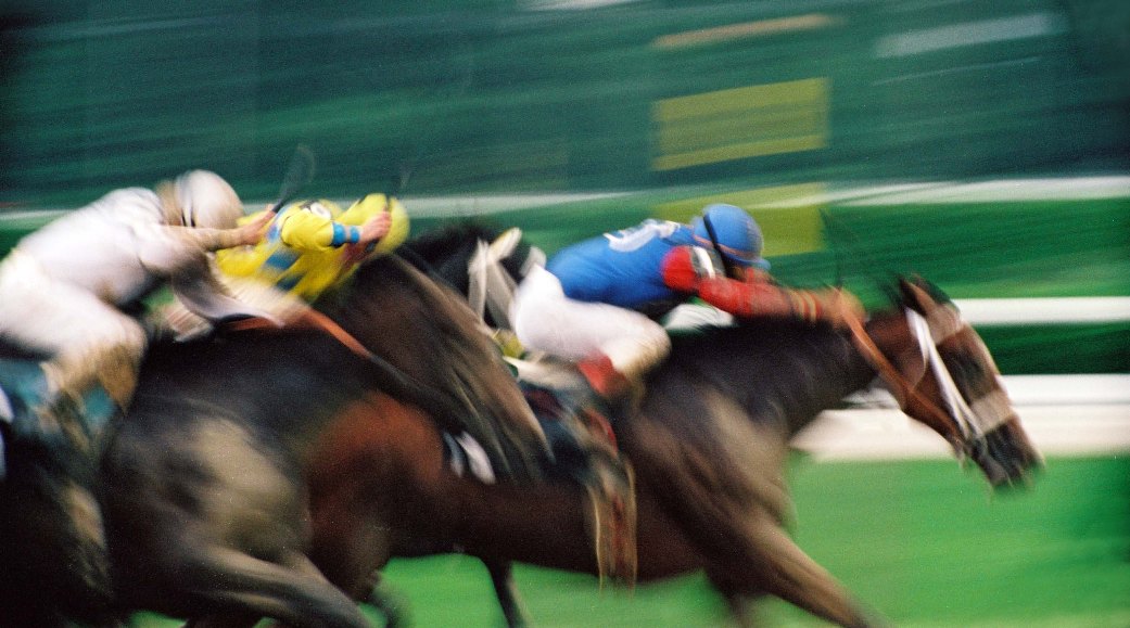 "So, I called a few amateur photographers I know who lurk around the track. As soon as I described what I needed, my friend Seth Holbrook's face lit up. 'I know exactly what you need!' he said. He forwarded an image to me and as soon as I saw it, I knew he was right. I pitched the image to my editor and we decided on a wraparound cover with very little text.
"The original photo has all the movement you see on the cover. It was taken by moving the camera at the speed of the horses and leaving the background and all other motion to blur. The original picture is quite striking. The art department then did their magic and antiqued it, while leaving all the vividness of the original image. It captures exactly what I was trying to capture in writing the book. It's a great pairing.
"I wished there was a way to get the whole image on the front of the book, but that would have required printing the book sideways, which would not go over well with anyone trying to shelve the sucker!
"So, I called a few amateur photographers I know who lurk around the track. As soon as I described what I needed, my friend Seth Holbrook's face lit up. 'I know exactly what you need!' he said. He forwarded an image to me and as soon as I saw it, I knew he was right. I pitched the image to my editor and we decided on a wraparound cover with very little text.
"The original photo has all the movement you see on the cover. It was taken by moving the camera at the speed of the horses and leaving the background and all other motion to blur. The original picture is quite striking. The art department then did their magic and antiqued it, while leaving all the vividness of the original image. It captures exactly what I was trying to capture in writing the book. It's a great pairing.
"I wished there was a way to get the whole image on the front of the book, but that would have required printing the book sideways, which would not go over well with anyone trying to shelve the sucker!
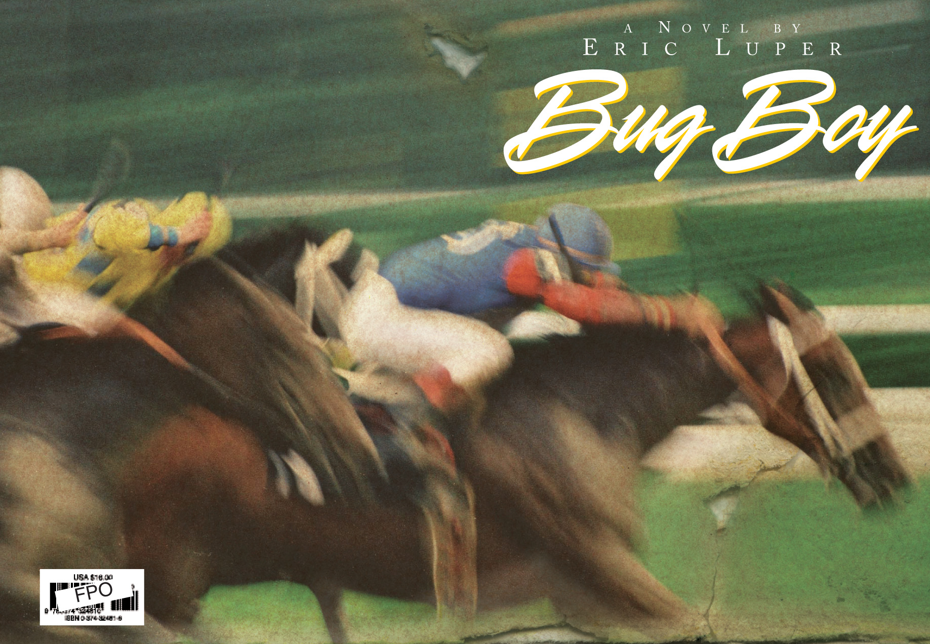 "There were some font changes and some subtle coloring and antiquing changes, but the cover did not evolve much throughout the process. As my editor would tell you, I like to offer my opinion on many things. I'm a visual person and I have a strong opinion about jacket design. I also think 'spine appeal' is extremely important. However, my expertise is in writing prose; I defer the final decisions on cover and whatnot to my editor and the art and marketing departments. It's their area of expertise.
"My litmus test for cover design is closing my eyes and envisioning myself at a book signing. I ask myself whether I'd be proud to be sitting next to a pile of the books or if I'd try to hide behind them. BUG BOY is a book I will be proud to sit next to."
I'm into the movement of the cover--Fast! Horses! Color! What do you guys think?
PS-Still on Honeymoon... back soon with pics!
"There were some font changes and some subtle coloring and antiquing changes, but the cover did not evolve much throughout the process. As my editor would tell you, I like to offer my opinion on many things. I'm a visual person and I have a strong opinion about jacket design. I also think 'spine appeal' is extremely important. However, my expertise is in writing prose; I defer the final decisions on cover and whatnot to my editor and the art and marketing departments. It's their area of expertise.
"My litmus test for cover design is closing my eyes and envisioning myself at a book signing. I ask myself whether I'd be proud to be sitting next to a pile of the books or if I'd try to hide behind them. BUG BOY is a book I will be proud to sit next to."
I'm into the movement of the cover--Fast! Horses! Color! What do you guys think?
PS-Still on Honeymoon... back soon with pics!