


 Just a reminder about this contest. It's going on for two more weeks. Get filming!
And another reminder about Daniel, who is awesome and inspired this contest:
Just a reminder about this contest. It's going on for two more weeks. Get filming!
And another reminder about Daniel, who is awesome and inspired this contest:
Photo Friday: Something Blue
in Photo Friday
Bye, everyone! I'm off to the wedding.I have a few timed posts for you, but generally I won't be around for 10 days or so. I promise to post a few (but not an obnoxious amount) of the best wedding photos later.
Meanwhile, here's a hint at what I'm wearing for at least part of the evening. I've got my something blue covered!
 Happy Weekend!
Bonus Cover Stories: Alibi Junior High by Greg Logstead
 Greg Logstead has been here once before, sharing the awesome Cover Story behind Something Happened. His new book is out now, and Greg is back to tell the tale of Alibi Junior High!"Melissa, thanks for featuring Alibi Junior High on your cover stories! This blog is so much fun. Let's see, I didn't really have an idea for the cover. All I really wanted was for it to be really cool. I was thinking maybe some kind of snake tattoo or something like that. (One of the characters, Andy has a snake tattoo.)
"My publisher asked for ideas and unfortunately all I could come up with was my very vague 'it should be really cool' suggestion. Which in retrospect isn't much help at all. It's like if a painter asked me what color I wanted my house painted and I just told him, 'I Just want it to look cool.'
"Okay, the first time I saw the first cover, I have to admit I...HATED it: the drawing, the
Greg Logstead has been here once before, sharing the awesome Cover Story behind Something Happened. His new book is out now, and Greg is back to tell the tale of Alibi Junior High!"Melissa, thanks for featuring Alibi Junior High on your cover stories! This blog is so much fun. Let's see, I didn't really have an idea for the cover. All I really wanted was for it to be really cool. I was thinking maybe some kind of snake tattoo or something like that. (One of the characters, Andy has a snake tattoo.)
"My publisher asked for ideas and unfortunately all I could come up with was my very vague 'it should be really cool' suggestion. Which in retrospect isn't much help at all. It's like if a painter asked me what color I wanted my house painted and I just told him, 'I Just want it to look cool.'
"Okay, the first time I saw the first cover, I have to admit I...HATED it: the drawing, the 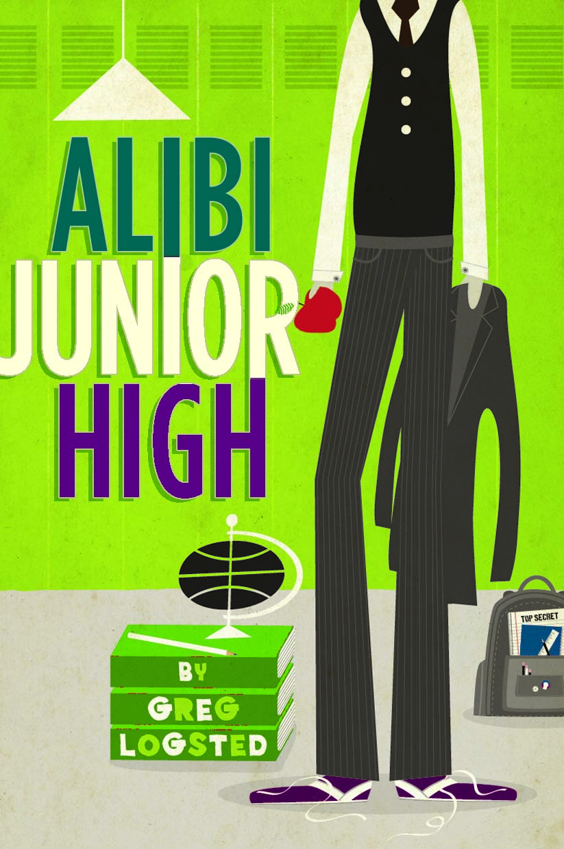 green colors, even the letters - it looked completely wrong to me. I was disappointed. This is only my second book so I didn't know what to do. I didn't want to be 'difficult' so I spent a whole lot of time trying to convince myself that it wasn't that bad.
"Luckily...I wasn't the only person who hated the first cover and they came up with the final cover which I LOVED the instant I saw it. I emailed it to friends and even printed it to show to people at work. Now...I can't even imagine Alibi Junior High without that final cover. I think they nailed it perfectly."
I'm with Greg! That first cover... eh, not so much. I love the final. What do you guys think?
green colors, even the letters - it looked completely wrong to me. I was disappointed. This is only my second book so I didn't know what to do. I didn't want to be 'difficult' so I spent a whole lot of time trying to convince myself that it wasn't that bad.
"Luckily...I wasn't the only person who hated the first cover and they came up with the final cover which I LOVED the instant I saw it. I emailed it to friends and even printed it to show to people at work. Now...I can't even imagine Alibi Junior High without that final cover. I think they nailed it perfectly."
I'm with Greg! That first cover... eh, not so much. I love the final. What do you guys think?

Shop Indie Bookstores
Win-It Wednesday: Time to SING! For A Treasure Map of Boys
Last week's winner of signed (with bookplate) copy of Evermore is... Llehn! And the signed copy of Blue Moon winner? Olivia! Send me your addresses, L and O. Evermore comes from me and Blue Moon comes from Alyson Noel. Yay!
Now, this week I'm about to leave for a big trip, so I'm starting a three-week-long contest. It's all based on this video by my myspace friend/Violet fan Daniel:
I cannot stop watching it. I love it. Seriously. I've already taped like 10 songs of myself doing this, none of which I can let you see (they are terrible). But I'm going to post my own version of me doing a song I love at the end of this contest.
Now, for you, here's the challenge: Make a video like this. Whatever song you like, a quick excerpt works. Lip Sync it up. Everyone who makes a video gets a prize, because--hello--you're providing me with major entertainment. I'll send out lip gloss, a book or two, maybe some new music, various fun stuff. Nothing boring.
If you're not up for the singing part (why not????!), you can spread the word 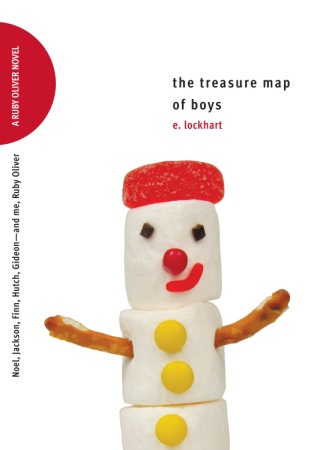 about this contest. That counts as an entry too. Just tell me below where you posted/tweeted/talked it up, and you'll be entered to win a copy of E. Lockhart's latest, The Treasure Map of Boys (if you know the Ruby series--and you should know the Ruby series--you know this book is going to ROCK). One random video-maker and/or word-spreader will win this book. And if you make a video, you have a chance to win this book and another prize because every video gets a prize!
Oh, and if you make a video, which you can totally do with the camera on your computer or a digital camera, put it on youtube and share it with me: youtube.com/melissacwalker. You don't have to make it public if you don't want to, but if you do, let me know if I can share it later. I would love to do a singing post in August.
Remember, the deadline for videos is August 5th. Good luck, and have fun!
about this contest. That counts as an entry too. Just tell me below where you posted/tweeted/talked it up, and you'll be entered to win a copy of E. Lockhart's latest, The Treasure Map of Boys (if you know the Ruby series--and you should know the Ruby series--you know this book is going to ROCK). One random video-maker and/or word-spreader will win this book. And if you make a video, you have a chance to win this book and another prize because every video gets a prize!
Oh, and if you make a video, which you can totally do with the camera on your computer or a digital camera, put it on youtube and share it with me: youtube.com/melissacwalker. You don't have to make it public if you don't want to, but if you do, let me know if I can share it later. I would love to do a singing post in August.
Remember, the deadline for videos is August 5th. Good luck, and have fun!
Librarian Deena Lipomi Talks Covers, Part 3
Here's another taste of my fun interview with Deena Lipomi, a YA Librarian at Brighton Memorial Library in Rochester, NY. I asked her about book covers, in relation to the Cover Stories series, and she gave me all kinds of fun tidbits. Catch Part 1 here (for some reason it won't let you comment on that one--sorry!) and Part 2 here.Here's part 3, where Deena talks about books that don't get picked up (and she blames the covers):
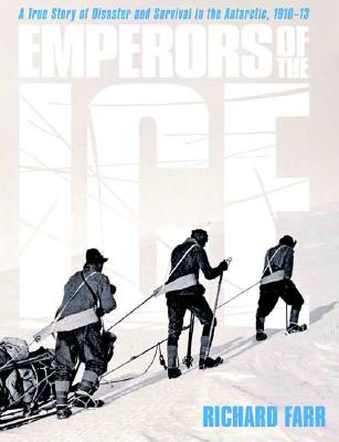
 "Unpopular covers that hide great books are such a huge disappointment to me! I LOVED Gary D. Schmidt's THE WEDNESDAY WARS and TROUBLE, but I have to hand sell them in order to get them to go out because the covers are so boring and dreary. Also, books with gray covers never
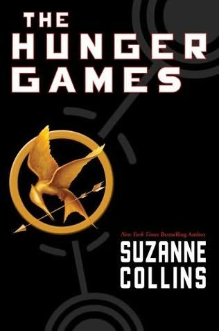
 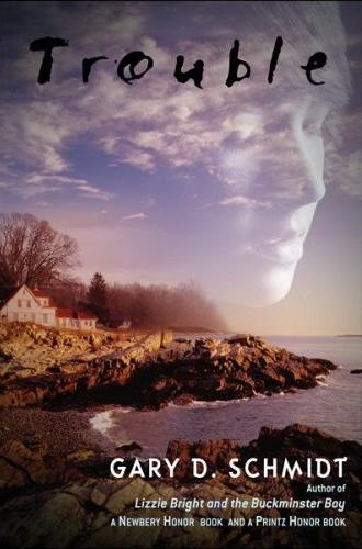 go out unless pushed. Some off the top of my head that sat and sat and sat on my New YA Books shelf no matter how many times I put them face out include CREATURE OF THE NIGHT by Kate Thompson (really good ghost story with heart), and EMPERORS OF THE ICE by Richard Farr (fantastic story about Antarctica). Thank goodness word of mouth is so good for THE HUNGER GAMES by Suzanne Collins because that cover is yawnsville.

 "Monochromatic covers don't do too well either. I didn't read it, but I know
 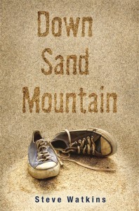 DOWN SAND MOUNTAIN by Steve Watkins won an SCBWI award, but it never goes out. One could argue the sneakers on it are "iconic," but for some reason it doesn't work that way with the entirely beige book.
 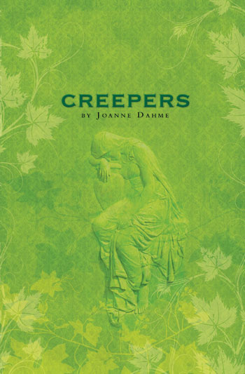 Also, the solid green cover of CREEPERS by Joanne Dahme never goes out. There's no focal point, and it's especially hard once the library plastic book covers are put over them to protect them; with the glare it is even harder to see what's on them."
 "Another cover type that doesn't go out much are cartoony ones. For paperbacks, they do OK, but for hardcovers, like MARCELLO IN THE REAL WORLD by Francisco X. Stork (which is a great story about a boy with an autistic-like condition), it doesn't help the cause. I'm not sure why -- is it too babyish? Or not as provocative as all the glitzy covers with real photos on them?"
I love hearing Deena's thoughts and observations. What do you guys think about what she's said? I know there's been debate about Lovestruck Summer's cartoon cover, and I totally welcome that. I actually really like the Marcello cover... but I kind of agree that the rest are a little bland.
Thanks, Deena, for such interesting answers!
PS-The winner of last week's contest for The Elite series is... Juliana! Send me your address, J.
"Another cover type that doesn't go out much are cartoony ones. For paperbacks, they do OK, but for hardcovers, like MARCELLO IN THE REAL WORLD by Francisco X. Stork (which is a great story about a boy with an autistic-like condition), it doesn't help the cause. I'm not sure why -- is it too babyish? Or not as provocative as all the glitzy covers with real photos on them?"
I love hearing Deena's thoughts and observations. What do you guys think about what she's said? I know there's been debate about Lovestruck Summer's cartoon cover, and I totally welcome that. I actually really like the Marcello cover... but I kind of agree that the rest are a little bland.
Thanks, Deena, for such interesting answers!
PS-The winner of last week's contest for The Elite series is... Juliana! Send me your address, J.
Cover Stories: North of Beautiful by Justina Chen Headley
 Today, readergirlz diva and fantabulous author Justina Chen Headley is here! She's sharing the Cover Story for North of Beautiful, which I adored, especially for its deft handling of difficult family dynamics. Here's Justina!
"My book has a twin: Alyson Noel's Evermore. The funny thing is, North of Beautiful and Evermore don't just share the cover girl. They were also published on virtually the same day. Twins separated at birth!
Today, readergirlz diva and fantabulous author Justina Chen Headley is here! She's sharing the Cover Story for North of Beautiful, which I adored, especially for its deft handling of difficult family dynamics. Here's Justina!
"My book has a twin: Alyson Noel's Evermore. The funny thing is, North of Beautiful and Evermore don't just share the cover girl. They were also published on virtually the same day. Twins separated at birth!
 "A bunch of people have asked me whether it's been a problem sharing the same cover girl. I don't think so. If anything, that anomaly has raised the profile of our books. Publishers Weekly even did a story about it. Plus, the treatment of the cover girl is so different I didn't even realize it was the same girl until a blogger pointed it out to me.
"I've hit the jackpot with all my book covers, thanks to my art director, Gail Doobinin who designed my first two books--Girl Overboard and Nothing but the Truth 
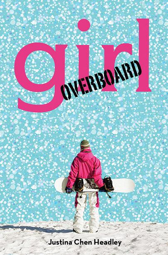 (and a few white lies). And my new book designer, Saho Fujii who created North of Beautiful. I know I'm lucky to love all my covers and to have a publisher who honors my opinion.
"For North of Beautiful, Saho played around with a bunch of different concepts--and obviously had read my book. One of her initial ideas was to collage the cover just the way Terra herself may have created. But then Saho found the perfect photo representation for Terra: hair draped over her cheek, downcast eyes. It was precisely how I imagined Terra holding herself in public.
"Then, the brilliance that is Saho found a fabulous old-fashioned compass rose that she used to separate the three parts of the story. My one and only request was that she somehow integrate that compass image on the front cover. Her treatment of the compass--placing it as a watermark over Terra's cheek--was inspired! It is a truly and exceptionally beautiful cover."
I agree--it looks so different on each cover that I can totally see it as both Terra and Ever--separate girls in two fantastic books. I also love how Justina's three books are blue, pink and yellow in overall color palette--gorgeous! What do you guys think?
And don't forget to check out Alea's Pop Culture Junkie Lookalikes post on this cover--you'll find even more twins (or triplets?).
Sunday Fun With Auras
in Other Stuff
So Alyson Noel's new series has a fabulous new Immortals website which involves all kinds of fun with red tulips and auras. I already made my aura. See? Remember, two contests this week: One for signed copies of Evermore and Blue Moon by Alyson Noel, and one for the full Elite series signed by Jennifer Banash! Hooray! Go enter. Oh, and make an aura and show me.
Happy Sunday!
Remember, two contests this week: One for signed copies of Evermore and Blue Moon by Alyson Noel, and one for the full Elite series signed by Jennifer Banash! Hooray! Go enter. Oh, and make an aura and show me.
Happy Sunday!
Photo Friday: The Family Edition
in Photo Friday
So I'm getting married a week from tomorrow (!!) and that got me in the mood to look at a ton of old family photos. I had to share some, even though my brothers will kill me. Luckily, they so don't read my blog:These are my two older brothers when they were teenagers. How 70s are they?!
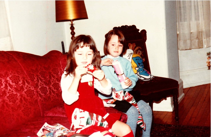
 Here's me (left) with my cousin Curry (a bridesmaid) on Christmas, early 80s:
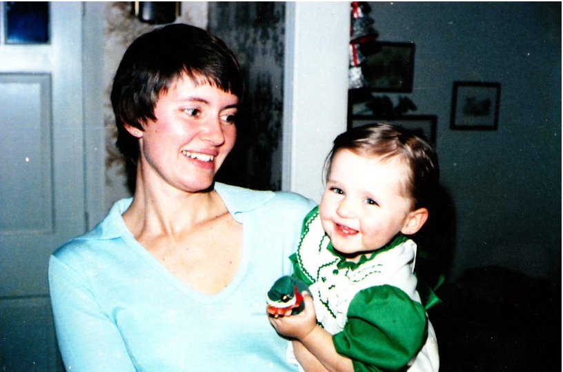
 Me with my gorgeous mom, who'll walk me down the aisle!
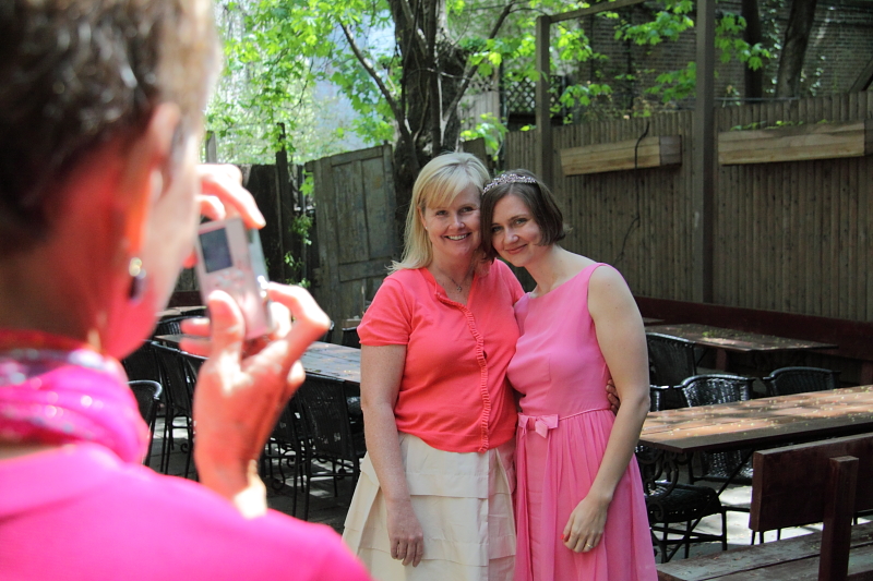
 And a current one: Me with my sister at my spring wedding shower (that's Mom taking a photo):
 Ah, family. Happy Friday!
Win-It Wednesday + Cover Stories: Evermore and Blue Moon by Alyson Noel!!
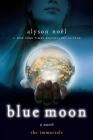
First, the winner of last week's contest for Persepolis is... Katie Bug! Send me your address, KB. Now, Alyson Noel's Immortals series is basically at the top of the heap this summer. Bestsellers, major sequels, a spin-off middle grade series--hooray! And yesterday, Blue Moon, the sequel to Evermore, was released.
Alyson has been kind enough to offer one commenter a signed copy of Blue Moon, and I'll send one commenter a signed (with bookplate) copy of Evermore, so two winners will be chosen next week! And here's Alyson with the Blue Moon Cover Story (remember her Evermore Cover Story?):
"Once again, I had no idea what the might look like, or even what I might want it to look like--sad, I know!
"My publisher asked for input, and even though I didn't have any real concepts in mind, this time, unlike the last time with the Evermore cover, I knew I'd be consulted so I was careful to make note of all the prominent symbols that appear in the story so I could at least appear to contribute in some way!
"The Blue Moon cover was a series of stock photos altered to within an inch of their lives! The girl is made to represent Ever, and the flowers inside the crystal ball she holds depict the blooming fields of Summerland--a mystical dimension she frequents.
"When I saw the first version of the cover (right), I thought, not so much. But we all
Now, Alyson Noel's Immortals series is basically at the top of the heap this summer. Bestsellers, major sequels, a spin-off middle grade series--hooray! And yesterday, Blue Moon, the sequel to Evermore, was released.
Alyson has been kind enough to offer one commenter a signed copy of Blue Moon, and I'll send one commenter a signed (with bookplate) copy of Evermore, so two winners will be chosen next week! And here's Alyson with the Blue Moon Cover Story (remember her Evermore Cover Story?):
"Once again, I had no idea what the might look like, or even what I might want it to look like--sad, I know!
"My publisher asked for input, and even though I didn't have any real concepts in mind, this time, unlike the last time with the Evermore cover, I knew I'd be consulted so I was careful to make note of all the prominent symbols that appear in the story so I could at least appear to contribute in some way!
"The Blue Moon cover was a series of stock photos altered to within an inch of their lives! The girl is made to represent Ever, and the flowers inside the crystal ball she holds depict the blooming fields of Summerland--a mystical dimension she frequents.
"When I saw the first version of the cover (right), I thought, not so much. But we all 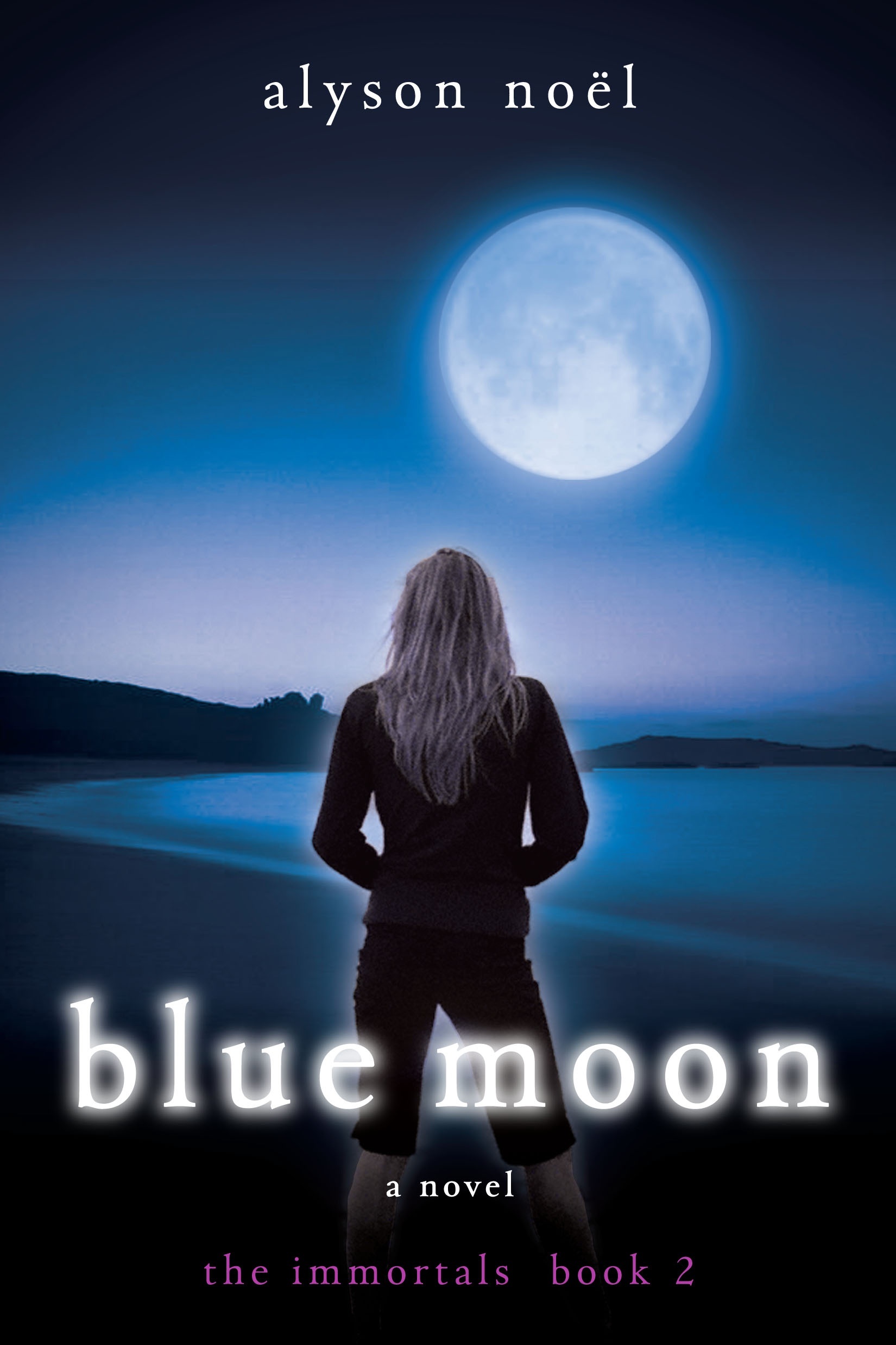 knew we weren't going to use it, we were just finding our way at that point. I have the best editor ever--Rose Hilliard rocks!--and we had quite a few phone calls and e-mail exchanges about the direction we wanted to go in.
"The cover changed greatly and for the better! Since it's a series, they were going for a more cohesive look, you know, the same but different. And I think the final Blue Moon cover ties in nicely with the Evermore cover since they both feature a girl (Ever) and a close up of an object that is hugely symbolic to the story inside.
"When I saw the final Blue Moon cover, I loved it immediately! I feel really lucky to work with such a great team at St. Martin's!"
Thanks, Alyson! I think these covers are iconic and they just glow. I have to admit that first version of Blue Moon seems 80s to me somehow. What do you guys think? Comment below to be entered for the signed copies!
Happy Wednesday!
knew we weren't going to use it, we were just finding our way at that point. I have the best editor ever--Rose Hilliard rocks!--and we had quite a few phone calls and e-mail exchanges about the direction we wanted to go in.
"The cover changed greatly and for the better! Since it's a series, they were going for a more cohesive look, you know, the same but different. And I think the final Blue Moon cover ties in nicely with the Evermore cover since they both feature a girl (Ever) and a close up of an object that is hugely symbolic to the story inside.
"When I saw the final Blue Moon cover, I loved it immediately! I feel really lucky to work with such a great team at St. Martin's!"
Thanks, Alyson! I think these covers are iconic and they just glow. I have to admit that first version of Blue Moon seems 80s to me somehow. What do you guys think? Comment below to be entered for the signed copies!
Happy Wednesday!

Shop Indie Bookstores
Shop Indie Bookstores
Release Day Contest for Simply Irresistible by Jennifer Banash
in Other Stuff
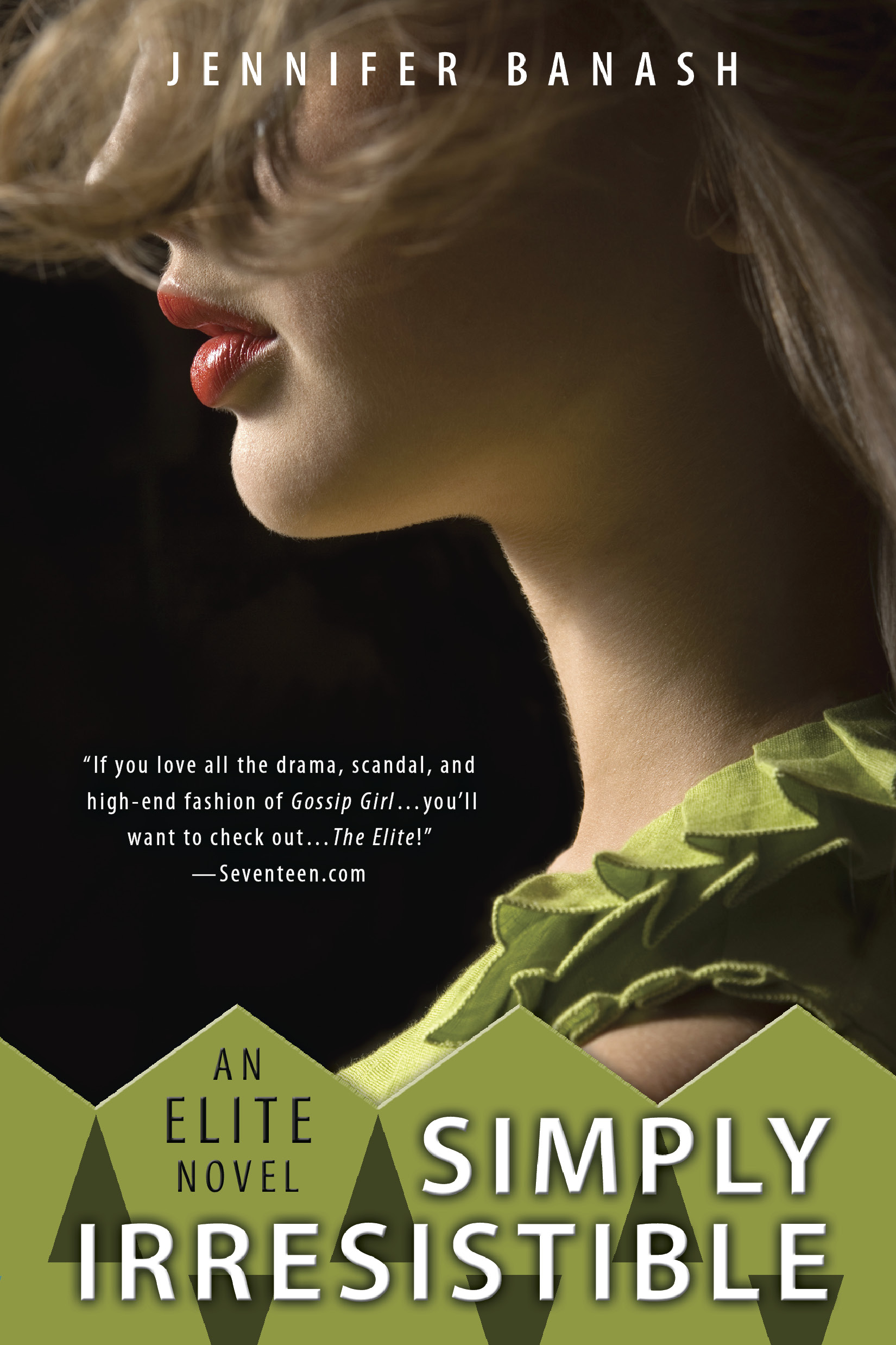 Okay, so this review quote is one I would almost kill for: "The Elite is Pretty in Pink for the millennium generation." --Romance Reviews TodayAnd today celebrates the release of the third and final book in Jennifer Banash's trilogy about small-town girl Casey McCloy who moves to New York's Upper East Side and has to deal with, well, you know. Mean girls and rich boys and all the swirling, delicious madness of the city.
Third and last in The Elite series, Simply Irresistible has my favorite cover (though they're all pretty darn smashing), I think because I just love the contrast of the green with the red lips. What do you guys think--which is your favorite?
Okay, so this review quote is one I would almost kill for: "The Elite is Pretty in Pink for the millennium generation." --Romance Reviews TodayAnd today celebrates the release of the third and final book in Jennifer Banash's trilogy about small-town girl Casey McCloy who moves to New York's Upper East Side and has to deal with, well, you know. Mean girls and rich boys and all the swirling, delicious madness of the city.
Third and last in The Elite series, Simply Irresistible has my favorite cover (though they're all pretty darn smashing), I think because I just love the contrast of the green with the red lips. What do you guys think--which is your favorite?

 Of note: The same art department did the Violet covers. Kudos to Penguin's Berkley Jam for really fantastic design work. Right?
Oh, and don't miss the trailer for Simply Irresistible (love the song, love the production):
PS-UPDATE! Jennifer has graciously agreed to donate the entire series as a prize for one lucky reader. Just comment below to enter--I'll pick a winner randomly next week!
Of note: The same art department did the Violet covers. Kudos to Penguin's Berkley Jam for really fantastic design work. Right?
Oh, and don't miss the trailer for Simply Irresistible (love the song, love the production):
PS-UPDATE! Jennifer has graciously agreed to donate the entire series as a prize for one lucky reader. Just comment below to enter--I'll pick a winner randomly next week!