Today's Cover Story is from Isabel Kaplan, whose debut novel just came out in June, the same month she finished her freshman year at Harvard!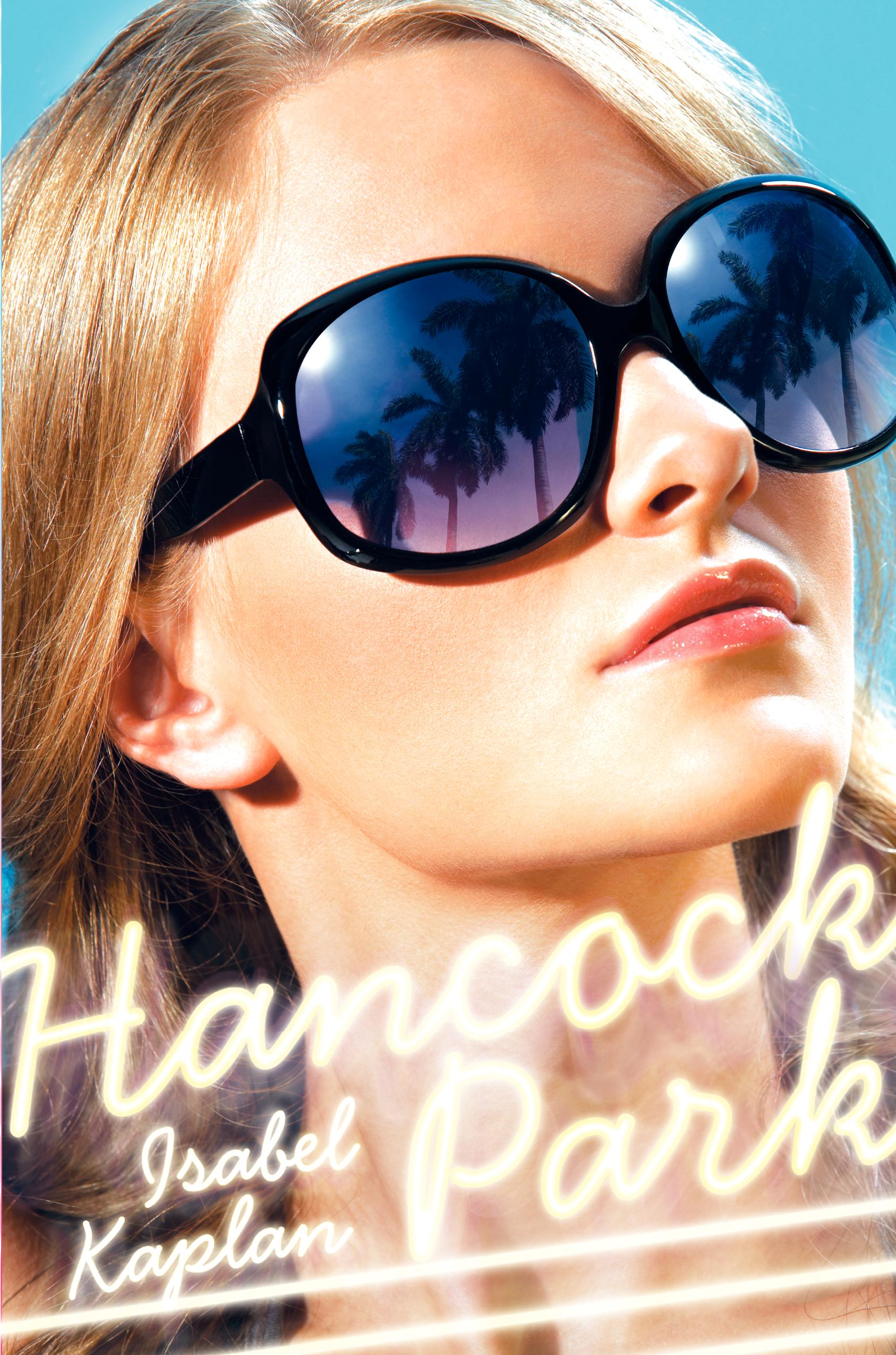 Hancock Park is about Becky Miller, who lives in the best neighborhood, goes to school with the children of movie stars, and has her psychiatrist on speed dial. By day, she navigates the halls of one of LA's most elite schools, where the mean girls are everywhere. At night, she deals with sparring parents, a grandmother who is man-crazy, and a younger brother, Jack, who answers only to J-zizzy. As Becky's life seems to come crashing down around her, she struggles to put it back together and learn to grow up while trying to stay sane.
"I didn't have a cover in mind as I was writing the book, but I knew that I wanted it to be fun and to have an authentic Los Angeles feel. My fantastic editor at HarperTeen, Farrin Jacobs, sent me the art department's initial jumping off point--a scan of a blonde lying on a beach chair wearing big sunglasses--and asked me what I thought.
"I really liked the idea of having a girl on the cover; the art department hired a model and did a photo shoot. Seeing the cover of my first book for the first time was surreal and so exciting. I love the palm trees that are reflected on the model's sunglasses and the neon sign with the title and my name right below the model's face. Also, once in a while, someone will ask me if the girl on the cover is me, which is very flattering! Although, now that I'm not a blonde anymore, I have a feeling I'll get less of those comments.
"I'm really pleased with how the cover turned out; it's fun, eye-catching, and very LA. I hope my readers will feel the same way!"
I haven't read Isabel's novel yet, but the family dynamic sounds really kooky (which I love) and LA settings always make for great summer reads. Plus, her Teens Read Too review by Amber Gibson mentions that fans of mine will like her "Hollywood with heart" tale. Cool!
For me, this cover DEFINITELY screams LA. What do you guys think?
Hancock Park is about Becky Miller, who lives in the best neighborhood, goes to school with the children of movie stars, and has her psychiatrist on speed dial. By day, she navigates the halls of one of LA's most elite schools, where the mean girls are everywhere. At night, she deals with sparring parents, a grandmother who is man-crazy, and a younger brother, Jack, who answers only to J-zizzy. As Becky's life seems to come crashing down around her, she struggles to put it back together and learn to grow up while trying to stay sane.
"I didn't have a cover in mind as I was writing the book, but I knew that I wanted it to be fun and to have an authentic Los Angeles feel. My fantastic editor at HarperTeen, Farrin Jacobs, sent me the art department's initial jumping off point--a scan of a blonde lying on a beach chair wearing big sunglasses--and asked me what I thought.
"I really liked the idea of having a girl on the cover; the art department hired a model and did a photo shoot. Seeing the cover of my first book for the first time was surreal and so exciting. I love the palm trees that are reflected on the model's sunglasses and the neon sign with the title and my name right below the model's face. Also, once in a while, someone will ask me if the girl on the cover is me, which is very flattering! Although, now that I'm not a blonde anymore, I have a feeling I'll get less of those comments.
"I'm really pleased with how the cover turned out; it's fun, eye-catching, and very LA. I hope my readers will feel the same way!"
I haven't read Isabel's novel yet, but the family dynamic sounds really kooky (which I love) and LA settings always make for great summer reads. Plus, her Teens Read Too review by Amber Gibson mentions that fans of mine will like her "Hollywood with heart" tale. Cool!
For me, this cover DEFINITELY screams LA. What do you guys think?

Shop Indie Bookstores
Photo Friday: New Orleans
in Photo Friday
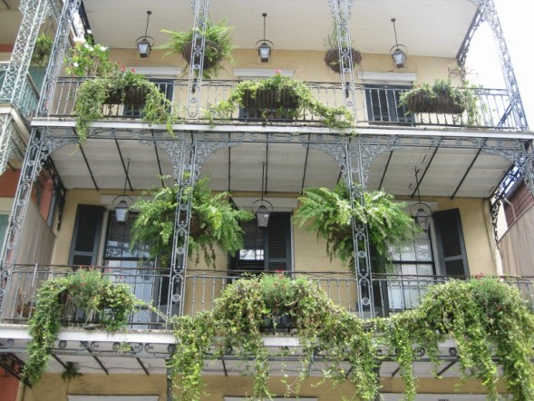 A couple of weekends ago, I went down to NOLA with a few friends. I'd never been there, and man, was it amazing. In, like, three ways: 1) HOT. So insanely hot. Like 105, and humid. 2) Gorgeous. Dripping with charm and whimsy at every turn. 3) Energetic. The city--and the swamps--were pulsing with energy. Here are some photos:This was the pool at our hotel, the Audubon Cottages. Some cottages were haunted, but we chose one that wasn't. Elizabeth Taylor used to stay here, we read. We swam about four times a day.
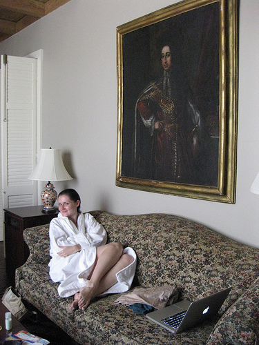
 Here's me having bathrobe time (I love hotel bathrobes!) under a really old painting that seemed too valuable to be in our room. But there it was.
 Alligators and swamps and fan boats, oh my! Our guide seriously did not lose one drop of sweat. Captain Lou was superhuman. (See how we're trying not to touch each other in that second photo? You cannot understand how sweltering it was.)

 We held this guy!
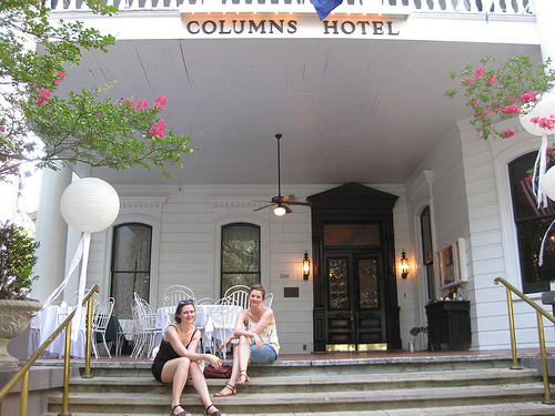
 The Columns Hotel had an amazingly huge porch where we had white wine and took in the shade.
 Special thanks to Pappy Strange for the amazing List of things to do and see. It did not fail us once! So who else has been to NOLA? Did you love it?
PS-My friend Erin, who blogs for Glamour, put up more pics of our trip here, if you're interested.
Special thanks to Pappy Strange for the amazing List of things to do and see. It did not fail us once! So who else has been to NOLA? Did you love it?
PS-My friend Erin, who blogs for Glamour, put up more pics of our trip here, if you're interested.
Bonus Cover Stories: Slept Away by Julie Kraut
The lovely Julie Kraut has a fabulously titled summer camp novel, Slept Away, that I cannot wait to read (the to-read pile is so, so big, but I'm determined to get to this one in the summer, so it'll be seasonally relevant). Until then, I'm tided over with Julie's Cover Story, which made me laugh out loud exactly four times:
 "While I love the cover of Slept Away, I didn't have much to do with it aside from coo-ing 'Awesome,' when I first saw it. And that is definitely for the best. I'm not artistic at all. When I attempt to craft, it looks like a glitter monster farted. My concepts of design are nonexistent. Even when I try to arrange the pillows on my bed in any way other than the picture on the bed set package, it never looks not quite right. So, I was happy that my editor, designer, and a very talented photographer took the cover into their own hands.
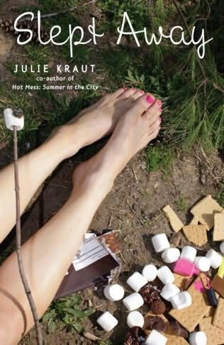
"I'm really pleased with the results. I like that the cover says camp and summer without hitting the reader over the head with some literal picture of a campground or sleeping bag. The burnt marshmallow, spilled nail polish, and general messiness of it all, hint to the summer going awry without being all that obvious either. Another biggie that makes me heart this cover hard is that Laney, Slept Away's main character, isn't on it. She's still left up to the reader to visualize. I think that not having an image of the main character makes it easier for the reader to relate to the character and the story. 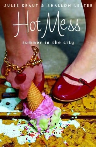 Slept Away's cover plays off of the cover of my first book, Hot Mess, with that foot and food combination. (That sounds way grosser than it actually is.) They're both stand-alones, but for a similar reader, so I dig that they're tied together in this way and how they look side by side.
"I'm sure I'll get this with Slept Away because I did for Hot Mess...A lot of people assume that it's my foot on the cover of the book. The disappointment and shock I get when I explain that it isn't me makes me feel like I'm telling a kid there's no tooth fairy sometimes.
"My only complaint is that the chocolate bar has nuts in it. A perfectly good Hershey Bar ruined with nuts! Yuck. All in all, though, I'm thrilled with Slept Away's cover."
I love all the little details on the cover when you really stop to look at it; it kinda makes me want to paint marshmallows with nail polish, but I guess that's silly. In all seriousness, though, I would like to meet a glitter farter! Thanks, Julie, for sharing the Cover Story! What do you guys think?
 Shop Indie Bookstores
Win-It Wednesday: Persepolis by Marjane Satrapi
in Other Stuff
The winner of last week's copy of Twenty Boy Summer by Sarah Ockler is... Lauren! Send me your address, L. Oh, and we did a special Sea Glass post on I Heart Daily last week, which made me think of Sarah's cover.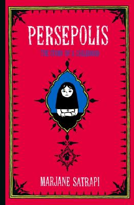 This week, I'm giving away a copy of Marjane Satrapi's Persepolis: The Story of a Childhood. It's a graphic autobiography that I am just in love with. It's the tale of Satrapi's life under the Islamic Revolution, when a totalitarian rule takes hold and the Iran-Iraq war results in bombings, murdered friends and a ban on parties. Despite the serious subject, the book is filled with charm and wit and joy. And, you know, sad and scary parts too.
So, to enter the contest, tell me what you're up to this summer. Camp, vacations, work, big dreams, goals... whatever. I wanna hear. Me? I'm writing and getting married. That takes up lots of time.
Happy Wednesday!
This week, I'm giving away a copy of Marjane Satrapi's Persepolis: The Story of a Childhood. It's a graphic autobiography that I am just in love with. It's the tale of Satrapi's life under the Islamic Revolution, when a totalitarian rule takes hold and the Iran-Iraq war results in bombings, murdered friends and a ban on parties. Despite the serious subject, the book is filled with charm and wit and joy. And, you know, sad and scary parts too.
So, to enter the contest, tell me what you're up to this summer. Camp, vacations, work, big dreams, goals... whatever. I wanna hear. Me? I'm writing and getting married. That takes up lots of time.
Happy Wednesday!

Shop Indie Bookstores
Librarian Deena Lipomi Talks Covers, Part 2
in Other Stuff
Here's another taste of my fun interview with Deena Lipomi, a YA Librarian at Brighton Memorial Library in Rochester, NY. I asked her about book covers, in relation to the Cover Stories series, and she gave me all kinds of fun tidbits. Catch Part 1 here (for some reason it won't let you comment on that one--sorry!).Here's part 2, where Deena talks about more books that she sees flying off the library shelves:
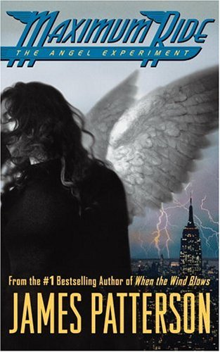

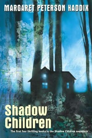
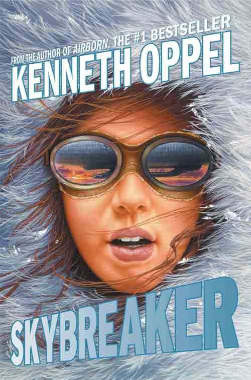 "Some titles that go out tend to be because of the authors name printed so boldly, and no matter what the cover looks like, the book will go out because of the author. James Patterson's MAXIMUM RIDE books, anything by Lauren Myracle, Margaret Peterson Haddix, and Kenneth Oppel, to name a few.


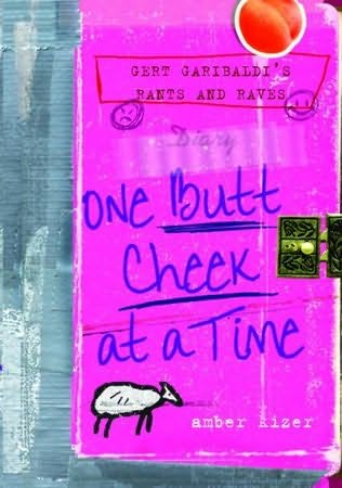
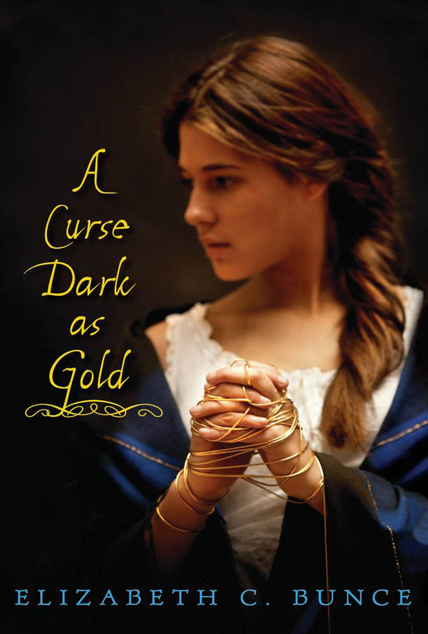 "The 'under the radar' books that seem to get checked out based on their covers alone are mostly the chick litty ones, like those I mentioned earlier. I couldn't believe how often that BUTT CHEEK book got checked out, but every time I put it face-out on the shelf, it was gone within hours! Same thing with GENERATION DEAD by Daniel Waters (fantastic cover; I liked that better than the book), and A CURSE DARK AS GOLD by Elizabeth Bunce (the haunting picture of the girl and the title are a real draw)."
Interesting, no? Thanks, Deena! What authors make you run for the shelves?
Look for part 3, about unpopular covers, soon.
"The 'under the radar' books that seem to get checked out based on their covers alone are mostly the chick litty ones, like those I mentioned earlier. I couldn't believe how often that BUTT CHEEK book got checked out, but every time I put it face-out on the shelf, it was gone within hours! Same thing with GENERATION DEAD by Daniel Waters (fantastic cover; I liked that better than the book), and A CURSE DARK AS GOLD by Elizabeth Bunce (the haunting picture of the girl and the title are a real draw)."
Interesting, no? Thanks, Deena! What authors make you run for the shelves?
Look for part 3, about unpopular covers, soon.
Cover Stories: Prada & Prejudice by Mandy Hubbard
Since I heard about Prada & Prejudice (which is a great title), I've wanted to see the cover. I knew I'd beg Mandy Hubbard to do a Cover Story, and luckily, she said yes. So here she is: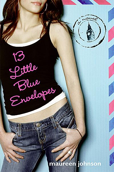 "I have to admit, I'm kind of obsessed with covers. If you read my blog, I'm always talking about my favorite covers, or comparing two covers when the publisher changes it. Suffice to say, I thought a lot about what I'd want mine to look like. I definitely pictured a headless model--like a Maureen Johnson or an Ally Carter cover. (Irony: I guess I did sort of get the headless model, she's just upside down and missing the torso, too). I figured it would have to have some kind of old-meets-new, so I
 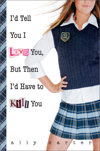 was picturing either my main character (Callie) dressed in a ball gown but with ultra-modern high heels poking out, or perhaps she'd be wearing her jeans and hoodie, leaning against a guy dressed in typical 19th century garb.
"My publisher didn't ask for my ideas, so when they sent over the first cover, I had no idea what to expect. She called it a 'cover comp,' which to me was meaningless. (Lesson: A cover comp means that its a very rough, early idea of the direction they're going. Sort of like if you were making a scrap book page, it would be when you just lay down all the photos to see what it looks like, before trimming anything or refining it.) Since I didn't understand that it was sort of a rough-draft, I totally freaked out. The first set of legs were scary-skinny and all crumpled looking, like they'd been run over by a bus. I talked to my editor, who reassured me that there would be a lot of modification.
was picturing either my main character (Callie) dressed in a ball gown but with ultra-modern high heels poking out, or perhaps she'd be wearing her jeans and hoodie, leaning against a guy dressed in typical 19th century garb.
"My publisher didn't ask for my ideas, so when they sent over the first cover, I had no idea what to expect. She called it a 'cover comp,' which to me was meaningless. (Lesson: A cover comp means that its a very rough, early idea of the direction they're going. Sort of like if you were making a scrap book page, it would be when you just lay down all the photos to see what it looks like, before trimming anything or refining it.) Since I didn't understand that it was sort of a rough-draft, I totally freaked out. The first set of legs were scary-skinny and all crumpled looking, like they'd been run over by a bus. I talked to my editor, who reassured me that there would be a lot of modification.
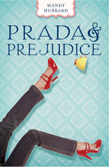 "A few weeks later, they had a photo shoot, and they sent me the three best options--and they let me pick (my choice at left)! There were two styles of jeans and two types of red high heels. It was super exciting to be able to have some input at that point, and I'm grateful that the folks at Razorbill shared it with me. True story: the legs don't belong to a model, but to another editor at Razorbill.
"At that point, I thought my cover was pretty well done, and it appeared in the catalog exactly the same as the cover I had picked out of the three,
"A few weeks later, they had a photo shoot, and they sent me the three best options--and they let me pick (my choice at left)! There were two styles of jeans and two types of red high heels. It was super exciting to be able to have some input at that point, and I'm grateful that the folks at Razorbill shared it with me. True story: the legs don't belong to a model, but to another editor at Razorbill.
"At that point, I thought my cover was pretty well done, and it appeared in the catalog exactly the same as the cover I had picked out of the three,  with a wallpaper-esque background, and my name in a cute little banner at the top. However, my editor emailed me saying she had given some more thought to the background, and they were going to change it. After a couple weeks of wondering exactly what was going to change, I received a new cover (right)--this one with adorable little swirls to replace the wallpaper, and my name became bigger and moved to the bottom. I'm glad they went the extra mile, because I much prefer the swirls! It makes it look more like she's actually falling.
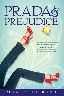 "Finally, after the ARCs were printed, they ended up darkening some spots on the bottom of the cover and on the spine, which I think was a nice adjustment (left, final cover). The fact that they were constantly thinking of ways to improve the cover was really impressive, and I can't thank them enough for going the extra mile. In the end, I really love my cover, and I think it conveys the right tone."
Ooh, I love knowing that those are an editor's legs! That photo shoot must have been hilarious. Also, I think the yellow teacup adds a nice touch, and the quote from Kieran Scott is great--I like that they replaced the tagline with that. What do you guys think?
"Finally, after the ARCs were printed, they ended up darkening some spots on the bottom of the cover and on the spine, which I think was a nice adjustment (left, final cover). The fact that they were constantly thinking of ways to improve the cover was really impressive, and I can't thank them enough for going the extra mile. In the end, I really love my cover, and I think it conveys the right tone."
Ooh, I love knowing that those are an editor's legs! That photo shoot must have been hilarious. Also, I think the yellow teacup adds a nice touch, and the quote from Kieran Scott is great--I like that they replaced the tagline with that. What do you guys think?
RIP, MJ
in Other Stuff
Thriller was my very first tape. We'll all miss you, MJ.
Photo Friday: BEA Weekend
in Photo Friday
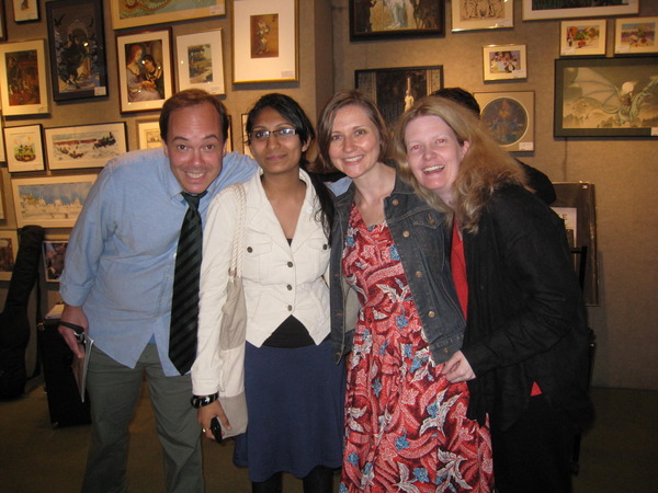
So I didn't go to BEA, but I got to hang around with lots of lovely people during that weekend. Sometimes it's nice to have NYC as your hometown. Here are some pics:Michael Northrop, Mitali, me and Elizabeth Scott!
 Devyn Burton, me and Elizabeth Scott (these are at the fabulous Books of Wonder, btw).
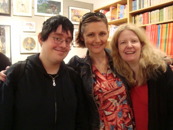 A fuzzy Dominique and me at the Jefferson Market NYPL (which rules).
 It was fun to hang out with everyone (and yes I know I'm way late getting these up). Happy Friday!
YA Book Carnival Win-It Wednesday + Cover Stories: Twenty Boy Summer by Sarah Ockler
 Phew! That's a mouthful of a title. But I wanted to say that this post is part of Shooting Stars Mag's YA Book Carnival. Yay! Go check out all the contest links over there (after you read this post, of course). :)The winner of last week's Win-It Wednesday for Serena Robar's Giving Up the V is... Tammy! Send me your address, T.
Today I'm hosting the awesome Sarah Ockler for another combo Win-It Wednesday + Cover Story. Take it away, Sarah!
Phew! That's a mouthful of a title. But I wanted to say that this post is part of Shooting Stars Mag's YA Book Carnival. Yay! Go check out all the contest links over there (after you read this post, of course). :)The winner of last week's Win-It Wednesday for Serena Robar's Giving Up the V is... Tammy! Send me your address, T.
Today I'm hosting the awesome Sarah Ockler for another combo Win-It Wednesday + Cover Story. Take it away, Sarah!
 "I love sea glass. I've always been fascinated with the idea that something whole and purposeful could be shattered and then utterly transformed by the magic of the sea into beautiful little gems, and that these gems could then wash up on shore somewhere else, years or even decades later. Think about that. Really. Isn't it amazing?!
"My own sea glass collection has been growing for more than twenty years, treasure-hunted from beaches along both coasts of the United States, Canada, Mexico, Puerto Rico, and the shores of Lake Erie here in Buffalo, NY. Like Anna in Twenty Boy Summer, I keep the glass in mason jars -- a colorful reminder of the waves shushing against the sand.
"For me, sea glass is highly symbolic of life's transformations. It's featured throughout Twenty Boy Summer to represent the beauty and rarity of true love and the cycle of loss, healing, and change that we endure when someone close to us dies. Because of the symbolism in the story and my own love of sea glass, I'd always secretly hoped that it would appear on the Twenty Boy Summer cover.
"When Little, Brown began the jacket design, my editor sent me several rounds of concept photos used to generate ideas -- beach landscapes, girls walking along the shore, summer-themed objects, boardwalk scenes -- all sorts of summer vacation-y goodness. I was grateful for the opportunity to share my thoughts on the ideas and watch them evolve. My editor is amazing, and she was diligent in her efforts with the designer and marketing team to find the best imagery to convey the story.
"Over the next several weeks, we saw almost 20 different concepts before reaching the final choice between two images with equal support from the Little, Brown team: a girl in the water and a still-life concept that would require a photo shoot with sea glass (OMG, sea glass!). My agent and I shared our thoughts and later that week, the jacket committee convened to consider the options and seal my cover fate.
"The final decision? Sea glass photo shoot! Sea glass photo shoot! Yay! There was cheering! There was clapping! There was... thankfully no video evidence of my celebratory dancing! ;-)
"A few weeks passed before we received the email with the cover. Since the initial idea was based only on a concept, I didn't know exactly how the final image would appear. I had butterflies in my stomach as I waited for the file to open and ultimately reveal... a lovely sea glass heart on the boardwalk. <3
"*Insert more celebratory dancing!*
"Well, it turns out the photo shoot was quite an adventure. Who knew that sea glass would be such a challenging model? :-) One of the assistant editors brought sea glass from home, which didn't work, and then had to run out and buy a new batch. Once they had the right glass, they went through dozens of different shots and setups and ideas and backdrops, looking for a perfect shot that just wasn't happening. Finally, at the very end of an all-day photo shoot, the cover designer suggested arranging the glass into a heart shape on a boardwalk prop, just to try something completely different and spontaneous.
"Sea glass.
Heart.
Boardwalk.
"The rest is cover history. ;-)
"I love sea glass. I've always been fascinated with the idea that something whole and purposeful could be shattered and then utterly transformed by the magic of the sea into beautiful little gems, and that these gems could then wash up on shore somewhere else, years or even decades later. Think about that. Really. Isn't it amazing?!
"My own sea glass collection has been growing for more than twenty years, treasure-hunted from beaches along both coasts of the United States, Canada, Mexico, Puerto Rico, and the shores of Lake Erie here in Buffalo, NY. Like Anna in Twenty Boy Summer, I keep the glass in mason jars -- a colorful reminder of the waves shushing against the sand.
"For me, sea glass is highly symbolic of life's transformations. It's featured throughout Twenty Boy Summer to represent the beauty and rarity of true love and the cycle of loss, healing, and change that we endure when someone close to us dies. Because of the symbolism in the story and my own love of sea glass, I'd always secretly hoped that it would appear on the Twenty Boy Summer cover.
"When Little, Brown began the jacket design, my editor sent me several rounds of concept photos used to generate ideas -- beach landscapes, girls walking along the shore, summer-themed objects, boardwalk scenes -- all sorts of summer vacation-y goodness. I was grateful for the opportunity to share my thoughts on the ideas and watch them evolve. My editor is amazing, and she was diligent in her efforts with the designer and marketing team to find the best imagery to convey the story.
"Over the next several weeks, we saw almost 20 different concepts before reaching the final choice between two images with equal support from the Little, Brown team: a girl in the water and a still-life concept that would require a photo shoot with sea glass (OMG, sea glass!). My agent and I shared our thoughts and later that week, the jacket committee convened to consider the options and seal my cover fate.
"The final decision? Sea glass photo shoot! Sea glass photo shoot! Yay! There was cheering! There was clapping! There was... thankfully no video evidence of my celebratory dancing! ;-)
"A few weeks passed before we received the email with the cover. Since the initial idea was based only on a concept, I didn't know exactly how the final image would appear. I had butterflies in my stomach as I waited for the file to open and ultimately reveal... a lovely sea glass heart on the boardwalk. <3
"*Insert more celebratory dancing!*
"Well, it turns out the photo shoot was quite an adventure. Who knew that sea glass would be such a challenging model? :-) One of the assistant editors brought sea glass from home, which didn't work, and then had to run out and buy a new batch. Once they had the right glass, they went through dozens of different shots and setups and ideas and backdrops, looking for a perfect shot that just wasn't happening. Finally, at the very end of an all-day photo shoot, the cover designer suggested arranging the glass into a heart shape on a boardwalk prop, just to try something completely different and spontaneous.
"Sea glass.
Heart.
Boardwalk.
"The rest is cover history. ;-)
 "I love love LOVE my cover. It so perfectly captures the symbolism of Anna and Frankie's journey in Twenty Boy Summer. And the coolest part? They sent me some of the glass from the photo shoot, so now I have an awesome memento from my first novel, and a few more special pieces of sea glass for my collection.
"Thank you, Melissa, for asking about the story behind the cover of Twenty Boy Summer!"
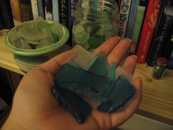
I think I need to start a sea glass collection (that's Sarah holding hers next to her bookshelf)! This is such a great story and I love that there was a sea glass photo shoot! What do you guys think? One lucky commenter (in the US or Canada only) will win a signed copy of the book, courtesy of Sarah herself.
Also, what books can you spot on Sarah's shelf? I see Wherever Nina Lies by Lynn Weingarten, which I loved, and I can also spot the gorgeous spine ofIf I Stay by Gail Forman... I love seeing people's shelves! Oh, and I see What I Saw and How I Lied by Judy Blundell at the very left corner.
"I love love LOVE my cover. It so perfectly captures the symbolism of Anna and Frankie's journey in Twenty Boy Summer. And the coolest part? They sent me some of the glass from the photo shoot, so now I have an awesome memento from my first novel, and a few more special pieces of sea glass for my collection.
"Thank you, Melissa, for asking about the story behind the cover of Twenty Boy Summer!"
I think I need to start a sea glass collection (that's Sarah holding hers next to her bookshelf)! This is such a great story and I love that there was a sea glass photo shoot! What do you guys think? One lucky commenter (in the US or Canada only) will win a signed copy of the book, courtesy of Sarah herself.
Also, what books can you spot on Sarah's shelf? I see Wherever Nina Lies by Lynn Weingarten, which I loved, and I can also spot the gorgeous spine ofIf I Stay by Gail Forman... I love seeing people's shelves! Oh, and I see What I Saw and How I Lied by Judy Blundell at the very left corner.
Librarian Deena Lipomi Talks Covers, Part 1
I did a fun interview with Deena Lipomi, a YA Librarian at Brighton Memorial Library in Rochester, NY. I asked her about book covers, in relation to the Cover Stories series, and she gave me all kinds of fun tidbits. Here's part 1 of her interview. I'll roll it out in small bites because what she says is such fun!"The types of covers that get checked out most often tend to be:
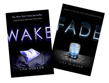
a) Iconic. WAKE & FADE by Lisa McMann, THIRSTY by M. T. Anderson, EVERMORE by Alyson Noel. I think this is spillover from the Twilight covers.
 b) Bright and fun, definitely illustrating a chick lit YA. SOMETHING TO BLOG ABOUT by Shana Norris, GERT GARIBALDI'S RANTS AND RAVES: ONE BUTT CHEEK AT A TIME by Amber Kizer.

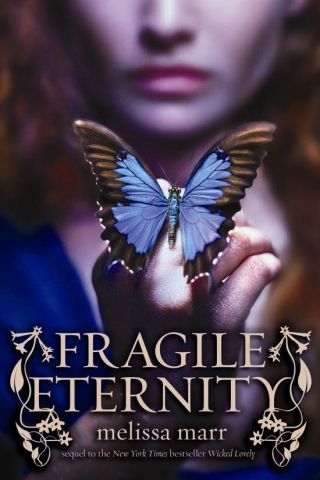
 c) Hinting at an urban fantasy story. FRAGILE ETERNITY by Melissa Marr, The Faerie Path series by Frewin Jones.
 d) Single word titles. See (a) above."
Interesting, right? What makes you pick up a library book? Any of the things above? I think I'm most drawn to those "iconic" covers above, honestly. More from Deena soon!
And in the meantime, here are a few places to visit if you want to try to win Lovestruck Summer:
1. Talk about unicorns and bunnies with Khy, and you may just win a copy of Lovestruck Summer.
2. Go to Cynsations for yet another chance to win a copy of LS!
3. Enter to win a ton of books (yes, including LS) from the Green Bean Teen Queen in her birthday contest.
d) Single word titles. See (a) above."
Interesting, right? What makes you pick up a library book? Any of the things above? I think I'm most drawn to those "iconic" covers above, honestly. More from Deena soon!
And in the meantime, here are a few places to visit if you want to try to win Lovestruck Summer:
1. Talk about unicorns and bunnies with Khy, and you may just win a copy of Lovestruck Summer.
2. Go to Cynsations for yet another chance to win a copy of LS!
3. Enter to win a ton of books (yes, including LS) from the Green Bean Teen Queen in her birthday contest.