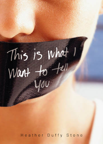
 Heather Duffy-Stone's This is What I Want to Tell You has a really arresting cover, which is why I invited her to the blog to tell her story. And here she is:"In imagining the cover of my book, the only thing I was sure of is that I did not want models represented as the characters. I told my editor I didn't mind a hand or a neck or an unidentifiable body part--I just want the reader to be able to imagine what the characters looks like... that was very important to me. I also liked the idea of tattoos being on the cover, as they figure sort of prominently in the text. At the early stages, too, the book was called Permanent Ink, so the idea of tattoos felt more connected to the title. My editor and I definitely had conversations about the cover but to be honest, I was sort of clueless. I knew Flux had amazing covers--that was actually part of what drew me to them. So I felt pretty confident standing back from the process...
"That said, when I first saw the cover I burst into tears. I was at work and I opened the PDF and I was in total shock. It was nothing like I had imagined... even though I'm not totally sure what I imagined. I thought it was incredibly violent. Then a student was in my office a few hours later and he saw the image and said 'Oh, is your book about a kidnapping?'
"I was horrified.
"So I called my editor and he was amazing. He talked to me about taking a few different versions of the cover to some teen focus groups. This one was the most popular by far, he said. Then he told me: 'A cover needs to do two things: it needs to give the reader some hint of what the book is about. And it needs to grab you.'
"I started to come around. This cover definitely grabbed.
"Then the more people saw it, the more I could step back from it. People were really struck and intrigued by the cover. Now, about six months after I first saw it, I am in love with it. It is actually very close to the original version. It is a stock photo but I like the story about writing the title. Apparently, at a staff meeting the designer asked everyone to write the title in his hand writing. I was hoping the handwriting on the actual cover belonged to Andrew, my editor, just because it would be so appropriate, because he was my guide through the whole process. But he said, apparently, his handwriting looked too much like it belonged to a serial killer. So I'm not sure whose handwriting it is in the end. But I like that it was a collaborative process--a stock photo and Flux handwriting and, though it is a model, I think there still leaves enough room for you to imagine what the characters look like. And hopefully want to read more..."
I have to say that this cover certainly drew me in, and it's interesting to hear that Heather was horrified at first. What do you guys think? Has this cover grabbed you?
Heather Duffy-Stone's This is What I Want to Tell You has a really arresting cover, which is why I invited her to the blog to tell her story. And here she is:"In imagining the cover of my book, the only thing I was sure of is that I did not want models represented as the characters. I told my editor I didn't mind a hand or a neck or an unidentifiable body part--I just want the reader to be able to imagine what the characters looks like... that was very important to me. I also liked the idea of tattoos being on the cover, as they figure sort of prominently in the text. At the early stages, too, the book was called Permanent Ink, so the idea of tattoos felt more connected to the title. My editor and I definitely had conversations about the cover but to be honest, I was sort of clueless. I knew Flux had amazing covers--that was actually part of what drew me to them. So I felt pretty confident standing back from the process...
"That said, when I first saw the cover I burst into tears. I was at work and I opened the PDF and I was in total shock. It was nothing like I had imagined... even though I'm not totally sure what I imagined. I thought it was incredibly violent. Then a student was in my office a few hours later and he saw the image and said 'Oh, is your book about a kidnapping?'
"I was horrified.
"So I called my editor and he was amazing. He talked to me about taking a few different versions of the cover to some teen focus groups. This one was the most popular by far, he said. Then he told me: 'A cover needs to do two things: it needs to give the reader some hint of what the book is about. And it needs to grab you.'
"I started to come around. This cover definitely grabbed.
"Then the more people saw it, the more I could step back from it. People were really struck and intrigued by the cover. Now, about six months after I first saw it, I am in love with it. It is actually very close to the original version. It is a stock photo but I like the story about writing the title. Apparently, at a staff meeting the designer asked everyone to write the title in his hand writing. I was hoping the handwriting on the actual cover belonged to Andrew, my editor, just because it would be so appropriate, because he was my guide through the whole process. But he said, apparently, his handwriting looked too much like it belonged to a serial killer. So I'm not sure whose handwriting it is in the end. But I like that it was a collaborative process--a stock photo and Flux handwriting and, though it is a model, I think there still leaves enough room for you to imagine what the characters look like. And hopefully want to read more..."
I have to say that this cover certainly drew me in, and it's interesting to hear that Heather was horrified at first. What do you guys think? Has this cover grabbed you?
Sunday Swooning
in Other Stuff
 The lovely Nina Malkin's Swoon is in stores now, and I made a vlog to talk about my first swoon in honor of its release. Other authors will be guest blogging on her site all month long, so head over to check out my vlog and other fun stuff, and comment to be entered to win a signed copy of Swoon. Isn't that a great word? And hey, the cover's kinda epic too.
Photo Friday: Wedding Shower Moments
in Photo Friday
I couldn't decide which photos to share from my wedding shower--my friend and awesome photographer Marcie Hume took so many great ones! But I had to share this series with me, my sister Kristi and my mom. I love it. Maybe I'll get one of those multiple frames and give this to them.

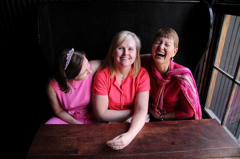
 Also, you must forgive us all the pink and excuse my tiara. I was embracing the wedding showerness of it all!
Happy Weekend!
Also, you must forgive us all the pink and excuse my tiara. I was embracing the wedding showerness of it all!
Happy Weekend!
Bonus Cover Stories: A Map of the Known World by Lisa Ann Sandell
in Other Stuff
Lisa Ann Sandell's latest novel is heartbreaking and lyrical, just as the cover indicates. I asked her to share her Cover Story, and she graciously obliged: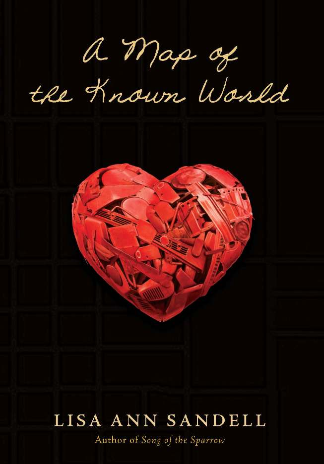 "As I wrote A MAP OF THE KNOWN WORLD, I had no idea what this book might look like. With the title, I of course had a map in mind, but I wasn't sure what that map would look like. I didn't want to give too much away right up front, so I really struggled with this.
"Fortunately for me, Elizabeth B. Parisi, the art director who designed both A MAP OF THE KNOWN WORLD and my previous book, SONG OF THE SPARROW, is a genius, and she really got this book. She called my editor, the brilliant Aimee Friedman (also a phenomenal author), and me into her office to tell us that she'd come up with the idea of using the heart/sculpture as a central image. Elizabeth also thought of layering it on top of a map. If you look closely at the cover, you can see that in the black background are gridlines of a map.
"As I wrote A MAP OF THE KNOWN WORLD, I had no idea what this book might look like. With the title, I of course had a map in mind, but I wasn't sure what that map would look like. I didn't want to give too much away right up front, so I really struggled with this.
"Fortunately for me, Elizabeth B. Parisi, the art director who designed both A MAP OF THE KNOWN WORLD and my previous book, SONG OF THE SPARROW, is a genius, and she really got this book. She called my editor, the brilliant Aimee Friedman (also a phenomenal author), and me into her office to tell us that she'd come up with the idea of using the heart/sculpture as a central image. Elizabeth also thought of layering it on top of a map. If you look closely at the cover, you can see that in the black background are gridlines of a map.
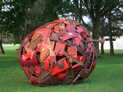 "As soon as she told Aimee and me what she was thinking, we were both super excited. Elizabeth showed us photos of the work of a sculptor she knew, Leo Sewell. He calls himself a junk sculptor, and if you visit his web site, you can see that he sculpts these phenomenal pieces out of found objects. So, Elizabeth had seen one of his sculptures, the Big Apple and was inspired to use it as the basis for the heart. She photographed the
  apple, then had artist Tim O'Brien paint a new piece, using the apple as a guide, in the shape of a heart.
"This process couldn't have been smoother or more delightful. Basically, as soon as she was finished reading the manuscript, Elizabeth had the idea, and Aimee and I were totally on board with it. And in the end, I can't think of a single image that would better capture the spirit of Cora's story, and I couldn't be more grateful for how beautiful this cover is or how perfect."
I love Lisa's Cover Story, especially because it incorporates real art that mirrors the work done in the book--perfect! What do you guys think?
apple, then had artist Tim O'Brien paint a new piece, using the apple as a guide, in the shape of a heart.
"This process couldn't have been smoother or more delightful. Basically, as soon as she was finished reading the manuscript, Elizabeth had the idea, and Aimee and I were totally on board with it. And in the end, I can't think of a single image that would better capture the spirit of Cora's story, and I couldn't be more grateful for how beautiful this cover is or how perfect."
I love Lisa's Cover Story, especially because it incorporates real art that mirrors the work done in the book--perfect! What do you guys think?
Win-It Wednesday: Candy in Action by Matthue Roth
 Last week's winner of Laura Resau's gorgeous novel Red Glass is... Jessica! Send me your address, J.This week, I'm giving away a copy of Candy in Action by Matthue Roth. You read the Cover Story, now win the book!
Since Candy in Action is all about a badass girl heroine, leave a comment naming one of your favorite female heroes (in whatever way you define that word--from Buffy to Susan B. Anthony) to enter.
Good luck!
PS-More touring for me on Diana Rodriguez Wallach's blog and Amanda Ashby's blog today! Extra entries for visiting there, or any of the blogs I mentioned yesterday, and leaving some love. Just mention that below.
Last week's winner of Laura Resau's gorgeous novel Red Glass is... Jessica! Send me your address, J.This week, I'm giving away a copy of Candy in Action by Matthue Roth. You read the Cover Story, now win the book!
Since Candy in Action is all about a badass girl heroine, leave a comment naming one of your favorite female heroes (in whatever way you define that word--from Buffy to Susan B. Anthony) to enter.
Good luck!
PS-More touring for me on Diana Rodriguez Wallach's blog and Amanda Ashby's blog today! Extra entries for visiting there, or any of the blogs I mentioned yesterday, and leaving some love. Just mention that below.
Tuesday Reminders
in Other Stuff
 As you can see above, the readergirlz LIVE! chat with Laura Resau is tomorrow night (Weds) at 9pm EST/6pm PST. Join in the conversation.
You can enter to win a copy of Laura's book, Red Glass, here. Enter by Wednesday!
Don't forget to enter the month-long Release Week contest by telling me about your favorite pop culture soulmates here.
Also, I'm touring around various author blogs this week, so here are a few places to find me so far...
At Wendy Toliver's blog!
At Karin Gillespie's blog!
Over at Ypulse!
Happy Tuesday.
As you can see above, the readergirlz LIVE! chat with Laura Resau is tomorrow night (Weds) at 9pm EST/6pm PST. Join in the conversation.
You can enter to win a copy of Laura's book, Red Glass, here. Enter by Wednesday!
Don't forget to enter the month-long Release Week contest by telling me about your favorite pop culture soulmates here.
Also, I'm touring around various author blogs this week, so here are a few places to find me so far...
At Wendy Toliver's blog!
At Karin Gillespie's blog!
Over at Ypulse!
Happy Tuesday.
Cover Stories: Candy in Action by Matthue Roth
in Other Stuff
"The moment that my publishers accepted the Candy in Action, I knew what the cover was going to look like. It wasn't even a matter of, what do I want it to look like. I just knew. It was going to be a sleek, glossy cover with black widescreen boxes at the top and bottom. Then the center was going to be a bright, vivid picture of the Los Angeles coast at night, taken from overhead--all neon lights and a million sparkling house parties--and then a black silhouette of a girl doing a kung-fu drop kick over it. That, uh, never happened."The publishers didn't ask for my input. I gave it to them anyway. My first book,  Never Mind the Goldbergs, was with Scholastic. At most big publishing houses, if you're a first-time writer and you're really nice to them, you get to say 'no' once, and they might listen to you. I said no three times--I was a total diva. They were cool with it each time, though. [MW note: And Matthue ended up with an awesome cover for that book, I think!]
"Candy was put out by an independent company--which means they're risking a lot more on me, in terms of money and their own time, but it also means that they care about what you think. My editor was totally supportive throughout the book, and we kept discussing the cover together. We went back and forth with all these ideas, almost as though we were fantasizing about it. Well, we were.
"The first cover they sent me--I was in Israel, on the road, and the only way to get internet was in the main shopping district, to sit in front of the storefronts. I downloaded the first cover they had. I don't want to say I didn't like it. Ok, though--I was repulsed. It was green and brown, and it looked so generic...it was the opposite of why I loved Soft Skull. My editor talked me down, though. She was like, 'this is why we do trial runs.'
Never Mind the Goldbergs, was with Scholastic. At most big publishing houses, if you're a first-time writer and you're really nice to them, you get to say 'no' once, and they might listen to you. I said no three times--I was a total diva. They were cool with it each time, though. [MW note: And Matthue ended up with an awesome cover for that book, I think!]
"Candy was put out by an independent company--which means they're risking a lot more on me, in terms of money and their own time, but it also means that they care about what you think. My editor was totally supportive throughout the book, and we kept discussing the cover together. We went back and forth with all these ideas, almost as though we were fantasizing about it. Well, we were.
"The first cover they sent me--I was in Israel, on the road, and the only way to get internet was in the main shopping district, to sit in front of the storefronts. I downloaded the first cover they had. I don't want to say I didn't like it. Ok, though--I was repulsed. It was green and brown, and it looked so generic...it was the opposite of why I loved Soft Skull. My editor talked me down, though. She was like, 'this is why we do trial runs.'
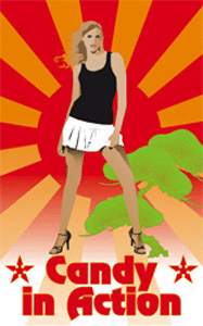 "The second cover (left), the distributors loved. I hated it again, though--it was a too-skinny girl with blond hair and no face. It felt, well, too porny. And there was this strange Karate Kid motif going on that I liked personally, but didn't know if anyone who wasn't a super geek would pick up on it.
"Again, one of the great things about working with a small publisher--it's not a procedure; you can do basically whatever you want to, and as long as it looks good, they're cool with it. One of the reasons I wanted to go with Soft Skull was because they don't do a certain type of book; they just do books that they love. And the design is almost always amazing. Daniel Nester's books about the band Queen are the size of 7" vinyl records; Matthew Sharpe's Jamestown was done as an old map.
"The second cover (left), the distributors loved. I hated it again, though--it was a too-skinny girl with blond hair and no face. It felt, well, too porny. And there was this strange Karate Kid motif going on that I liked personally, but didn't know if anyone who wasn't a super geek would pick up on it.
"Again, one of the great things about working with a small publisher--it's not a procedure; you can do basically whatever you want to, and as long as it looks good, they're cool with it. One of the reasons I wanted to go with Soft Skull was because they don't do a certain type of book; they just do books that they love. And the design is almost always amazing. Daniel Nester's books about the band Queen are the size of 7" vinyl records; Matthew Sharpe's Jamestown was done as an old map.
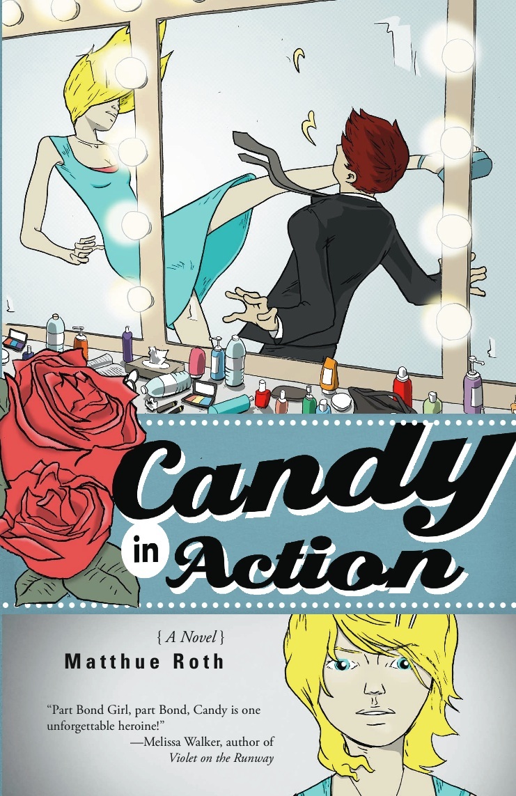
 "Eventually, both my editor and I wanted to do a pop-art cover--you know, like the Ray Lichtenstein paintings that look like
  old comic strips (right). She had a friend, Jaime Mendola (who actually worked for Penguin, yet another major publisher) who took on the project for fun. She came at it with this great portrait of Candy as a Lichtenstein painting (left, the original hardcover cover).
"But Candy was supposed to be a young adult book, and because Candy is 18 years old, the major bookstores wanted to shelve it in adult fiction. So when the
old comic strips (right). She had a friend, Jaime Mendola (who actually worked for Penguin, yet another major publisher) who took on the project for fun. She came at it with this great portrait of Candy as a Lichtenstein painting (left, the original hardcover cover).
"But Candy was supposed to be a young adult book, and because Candy is 18 years old, the major bookstores wanted to shelve it in adult fiction. So when the 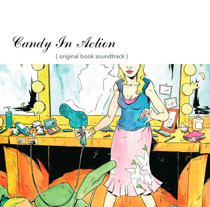 softcover came out, we wanted a redesign. Fred Chao, who writes and draws the comic book series Johnny Hiro: Half-Asian, All Hero, had already drawn one version of the cover. We used that for the cover of the CD--there's a 12-track soundtrack of original songs by different bands that you can download for free--and, since the hardcover had come out, Fred had started doing book covers for Harper.
"He'd always wanted to do a project for Soft Skull, and I'm a huge fan of his stuff. He took on Candy--again for free, and again because there are all these truly goodhearted people in the world who love independent presses--and did a bunch of original art for it. I love the look he gave it--it's kind of retro and kind of ultra-modern, Indiana Jones meets Moulin Rouge. [That's the final paperback cover, left.]
"Each version of my cover was completely different. This might have been a mistake, or maybe it was just a miracle; but either way, it was really inspiring. Candy is so many types of books--it's part Veronica Mars and part college novel and part romance and part travel story. And each cover was a different way of saying, you're not going to know what to expect.
"In the end, I feel Love. Glowing, shining love. Soft Skull gave me a bunch of hard copies of just the cover, and I can't decide what to do with them. I think I want to dip them in gold."
I think the final paperback is the best Candy in Action cover. It tells a story in one image, or frame, and it gets across the pop-art-action feel of the story. What do you guys think?
softcover came out, we wanted a redesign. Fred Chao, who writes and draws the comic book series Johnny Hiro: Half-Asian, All Hero, had already drawn one version of the cover. We used that for the cover of the CD--there's a 12-track soundtrack of original songs by different bands that you can download for free--and, since the hardcover had come out, Fred had started doing book covers for Harper.
"He'd always wanted to do a project for Soft Skull, and I'm a huge fan of his stuff. He took on Candy--again for free, and again because there are all these truly goodhearted people in the world who love independent presses--and did a bunch of original art for it. I love the look he gave it--it's kind of retro and kind of ultra-modern, Indiana Jones meets Moulin Rouge. [That's the final paperback cover, left.]
"Each version of my cover was completely different. This might have been a mistake, or maybe it was just a miracle; but either way, it was really inspiring. Candy is so many types of books--it's part Veronica Mars and part college novel and part romance and part travel story. And each cover was a different way of saying, you're not going to know what to expect.
"In the end, I feel Love. Glowing, shining love. Soft Skull gave me a bunch of hard copies of just the cover, and I can't decide what to do with them. I think I want to dip them in gold."
I think the final paperback is the best Candy in Action cover. It tells a story in one image, or frame, and it gets across the pop-art-action feel of the story. What do you guys think?
Photo Friday: Fishface Singing Telegram
in Photo Friday
Book Chic and I once talked about our love for the movie Clue (anyone else?), and my favorite scene in that movie is the Singing Telegram scene. You know what I mean if you've seen it.Anyway, last week was my friend Anne's birthday, and a group of us got together to deliver a singing telegram to her, and this is what showed up on her doorstep:
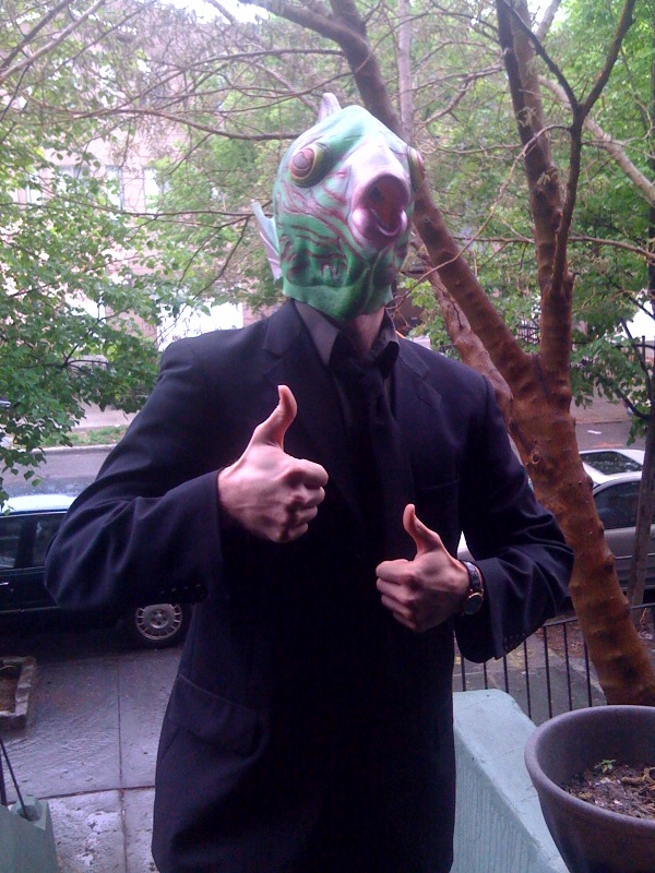 And Anne's reaction: "Omg you guys this was so weird and I had just woken up, didn't have my contacts and no coffee. HILARIOUS!!"
He sang a medley of birthday songs, of course. I highly recommend this gift!
PS-The winner of last week's contest for Sweethearts is... Denise. Send me your address, D!
PPS-Linda Gerber's Death by Denim release party is going on, and I blogged about my favorite jeans. Go comment for a chance to win a signed copy of Lovestruck Summer, and check out the other denim posts while you're there! Lots of prizes.
PPPS-I can't resist:
Happy Friday, everyone!
And Anne's reaction: "Omg you guys this was so weird and I had just woken up, didn't have my contacts and no coffee. HILARIOUS!!"
He sang a medley of birthday songs, of course. I highly recommend this gift!
PS-The winner of last week's contest for Sweethearts is... Denise. Send me your address, D!
PPS-Linda Gerber's Death by Denim release party is going on, and I blogged about my favorite jeans. Go comment for a chance to win a signed copy of Lovestruck Summer, and check out the other denim posts while you're there! Lots of prizes.
PPPS-I can't resist:
Happy Friday, everyone!
Bonus Cover Stories: A Really Nice Prom Mess by Brian Sloan
The winner of Jenny Han's The Summer I Turned Pretty is... Iryna! Send me your address, I. You are going to loooove this book. I'm halfway through (I'll send after I finish!) and totally swooning. I am so ready for summer! Today Brian Sloan is here to talk about his cover for A Really Nice Prom Mess, which involves boobs and big-chain objections! Let the story begin:
"Prom, of course, is a huge genre for YA fiction with a lot of books out there on the topic. A REALLY NICE PROM MESS is about a secret gay double date to the prom that doesn't stay a secret very long, leading to an all-night long series of adventures/ catastrophes involving strippers, drug dealers and a good chunk of the DC police force. I think the key thing for me in thinking about the cover was trying to come up with something that would differentiate this book from all the other prom titles since it does not tell your average prom story.
"I talked with my editor, David Gale at Simon & Schuster, about the cover before they started working on it. Starting out, David and I discussed a very general concept about having an image that would seem like a snapshot of the couples in the story as opposed to a more formal looking cover photo. Also, the snapshot concept seemed in line with the book's take on the prom, which is this haphazard night that spins out of control. So we thought a photo that looked like it was taken on the fly would capture that idea.
"David Gale knew this photographer whose work he really liked, Sam Bassett, and got him to do a full-on professional shoot. They hired some actors that were close to the characters, though the woman was given a very convincing red wig to match her character's hair in the book. I thought the guy who 'plays' Cameron on the cover, Daryl Crittenden, looked so right that I had him do some readings with me, actually. I wasn't really involved in the process of the photo shoot which was probably for the best. I'm also a film director so I probably would have driven everyone crazy!
"The first time I saw the cover, I thought it was awesome! Honestly. I thought it really captured the essence of the book; that this was not a traditional prom story but something more unusual. Not your mother's prom book, as I liked to say. Sam created such a great image which said just enough about what to expect in the story, a little chaos and a lot of sexiness as well as some angst, without giving too much away. And the picture itself had a certain artfulness to it as well. Once they sent it to me, I was showing it to anyone and everyone I met, like a proud parent... 'Look at my book cover, isn't it cute!' :)
"I really didn't have any suggestions on the front cover. I think the quote on the back was changed, which was an excerpt from the book, but I really thought the cover was close to perfection. Then Barnes and Noble got involved. S&S always sends their covers to the B&N sales reps to get their comments before finalizing the covers. B&N doesn't have 'approval' of covers but publishers definitely pay some attention to what they say, given that the chain is so key to any book's success.
"Well, B&N had a bit of a problem with the girl's cleavage. They said they could sell the book with the original cover design but that they would not be able to promote it in-store because of the prominent décolletage. It seemed a little odd to me frankly, giving the sexiness of other YA covers where girls are in bikinis and bras. But there was something about this particularly ample cleavage that really bothered them for some reason. Anyway, there was a lot of discussion about what to do at S&S.They looked at other images from the shoot but decided that this one was definitely the best. So they stuck with it and the art department made a small clever change, moving the title up over the breasts and adding a white screen to shield the public from the damaging effects of cleavage. This was enough to assuage B&N and the situation was peacefully resolved. Here are the before and after shots to compare:
Today Brian Sloan is here to talk about his cover for A Really Nice Prom Mess, which involves boobs and big-chain objections! Let the story begin:
"Prom, of course, is a huge genre for YA fiction with a lot of books out there on the topic. A REALLY NICE PROM MESS is about a secret gay double date to the prom that doesn't stay a secret very long, leading to an all-night long series of adventures/ catastrophes involving strippers, drug dealers and a good chunk of the DC police force. I think the key thing for me in thinking about the cover was trying to come up with something that would differentiate this book from all the other prom titles since it does not tell your average prom story.
"I talked with my editor, David Gale at Simon & Schuster, about the cover before they started working on it. Starting out, David and I discussed a very general concept about having an image that would seem like a snapshot of the couples in the story as opposed to a more formal looking cover photo. Also, the snapshot concept seemed in line with the book's take on the prom, which is this haphazard night that spins out of control. So we thought a photo that looked like it was taken on the fly would capture that idea.
"David Gale knew this photographer whose work he really liked, Sam Bassett, and got him to do a full-on professional shoot. They hired some actors that were close to the characters, though the woman was given a very convincing red wig to match her character's hair in the book. I thought the guy who 'plays' Cameron on the cover, Daryl Crittenden, looked so right that I had him do some readings with me, actually. I wasn't really involved in the process of the photo shoot which was probably for the best. I'm also a film director so I probably would have driven everyone crazy!
"The first time I saw the cover, I thought it was awesome! Honestly. I thought it really captured the essence of the book; that this was not a traditional prom story but something more unusual. Not your mother's prom book, as I liked to say. Sam created such a great image which said just enough about what to expect in the story, a little chaos and a lot of sexiness as well as some angst, without giving too much away. And the picture itself had a certain artfulness to it as well. Once they sent it to me, I was showing it to anyone and everyone I met, like a proud parent... 'Look at my book cover, isn't it cute!' :)
"I really didn't have any suggestions on the front cover. I think the quote on the back was changed, which was an excerpt from the book, but I really thought the cover was close to perfection. Then Barnes and Noble got involved. S&S always sends their covers to the B&N sales reps to get their comments before finalizing the covers. B&N doesn't have 'approval' of covers but publishers definitely pay some attention to what they say, given that the chain is so key to any book's success.
"Well, B&N had a bit of a problem with the girl's cleavage. They said they could sell the book with the original cover design but that they would not be able to promote it in-store because of the prominent décolletage. It seemed a little odd to me frankly, giving the sexiness of other YA covers where girls are in bikinis and bras. But there was something about this particularly ample cleavage that really bothered them for some reason. Anyway, there was a lot of discussion about what to do at S&S.They looked at other images from the shoot but decided that this one was definitely the best. So they stuck with it and the art department made a small clever change, moving the title up over the breasts and adding a white screen to shield the public from the damaging effects of cleavage. This was enough to assuage B&N and the situation was peacefully resolved. Here are the before and after shots to compare:
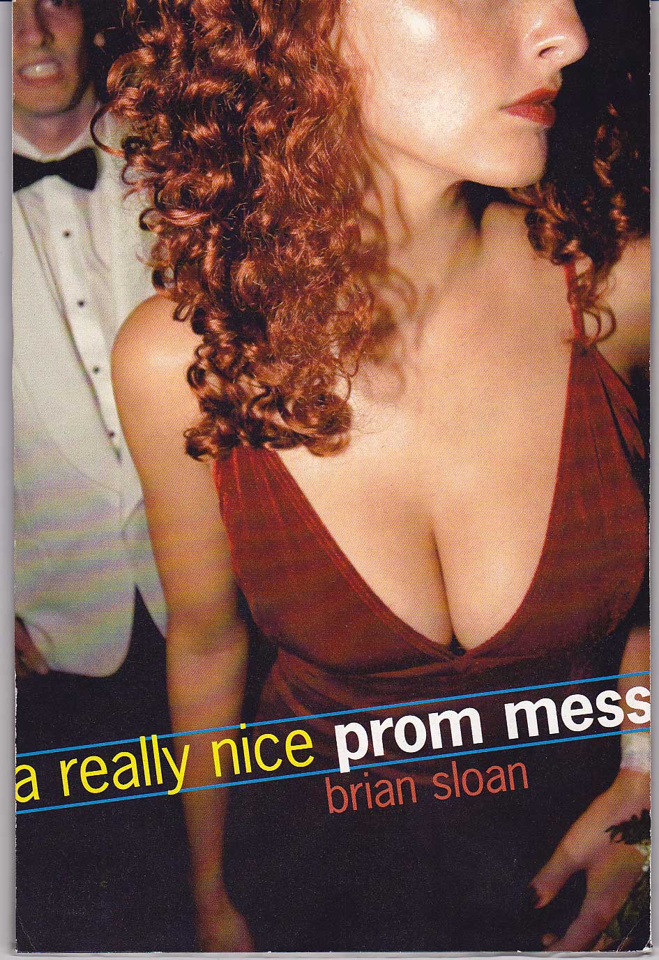
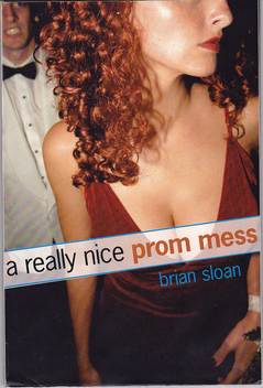 "It was a little frustrating because I think, graphically, the original design was so great. Also, I felt the uncovered cover was sorta subversive in that the racy image might catch the attention of those notoriously reluctant boy readers, even though the narrator is a gay teen. In the end, though, the original cover is basically still there. However, I think you do miss a bit of the effect with her chest covered by the title. But it was better to have B&N on-board than put up a huge fight over it. I think the great irony in all of it is that my book is about a gay male couple going to the prom and the thing that got them bent out of shape was the fake-date's boobs. I can't even imagine what would have happened if we put one of the strippers on the cover!"
I love the drama of Brian's Cover Story! I also love the main character's stricken expression on the cover. What do you guys think?
"It was a little frustrating because I think, graphically, the original design was so great. Also, I felt the uncovered cover was sorta subversive in that the racy image might catch the attention of those notoriously reluctant boy readers, even though the narrator is a gay teen. In the end, though, the original cover is basically still there. However, I think you do miss a bit of the effect with her chest covered by the title. But it was better to have B&N on-board than put up a huge fight over it. I think the great irony in all of it is that my book is about a gay male couple going to the prom and the thing that got them bent out of shape was the fake-date's boobs. I can't even imagine what would have happened if we put one of the strippers on the cover!"
I love the drama of Brian's Cover Story! I also love the main character's stricken expression on the cover. What do you guys think?
Win-It Wednesday: Red Glass by Laura Resau
The winner of Beth Kephart's fabulous Nothing But Ghosts (and it really is fantastic--I just finished reading it and can't wait to share it!) is... Marie! Send me your address, M.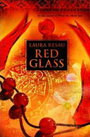 Now, I have to admit that I hadn't seen Red Glass by Laura Resau before it was the readergirlz May pick, despite the fact that it won a gajillion awards. And now I know why--it's amazing. Seriously, you guys will find this story and Laura's fabulous writing so riveting.
You can read about the book's plot here, but I'll just give you a sample of the spot-on images and emotions Laura renders:
"Loneliness was tricky: A cup filled at one moment with freedom, and the next, with emptiness."
"He said that guys my age can't look true beauty in the face--it scares them, blinds them like the sun."
"For a moment I caught a glimpse of how life could be if the sharks turned out to be dolphins. If fear went out like the tide and confidence rushed in to fill its place. If I believed that my bony elbows actually were nice, that maybe there was a shiny stone of greatness buried somewhere inside of me."
Okay, I have to stop or I'll just keep writing a ton of quotes that I flagged in the book. But anyway, it's fantastic. Can't you tell?
So, to enter to win, tell me your favorite sentence/phrase/passage from a book you love. And if you can't think of one, tell me what book you're reading now, open your book to page 17 and write the first full sentence you find below. Just for fun.
And join in the readergirlz talk about Red Glass!
Good luck!
PS-Help Guys Lit Wire pick out some books for a library for incarcerated LA teens (it'll make you feel warm and fuzzy).
Now, I have to admit that I hadn't seen Red Glass by Laura Resau before it was the readergirlz May pick, despite the fact that it won a gajillion awards. And now I know why--it's amazing. Seriously, you guys will find this story and Laura's fabulous writing so riveting.
You can read about the book's plot here, but I'll just give you a sample of the spot-on images and emotions Laura renders:
"Loneliness was tricky: A cup filled at one moment with freedom, and the next, with emptiness."
"He said that guys my age can't look true beauty in the face--it scares them, blinds them like the sun."
"For a moment I caught a glimpse of how life could be if the sharks turned out to be dolphins. If fear went out like the tide and confidence rushed in to fill its place. If I believed that my bony elbows actually were nice, that maybe there was a shiny stone of greatness buried somewhere inside of me."
Okay, I have to stop or I'll just keep writing a ton of quotes that I flagged in the book. But anyway, it's fantastic. Can't you tell?
So, to enter to win, tell me your favorite sentence/phrase/passage from a book you love. And if you can't think of one, tell me what book you're reading now, open your book to page 17 and write the first full sentence you find below. Just for fun.
And join in the readergirlz talk about Red Glass!
Good luck!
PS-Help Guys Lit Wire pick out some books for a library for incarcerated LA teens (it'll make you feel warm and fuzzy).