Big Thank Yous! And the Worst Review Ever

LoveSum.jpgThanks for all of your shout-outs and support for the release of Lovestruck Summer! I'm thrilled that some of you guys are already reading it and liking it. Here are a few reviewer quotes:"It's smart and funny and has romance that's sweet and not gushy." --Library Ninja "This novel has comedy, romance, depth, and moments of unpredictability for those readers who tire of knowing how a book will end (but the journey is what matters anyway, right?). I highly recommend this as a perfect summer read. I have a feeling I might even reread it later this summer, it's that good!" --Amee E. "This is the part where I squeal about the ADORABLE romantic scene. Okay, so you can't really hear me mentally squeal, but I'm doing it! hehe I just loved that moment so much, if it were a movie I'd rewind it again and again..and about 50 times more :) It was just so cute!" --tvandbookaddict I hope you guys all enjoy it this summer! And also, to counteract all that self-promotion and gushy hype, the hilarious Alexa Young has started a blog called The Worst Review Ever. I posted the most scathing review I've seen of Violet on the Runway, so come over and commiserate with me? PS-The random number generator has told me that Nancy is the winner of Siobhan Vivian's Same Difference! She called the cover "beautiful but not perfect." True! Send me your address, N.

Cover Stories: Vamped by Lucienne Diver

The winner of last week's Sarah Dessen contest is... Mishel (who, ironically, has never read a SD book! WHOA.) Start here, M. Send me your address! Today, the fabulous Lucienne Diver is here to talk about the cover of her new release, Vamped. I love that it looks like a Vampire Lipstick ad! Here's Lucienne:

rachelvincent.jpg"I didn't have anything in mind when writing the book. When asked, I took a look at a bunch of YA covers I thought hell_week_rosemary_clementm.jpgworked and sent them off in a file to my editor. It included Rachel Vincent, Rosemary Clement-Moore and Rachel Caine covers. Now that I've seen A.S. King's Dust of 100 Dogs cover, that one would have been there as well.

rachelcaine.jpg "I also put out a call on my blog. There were some fabulous ideas thrown out, and one of my authors e-mailed me separately (I'm a literary agent by day) with a wonderful concept: Have what looks like a photo out of a yearbook that someone has drawn fangs on. It would have captured the fun feel of the book, but might have been a little too cartoonish, ultimately, since Vamped has its dark moments as well as light.

Vamped.jpg"Anyway, I browsed a whole host of YA covers and sent a file of the kind of art I most wanted to emulate. Flux blew them all out of the water. I still think all those covers are great, but Flux managed to truly capture the tone of Vamped with the cover: Fangs and fun!

"I don't know if the girl on the Vamped cover was hired specifically for this photo shoot or whether the art department used a photo from their arsenal which they modified; hard to come by natural fangs, at least in a model that actually shows up on camera!

"I was traveling and first saw the cover when I checked my e-mail at an internet cafe. I paid to print it out and had to show the guy behind the counter, who looked a little bemused. I then proceeded to show everyone I encountered, whether they knew me or not!

"I thought it was pretty much perfect. About the only thing I had to say was, 'Do you want to see my taglines? I promise, they're nothing like my etchings!' Anyway, when he said yes, I sent him off three or four to look at and they chose to go with Eternity needs an entourage, which I love. It now appears in the upper right hand corner of the cover.

"The only changes were the length of the fangs, which they extended to make them stand out more, and the addition of the tagline.

"I really like my cover. My name's a little small (*grin*) but I can live with that. Vamped is all about Gina, my heroine, and she really hates to share credit. After all, I only channeled her. She did all the hard work. (Kicking butt and taking names is hell on her couture.)"

Like I said, I'm all about vampire beauty. I also like that it brings up the red-and-pink question that Sarah Dessen mentioned last week in her Cover Story. And I love the tagline! What do you guys think of this cover?

Release Week Recap!

MySpace Glitter Graphics

Phew! That was a really fun week for me, and I hope it was for you guys, too. Lovestruck Summer should be in your local bookstores, so plop down $6 and it's yours! You still have time to enter all the contests, so just as a recap, here goes: Enter by Mon: The Sarah Dessen contest Enter by Tues: The Siobhan Vivian contest Enter by Weds: The Beth Kephart contest Enter by Thurs: The Jenny Han contest Enter by Fri: The Sara Zarr contest Enter by June 1: The Susane Colasanti & Me contest I also wanted to show you guys this video I made for Sarah Dessen's birthday over at Adele's Sarah Dessen Diarist blog! Come celebrate the countdown to Sarah's 39th! And I did a "Girl in Media" interview with Girl With a Satchel, a fantastic blog. Stop by if you have time. Happy Weekend! PS-Yes, I know that graphic up top is a little out of control but I just want to thank everyone for all the love!

Release Week Cover Stories: Story of a Girl by Sara Zarr

Welcome to the fifth and final post of my Release Week Cover Stories extravaganza! (Lovestruck Summer was officially released on Tuesday!) I use the word extravaganza because each day, as I interview a new author about their cover, I will also be giving away a copy of the book we're talking about. To enter to win, just leave a comment about the Cover Story. I'll choose a winner exactly a week later. storyofagirl.jpg
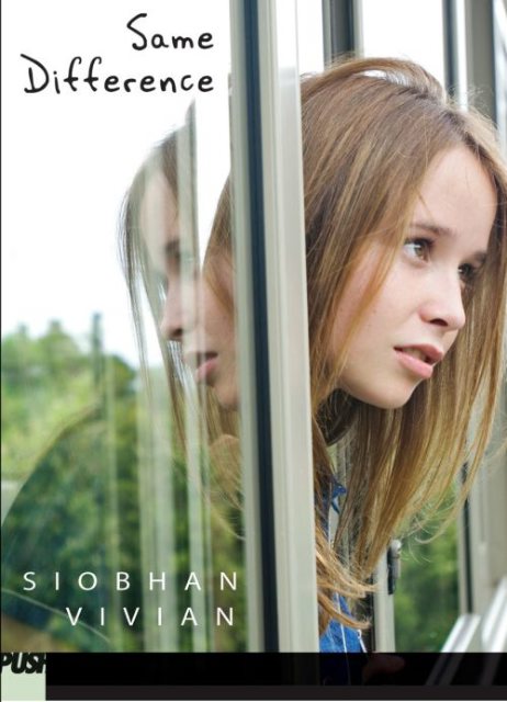
The amazing Sara Zarr is here for the final day of the Release Week Cover Stories, bookending a really fun week with Sarah Dessen, Siobhan Vivian, Beth Kephart and Jenny Han! I hope you guys have enjoyed it! Here's Sara:

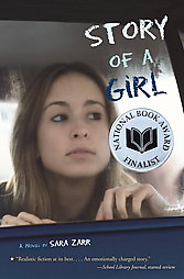
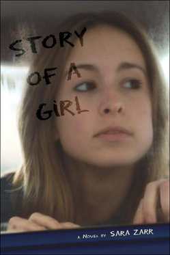
"I am not at all arty. In fact, I am a little challenged when it comes to visualizing the abstract in any way, shape, or form. All the furniture in my house is pushed up against the wall because I can't visualize any other way of doing it. I can barely read a map! So when it came to the cover my first book, Story of a Girl, I had literally no clue what to expect. I do remember saying to my agent, 'I'll be happy with anything, as long as it doesn't have a big giant photograph of the character's face on it.'

"My publisher didn't ask for ideas or give me any hints. I didn't even know the cover was coming when one day I got an image in my email. And, guess what? A big giant photograph of the main character's face! My gut reaction was pure disappointment, to the point of feeling queasy and like I was going to cry. I could see where the concept made sense but I didn't like the girl in the picture. To me, her face and expression were all wrong. Her hands were too small and delicate. She was too pretty. Just not Deanna. I talked to my agent on the phone and we commiserated. He showed it around his office and they all felt like it was a good cover, in terms of marketing and representing the story. I tried to be happy and reconciled to it, but, honestly, it was a big disappointment.

firstaid.jpg
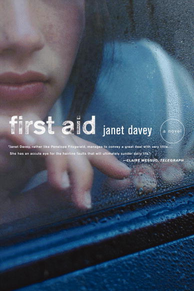
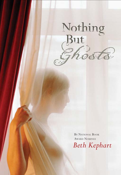
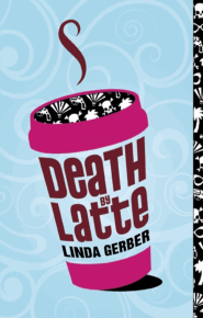
"A few weeks later I got another email. They'd decided not to use the photo. They were going to stick with the concept but do a shoot with a model, and I could give my input when it came to picking the model. Yay! Not long thereafter, I saw the cover for an adult novel---Janet Davey's FIRST AID. And there was the image for my original cover (left).

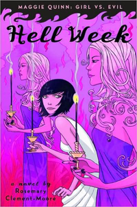
"On my original cover, this same photo was less zoomed---you could see more of the girl's face, including her eyes. You can see that there's something about the way she's holding her hands that feels a little bit like a model and not a real girl. anniesbaby.jpg
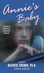
At least not the real girl in my story. I wish I could show you the original, but...oh, wait! Here it is on a recent YA book from the author of GO ASK ALICE (right).

"But back to Story of a Girl. The cover designer sent me head shots of the two models they were choosing from. The first attachment I opened was of a girl who looked normal enough, but to me she screamed 'East Coast.' She was tough-looking, like Deanna, but almost too tough, almost a little gangsta. I crossed my fingers, hoping that the next model would be better suited. When I opened up the picture files, I almost cried again, but this time they would have been tears of joy. The model, Linsday, was, to me, the embodiment of Deanna. And then she did an amazing job at the cover shoot capturing the emotion that is just right for the story. It's the kind of picture you can look at and think she's feeling hopeful, or you can look at and think she's feeling sad. Awesome. In addition, they used a printing process for the hardcover that made the majority of the cover matte while the title is glossy.

storypaperback.jpg
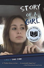
"The paperback cover is a little bit different, foregoing the glossy cover font for easier-to-read white and moving it around a bit to make more room for quotes and what have you. And of course, my favorite thing about the current incarnation of the cover is the sticker from the National Book Foundation. Yay!

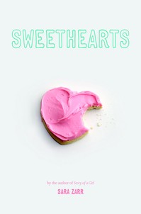
"For my second book, SWEETHEARTS, once again I had no idea what the art department could possibly come up with. But in this case, it was total love at first sight."

I'm so glad Sara got to find the girl who really represented Deanna for Story of a Girl! And Sweethearts, well, what can I say? I want a frosted cookie.

sweethearts.jpgSpeaking of Sweethearts, it just so happens to be the June readergirlz pick, so to enter to win a copy of the newly released paperback, just comment below and tell me what you think of Sara's covers. Then you can join the online book talk in June!

Happy Friday! Be sure to go back and enter each contest this week, and of course don't forget to enter the big month-long contest I'm hosting with Susane Colasanti!

Oh, and did I mention that Lovestruck Summer is just $5.99? It's a bargain! It's in stores now! I will now stop my shameless promotion.

Release Week Cover Stories: The Summer I Turned Pretty by Jenny Han

Welcome to the fourth post of my Release Week Cover Stories extravaganza! (Lovestruck Summer was officially released on Tuesday!) I use the word extravaganza because each day, as I interview a new author about their cover, I will also be giving away a copy of the book we're talking about. To enter to win, just leave a comment about the Cover Story. I'll choose a winner exactly a week later. Jenny Han is a Carolina graduate, so she and I can talk Chapel Hill and pretty much geek out over basketball. I am so excited to read her new release The Summer I Turned Pretty, which shares a release date with Lovestruck Summer! So here's Jenny's Cover story: inspiration.jpg "I sat down with my editor and my designer and I gave them a mood board of a bunch of images I liked. I wanted something pretty and classic and nostalgic.

pretty.jpg"My editor let me give a lot of input, which I will be forever grateful for. I got to pick the models, which is basically like choosing which Barbie doll should go with which Ken doll-- soooo fun. The hardest character to cast was Jeremiah, because apparently blond teenage male models are in short supply in NY. It took us a while to find the right one, but in the end, I loved who we picked. I especially loved the girl, because she was so fresh and sweet-looking and also she has those adorable freckles.

"They ended up doing the shoot at Coney Island. They shot like, a million pictures and the one we picked was literally right at the end of the roll. The sun was setting, and even though you couldn't see the beach, there was just this beautiful beachy light. It felt like summer to me.

"The first time I saw the cover, I could not stop staring at it. Love at first sight, I swear. And I continue to be in love with it!"

I love how involved Jenny got to be with her photo shoot--the most involved I've heard with an author so far! Casting models? Awesome. And yes, this looks like golden moments of summer to me for sure. Sigh. So, for a chance to win my early copy of The Summer I Turned Pretty, comment below and let me know what you think of the cover. Does it say summer to you?

One more day left of the release week fun!

PS-Nisha Sharma interviewed me about writing this week, so go read the interview if you have time!

Release Week Cover Stories: Nothing But Ghosts by Beth Kephart

Welcome to the third post of my Release Week Cover Stories extravaganza! (Lovestruck Summer was officially released... YESTERDAY!) I use the word extravaganza because each day, as I interview a new author about their cover, I will also be giving away a copy of the book we're talking about. To enter to win, just leave a comment about the Cover Story. I'll choose a winner exactly a week later. NothingButGhosts HC c.jpg"Since Nothing but Ghosts is rooted not just in my imagination, but within Chanticleer, a very specific pleasure garden that I have now visited for years, this book was always visually alive to me. I could see each scene--place it atop the ambling hill, or beside the watercress stream, or within the shadows of a tree at night. I could see it. I hoped that others would.

"I sent photographs of the garden to my editor, Jill Santopolo, and to Carla Weise, art director, at HarperTeen. I sent images, too, of young women standing by windows, since DSC03278.jpgthis is one of the book's prevalent themes. And then I waited, as Jill, Carla, and the HarperTeen worked through what sounds like dozens of possibilities. One of the pivotal scenes in the book involves the sun streaming through a window and catching the light of tinted bottles; a related image was DSC03257.jpgapparently tried. There are horses and old photographs in this book; these, too, were considered. In the end, there was but one day left before the book would have to be sent out for binding into ARCs, and that is the day that I first saw, on my husband's tiny phone, the image that became the Nothing but Ghosts cover.

DSC03280.jpg"I loved it--every single thing about it--and felt the great happiness that arises when one feels as if an editor, an art director, and a marketing team have entered into your world and seen just what it was you were hoping to leave behind. That mood. That manner of maturity. That character waiting for a breeze. I seek, with my YA novels, to write beyond DSC03218.jpggenre or category--simply to tell a story that has a teen protagonist at its heart, in a way that engages any reader, of any age. This particular cover is timeless and ageless, too. Oh, how I had hoped for that.

"It is rare when an author feels as at peace as I have felt about this particular cover. I know how lucky I got, this time around, and I am grateful."

I love this cover! I think it has a softness and a sense of nostalgia--and whoa, those grounds that Beth knows, how gorgeous are they? I'm right in the middle of reading the book--it's fantastic. Beth Kephart is a wonderful writer (just check out her blog, filled with photos and poetry daily--a bouquet of posts to enjoy!). I mean, Beth even writes poetry when she's telling me her Cover Story! So, for a chance to win my early copy of Nothing But Ghosts (after I read it!), comment below and let me know what you think of the cover, what it might mean to you.

Happy Wednesday!

PS-Over at Shooting Stars Mag, Lauren set it up so that Violet Greenfield interviewed me (and yes, it was bizarre and fun to be interviewed by my own character!). Check it out.

PPS-Last week's winner of Sophomore Switch is... Leighanna! Send me your address, L. (I loved hearing about all your views on feminism... maybe I'll ask questions like that more often).

Release Week Cover Stories: Same Difference by Siobhan Vivian

Welcome to the second post of my Release Week Cover Stories extravaganza! (Lovestruck Summer is officially released... TODAY!) I use the word extravaganza because each day, as I interview a new author about their cover, I will also be giving away a copy of the book we're talking about. To enter to win, just leave a comment about the Cover Story. I'll choose a winner exactly a week later.same difference cvr.jpg Siobhan Vivian is one of my favorite people, and I adored her spring release, Same Difference. Today, she shares her Cover Story: "I was extremely anxious about the cover for SAME DIFFERENCE when my editor called me into his office for a meeting to brainstorm possible directions. At the time, I was just about to finish up the first draft of the book, and the story still wasn't clicking together the way I wanted it to. If my editor had asked me any questions about theme or whatever, I probably would have had a complete meltdown. "But part of me hoped that if we did come up with something amazing for a cover, it could act like a lighthouse, and I could follow that beam of light through the fog and arrive safely on the shores. To me, covers and titles can help in that way. They can bring clarity, focus. "Anyhow, my editor pitched me a couple of concepts. These are the two I remember: 1) A photograph of a girl, painting her self-portrait. You wouldn't see her actual face, only the portrait. 2) A photograph of a girl from the waist down, carrying her art portfolio which would be covered in a bunch of random stickers. "On the surface, these felt like okay solutions. After all, SAME DIFFERENCE was a book about a girl who goes to a summer art program--which was also the stock answer I'd been giving to people who asked what my new book was about. But I wasn't completely sold either. Their ideas seemed so art-heavy. And I wondered if that kind of approach would alienate readers who didn't find that kind of experience interesting. "It challenged me to dig to the heart of my story. And I quickly realized that even though SAME DIFFERENCE had art in it, art it wasn't the crux of the story. The meat and bones were Emily's journey as she tried to figure herself out. A girl stuck between two worlds, two friends. "Hmmm... I ran home and went onto the stock photo sites and started doing some research. I typed in TEEN and GIRL and REFLECTION. A couple interesting pictures came up. But when I saw the one that would turn out to be my cover. "First off, the girl was PERFECT. I mean, she was beautiful...but she also still looked like a normal girl. (This has always been so important in my covers! Real girls only!) And I loved the reflection, and watching her step out of the glass and leave a version of herself behind. Totally a slam dunk, IMHO! I sent the photo to my editor, who shared it with the design team. Everyone agreed it was perfect. "Finding that cover definitely gave me the clarity to push through the rest of my first draft with confidence. Once I found out who Emily really was, there was no looking back!" marcelle.jpg"And... I got a FaceBook message from the model! She lives in South Africa and a friend found my book and recognized her. She was so excited, and I was too! Here she is, and her name is Marcelle." "Also, someone had commented on my LJ a long time ago that they thought she looked familiar from another cover, Busted: Confessions of an Accidental Player by Antony John. I couldn't tell for sure, but sent her the link. busted_350.jpgTurns out it IS her...and her brother. So she went from ZERO to a cover star of two YA books in a matter of minutes!" How cool is that? Love meeting-the-model stories. And, I love how Siobhan had to dig deeper into her story to find the right cover. Nice! What do you guys think? Comment below for a chance to win a signed copy of Same Difference, direct from Siobhan! And stay tuned for more Release Week fun! PS-Today is the last day to enter Stephanie Kuehnert's Women Who Rock Wednesday contest, and the last day to enter last week's Win-It Wednesday. Good luck!

Release Week Cover Stories: Along for the Ride by Sarah Dessen

Welcome to the first post of my Release Week Cover Stories extravaganza! (Lovestruck Summer is officially released... tomorrow!) I use the word extravaganza because each day, as I interview a new author about their cover, I will also be giving away a copy of the book we're talking about. To enter to win, just leave a comment about the Cover Story. I'll choose a winner exactly a week later.AlongForRide.jpgToday through next Monday, you have a chance to win a very special Advance Copy of Sarah Dessen's upcoming June 16th release Along for the Ride (which is vintage Sarah Dessen--a touching summer story of love and and friendship and growing up... sigh.) And Sarah is here sharing her Cover Story: "I knew I wanted my cover to reflect at least one of the major themes of the book: either something involving the night, or bicycles. Maybe even both. Most of all, though, I wanted it to look as summer-esque as possible. Like the kind of book I'd want to take to the beach with me. "My editor and I discussed a few options. We liked the idea of a diner, or some kind of cafe, at night. The fabulous art designer at Penguin read the manuscript so she had a few ideas as well. The title was in flux at the same time, though, so after we decided on Along for the Ride, we decided to go for the bike thing. It just fit better. "This was actually the very first time we had a photo shoot specifically for one of my covers. We just couldn't find a shot with a bike that everyone liked. Also I think since some of my other cover images have popped up other places Penguin wanted to be sure this one would be ours alone. "When I saw the cover, I loved how it captured the idea of summer so perfectly. Because I am a stickler for things matching, though, I was a bit hesitant about the pink dress on a red bike. I was always taught those colors don't go well together. "There were a LOT of phone calls and emails back and forth between myself, my editor, my agent, and the art department. Everyone had a different opinion, but we all know how important a good cover is. It is worth the stress. "[The art department] is always really patient with me when it comes to the covers, because they know how important it is to me that the book look just right. They actually did a bunch of comps with the bike and dress different colors, and I realized that the pink on red actually looked best. They were right, it just popped. And now, I can't imagine it any other way. "I'm really, really pleased with this cover. It just captures that feeling of summer that I was going for. And I love that pink dress. I WANT that pink dress!" I agree with Sarah! The cover has such a summer feel, and the pink dress looks like it's organza, perfectly blowing in the ocean breeze. What do you guys think? Comment below to be entered to win an early copy of Along for the Ride. PS-Last week's winner of the early copy of Susane Colasanti's Waiting for You is... Tiff! Send me your address, T. PPS-Don't forget to enter The Big May Release Contest too. OMG, so many prizes. I'm brimming with excitement!

The May Release Contest: Me and Susane Colasanti!

Lovestruck Summer, by me, and Waiting for You, by Susane Colasanti, are almost in stores (or maybe even already in stores!). So we invented a contest, and we present it to you in video format: Forgive me for my amateur hour filming and editing--I tried! So, you got it, right? Basically, you just comment here telling me your favorite TV or movie soulmates, and you'll be entered to win Susane's prizes. Then go comment at Susane's blog for a chance to win my prizes. And to get a double entry, share this video via your blog, twitter, facebook, myspace, an email--whatever. Just tell us you did that and your entry doubles itself. Yay! You've got a whole month to enter! We'll choose a winner on June 1st. product_Lip_Bronzer_001_l.pngAnd, just so you know, that full Too Faced makeup set includes: Lip Bronzer in "Sun Bunny," Pinch My Petals Blush, a cruelty-free Powder & Blush Kabuki Brush, Mineral Bronzer with crushed fresh water pearls, Lockdown Creaseless Cream Eye Shadow in "I'm Guilty." Thanks, Too Faced! Happy Release Month! (Uh, to me? And Susane!)

Linda Gerber's Death by... Series

cdbd.gifLinda Gerber shared the Cover Stories for her Death By... series last fall, so I wanted to ask her a little bit about how she chooses those venomous nouns--Bikini, Latte, Denim--in her titles. (Death by Denim is out next week!)"With just the title and the first draft of the book,Theresa Evangelista came up with the killer cover design. That set the precedent for the rest of the series. All the titles became Death by... titles, and the covers all have the cool, iconic images. The books themselves grew from there. "Even after the first one--Death by Bikini--was named, I was thinking of entirely new titles cdbbikini.giffor the next book. But when my editor told me what they would like to see as far as titles were concerned, it felt completely right, like that's how it was supposed to be all along. "My daughter actually helped to come up with the first one. (Thanks, Jenna!) At that point, the book didn't involve a murder, just the intrigue about Seth's family being on the run. But when she suggested that title, a whole new angle for the series was born. For the next cddlatte.giftwo titles, I had given my publisher the locations for the books and was brainstorming ideas, but they were the ones who actually came up with the winners. Latte was perfect for Seattle, but I was a little thrown by denim for Europe... until I did some research on designer denim in Europe - and a whole new twist was added to the story. On other names considered: "I really liked Death by Chocolate. : ) We also had a close runner up with Death by Lip Gloss. Oh, and Death by Deception. But, as I said, the ones we settled on were truly the right fit for the series. At the moment, we are working on another couple of projects, but I would love to hang out with Aphra and Seth some more in the future. We will see..." I vote for Death by Lip Gloss next. I love that one for some reason. Got ideas for Death by... titles? I'd love to hear!