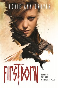
 Lorie Ann Grover, a co-founder of readergirlz.com, is an idol of mine. Her spirit, her love of reading and her writing... Well, let's just say I look up to her mucho. Her latest novel, Firstborn, already has a star from Kirkus. And she has this to say about it: "Firstborn originally sprang from an article I read on gendercide. Over 37 million girls are missing today due to China’s One Child Policy. Visit Global Gendercide Advocacy Alliance Project or All Girls Allowed to learn more and act."
And now, her Cover Story:
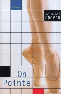
"I’m so honored to be included in Melissa’s Cover Stories! I have to say, we authors usually sit at home holding our breath, waiting for our cover reveal from the publishing house. On rare cases we are able to interject a thought before the creation. In On Pointe I was able to ask for a specific type of toe shoe to be portrayed (read that epic Cover Story!). Even more unusual is the request for a correction after the image is designed. Upon seeing the cover for Loose Threads, I asked for embroidery needles to be replaced by knitting needles, in keeping with the story. My request was granted. But as I waited for the unveiling of the Firstborn cover, I prepared to give zero input. Zero. Like normal.
"What a delight to not have a speck of criticism. When I opened the cover file for Firstborn, I was blown away! I remember sitting in amazement that Mike Heath from Magnus Creative had caught the atmosphere, the character, the place with his art. The font itself conveyed the angst and aggressiveness I had hoped to convey within the story. There was my moment of awe, followed by chills, a prayer of thanks, a happy dance, and then a call to my family to see and share my first fantasy cover.
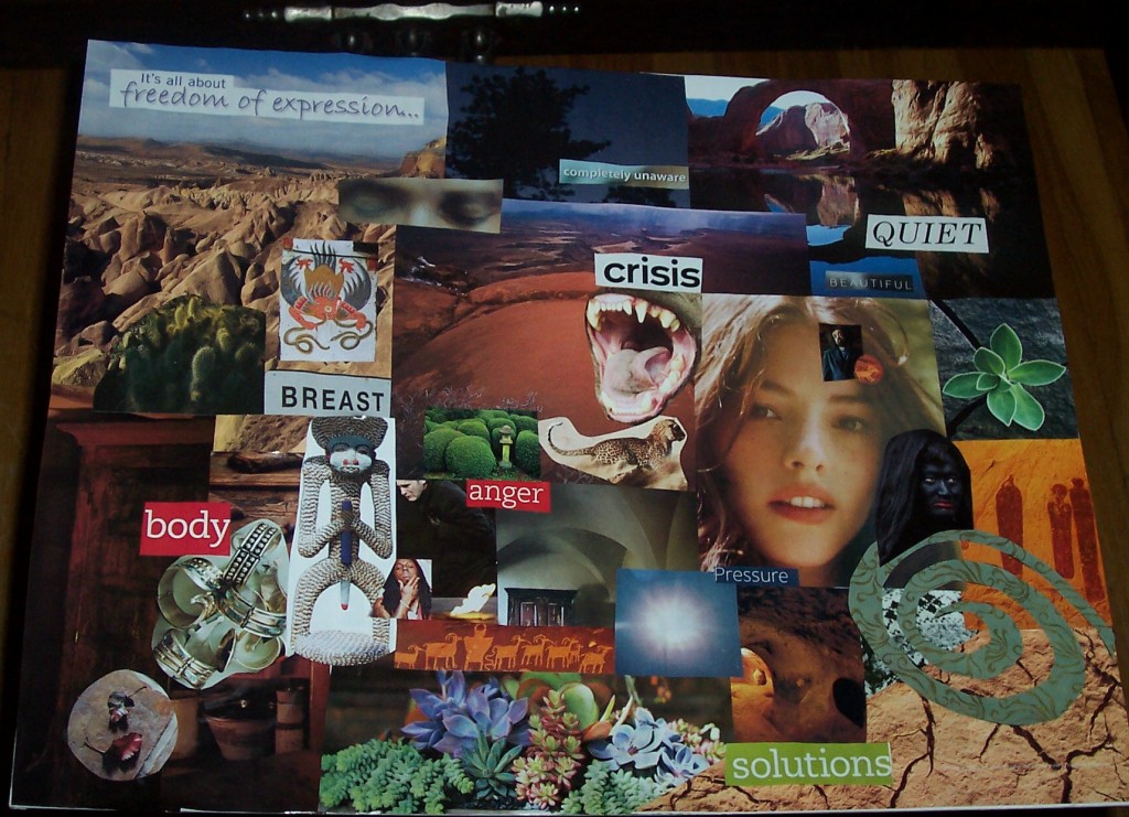
"When I’m working on a novel, at the start or shortly after, I’ll often create a vision board to help me capture those first impressions and hold onto them through the process to publication. I’ll tear out images of characters, the setting, and objects from magazines and books. Then I compose the pieces into a unified whole. This is the vision board I created for Firstborn:
I believe the essence of my board lies in the Blink cover, which was created before I shared this image with the team. The trailer was in keeping with the collage as well:
"I’m incredibly blessed to be working with such a talented team at Blink. I appreciate that they have visually brought my story to the cover. It’s a perfect bridge to the reader."
Thanks, LA! Cannot WAIT to read this book (which is out tomorrow!).
