Cover Stories: Drink, Slay, Love

Sarah Beth Durst has shared the Cover Stories for her novels Enchanted Ivy and Ice, and now she's here to tell her perspective on the scintillating cover of Drink, Slay, Love. "Creating the cover for DRINK, SLAY, LOVE was a traumatic experience. The problem began when the vampire hired to pose as Pearl came to the photo shoot hungry. She drained three assistants before someone had the presence of mind to pass her the bottle of donated blood that you see on the cover. The photographer snapped shots of her as she sated the last of her hunger with the bottled blood. Though they'd originally planned for a panorama, he was forced to do a close-up due to the carnage that littered the studio behind her.
"Okay, that's not true. She only drank from two people and both survived.

"Seriously, I don't know the story behind this cover. I only know that I love it. The little smile on her face perfectly captures the attitude of my vampire girl Pearl. Pearl is fierce, funny, fearless, and mostly evil... or at least she is before her unfortunate encounter with a were-unicorn. She was the most fun to write of any character I've ever written.

"This cover was designed for Simon & Schuster by Evan Schwartz and Jessica Handelman. My hat is off to them. And I hope they didn't lose too much blood."

Thanks, Sarah! I mean, I wouldn't have messed with this perfection either... that cover is hands-down gorgeous. Anyone else think Pearl's lips look kind of like Anne Hathaway's?

Oh, and in case you wonder if the insides live up to the outsides, here's what Kirkus had to say: "Combining a sense of humor with the dark appeal of supernatural romance, this book is funny, scary and thought provoking all at once. Even jaded fans of the supernatural will find fun in this one."

NICE. Happy Monday!

Win-It Wednesday: Dream School by Blake Nelson (Signed!)

Last week's randomly chosen winner of The Space Between is Leann. Send me your address, L. This week, I have a *signed* copy of Blake Nelson's awesome Dream School. It's the sequel to his fantastic 90s novel, Girl, and it delivers. Read about my love for it here (and read the interview that shows Blake's personality here) if you want to learn more.

To enter to win, tell me one of your dreams. It can be your dream school, your dream career, your dream holiday gift, your dream date... anything! Fill the comments with dreams and I'll pick a winner at random next week.

Happy Wednesday!

PS-Want another shot at this book? Enter Figment's Dream School contest.

PPS-While you're at it, enter the Figment-I Heart Daily contest too! Review your favorite book of 2011 on Figment for a shot at a loaded Kindle! (I'm judging!)

Cover Stories: Interview with Regina Roff

Regina Roff designs book covers for Bloomsbury/Walker, and she was the one who created the final version of Lauren Baratz-Logstead's Little Women and Me (read that Cover Story from Lauren's POV). Now Regina's here to share her side of that cover's story, and share a few other covers she's been working on (like that gorgeous one at left):

"When I came onto Little Women and Me, it was already started by another designer. It was one of the first books I worked on at Bloomsbury/Walker, so it was a really exciting project for me. The art director explained the story to me loosely and showed me a few of the original cover comps (like the one posted below, right). The team liked that direction but they also wanted to see some other options.

"So, I sat down and read the story, to get a feel for the tone, mood, etc of the novel. I was instantly transported into the world that Lauren Baratz-Logsted created! I wanted to capture the feeling of being from the outside looking in on this classic story of LITTLE WOMEN. At first, most of my cover comps were similar to what had already been tried: they featured images of girls reading, etc. Then I thought it'd be interesting to see the main character sort of 'spying' on the characters in LITTLE WOMEN. I had a few options where a girl pulled back a curtain on a scene of LITTLE WOMEN, but they didn't have the impact I was hoping for. After looking and looking for more 'spying' images, I ended up finding the image on the final cover, the girl popping through a piece of paper. That's where everything started coming together, with the original LITTLE WOMEN artwork and the modern girl coming through the page.

"We worried that the unaltered LITTLE WOMEN artwork would make the book look oddly anachronistic, so I played with ways of making the art look more modern. I did a lot of Photoshop with creating 4 color separations, half tone dot screen patterns, and then splicing it all back together again. [um...Design speak redacted; translation: MAGIC!] It was my little design tribute to my love of pop art and Roy Lichtenstein. I liked the result because it almost looked like a colorized negative of the original art, so you could read the final image as the girl coming out of the book or the girl looking into the book. Originally, the main character was popping out over the faces of the LITTLE WOMEN characters (I thought I was being clever with a visual metaphor about how she 'becomes' a character, haha!) but the team thought it made the artwork less recognizable. In the end, I'm glad we ended up composing the image the way we did because it definitely makes it feel like the main character is an 'addition' to the LITTLE WOMEN cast of characters!

"Some other fun covers I've designed for Bloomsbury and Walker are Alexandra Harvey's latest Drake book BLEEDING HEARTS and the bind-up of the first 3 books, RULING PASSION (below). Those were great fun for me to work on because I love, love, love the Drakes, and I especially love Lucy. (Lucy and I have the same hair cut and cat eye glasses, not to mention a bit of a preoccupation with slaying vampires.)


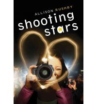
"Most of the covers I've worked on won't be hitting the shelves until the Spring or Fall of next year, but those include Trish Doller's SOMETHING LIKE NORMAL, Allison Rushby's SHOOTING STARS and Amy McAuley's VIOLINS OF AUTUMN (all shown below).


"(Full disclosure: I almost missed getting off the bus during my morning commute because I was so engrossed in reading a draft of VIOLINS OF AUTUMN when I was conceiving the cover design. It's THAT good!!!) There are a LOT more coming out in the Fall, but they're not ready yet."

Thanks, Regina! It's really interesting to hear things from an Art Department perspective, and these covers you've been working on are lovely! What do you guys think?

Win-It Wednesday: The Space Between

Thanks for all of your song recs from last week's giveaway of A Million Suns by Beth Revis! The mix is going to RULE. I chose a winner via Random Number Generator, and it is... Vanessa Romero! Send me your address, V. This week I have a lovely hardcover of The Space Between by Brenna Yovanoff. Read a review on Book Fetish.

I have to admit that I cannot keep up with my book pile lately, and I haven't read this one. But I like the red sky against the metallic elements and the girl's dark hair and pale skin. So, cover love.

To enter to win this lovely book, tell me what your favorite part of the holiday season is. I know there are a bunch of drags about this time of year--weird relatives, shopping crowds, traffic--but let's make lists of the awesome parts.

Happy Wednesday!

Cover Stories: Off Leash

Renee Pace's Off Leash was a semi-finalist in the Amazon Breakthrough Novel Contest, and she had control of the cover design, so she's here to talk about it:

"I knew I wanted a skinny teenage boy and a boxer dog for my cover. That was it. I also wanted it to have a nitty gritty feel. Those were my three outlines to my cover artist.

"When I saw the cover I was floored. She nailed it. I loved that the dog was looking back at the boy but the boy’s looking out at the reader.

"I didn’t want anything changed. It was like Angela Waters had read my mind and took the picture from my head to make my cover.

"We used stock photos only and I gather from my cover artists that securing teen photos is really hard.

"My cover tells me three things. One both my teen and dog are alone but together. That one glance back by the dog tells me he’s waiting for the boy and with how the boy is looking with such a questionable look on his face it just makes me get goose bumps because that’s what that story is about. A boy and a dog and their complicated friendship. The setting is perfect – that alley conveys to the reader that life isn’t great for both of my characters."

Thanks, Renee! It's interesting to hear how it goes when authors have such a big role in cover design. What do you guys think?

Win-It Wednesday: A Million Suns

Yes, it's Thursday. Time isn't my strong suit. I have other good qualities. The winner of AS King's Everybody Sees the Ants is... Dea! Send me your address, D. You will really enjoy this book.

This week, I'm giving away A Million Suns, the much-anticipated sequel to Across the Universe by Beth Revis. It comes out in January, but I have an ARC for one commenter below.

So, the task: I'm making a mix for some friends, and I'm trying to include a lot of great songs from 2011. So... what's your favorite song or album or band from this year? Help me make the mix! 

Oh, and for the record, I listen to everything--Top 40, country, hip hop, indie rock, show tunes. I guess the one thing I'm not into is House music.

Happy Thursday!

Cover Stories: Life's a Witch

Brittany Geragotelis' novel, available December 8th, is a YA retelling of the Salem Witch Trials, and it has been read like a bazillion times since being posted on wattpad.com. She's publishing the book herself (read a little about that) and she had a huge hand in the cover design, which is what she's on the blog to talk about.

Here's Brittany:

"I always knew that I didn't want the full face of my main character to be shown on the cover. As a reader and book reviewer, I understand how important a book cover is. The covers I'm most drawn to are ones which display a partial identity (Gossip GirlI'd Tell You I Love You But Then I'd Have to Kill You, etc). I think this is because it looks trendy and modern, while not giving away the whole look of your main character. I think this is important for the reader, because then they can really create the final look of the character in their own imaginations.

"I really wanted the character to have a very strong pose on the cover, too, so when I was looking for images, that was especially important to me. I always pictured my main character's hands on her hips, looking very super-hero-esque and strong; a pose that would convey to the reader that she's very powerful.

"Lastly, I wanted to find a picture that showed the character in an outfit that my main character would wear--and that had to include red pumps. In Life's a Witch, Hadley is obsessed with fashion and thinks that a great pair of heels is the answer to any situation. Her favorite color is red--which is very important to the storyline--so I knew I had to have that element in there, as well.

"I never pictured the cover shot as being black and white, but after I saw this photo, I kept thinking about how great and dramatic it was. When my designer said she could turn the shoes in the picture red, I knew I'd found my shot.

"I was so lucky to have had my very talented designer friend, Toni Misthos, create my cover. She's read a lot of my books, so when I asked her if she'd design my book cover, she didn't hesitate.

"She was only able to read part of Life's a Witch before she designed the cover though, since it wasn't done yet at the time, but I told her what I was looking for and the general storyline. At this point, we both started searching through stock photography for a specific type of girl and came up with about a dozen shots to choose from. In the end, we kept going back to the one we ended up choosing.

"Toni always knew that designing my book cover was my thing, and because we'd worked together (she was the art director at the magazine I work for), she understood that I'm very opinionated and picky, so she didn't really try to fight me on anything. But as far as the font for the cover and placement, I let her choose that. She gave me a few options and in the end we chose the one we both liked most.

"I offered to pay her, but we ended up with an even trade. She's back in school and needed someone to proofread her papers before she turned them in, so I agreed to do that as a way to pay her back. It was a win/win (although I may have gotten the better end of this deal)! Since then, Toni's designed my second book cover as well. She's a genius at art design. If anyone's interested in a professional-looking cover and doesn't mind spending a little bit of money, they should check her out at fotinimisthos.com.

"The first time I saw my finished cover, I thought, 'Man, that's hot!' Ha! But really, I felt that it was classy and sassy, dramatic and powerful, just like my main character. I was so proud of the way my book was portrayed visually. I'm actually still impressed by it today, but then again, I'm a little biased.

"Because I was so heavily involved with the design of the cover from the beginning, there weren't a whole lot of suggestions I had to make throughout the process. Toni knows me and my tastes so well, that she zeroed in on what I wanted right away.

"The cover didn't really change much from version one to the version my fans see today. But the final product was definitely different than my original concept. That's to be expected though, when you're not doing your own original photography...you sort of have to settle for the closest thing to your vision. "The photo was definitely a stock photo. I actually went on istock.com (a site we use for stock photography at work) and searched through their files. The image I chose wasn't exactly cheap, and later on, I had to purchase a much bigger file (this equals more money) of the photo to ensure that I was covered if I needed to do any promotional stuff with it later. Good thing, too, because I'm using the same image now for the print version of Life's a Witch.

"I really love my cover! But then again, I was super-involved in designing it, so there's nothing for me to complain about. I get so many compliments on it today and I really feel like it showcases the book perfectly. There's no doubt in my mind that having a smart-looking, enticing cover has helped pull in potential readers."

Thanks, Brittany. I really like the cover (I'm a fan of that style, too, as my Violet books have that type of feel, as well as the black and white with a pop of color thing...), and I think the image is strong.

What do you guys think?