I love a fall manicure with accent nail. Remember those little turkey handprint paintings you used to make as a kid? I love those too. Anyway...

I missed Win-It Wednesday, so you can enter the giveaway for one more week.
Happy Thanksgiving!
I love a fall manicure with accent nail. Remember those little turkey handprint paintings you used to make as a kid? I love those too. Anyway...

I missed Win-It Wednesday, so you can enter the giveaway for one more week.
Happy Thanksgiving!
 Lauren Baratz-Logsted has been here before, sharing Cover Stories for The Twin's Daughter, The Sisters 8, The Education of Bet and Crazy Beautiful. Her latest novel is Little Women and Me, about a girl who gets trapped in Louisa May Alcott's classic novel and considers changing everything (Beth lives! Laurie ends up with Jo!). How fun does that sound?
Here's Lauren to discuss the cover:
"Sometimes, I have ideas for what my book covers should be and I get my wish. Sometimes I don't. But this time, I had absolutely no idea! How do you visually express the idea of someone getting sucked into a classic book or living inside it???
"Bloomsbury is very good about respectfully asking for input, but this time I truly had no ideas.
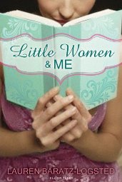 "The cover changed a lot! Originally, it was just a picture of a girl with a book open in front of her, like she's reading it. Across the front of the book, it had Little Women and Me in script. It was a pretty-enough cover but in no way did it express the plot of the book (right).
"When I first saw my final cover, I loved it! I don't know how they came up with it, but somehow they truly visually expressed the book. The biggest - and only - objection came from my daughter Jackie. Originally, the picture of the main character literally busting through the book appeared at the top of the book jacket, with the image from the Louisa May Alcott cover of the March sisters together appearing below. Jackie said it should be reversed, and they did that.
"It looks to me like they took the artwork from Little Women itself and then did fun things to it so that it looks like a real person is trapped inside the book and is peering out from it.
"At first, I thought it only represented Emily trying to look outside once she's become trapped inside the book. But then I realized it could also be interpreted as Emily trying to peek inside the book before she gets sucked in. I think it's just great. It definitely evokes the plot of the story and I can't think of another book jacket I've seen that's quite like it."
Thanks, Lauren! I agree that the first cover doesn't have much "grab" factor. The final design is much more energetic. What do you guys think?
So you guys know that there's going to be this amazing Pajants reading at Books of Wonder on Saturday, December 3rd, from 3-5 PM. Seriously, this lineup rules. Pen it in! The pajants, as you may have heard, have been worn all over the world... and even on the famous legs of one Ms. Tyra Banks (who signed right between me and E. Lockhart--exciting!):
Remember my Pajants adventures? Oh, the places they've gone! Remember my Tyra adventures? Full circle, people.
Check out the full Pajants saga on Facebook.
Happy Friday!
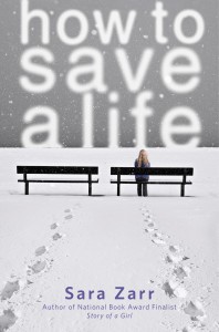
 The winner of last week's giveaway for Sara Zarr's gorgeous How to Save a Life is... Sophie! Send me your address, S. Thanks to everyone for the get-up-earlier (and/or go -to-bed-earlier) tips. I'm trying them all. June is a 6:30am riser. Yawn.
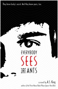
This week, I'm offering up a copy of A.S. King's Everybody Sees the Ants. You may have noticed I was reading it a couple of weeks ago. It's excellent, as you surely expect. A.S. King has a way of digging deep into the minds of her characters with clean, clear prose. They are imminently "gettable," and I love that.
To enter to win this book, tell me what you're reading right now, for pleasure or school or whatever. Yeah, I ask this from time to time. I like to peek at your bookshelves.
Good luck!
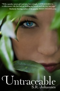 S.R. Johannes's Untraceable is out this month -- it's a young adult wilderness thriller with a missing father, a kick-butt heroine, and, of course, two hot boys. S.R. and cover photographer Vania talked to me about how the cover came to be:
Shelli: I always had a cover in mind from when I first starting writing the book. Something about a girl hiding in the woods. But Vania made it come to life.
Vania: We wanted something that obscured the girl but yet it drew you in.
Shelli: We wanted to use a real life model. I think stock photos are great but to me – we wanted that feeling of being in the woods. Of Grace hiding, and I think Vania got that. There is nothing like an original artwork.
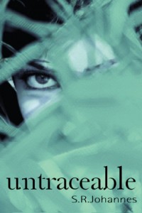 Vania: There’s something to be said for having something on your cover that is just yours. Plus this way we can control more of what the model looked like, where we shot, and what the shot looked like. [Here's a mockup, left.]
Shelli: Vania sent out a casting call and our model was one that responded. The minute I saw her picture, I knew she was the one. 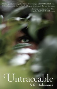 She is Grace in a nutshell. They tromped off into a wooded park area with lots of greenery and got great shots (one draft is shown, left).
Vania: I naturally just shoot as I see opportunity so we ended up with so much more shots we could have used.
Shelli: I love this cover! It is everything I wanted it to be. Grace is a nature girl and the book is a thriller. I think this captures that. Perfectly.
Thanks, you guys! I think the final cover is lovely--the colors pop and the themes of nature and mystery really come through.
What do you guys think?
 The winner of Drink, Slay, Love is... Krista! Send me your address, K.
This week I'm giving away a copy of Sara Zarr's How to Save a Life, which is one of the best books I've read all year. For reals. Here's what I tweeted right after I finished reading it: "Just finished
 @sarazarr's How to Save a Life. Tears. Heart swoons. Joy. Bittersweetness. A gorgeous book!"
That's how I feel. And you can win it! This week, I need some help. I'm a total night owl, but having a baby means I really need to get with the program and become a morning person so I can wake up by 7am with June. I know that's not crazy early, but to me it's INSANE. I'm a 10am wake-up, at best, if I follow my body's instincts.
So, give me a tip (or just a why-it's-nice-to-be-a-morning-person note) below in the comments, and you're entered to win Sara's lovely book. I'll choose a winner at random next Wednesday.
 Catherine Greenman's Hooked has a cover that gets right to the point. Here's Catherine to talk about her debut cover's creation:
"I didn't have a very clear idea about anything as I was writing Hooked. The writing process, at least for me, as it was my first time, was all-consuming and very mono-focused on the characters and what was happening within the story. Looking back now, I'm amazed at all the things outside of it that I didn't think about at all. For example, I wasn't fully aware that Hooked would be marketed as a young-adult novel. But I guess that's what happens when your protagonist is seventeen years old and speaking in the first person!
"I originally was picturing using an old looking photograph of a young girl standing on a beach in a crocheted bikini. This photo is a touchstone throughout the book that eventually inspires Thea, my protagonist, to design her own bikini line. I was very interested in the idea of what positive steps one can take when they're in crisis, and Thea taking the steps to conceive of and start a business was one of the positive things that came out of her difficult situation. So I thought the photo would be a good illustration of one of the themes of the book.
"A friend was kind enough to lend me her six-year-old daughter and we put her in this bikini (you can see this photo here). To me it illustrates one of the story lines of Hooked -- a photograph taken when Thea was very young inspired her to recreate a bikini she loved wearing as a child. Of course, she didn't just love the bikini, she loved what it represented -- an earlier, less troubled time in her life.
"When I first saw the cover, I worried that it was a little racy. It's a profile of a tee-shirted pregnant belly and half of the belly is exposed and her fly button is undone. So I did what a lot of first-time authors did: I sent it around to my friends to hear what they thought, and the general consensus was that, although it was a tad in-your-face, and yes, racy, it was also very attention grabbing. So with the goal to sell books in mind, I was happy with it.
"The one element I wasn't crazy about was that the black crocheted heart on her hip looked like a tattoo which Thea, my protagonist, doesn't have. [They didn't change that.] I asked them to try and incorporate more of a crochet theme and so they did the spine and back jacket with a white crochet background (below).
"I'm pretty sure it was a stock photo, although I'm not one hundred percent sure. A lot of my friends thought it was me! I was flattered. I didn't look that good pregnant!
"I'm more or less happy with the cover. I like that the font is in script, which I think looks nice and somehow makes it less racy. Hooked is about a teenager who falls in love and makes the somewhat unusual choice of keeping her baby, so I think it captures the tension of the story arc."
Thanks, Catherine! I think this cover definitely tells it like it is. I like the simple white shirt and jeans, though I'm with you on the tattoo since it goes against Thea's character a little. Still, it balances out the title somewhat to have that graphic so I see why they did it. Overall, I think the colors are great and the cover invites you clearly into Thea's story, which is what it's supposed to do.
What do you guys think?
Just a photo of my read for this week... Everybody Sees the Ants by the incredible A.S. King (awesome so far!).
Happy Friday! What are you reading this weekend?
 I know it's Thursday. The baby thing again. It's time-consuming, so let's just pretend it's Wednesday. I liked hearing your favorite love scenes, and the winner of Lola and the Boy Next Door is... Ashly! Send me your address, A.
This week I'm giving away a copy of Drink, Slay, Love by Sarah Beth Durst. Look at that bright red-laden cover. I love it.
It makes me think of Coke, which is my favorite soda. Regular Coke, not diet. I cannot resist it. So, what's your favorite soda (or other beverage, if you're a virtuous non-soda person)? Tell me in the comments and you're entered to win this lovely hardcover.
Happy Wednesday!
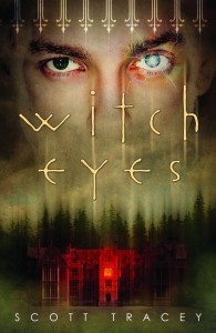 The first book in Scott Tracey's Witch Eyes trilogy came out this fall, and it seems like a good pick for a Halloween Cover Story!
Here's Scott:
"When WITCH EYES sold, and I first knew that it was going to Flux, I was extremely excited. Some of my favorite covers of the last few years have come out of Flux, so right off the bat, I was ecstatic. There was panic, too, like 'what if my cover's the exception?' but we pretend that never happened. You do that a lot as a writer. Sweep things under the rug or lock them in the closet and pretend you can't hear them whimper.
"Anyway, when it came to the cover, in my head I'd always pictured something in lots of darks and purples. Maybe an aerial shot overlooking a town at night, with all their house lights on and a boardwalk or a lighthouse or something. Or maybe a pair of eyes in photo negative so they're all dark and moody. I think all this is the result of reading too many Dean Koontz and John Saul novels when I was a teenager.
"It had worked out that just before Brian (my editor at Flux) asked me for images from covers I liked, and images that 'fit' the book, I stumbled onto this picture. It was a photo manip that someone had made, and posted on Tumblr. A pair of large (possibly feminine - it was hard to tell) eyes, overlaid above an image of an old castle on fire. I sent it along too, mostly because the idea of eyes overlooking something was fantastic - and perfect for my book.
"Like most covers, it went through several different designs and layouts (which I didn't see) before they finally settled on a concept that everyone at Flux liked. And they showed it to me - a rougher, less colorful version of the final cover you see now. And it was perfect. The only reason I didn't immediately send out emails that said 'OMG YES YES YES' was because I was told to sit on my answer for 48 hours, and then see what I thought. Which makes sense, but at the time I thought it was a horrible idea. Because what if THEY changed their mind in the next 48 hours and I was busy getting attached and making it my computer background and singing it lullabies...
"I had the opportunity to weigh in on the cover, but the truth was that I didn't have a single reservation. I was sure that when the time came, I'd be able to come up with a list of tweaks, of things I'd like to see, or things I didn't like it. But I felt like the cover was absolutely perfect.
"People tell me that my book is dark - I don't see it that way, but I definitely think of it as 'serious.' As serious as a book about a gay witch cursed with magic eyes who walks into the middle of a feud between powerful warlocks can be, at least.
"I've always been a fan of darker, somber covers. There are so many elements of the cover that I love, it's hard to boil it all down into individuals. The fencing at the top is one of my favorite elements, because there's definitely a sense of being 'trapped' that runs through the book. The lightning around the eye, and the way it discolors the skin there (making it look like an almost healed bruise), the super creepy mansion with the single lit room, bathed in red light. I even love the way everything is blurred and bleeding up and down."
Thanks, Scott! I'll add that I think the trees have a Twin Peaks feel that I like, and I'm a fan of the creepy font too. What do you guys think of this cover?
Happy Halloween!