Photo Friday: 4 Delightful Things

1. This is what I was reading in Florida last weekend (snow on the beach!). Sara Zarr is EXCELLENT. Please read.

2. Prospect Park always amazes me with its many gorgeous spaces. Here's June on an afternoon walk, flanked by lovely columns.

3. There's a consignment store by my house that always has great window displays that make me want to go to fancy parties. This week's:

4. The perfect cappuccino from Couleur Cafe:

Happy Friday! How was your week?

Win-it Wednesday: Lola and the Boy Next Door

So this week I finished Lola and the Boy Next Door by Stephanie Perkins (whom I met briefly in Austin, and who was full of smiles and blue hair, as expected -- so great). The sparkling energy from Anna and the French Kiss continues in Lola, and there are a few amazing-chemistry scenes that I flagged for future reference, especially a certain moment involving nail polish. Now I'm giving away a lovely hardcover copy of this novel to one commenter who tells me about their favorite love scene. It can be from a book, a movie, real life (you know I'm nosy)... just spill. 

I'll choose a winner randomly next Wednesday!

PS-Lola works in a movie theater, just like my Violet did. Yay for cinema jobs!

Cover Stories: Between by Jessica Warman

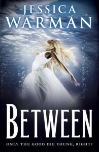
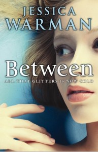
Jessica Warman has some amazing covers, and her latest is no exception. Check out the Cover Story:

"It’s funny – I’m the most non-visual person I’ve ever met.  Truly.  My mom is an amazing realist painter, and while I can appreciate the beauty of her work, I just don’t find the visual arts nearly as engaging as I assume most people do. Same thing goes for great scenery, great decoration – anything visual.  I see images of the Grand Canyon and am like, 'Yes, it’s beautiful, but…  once I’ve seen it, I’ve seen it.' I can remember going to Niagara Falls as a kid and thinking, 'Okay, here we are, I’m looking at the waterfall… what now?' It’s very odd – at least I’m told that it’s odd by my friends and family. My point being: I can never really visualize what I want for a cover, because my mind sort of doesn’t work that way. I tend to think exclusively in a narrative. Weird, I know.

"My publisher didn’t ask for my input at first, but I was shown an early version of the cover VERY early on, and I absolutely loved it. I felt like it perfectly captured the tone and content of the book. I made it my background on my computer, and I’d look at it multiple times a day… which is saying a LOT, considering the fact that I’m pretty deficient when it comes to my appreciation of the visual arts!

"There was also the first version of the Egmont cover for the UK edition of the book (right) with the woman underwater with her hair and dress sort of suspended all around her. I tend to really trust people who do things professionally that I know nothing about – for instance, people who design book covers and know what sells – but I was a bit startled the first time I saw this version. For some reason it felt very 1970s to me, and I’m not exactly sure why.

"For the US version, I’m sure she would have been receptive to my thoughts, but I was so thrilled with what the art department had already come up with that I didn’t have much input to give. The cover was tweaked a little bit. I believe they initially used a stock photo, but were unable to contact the photographer for the rights, and so they ended up doing a photo shoot to come up with something very similar.

"With the Egmont/UK version, it worked a little differently, because I technically didn’t have much of a say in what the cover looked like. But my editor did tell the folks at Egmont that I was a little lukewarm, and they went back to the drawing board. I’m so glad they did, because I think their final cover (left) is amazing. It’s SO different from their first try, and also totally different from the US cover. I tried to decide which one I liked more, but it’s like comparing apples to oranges."

Thanks, Jessica! I love, love, love the final US cover. The first UK cover definitely has a little disco fever vibe but the final one has a great feel to it. (The US is my favorite though -- cloud swings!) What do you guys think of these covers?

Questions, Answered

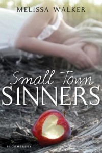
Last week I did a live chat with Inkpop (transcript here) and tons of great questions got asked, plus two attendees won Small Town Sinners! But things got so hectic that I didn't get to answer all of the Qs in the comments. So here are responses to a few of those:

  • Hi Melissa, would you consider to write book(s) from other genres? Or insert elements of other genres in your book(s) (i.e. horror)?
    I would definitely consider any genre, because I love trying new things (if you've read all of my books you know they are all pretty different in tone). Horror, though, is probably not one I'll do, mostly because I'm a complete FRAIDY CAT and I'd probably scare myself.


  • I just finished Small Town Sinners, and it was incredible. How did you come up with the idea for it and create a setting that seemed so real?
    Thank you! The book was based partially on this magazine story (pictured), which definitely helped me establish a setting.


  • How do you encourage yourself to write when you're feeling down? 
    This is happening right now because I feel very torn between new baby time and writing time (but I need to be writing!). Listening to music is really helping. It puts me in a mood (good or bad, whatever I need for the scene) and helps me create emotional moments.
    I'll bring Win-It Wednesday back next week after I catch up on mailing out previous prizes. Remember to always check the week after to see if you've won--sometimes people miss that part!

Cover Stories: Jessie ♥ NYC

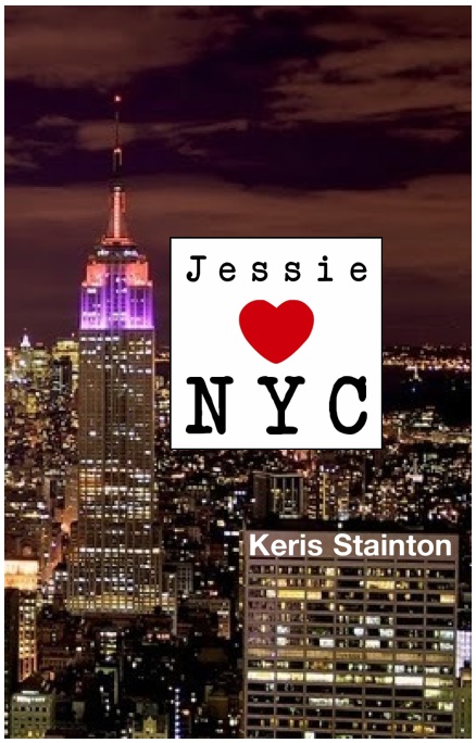
Keris Stainton was here last year to share the Cover Story for Della Says: OMG!, and now she's back with the tale of Jessie ♥ NYC!

Here's Keris:

"I didn't really think about the cover when I was writing the book -- I'd made a collage so I just pictured that... although it did have the Empire State Building smack bang in the middle!

"After I'd delivered the book I actually dreamed the cover and the title. I told my editor and she asked me to send over the details, so I made a few mock-ups and she loved them (one is below):

"The first version I saw was black and white (right) and then the next one was gold, but not as fabulously shiny as the finished product.

"When I saw the cover, I absolutely loved it. I think I may have welled up and I know I got butterflies. It took the 'concept' from my dream and made it absolutely gorgeous. And my name on a New York street sign? How could I not love that?!

"The only change I suggested was to add the antenna to the top of the building, and they did!

"I don't think I could love the cover more. I love the front and the back and the spine and the debossed gold windows. It's perfect. And, yes, it's perfect for the book too, I think -- the Empire State Building is central to the story so I think it's right that it's on the cover."

Thanks, Keris! There she is holding the actual book and showing off the super shine, which is perfect for the streets of Manhattan!

What do you guys think?

Photo Friday: The Friday Night Lights Field

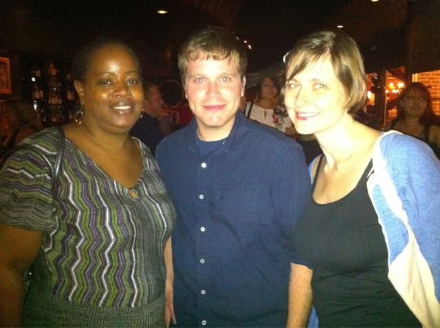
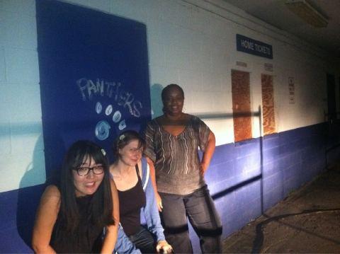
Last week I posted some Austin Teen Book Festival photos, and I left out one big part of the journey: The trek to the Friday Night Lights field! Jenny Han mentioned it early on, and then we talked Corey Whaley into driving us out there. Coe Booth was down for an adventure too (here's a pic of Coe, Corey and me just before we piled into Corey's car.)

Corey shined the headlights on us so we could get this shot while Jenny played the FNL theme on her iPhone:

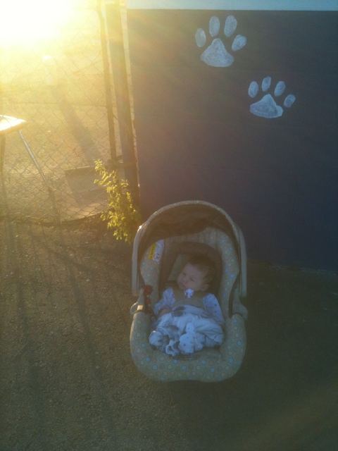
And not to be a super nerd, but I went back the next morning before I flew out of town. Because, you know, the light was all Texas-y and I had to make sure June got there, in case she's a fan later on:

Happy Friday!

Win-It Wednesday: Live Chat Tonight at 5pm EST!

The crying stories from last week made me laugh and broke my heart -- this is a good emotional combination in my book. Random Number Generator chose a winner for Jennifer Castle's The Beginning of After, and it is... Allison R.! Send me your address, A. Today, I'm doing a LIVE chat at 5pm EST over at inkpop, so I'd love it if you'd come hang out from 5-6pm. I'm specifically talking about how to make full-time writing work, but I will be happy to talk about everything from the weather to Tim Riggins to baby June!

Even if you can't attend, you can leave a question for me in the inkpop comments section (not below!) about the chat, and I'll answer it during the hour. Showing up at the chat or leaving a question earns you a chance to win one of two copies of Small Town Sinners... so that's this week's Win-It Wednesday!

Come chat if you have time!

Cover Stories: The Cold Awakening Series

The amazing Robin Wasserman is back to share the story of the cover--and title!--changes for her latest trilogy. Here goes: "The last time I got to pontificate on this blog, I talked about how much I loved the cover my publisher had come up with (true) and how much we’d struggled to come up with the right title for the book (also true), and then ended with this: 'My editor promised me that after a few weeks of looking at SKINNED on the cover, I wouldn’t be able to imagine the book being titled anything else. She was right.'
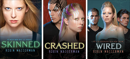
"As they say…famous last words.

"Because fast forward three years later, and these books are getting brand new covers. And brand new titles to go with them.

"And I couldn’t be happier.

"Not that I didn’t like the original look for the trilogy, but who doesn’t love a makeover? (You’re talking to a girl who spent all of high school convinced that if she whipped off her glasses and shook out her ponytail in just the right way, she might become homecoming queen.) (Didn’t happen.)

"My editor first contacted me about the repackage about a year and a half ago (which means before the third book in the trilogy even came out!), and as I had the first time around, I jumped at the chance to weigh in:

'I'm so excited about the idea for new covers for these books! I'm the first to admit that I'm visually/artistically challenged, to put it mildly, but since you kindly asked if I had any thoughts on the subject, I took a look around to see what jumped out at me, and actually, I found that everything I gravitated toward had a sort of similar look, so I'm sending them along to you, in case anything sparks your imagination. You'd mentioned you were thinking iconic, which I think is a cool idea -- and I'm wondering what you think about using the *body* as a object, so to speak (ie instead of a chair or an apple or whatever), since that really gets at the heart of the trilogy.

I'm not talking about headless girl parts, so much as something like this - or even this.

In a sort of similar vein.

"We were all agreed that we wanted to move away from the photographic look of the original covers and find some kind of object that would really capture the theme of the trilogy. My editor and designer weren’t sure my idea of using the human body would work, so they suggested we try to find objects the evoked the same feel. I loved the way they were approaching it:

"'We’ve been talking a lot about the ideas of frailty v strength, something beautiful masking something unnatural, rebirth, etc—all with an iconic approach.' ---my awesome editor

"They told me they were going to look around from some stock photos of things that might capture this frailty/strength, natural/artificial divide, like cracked eggshells, frozen flowers, and silhouetted fruit.

"Which I thought was a great idea…but not as great as the idea they sent over a couple weeks later:
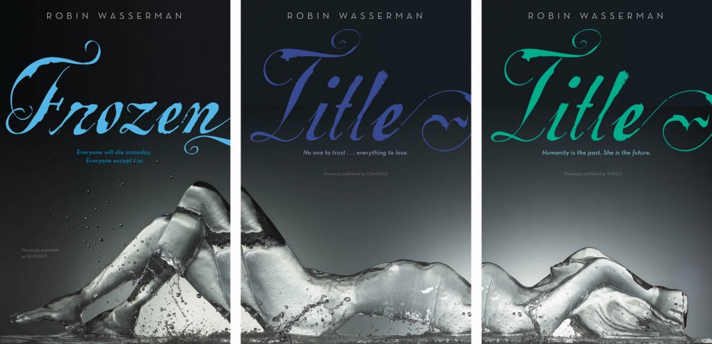
"Apparently the designer came across the image and immediately fell in love – and you can see why! It took about five minutes for everyone to agree that these were perfect.

"Which left us with only one tiny problem… the titles.

"I’ve had a lot of people ask about why these books are getting new titles, and I usually say something like, 'Um…I don’t actually know? Sometimes that just happens? I guess?' So this time it occurred to me that instead of stammering like an idiot, I should just ask my editor. The Official Answer:

“'The original packages seemed to have missed the mark, perhaps because--as some people theorize--Skinned sounds a little horror-ish and Crashed and Wired feel too tech-focused. You were on the cutting edge of the swell of post-apocalyptic/dystopian, before we had a robust category in teen (in fact, we called your trilogy "realistic science fiction" which is still accurate but not currently "in vogue"), and the packaging across the YA industry would ultimately head in a starker, more iconic direction. Hence the change!

"Who knew?

"Of course, there’s a big gap between deciding we needed new titles and actually agreeing on new titles. And lost in that gap is a long, loooooong list of discarded ideas. Here’s just a taste of some of the title brainstorming:

DROWN TRESPASS SACRIFICE BARE EXPOSED DREAMER UNBOUND UNFORGIVEN EMPTY GUILTY FORGOTTEN

"Not to mention the unused trilogy titles! THE METAL DREAMERS SONGS OF STEEL THE LIVES OF LIA SONGS OF SELF

"You can see how this might have gone on forever. It’s kind of a miracle that we finally settled on something, and if you ask me, it’s something perfect:
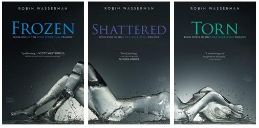
"This has been a strange experience for me, since the original titles and covers have come to feel like they belong to me, while, for a long time, the new versions felt like they must be someone else’s books. Someone else’s beautiful books, to be sure, but not anything I had the right to call my own. It’s taken a lot of mental gymnastics – and a lot of gazing at the new covers on the computer screen – to convince myself that even with a new look and a new name, these are still my books. But I’m finally there.

"And I’m grateful for it. Because, if you want to know a secret--just between you and me and, you know, the entire internet--I love these covers about a million times more than the originals. I love these covers more than any covers I’ve ever had. Now I just hope the rest of the world will, too."

I love hearing this detailed story. Thanks, Robin! Um, if ever there were a reason to buy all three books in a series (besides the story, of course), these covers are IT. Am I right?

What do you guys think?