 The fantastic Kieran Scott is here to talk about title changes, taglines and Tiffany blue on the cover of her latest novel, She's So Dead to Us (I've heard her read from it, and in case you're not familiar with her books, Kieran -- who also writes as Kate Brian -- pens a great novel).Here she is:
"The story of my cover is all tied up with the story of my title. When I first pitched the idea that eventually became SHE'S SO DEAD TO US, it was titled RETURN TO ORCHARD HILL. In my mind it was a coming-home story wrapped up in a romance. I had all these thoughts of Dawson's Creek-style, sepia-toned images of autumn trees and quaint neighborhoods. It was all very romantic and dreamy.
"Unfortunately, my publisher didn't love the title. It sounded too old-fashioned and literary. They wanted something more immediate. Something that would grab the reader, rather than lull them into a state of nostalgia. So I went back to the drawing board. I came up with lists and lists of potential titles. I brainstormed with my agent and I brainstormed with my editor. I even brainstormed with my sister and my best friend. But somehow, we couldn't all get on the same page. There was one title we all liked, but we already knew there were going to be three books, and we couldn't come up with accompanying titles that made sense. We went back and forth about this for weeks, until it was basically do-or-die time. Catalog copy had to be set. Covers had to be made. We were playing with fire.
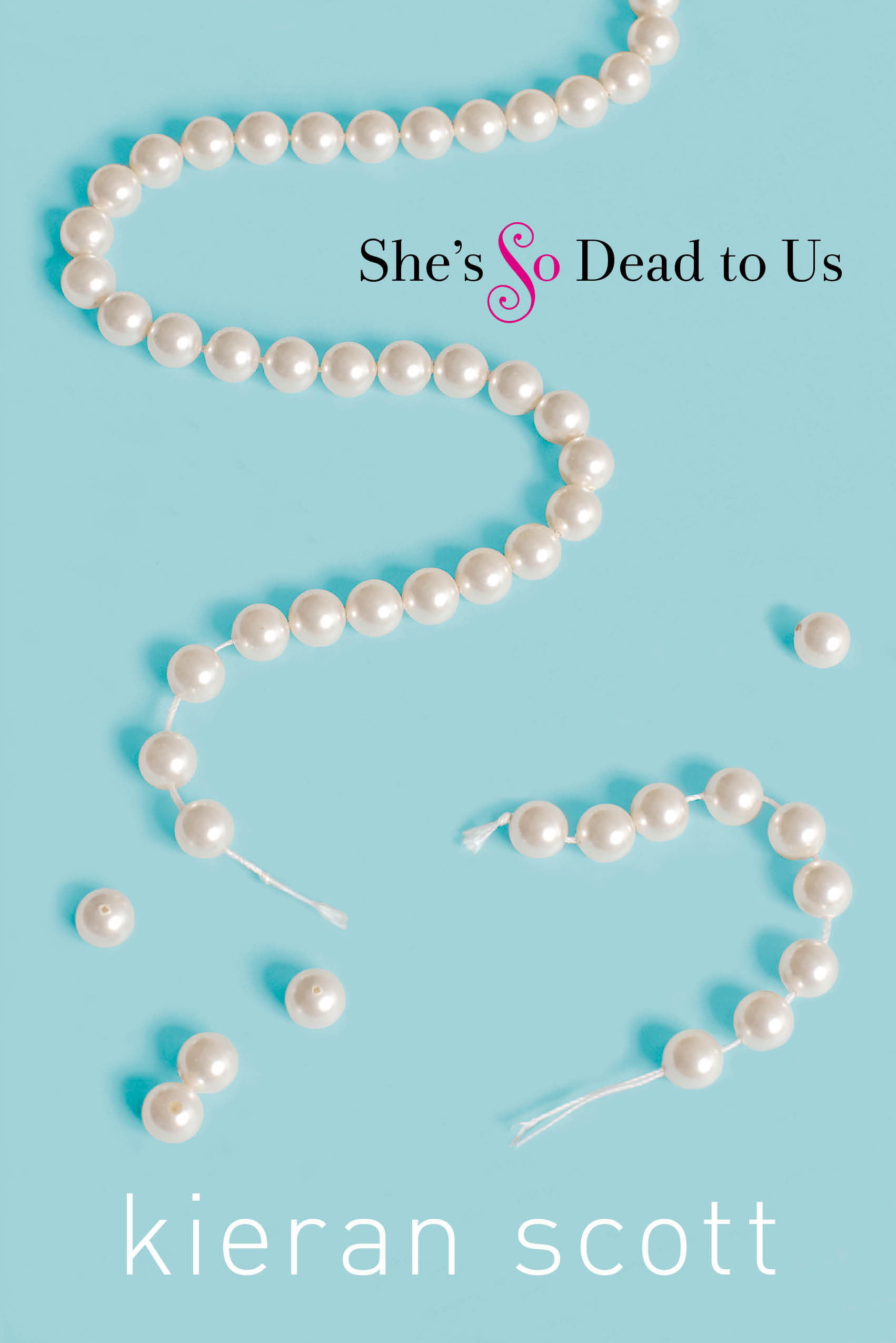
"We wanted something that would evoke the idea of 'you can't go home again,' but we also wanted romance. It seemed impossible to have both. Then, one day, my editor sent me a mock-up that the talented Krista Vossen had put together. It was a light-blue cover with a broken strand of pearls and the title SHE'S SO DEAD TO US. The title had been the brainstorm of someone in marketing, I believe. And a brilliant editorial assistant (ahem, Julia Maguire), had come up with the tagline 'Born with a silver spoon, living with a plastic spork.' I took one look at the package and fell in love with it. The cover, in my opinion, is drop-dead gorgeous. And what female among us is not attracted to that Tiffany blue? The romance angle was, clearly, not present, but at this point I had resigned myself to the fact that I couldn't have it all. I had to hope that when readers opened the book and saw the alternating points of view, they'd see what it was all about.
The fantastic Kieran Scott is here to talk about title changes, taglines and Tiffany blue on the cover of her latest novel, She's So Dead to Us (I've heard her read from it, and in case you're not familiar with her books, Kieran -- who also writes as Kate Brian -- pens a great novel).Here she is:
"The story of my cover is all tied up with the story of my title. When I first pitched the idea that eventually became SHE'S SO DEAD TO US, it was titled RETURN TO ORCHARD HILL. In my mind it was a coming-home story wrapped up in a romance. I had all these thoughts of Dawson's Creek-style, sepia-toned images of autumn trees and quaint neighborhoods. It was all very romantic and dreamy.
"Unfortunately, my publisher didn't love the title. It sounded too old-fashioned and literary. They wanted something more immediate. Something that would grab the reader, rather than lull them into a state of nostalgia. So I went back to the drawing board. I came up with lists and lists of potential titles. I brainstormed with my agent and I brainstormed with my editor. I even brainstormed with my sister and my best friend. But somehow, we couldn't all get on the same page. There was one title we all liked, but we already knew there were going to be three books, and we couldn't come up with accompanying titles that made sense. We went back and forth about this for weeks, until it was basically do-or-die time. Catalog copy had to be set. Covers had to be made. We were playing with fire.
"We wanted something that would evoke the idea of 'you can't go home again,' but we also wanted romance. It seemed impossible to have both. Then, one day, my editor sent me a mock-up that the talented Krista Vossen had put together. It was a light-blue cover with a broken strand of pearls and the title SHE'S SO DEAD TO US. The title had been the brainstorm of someone in marketing, I believe. And a brilliant editorial assistant (ahem, Julia Maguire), had come up with the tagline 'Born with a silver spoon, living with a plastic spork.' I took one look at the package and fell in love with it. The cover, in my opinion, is drop-dead gorgeous. And what female among us is not attracted to that Tiffany blue? The romance angle was, clearly, not present, but at this point I had resigned myself to the fact that I couldn't have it all. I had to hope that when readers opened the book and saw the alternating points of view, they'd see what it was all about.
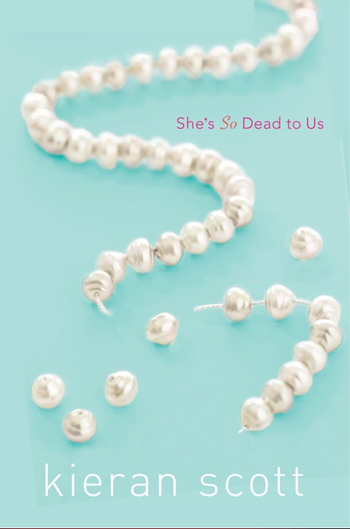
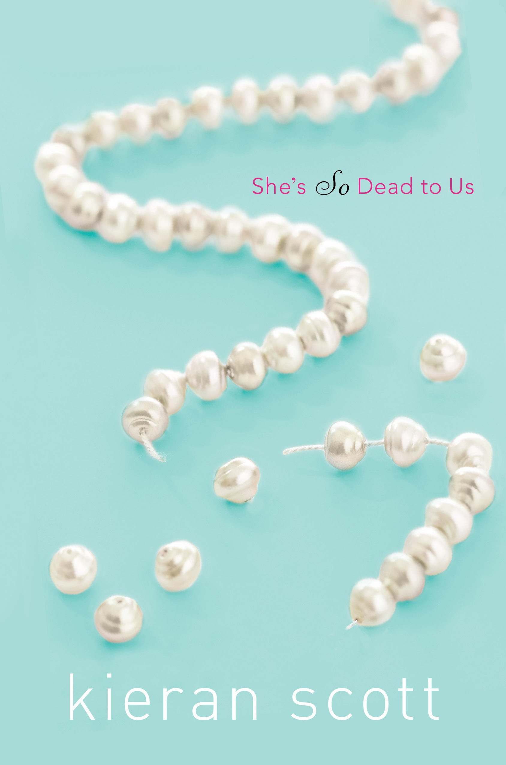 "The first cover I saw had a different font (above, see two earlier versions), but in essence the design remained the same from there on out. When I saw the final version I flipped over the embossed, raised pearls. The whole thing just feels so elegant to me, and you don't find a whole lot of elegant on the YA shelves. Some, but not a lot.
"The CODA to all this is that the cover is going to change for the paperback version. It's going to more editorial. I haven't seen the mock-up yet, but once I do, I'll let you know what I think!"
Thanks, Kieran! I agree... elegant. And the subtle tweaking of fonts and pearl placements really does make the final cover seem like a more polished version. Can't wait to see the sequel, He's So Not Worth It (another great title)!
What do you guys think?
"The first cover I saw had a different font (above, see two earlier versions), but in essence the design remained the same from there on out. When I saw the final version I flipped over the embossed, raised pearls. The whole thing just feels so elegant to me, and you don't find a whole lot of elegant on the YA shelves. Some, but not a lot.
"The CODA to all this is that the cover is going to change for the paperback version. It's going to more editorial. I haven't seen the mock-up yet, but once I do, I'll let you know what I think!"
Thanks, Kieran! I agree... elegant. And the subtle tweaking of fonts and pearl placements really does make the final cover seem like a more polished version. Can't wait to see the sequel, He's So Not Worth It (another great title)!
What do you guys think?
she's so dead to us