 Nana Ekua Brew-Hammond's debut novel, Powder Necklace, follows London teenager Lila as she's sent to school in her native Ghana, then yanked back to London, and finally shipped off to New York -- all at her parents' whims. It's a book about dislocation and discovery, and Publishers Weekly says, "the beauty of the prose and the resilience of the heroine make this a winning debut." Plus, the book is gorgeous.Here's Nana to tell the story behind the cover:
"For the cover, I envisioned a tin of powder laying on either a blank space or girl's dresser with powder spilling from it -- Ghana has these cool-looking vintage-esque tins of powder that I remember marveling at when I was in school there. I was also thinking a photographic treatment would be cool, in particular, a more literal representation of the title featuring a close-up of a girl's neck dusted with powder.
Nana Ekua Brew-Hammond's debut novel, Powder Necklace, follows London teenager Lila as she's sent to school in her native Ghana, then yanked back to London, and finally shipped off to New York -- all at her parents' whims. It's a book about dislocation and discovery, and Publishers Weekly says, "the beauty of the prose and the resilience of the heroine make this a winning debut." Plus, the book is gorgeous.Here's Nana to tell the story behind the cover:
"For the cover, I envisioned a tin of powder laying on either a blank space or girl's dresser with powder spilling from it -- Ghana has these cool-looking vintage-esque tins of powder that I remember marveling at when I was in school there. I was also thinking a photographic treatment would be cool, in particular, a more literal representation of the title featuring a close-up of a girl's neck dusted with powder.
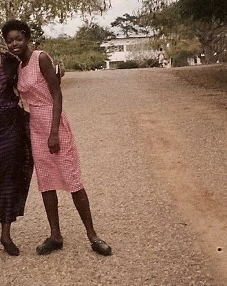 "My editor asked me what I was thinking in terms of the cover so I shared my ideas, which she was really into. I couldn't get her a good reference picture of the powder tin in time, but I did send her some images from my days in boarding school as a reference (that's Nana, right).
"I had a bit of anxiety when I got my cover. Seeing it made it real, and I had to ask myself if I could live with this image -- the cover of my first born book! -- FOREVA. The fashion girl in me wondered if I should go more 'editorial' with the cover, i.e. the powder tin, while the Poli Sci & Africana Studies major in me wanted to ensure the image was responsibly portraying Africa. I also recognized I'm a newbie and that the publisher had a far better reference than I did of what would sell on a shelf. I started googling the covers of my favorite authors to get a sense of what was out there and I decided I wanted the cover to clearly and elegantly communicate what the story was about -- and it did!
"My editor asked me what I was thinking in terms of the cover so I shared my ideas, which she was really into. I couldn't get her a good reference picture of the powder tin in time, but I did send her some images from my days in boarding school as a reference (that's Nana, right).
"I had a bit of anxiety when I got my cover. Seeing it made it real, and I had to ask myself if I could live with this image -- the cover of my first born book! -- FOREVA. The fashion girl in me wondered if I should go more 'editorial' with the cover, i.e. the powder tin, while the Poli Sci & Africana Studies major in me wanted to ensure the image was responsibly portraying Africa. I also recognized I'm a newbie and that the publisher had a far better reference than I did of what would sell on a shelf. I started googling the covers of my favorite authors to get a sense of what was out there and I decided I wanted the cover to clearly and elegantly communicate what the story was about -- and it did!
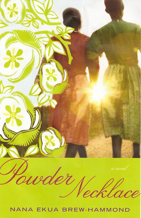 "I LOVE-love-LOVED the photograph. I don't know where they found it, but it was a spot-on evocation of the school in the book, the bonds the character makes with her schoolmates, and the journey she embarks on. I loved the little details too! The sun piercing through, strategically covering their holding hands; the red dirt on the ground; and the uniforms they were wearing. The uniform colors corresponded to the houses the girls lived in in the book. Again, I don't know where they found the shot or who took it, but I want to kiss him/her! I wanted to pump up the photograph and details, so the lime green and initial illustration did not work for me.
"I suggested we go with a flower that grew in the area and sent her some images I googled. I also wanted to go with red instead of green since the main character's house color was red. The color change and flower choice made a big difference to me. When she messengered over the final image I was like 'holla!' I would so buy this book."
Thanks, Nana! Agreed. This cover is gorgeous, and I love the photograph, the lighting and the flowers. For the record, I also liked the original illustrated treatment, but I think the colors on the final are stunning.
What do you guys think?
"I LOVE-love-LOVED the photograph. I don't know where they found it, but it was a spot-on evocation of the school in the book, the bonds the character makes with her schoolmates, and the journey she embarks on. I loved the little details too! The sun piercing through, strategically covering their holding hands; the red dirt on the ground; and the uniforms they were wearing. The uniform colors corresponded to the houses the girls lived in in the book. Again, I don't know where they found the shot or who took it, but I want to kiss him/her! I wanted to pump up the photograph and details, so the lime green and initial illustration did not work for me.
"I suggested we go with a flower that grew in the area and sent her some images I googled. I also wanted to go with red instead of green since the main character's house color was red. The color change and flower choice made a big difference to me. When she messengered over the final image I was like 'holla!' I would so buy this book."
Thanks, Nana! Agreed. This cover is gorgeous, and I love the photograph, the lighting and the flowers. For the record, I also liked the original illustrated treatment, but I think the colors on the final are stunning.
What do you guys think?
nana ekua brew-hammond