Michelle Zink got a redesign! Her Prophecy of the Sisters has a new cover for its paperback incarnation, and Guradian of the Gate, its sequel, follows that design. So how does Michelle feel about the changes?Read on:
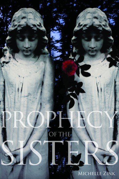 "I'm always so focused on channeling the story that the cover doesn't occur to me until well after the book is complete. Prophecy of the Sisters was my first published book, and I was so focused on writing something worthy of publication that I never dared to DREAM about the possibility of a cover! With Guardian of the Gate, I originally envisioned another graveyard statue (because that's what was on the cover of the Prophecy hardcover, left). Once I heard that Little Brown would be rejacketing the series, I immediately imagined something very pretty that would stand out on the shelves and reflect the sensuality of the era and the books without being obviously historical.
"I've always felt strongly that everyone has a job to do in bringing a book to the shelves of a bookstore. I rarely second-guess my agent's advice (because I trust him implicitly and he's never steered me wrong), and I try not to question the advice and expertise of my editor, the Marketing department, my publicist, etc. It's not that I can't think for myself, it's that the skills necessary to write a great story are so different form the skills of an editor, a publicist, a cover designer. Maybe because of this, it never occurred to me that I might be included in the cover design, and when the talented Alison Impey designed the first Prophecy cover, I saw immediately why she'd created it! Once I was told the series was getting new covers, my editor sought my ideas and suggestions for the new look, and we had some really great back-and-forth about our ideas for the new look. We were totally on the same page, which was awesome!
"I had mixed feelings about the first cover, not because I didn't love it. I TOTALLY loved it. I knew how unique and striking it was and how different from anything else in the YA market. But I wasn't entirely positive it would be warm enough for the average teen reader. Bloggers are savvy when it comes to covers and adults tend to see covers very differently from teens, but the average teenage girl (I have a teenage daughter and am surrounded by teenagers so I see firsthand how they choose books) who just walks into a bookstore looking for something to read is often drawn to things they can identify with and/or things that are beautiful and sensual.
"The original Prophecy cover had done its job bringing in a tremendously loyal following among readers of dark fantasy, but as time passed, we noticed a growing trend of young people saying things like, 'I didn't know if this would be my kind of book, but I ended up loving it!' The book was often called 'addicting' by these same teens, and we started to wonder if we could expand that audience with a different look. All of that led to the new covers, which I loved on sight! I immediately believed they were going to do great things in the way of extending the readership of the series.
"I did give feedback on all my covers, but my feedback was sought earlier and given more weight with the new covers. From what I've heard, this is completely normal! Debut authors are rarely given heavy consideration in the design of their covers which makes perfect sense. I'm a writer, not a designer!
"With the redesign, the art department really, really did take my suggestions to heart! I was able to give feedback on the proposed photographer (by looking at samples of her work) and the models (by looking at their casting photos) before they were hired. My editor and I spent at least an hour one night just brainstorming ideas for giving the new covers the right blend of drama, intensity, sensuality, and semi-era neutrality that I thought would be so important in a new look. I'm so grateful for the opportunity to play such an active role!
"The final covers for the Prophecy paperback and Guardian of the Gate didn't change much at all. The brainstorming we did ahead of the shoot really paid off, and I think we started out all on the same page. Plus, with a gifted designer like Allison, a talented photographer, and such gorgeous models, the covers didn't need much!
"The new covers were shot with models (twins, in fact!) that were chosen after Little Brown held a casting call for the cover shoot. Originally, they thought they might need to choose non-twins to allow for some differentiation on the cover (even though the book is about twins, we didn't want them to be totally identical on the cover), but in the end, the stunning twins you see now ended up being too perfect to pass up! I think I gasped aloud when I saw them! [Here's the full jacket for the new paperback]:
"I'm always so focused on channeling the story that the cover doesn't occur to me until well after the book is complete. Prophecy of the Sisters was my first published book, and I was so focused on writing something worthy of publication that I never dared to DREAM about the possibility of a cover! With Guardian of the Gate, I originally envisioned another graveyard statue (because that's what was on the cover of the Prophecy hardcover, left). Once I heard that Little Brown would be rejacketing the series, I immediately imagined something very pretty that would stand out on the shelves and reflect the sensuality of the era and the books without being obviously historical.
"I've always felt strongly that everyone has a job to do in bringing a book to the shelves of a bookstore. I rarely second-guess my agent's advice (because I trust him implicitly and he's never steered me wrong), and I try not to question the advice and expertise of my editor, the Marketing department, my publicist, etc. It's not that I can't think for myself, it's that the skills necessary to write a great story are so different form the skills of an editor, a publicist, a cover designer. Maybe because of this, it never occurred to me that I might be included in the cover design, and when the talented Alison Impey designed the first Prophecy cover, I saw immediately why she'd created it! Once I was told the series was getting new covers, my editor sought my ideas and suggestions for the new look, and we had some really great back-and-forth about our ideas for the new look. We were totally on the same page, which was awesome!
"I had mixed feelings about the first cover, not because I didn't love it. I TOTALLY loved it. I knew how unique and striking it was and how different from anything else in the YA market. But I wasn't entirely positive it would be warm enough for the average teen reader. Bloggers are savvy when it comes to covers and adults tend to see covers very differently from teens, but the average teenage girl (I have a teenage daughter and am surrounded by teenagers so I see firsthand how they choose books) who just walks into a bookstore looking for something to read is often drawn to things they can identify with and/or things that are beautiful and sensual.
"The original Prophecy cover had done its job bringing in a tremendously loyal following among readers of dark fantasy, but as time passed, we noticed a growing trend of young people saying things like, 'I didn't know if this would be my kind of book, but I ended up loving it!' The book was often called 'addicting' by these same teens, and we started to wonder if we could expand that audience with a different look. All of that led to the new covers, which I loved on sight! I immediately believed they were going to do great things in the way of extending the readership of the series.
"I did give feedback on all my covers, but my feedback was sought earlier and given more weight with the new covers. From what I've heard, this is completely normal! Debut authors are rarely given heavy consideration in the design of their covers which makes perfect sense. I'm a writer, not a designer!
"With the redesign, the art department really, really did take my suggestions to heart! I was able to give feedback on the proposed photographer (by looking at samples of her work) and the models (by looking at their casting photos) before they were hired. My editor and I spent at least an hour one night just brainstorming ideas for giving the new covers the right blend of drama, intensity, sensuality, and semi-era neutrality that I thought would be so important in a new look. I'm so grateful for the opportunity to play such an active role!
"The final covers for the Prophecy paperback and Guardian of the Gate didn't change much at all. The brainstorming we did ahead of the shoot really paid off, and I think we started out all on the same page. Plus, with a gifted designer like Allison, a talented photographer, and such gorgeous models, the covers didn't need much!
"The new covers were shot with models (twins, in fact!) that were chosen after Little Brown held a casting call for the cover shoot. Originally, they thought they might need to choose non-twins to allow for some differentiation on the cover (even though the book is about twins, we didn't want them to be totally identical on the cover), but in the end, the stunning twins you see now ended up being too perfect to pass up! I think I gasped aloud when I saw them! [Here's the full jacket for the new paperback]:
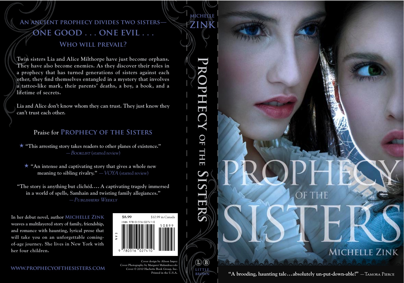 "I ADORE my new covers! I had the kind of immediate, knee-jerk, 'Oh, my God, these are unbelievably gorgeous!' reaction that I hope will be mimicked by teen girls in bookstores.
 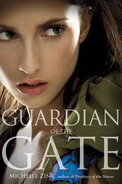 I know it's sometimes hard for existing readers to get their heads around a cover change, but the new covers are going to open the series up to a whole new audience. Not only are the girls on the cover beautiful, with the kind of classic bone structure that I always pictured Lia and Alice as having, but they both have an intensity in their eyes that really speaks to the book. It's hard to capture that in a photograph, I think, but it is really done well here.
"I love how the lighting on the Prophecy cover is cool and blue. It reflects the feel of the first Prophecy cover in a fresh new way, and I love the expression on the girl's face on the Guardian of the Gate cover. It almost looks like she's getting ready to flee something, which is very, very fitting for Guardian. One of my favorite things about them is the texture visible in the small glimpses of clothing on both covers. It brings a subtle sensuality to the image that lends itself well to the story's era without being cliched or overtly historical. I confess that I sometime can't help taking another look at them!"
Thanks, Michelle! I have to admit I love the darkness of the original hardcover, but I get the marketing concerns about what readers will gravitate to in a bookstore, and the new covers are definitely way pretty.
What do you guys think?
I know it's sometimes hard for existing readers to get their heads around a cover change, but the new covers are going to open the series up to a whole new audience. Not only are the girls on the cover beautiful, with the kind of classic bone structure that I always pictured Lia and Alice as having, but they both have an intensity in their eyes that really speaks to the book. It's hard to capture that in a photograph, I think, but it is really done well here.
"I love how the lighting on the Prophecy cover is cool and blue. It reflects the feel of the first Prophecy cover in a fresh new way, and I love the expression on the girl's face on the Guardian of the Gate cover. It almost looks like she's getting ready to flee something, which is very, very fitting for Guardian. One of my favorite things about them is the texture visible in the small glimpses of clothing on both covers. It brings a subtle sensuality to the image that lends itself well to the story's era without being cliched or overtly historical. I confess that I sometime can't help taking another look at them!"
Thanks, Michelle! I have to admit I love the darkness of the original hardcover, but I get the marketing concerns about what readers will gravitate to in a bookstore, and the new covers are definitely way pretty.
What do you guys think?
michelle zink