 I love a bright red cover. Sleek and striking, Kirsten Miller's new release, The Eternal Ones, caught my eye instantly. Here she is to tell the tale:"I had an idea for the cover: I thought of two hands reaching for each other across the cover. The female hand was flesh and blood, while the masculine hand appeared ghostly--almost translucent. It was a rather literal nod to the plot. (The book is about reincarnation.) But I also knew going into the process that there are people who are MUCH better at this sort of thing than I am, so I wasn't going to ram my idea down anyone's gullet.
"I know I discussed the design a great deal with my editor, but I'm not sure if mentioned 'my cover' or not. He had some pretty cool ideas of his own that I thought would be interesting to pursue.
I love a bright red cover. Sleek and striking, Kirsten Miller's new release, The Eternal Ones, caught my eye instantly. Here she is to tell the tale:"I had an idea for the cover: I thought of two hands reaching for each other across the cover. The female hand was flesh and blood, while the masculine hand appeared ghostly--almost translucent. It was a rather literal nod to the plot. (The book is about reincarnation.) But I also knew going into the process that there are people who are MUCH better at this sort of thing than I am, so I wasn't going to ram my idea down anyone's gullet.
"I know I discussed the design a great deal with my editor, but I'm not sure if mentioned 'my cover' or not. He had some pretty cool ideas of his own that I thought would be interesting to pursue.
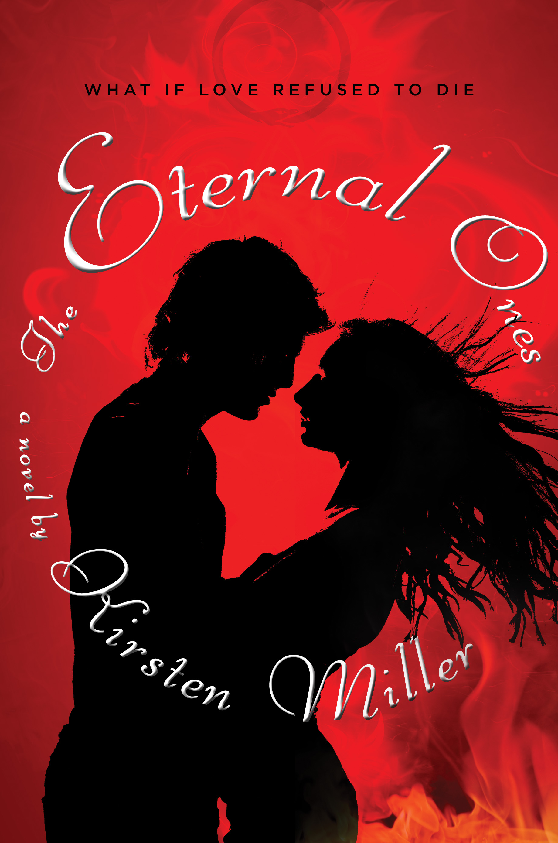 "The cover went through at least five phases which bore no resemblance to each other. There was the action cover, the bodice-ripping cover (which graced the original ARC, right), the spiritual cover, the lost in space cover, and the final cover.
"I recently found out that they had something close to the final cover all along! But I'm happy they explored so many options. This way we all know we ended up in the right place.
"I saw the final cover for the first time on my blackberry. As tiny as it appeared on the screen, I knew it was perfect the moment I opened the attachment. It's sleek, beautiful, and a little bit sinister. Exactly the combination I wanted.
"A lot of authors don't get a chance to put in their two cents, but I did. If my comments were good, they were taken to heart. If they weren't so great, they were often ignored. (Which is just as it should be.) The secret is making only the suggestions that truly need to be made and not overwhelming the designers with minutiae. These people are artists and professionals, too. You have to let them do their job. (And while you wait to see the results, I recommend lots of prayer. Ha.)
"I knew that I did not have the final say. But I was in good hands, so I was confident that we'd eventually land on something I loved. (One of the reasons I was so happy to go with Razorbill in the first place was the quality of their covers.)
"I believe the silver ouroboros (snake swallowing it's tail) on the cover was created by a designer at Penguin. It was a real challenge to create an image that was both sinister and beautiful.
"I love it. When you take it out into the sunshine it sparkles quite alluringly. And it certainly stands out in the bookstore. (Particularly since most books seem to be dark and gothic these days.) Having an iconic image to work with doesn't hurt, either. It lends itself to all sorts of stuff--tattoos, rings, etc. So in the end, I really couldn't be more pleased.
"In The Eternal Ones, the ouroboros is the logo of the Ouroboros Society, a mysterious private club in Manhattan whose members all believe they've led multiple lives. The snake swallowing its own tail has long been a symbol of eternity, so it works perfectly with the story.
"The final cover looks so much prettier in person!"
Hear that? I think we all need to pick it up. It's #9 on the NY Times Bestseller list this week, so I think a lot of people are following that advice. Awesome!
What do you guys think of this cover?
PS-Kirsten also has a spectacular blog where you can submit a photo and have a past life revealed. She did one for me and I swoon whenever I read it. Gorgeous.
"The cover went through at least five phases which bore no resemblance to each other. There was the action cover, the bodice-ripping cover (which graced the original ARC, right), the spiritual cover, the lost in space cover, and the final cover.
"I recently found out that they had something close to the final cover all along! But I'm happy they explored so many options. This way we all know we ended up in the right place.
"I saw the final cover for the first time on my blackberry. As tiny as it appeared on the screen, I knew it was perfect the moment I opened the attachment. It's sleek, beautiful, and a little bit sinister. Exactly the combination I wanted.
"A lot of authors don't get a chance to put in their two cents, but I did. If my comments were good, they were taken to heart. If they weren't so great, they were often ignored. (Which is just as it should be.) The secret is making only the suggestions that truly need to be made and not overwhelming the designers with minutiae. These people are artists and professionals, too. You have to let them do their job. (And while you wait to see the results, I recommend lots of prayer. Ha.)
"I knew that I did not have the final say. But I was in good hands, so I was confident that we'd eventually land on something I loved. (One of the reasons I was so happy to go with Razorbill in the first place was the quality of their covers.)
"I believe the silver ouroboros (snake swallowing it's tail) on the cover was created by a designer at Penguin. It was a real challenge to create an image that was both sinister and beautiful.
"I love it. When you take it out into the sunshine it sparkles quite alluringly. And it certainly stands out in the bookstore. (Particularly since most books seem to be dark and gothic these days.) Having an iconic image to work with doesn't hurt, either. It lends itself to all sorts of stuff--tattoos, rings, etc. So in the end, I really couldn't be more pleased.
"In The Eternal Ones, the ouroboros is the logo of the Ouroboros Society, a mysterious private club in Manhattan whose members all believe they've led multiple lives. The snake swallowing its own tail has long been a symbol of eternity, so it works perfectly with the story.
"The final cover looks so much prettier in person!"
Hear that? I think we all need to pick it up. It's #9 on the NY Times Bestseller list this week, so I think a lot of people are following that advice. Awesome!
What do you guys think of this cover?
PS-Kirsten also has a spectacular blog where you can submit a photo and have a past life revealed. She did one for me and I swoon whenever I read it. Gorgeous.
kirsten miller