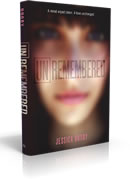
 Jessica Brody has been here before to talk about the covers for her previous novels (The Karma Club, My Life Undecided and 52 Reasons to Hate My Father -- click to read). This time, she made a video to discuss her latest book, Unremembered. Take a gander (you get to see the UK cover and some font adjustments!) and then download the first five chapters of the book for free!
jessica brody
Cover Stories: 52 Reasons to Hate My Father
 Jessica Brody has shared two previous Cover Stories here (for My Life Undecided and The Karma Club). She's back for a GCC tour, telling the tale behind the cover of 52 Reasons to Hate My Father.
"I’m terrible at envisioning covers. So no, I didn’t really have an idea in mind. But I knew I wanted it to show the contrast of my main character’s two worlds (spoiled heiress and working girl) which I think they ended up doing really well!
Jessica Brody has shared two previous Cover Stories here (for My Life Undecided and The Karma Club). She's back for a GCC tour, telling the tale behind the cover of 52 Reasons to Hate My Father.
"I’m terrible at envisioning covers. So no, I didn’t really have an idea in mind. But I knew I wanted it to show the contrast of my main character’s two worlds (spoiled heiress and working girl) which I think they ended up doing really well!
"Honestly, I was surprised when I saw the cover. It was SO different from the light, pastel, girly looks of my other YA book and my publisher had told me they were going to keep with the same look. So when I opened this, I almost thought that they sent me the wrong cover! It was all edgy and kind of punk rock-ish. I wasn’t quite sure how I felt about it. It took me a few days to really come around to it. My publisher explained that they’d decided to change directions with this book. And go with an edgier look (because the book is a bit older and edgier than my other titles). But once I got over the shock of how different it was, I could finally see how awesome it was! And I’ve loved it ever since!
"It really didn’t change at all. They added a few more 'paparazzi flashes' in the background and the Meg Cabot blurb that we got (SQUEEE!) and that was about it! I guess they felt they got it right the first time!
"Apparently they used a model to shoot a photo for a first version of a cover concept that I never saw. I did get to choose the model, though! My editor sent me photos of about five different girls and asked which one I thought looked the most like Lexi. I was told the original concept was something about a girl in a maid’s uniform, holding a mop, but wearing all sorts of shiny, blingy jewelry.
"But then I guess the marketing and sales department didn’t end up liking the way it came out so they scrapped it and went with this concept instead. Which is really just the reverse of the original concept. In the original, it was Lexi in a work uniform, with heiress accessories. In this version, it’s Lexi in heiress clothes, with work accessories. I can see how this version might play better on the page.
"With the current cover, they didn’t have time to do another photo shoot so they used a stock photo instead. But what’s funny about the whole thing is I actually think this girl (the stock photo) looks more like Lexi than the model I chose! So I guess that worked out!
"When they sent me the cover, I noticed that the girl in the picture was wearing a donut shop hat. I found this odd because in the book, my character never works at a donut shop (she works just about everywhere else though!) But my editor explained that they wanted the heiress to be wearing a hat that distinctly contrasted the 'heiress' look and represented her new working status. They felt that the donut shop worked the best. I agreed so I went into the manuscript (which was still being revised), deleted one of the other jobs and replaced it with a donut shop job. It was a job that only had a few sentences of description so it was easy to replace but I actually ended up liking the donut shop job better than the original."
Thanks, Jessica! I have to admit that I had 100 questions upon first glancing at this cover, so I love hearing the explanations. And I think it's so great that the book reflects the donut job, because as a reader, I really want to see the cover image reflected inside.
What do you guys think of the cover?
PS-Jessica always has amazing trailers. This one? No exception:
Cover Stories: My Life Undecided
 Jessica Brody, who's on tour with the Girlfriend Cyber Circuit this week, is here to talk about the cover for her new release My Life Undecided! The book is about 15-year-old Brooklyn, who starts a blog to enlist readers to make all her decisions for her: Should she join the debate team? Try out for rugby? She lets readers decide. But soon she finds out that some things in life you just can't choose -- like who you fall in love with.
How fun does this book sound? Here's Jessica:
"I’m pretty bad at visualizing things. I know what I like when I see it but coming up with it myself is often hard for me. However, I did have an idea of doing some kind of cover that represented choice, since that’s the theme of the book. And I envisioned some kind of split cover with two different images to represent the main character’s battle with choices. But I think the current cover does a good job of representing the theme. She’s clearly indecisive!
"The cover for this book was a bit of an emotional roller coaster for me. We had a very early original cover that was similar to this one (that I loved!) but it quickly came to our attention that it was VERY much like another book that was already on the market. So it had to be changed.

"Then we had a second cover that I didn’t really like much. I told my editor that and she was thankfully able to get it changed. But it was complicated because at the same time, they were redesigning the cover for the paperback of The Karma Club [read the story behind the hardcover] so that it would match the look and feel of My Life Undecided. It was getting a little crazy with all the back and forth and we were running out of time. Finally, they came up with this one and the current paperback for The Karma Club (right) and I loved it. It was exactly what I was hoping for. Simple and clean yet at the same time fun and colorful. Phew!
"The girl on the cover is a stock photo. But I really think they did a good job choosing one that captures the feeling of the book. This girl looks fun, cute and a bit quirky, which is exactly how I’d describe Brooklyn Pierce."
Thanks, Jessica! I think the final cover has great colors. It reminds me a little of Elizabeth Scott's Something, Maybe (which has a fabulous Cover Story), I think because of the hat and the soft lighting.
What do you guys think?
PS-Watch the amazing trailer for the book:
Cover Stories: The Karma Club by Jessica Brody
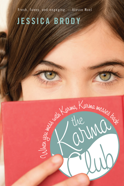 Jessica Brody runs Free-Book Friday, of which I am (naturally) a fan! Her debut YA novel, The Karma Club, came out this week, and I invited her over for a little cover talk as a stop on her Girlfriends Cyber Circuit tour.
Here's Jessica:
Jessica Brody runs Free-Book Friday, of which I am (naturally) a fan! Her debut YA novel, The Karma Club, came out this week, and I invited her over for a little cover talk as a stop on her Girlfriends Cyber Circuit tour.
Here's Jessica:
"When I first saw the cover: Oh my God, I fell in love with it...instantly! They actually showed me two different ones and my editor told me beforehand that this one was her favorite of the two and I couldn't have agreed more! I am pretty bad at envisioning covers so I really didn't know what to expect. I just wanted something fun and colorful because I think that represents the book and that's exactly what I got! It's my favorite cover thus far!
"The only suggestion I made was that they separate the "R" and "M" in Karma because when blended together, I was worried it would look too much like The Karina Club. They agreed and it was quickly changed. "This was actually a stock photo from Getty Images! My editor later told me that they did do a photoshoot with a model but she didn't think it came out right so they set off to look for a stock photo instead. I never actually saw the original cover, although I am very curious!"
So am I! I have seen this photo because it's a favorite avatar of book maven Little Willow! I adore the image, and I also like the idea of karma messing back with someone. What do you guys think?
Oh, and here's the trailer for the book, so you'll know more about it!