I've raved about both of the Beth Kephart books I've read (Undercover and House of Dance--click to see the raves!), and I've also recommended Beth's gorgeous blog a few times (and she's vlogging now--yay!). It's truly worth a peek. As is the tale of two covers she shares, here:
"When I was nine years old, I taught myself to skate on a frozen Boston pond. I wore a couple of sweaters and an overgrown coat, nondescript pants, and thick socks, but when I went out onto that ice, I floated, I dazzled, I pleasantly surprised--at least in my own mind I did.
"When began to write UNDERCOVER, which is very loosely based on some chapters of my adolescence, I conceived of my heroine as a no-nonsense, tough-on-the-outside type (the wardrobe from nowhere, the hair that misbehaves, the grown-up vocabulary that is oddly bereft of any fashion terms) who harbors a sensitive soul within. Elisa's beauty would be all about those things no one could readily see; to appreciate Elisa, you'd actually have to get to know her.
 "I called this book GET BACK TO ME, in reference to the letters Elisa keeps writing to her absent father. But that title didn't finally suit book buyers, and a conversation then ensued with the HarperTeen team: 'What should we name this book? In what wardrobe should we dress it?'
SWEET THAT VOICE ROARING (shown left) was the first approach that was suggested to me; I got an email, and there it was. I understood the sales value of the image at once--this glamorous girl on the ice, that Beillmann spin. But the thing was, Elisa didn't own a single thread of glamour, and as a self-taught skater she didn't have a Beillmann in her repertoire (indeed, very few skaters anywhere can pull off a Beillmann). Would the uber-poetic title attract or detract? I had my doubts. I showed the cover to my son. He said: 'Cute girl, Mom, but I thought you were writing a book that was more about who you were.'
"I called this book GET BACK TO ME, in reference to the letters Elisa keeps writing to her absent father. But that title didn't finally suit book buyers, and a conversation then ensued with the HarperTeen team: 'What should we name this book? In what wardrobe should we dress it?'
SWEET THAT VOICE ROARING (shown left) was the first approach that was suggested to me; I got an email, and there it was. I understood the sales value of the image at once--this glamorous girl on the ice, that Beillmann spin. But the thing was, Elisa didn't own a single thread of glamour, and as a self-taught skater she didn't have a Beillmann in her repertoire (indeed, very few skaters anywhere can pull off a Beillmann). Would the uber-poetic title attract or detract? I had my doubts. I showed the cover to my son. He said: 'Cute girl, Mom, but I thought you were writing a book that was more about who you were.'
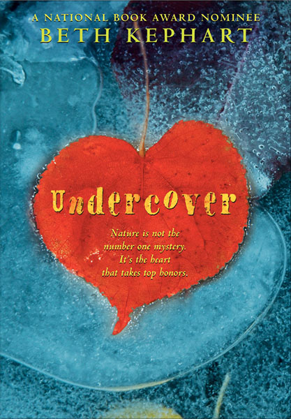 "The wonder of Laura Geringer and Jill Santopolo at HarperTeen is how generously they listened to my concerns. They wanted me, they said, to be happy, even as the fate of a book is now so heavily bound up in what the buyers of chains collectively think. The pretty layback girl was marketable. But perhaps there was another option. We looked at other skating images. We looked at photographs of the ice. We considered more truly typographic treatments. Laura even took the step of hiring a freelance designer, Chad Beckerman, who had worked with her before. Finally, a few days before Thanksgiving, Laura Geringer sent the cover, Chad's cover, that became the cover of my first novel for young adults (above).
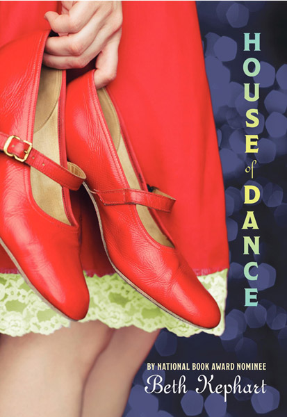 "It was abstract and glorious and color saturated. It was something you couldn't take in with a quick glimpse. It suggested depth and fractures beneath a surface, and I loved everything about it. The look that the team created for UNDERCOVER became a franchise look for the books I've gone on to write since then. HOUSE OF DANCE (left), for example, is richly red and evocative, no hard lines. NOTHING BUT GHOSTS, due out next spring, will be graced by a cover (I understand) that is all hue and tone lit up by sun.
"Covers matter enormously to authors, but we don't always have control. I've always been grateful to the team at HarperTeen for going countless extra miles on behalf of my more dreamy-than-plotty books."
Thank you, Beth. I am in love with more-dreams-less-plot, I have to say. And I do wish we could peek at the cover for NOTHING BUT GHOSTS--share it when you can!
So what do you guys think: Do you like the first skating cover or the heart-shaped leaf? I'm a fan of the latter, personally. And I adore House of Dance's cover too--makes me want to get some bright red heels.