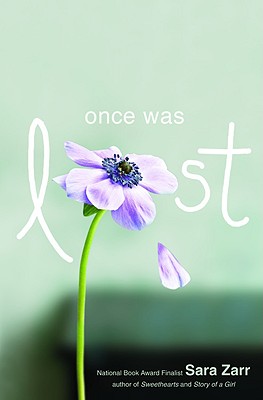
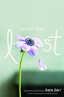
 The very cool Sara Zarr is here to talk about the cover of her latest book, Once Was Lost, and I couldn't be more excited to read it. In case you can't tell by these stories, I'm sort of a judger-of-books-by-their-covers, but I try to fight it... here, it works, because this cover is beyond gorgeous.And here's Sara:
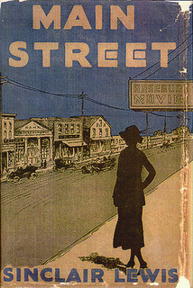 "Once Was Lost is set in this very small, rural town, and there was a point during the writing process when I was reading Sinclair Lewis' MAIN STREET and found this cover I loved (left).
"I became somewhat obsessed with it and imagined a similar cover--the silhouette of the main character, Sam, looking at a small town main street, kind of separate from it, and observing. I send this picture to the designer, Alison Impey, not to try to tell her what to do but just throw some inspiration out there. Other than that, I really had no clue what would work or what to expect. I'm definitely a word person and not a design person.
"Obviously there is nothing of the Sinclair Lewis cover in the final cover for Once Was Lost. I think they tried that direction but decided the end results didn't look YA enough. My publisher sent me the two concepts they'd narrowed it to:
"Once Was Lost is set in this very small, rural town, and there was a point during the writing process when I was reading Sinclair Lewis' MAIN STREET and found this cover I loved (left).
"I became somewhat obsessed with it and imagined a similar cover--the silhouette of the main character, Sam, looking at a small town main street, kind of separate from it, and observing. I send this picture to the designer, Alison Impey, not to try to tell her what to do but just throw some inspiration out there. Other than that, I really had no clue what would work or what to expect. I'm definitely a word person and not a design person.
"Obviously there is nothing of the Sinclair Lewis cover in the final cover for Once Was Lost. I think they tried that direction but decided the end results didn't look YA enough. My publisher sent me the two concepts they'd narrowed it to:
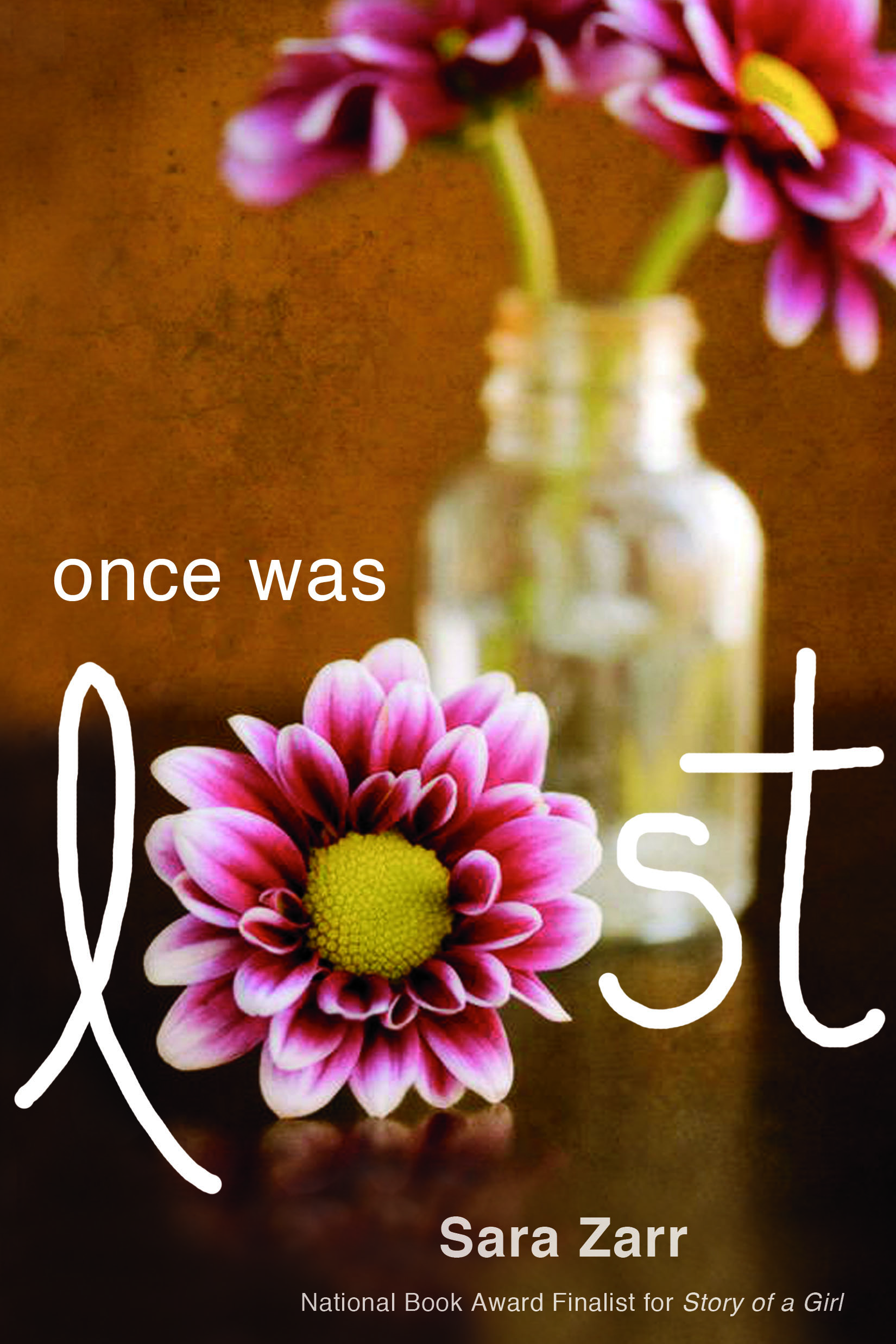
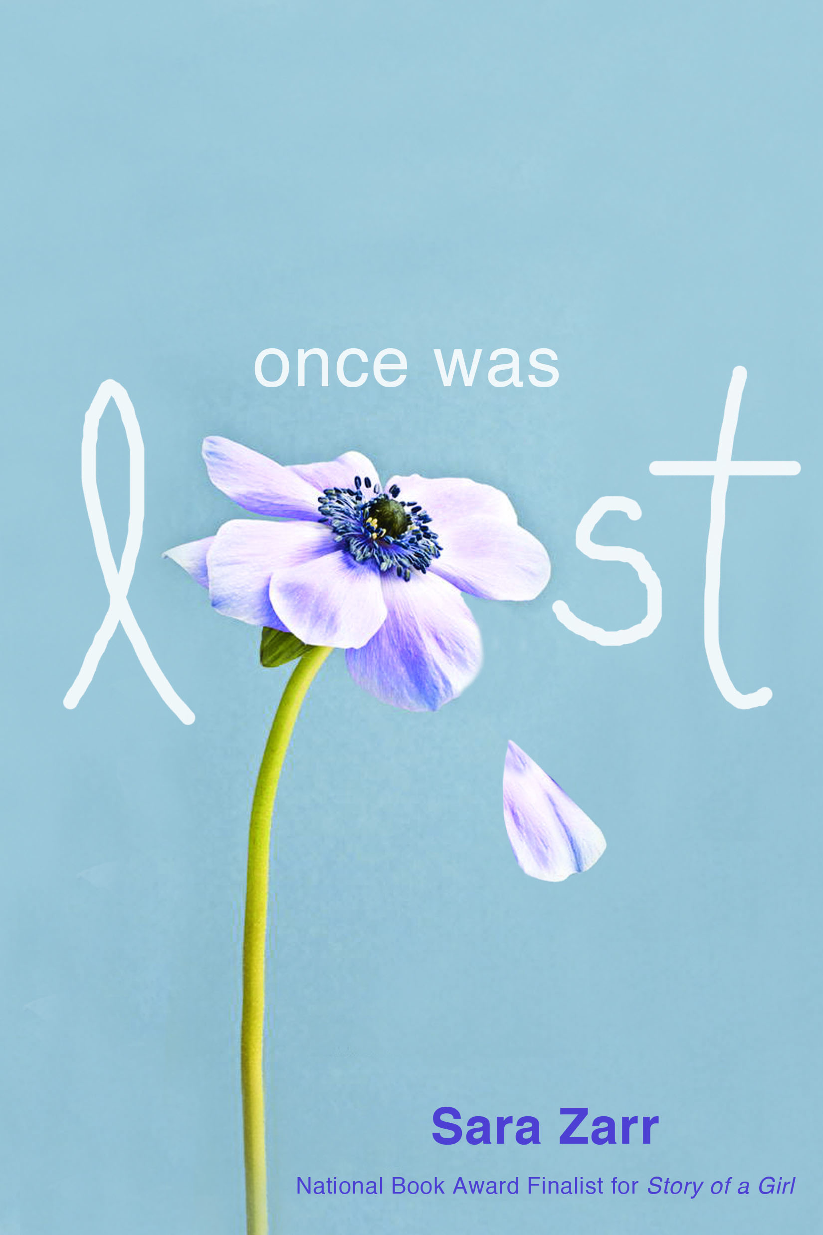 "My initial reaction to the one with the vase was that I didn't like it at all, at least for the story. It was a little too pretty, maybe? And didn't hint at the content in any meaningful way, I thought. I loved the second one, with the flower and the very stark background. My only comment at this part of the process other than that was that my most enthusiastic fan mail came from readers who loved Sweethearts, and I felt we needed to have the Sweethearts title on the cover, not just Story of a Girl.
"When I saw the final version (right), they had kind of blended the image of the single flower with the more layered, gauzy look of the vase photo, and tweaked the color scheme. At first, I was all about keeping the starkness and eliminating the soft focus, but everyone at Little, Brown overwhelmingly liked the one with more depth. And, they are professionals, so I trusted them!
"I love it. When you see the whole thing put together, in hard cover, in your hand, it's so much more powerful than just seeing an image on the screen. The background is matte and the title and flower are glossy. They were so right about the depth of the photo, because even that fuzzy table in the background tells you there is a home here, a family.
"And, the book is so much about decay and brokenness, and also unexpected life, so the flower with the dropping petal is perfect. I also like that it's consistent with the Sweethearts cover in a way--a central image that is of a pleasant thing (a cookie! a flower!) but there's something off and missing. That works for my books! Also I love the color palette and what Alison did with the back, spine, and inside flaps. You'll just have to go get a copy to see what I'm talking about!"
I need a copy right now! I love this cover unabashedly and I think the combination of the photos is just right. What about you guys?
"My initial reaction to the one with the vase was that I didn't like it at all, at least for the story. It was a little too pretty, maybe? And didn't hint at the content in any meaningful way, I thought. I loved the second one, with the flower and the very stark background. My only comment at this part of the process other than that was that my most enthusiastic fan mail came from readers who loved Sweethearts, and I felt we needed to have the Sweethearts title on the cover, not just Story of a Girl.
"When I saw the final version (right), they had kind of blended the image of the single flower with the more layered, gauzy look of the vase photo, and tweaked the color scheme. At first, I was all about keeping the starkness and eliminating the soft focus, but everyone at Little, Brown overwhelmingly liked the one with more depth. And, they are professionals, so I trusted them!
"I love it. When you see the whole thing put together, in hard cover, in your hand, it's so much more powerful than just seeing an image on the screen. The background is matte and the title and flower are glossy. They were so right about the depth of the photo, because even that fuzzy table in the background tells you there is a home here, a family.
"And, the book is so much about decay and brokenness, and also unexpected life, so the flower with the dropping petal is perfect. I also like that it's consistent with the Sweethearts cover in a way--a central image that is of a pleasant thing (a cookie! a flower!) but there's something off and missing. That works for my books! Also I love the color palette and what Alison did with the back, spine, and inside flaps. You'll just have to go get a copy to see what I'm talking about!"
I need a copy right now! I love this cover unabashedly and I think the combination of the photos is just right. What about you guys?
Shop Indie Bookstores