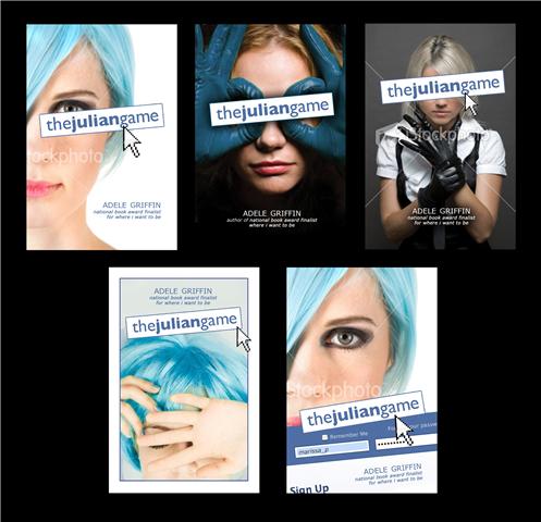
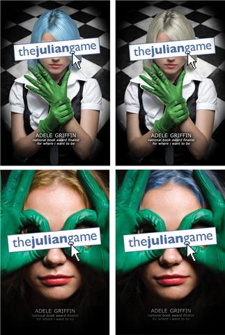
 Adele Griffin's The Julian Game was released in 2010 with a raucous cover that I always meant to share here. Much belatedly (my fault!), she's showing some early cover options for that book and a bit about the story. Also, I'm psyched that she's got another book coming out this year (All You Never Wanted, October).
Here's Adele:
"I had no cover ideas at all. For one thing, the original title of the book was MELLEN IN SPRING which gives me such big shivers of Terrible Title-ness. What was I thinking? It sounds like a strange, Little House on the Prairie story. That early draft was so different. Mellen was short for Mary Ellen, who then became Ella. And the story was more like a 'bad influence' type, with Mellen getting Raye to do awful stuff for her. So, no cover had jelled. Maybe: two girls in a red convertible? More shivers!
"My publisher went into the bat cave slash think tank, and came up with a lot of options. I loved so many of them. It was during the summer, and my family was on vacation in Fire Island, so we printed them up and put them on the kitchen table. And people would walk by and say--'I love that one! No, that one!'
"Penguin's art department is, in my mind, very 'mad genius in the lab'-- and my last cover with them was for my middle grade 'Vampire Island' series. I'd been over the moon for their choices there. All I'd said on VI was 'What do you think about making the vamps sweet but streetwise?' and they came back with pure gothy delicious. So I was prepared to be bowled over. And I was!
"I got to make suggestions for the cover, which was fun. I didn't bring much-- really all I brought were the crayons. I knew the book so well, and I owned that blue wig (Halloween costume!) So I said: how about bright blue hair and bright green the gloves on the black-and-white, dominatrix image-- that was the one I thought was the sexiest. And then the bathroom scene was a later draft chapter, so we checkered the floor, a la Fulton's bathroom.
"Then Nancy (my editor) came back and said-- but Raye never wears those gloves. So we edited a couple of scenes that motivated her to put them on once. For logic.
"We had one little back-and-forth with a cursor button. Like that arrow that shows you where your mouse is? It was on the edge of the title, as if you could click the title. I wasn't feeling it, and even though it was popular within the departments (editorial, art, marketing), they very graciously took it off. I was so appreciative; because I knew I'd always be staring at that cursor, like a paint scuff or something.
 "The cover was a stock image. I used to collect my jackets because they were almost always original art. Now it's the rare exception. But it's amazing how much emotion can be packed into covers, I love walking along the bookstore table and seeing so many visual stories.
"The book is about cyberbullying, and I've come to see the blue wig as representing a person who is more guarded, defensive and careful about her cyber-presence-- while the gloves belong to the aggressor, the manipulator."
Thanks, Adele! I love being able to see and show so many versions of this cover. The final has all the best elements: blue hair, green gloves, black-and-white checkered floor. It makes the image more 3D and has that extra pop. I'm into it. And this cover definitely is a double-taker, as in, "Whoa, what is that book?"
What do you guys think?

