 Today, Jo Knowles is here to talk about her latest novel, See You at Harry's. (Read a rave review on Stacked, and note that it just got a star from Kirkus!)
"I think I imagined [the cover as] an image of the restaurant described in the book [as I was writing]. Or the family posing for their annual Christmas card. But… nothing really concrete. I was just hoping whatever it was, I would love it.
"My publisher didn't ask for input. But I gave a few suggestions when I was arguing to keep the title, which is another whole story. :-)
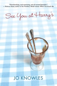
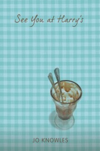
"When I first saw the cover, I felt... Relief! I thought the image was perfect. I liked that the background was blue, not pink. I liked that it wasn’t an image of a sad or lonely girl. I loved that the empty dish had two spoons, not one. I felt that the image captured the mood of the book just right, without giving too much away.
"I had some tiny comments about the font and size of the title, and they worked on those.
"But a big bookseller chain that shall remain nameless wasn’t wild about the original cover (right). My publisher tried a few other mock-ups in reaction to the feedback, but kept coming back to the original concept. So, they embellished the original and came up with what I think is even more perfect. I couldn’t be happier with how it turned out.
"It is partly from a stock photo, and I still love it. I see a lot of hidden meanings, but if I shared them, I would spoil the story."
Thanks, Jo! I cannot wait to read this one, and the cover is really excellent. I like the final better than the original--it feels more finished, somehow. But the overall concept is fantastic and I'm glad they stuck with it!
What do you guys think?
