Arthur Slade has two covers--one US and one Canadian--to share today. His new steampunk book, The Hunchback Assignments, is full of action, adventure and a mad scientist, for good measure.Here's Art:
"Covers! I've always had a difficult time trying to picture the perfect cover for any of my books. So far, out of all 13 of my books, my idea has not made it on the front once. And that tradition continued with The Hunchback Assignments, my steampunkish series. Because I have both a Canadian publisher (HarperCollins) and an America publisher (Wendy Lamb Books), I had two different experiences with the covers.
 "Wendy (from Wendy Lamb Books) and I spoke about the cover and I just had general ideas like 'don't show the hunchback's face' and 'don't give away any plot points' (see how helpful I can be). Since Modo spends a lot of time swinging from rooftop to rooftop in London, Wendy liked the idea of him being above the city and looking down. You can see the artist, Chris McGrath liked that idea, too (it also echoes a scene in the book). When I first saw the cover there was no title and none of the 'clockwork' images, so my very first impression was that it was a very beautiful cover and something that would stand out. It had a general otherworldliness to it that suggested this wasn't quite the 'real' word. Then I started to have 'authorial' doubts like 'does this convey the steampunk nature?' and does the 'action' in the book come across? The addition of the 'gears' and the 'clockface' helped position the book more in a fantasy/steampunk world (one of the evil organizations is called The Clockwork Guild). There is another version of the cover on his website that Chris had to tone down to make it more YA/Kidlit friendly.
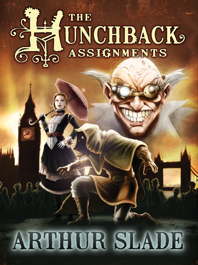 "I was much more involved in the Canadian cover. A friend of mine, Christopher Steininger, is also represented by my agent, so he was able to put together his own ideas on the cover, which eventually became the Canadian version. Because I know Chris, I was involved from the beginning and he would send a few sketches and mock ups and ask for more descriptions of the characters. He chose to go a more dramatic route and included three of the characters from the book and have the "altered" street urchins in the background. So with this cover I was able to watch it mutate into the form you see now. I like that this cover portrays the "action" of the book and Dr. Hyde's eyepiece suggests the steampunk world these characters inhabit. And Octavia is one of my favorite characters, so I was pleased to see her come to life. Plus she has an umbrella. An umbrella on the cover means big book sales, right!
"Which cover is better? I have no idea. One is bluish and foggy and the other is goldish and orangy. Which color will sell more? I have long since given up on trying to figure out how marketing departments at various publishers come up with their reasons for choosing different covers (I think it has something to do with auguring sheep guts, but I'm not sure). I know that the American cover really captures the gothic/romantic feel of the books. I assume it will appeal to girl readers and to my eye it skews to an older reader than the Canadian cover. The Canadian cover is more comic bookish. Will that mean more sales? In some ways I feel as though I have the best of both worlds as the covers seem to cover different bases. I guess the readers (as always) will decide."
I've looked at these covers for a while, and I think I'd be first drawn to the brighter one, and I do like seeing more characters. But I somehow prefer the blue one--I like it's dark tone and the way London looks below Modo.
So what do you guys think, as future readers--which cover do you like better? The book drops September 22.
"I was much more involved in the Canadian cover. A friend of mine, Christopher Steininger, is also represented by my agent, so he was able to put together his own ideas on the cover, which eventually became the Canadian version. Because I know Chris, I was involved from the beginning and he would send a few sketches and mock ups and ask for more descriptions of the characters. He chose to go a more dramatic route and included three of the characters from the book and have the "altered" street urchins in the background. So with this cover I was able to watch it mutate into the form you see now. I like that this cover portrays the "action" of the book and Dr. Hyde's eyepiece suggests the steampunk world these characters inhabit. And Octavia is one of my favorite characters, so I was pleased to see her come to life. Plus she has an umbrella. An umbrella on the cover means big book sales, right!
"Which cover is better? I have no idea. One is bluish and foggy and the other is goldish and orangy. Which color will sell more? I have long since given up on trying to figure out how marketing departments at various publishers come up with their reasons for choosing different covers (I think it has something to do with auguring sheep guts, but I'm not sure). I know that the American cover really captures the gothic/romantic feel of the books. I assume it will appeal to girl readers and to my eye it skews to an older reader than the Canadian cover. The Canadian cover is more comic bookish. Will that mean more sales? In some ways I feel as though I have the best of both worlds as the covers seem to cover different bases. I guess the readers (as always) will decide."
I've looked at these covers for a while, and I think I'd be first drawn to the brighter one, and I do like seeing more characters. But I somehow prefer the blue one--I like it's dark tone and the way London looks below Modo.
So what do you guys think, as future readers--which cover do you like better? The book drops September 22.