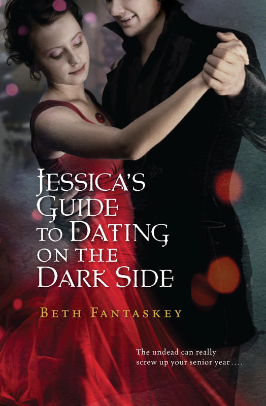
 Beth Fantaskey's covers look almost like they're underwater to me--they're shadowy and muted in an enticing way. I invited her to share the stories of her two novels, and here she is!"When I wrote Jessica's Guide to Dating on the Dark Side, I had no ideas for the cover. I couldn't even imagine selling a book to a publisher! But as we started discussing art, I got a very firm idea in mind. I really wanted to use an image from the first chapter, where the vampire prince, Lucius, stands in the middle of a lonely country road, watching his destined princess's school bus disappearing into the morning fog. I could just picture him from the back, straddling the yellow line.
"Of course, the people at Harcourt had different ideas, and when I saw their first sketch, I was beyond disappointed. It was a line drawing of two angular, gawky people dancing. The fact that I didn't even save the image speaks to how much I hated it. Who doesn't save the artwork for her first book?
"But I was a new author, and I didn't complain - and I'm glad, because when I saw the finished cover, I almost cried in a good way. I thought it was beautiful and captured the spirit of the story.
Beth Fantaskey's covers look almost like they're underwater to me--they're shadowy and muted in an enticing way. I invited her to share the stories of her two novels, and here she is!"When I wrote Jessica's Guide to Dating on the Dark Side, I had no ideas for the cover. I couldn't even imagine selling a book to a publisher! But as we started discussing art, I got a very firm idea in mind. I really wanted to use an image from the first chapter, where the vampire prince, Lucius, stands in the middle of a lonely country road, watching his destined princess's school bus disappearing into the morning fog. I could just picture him from the back, straddling the yellow line.
"Of course, the people at Harcourt had different ideas, and when I saw their first sketch, I was beyond disappointed. It was a line drawing of two angular, gawky people dancing. The fact that I didn't even save the image speaks to how much I hated it. Who doesn't save the artwork for her first book?
"But I was a new author, and I didn't complain - and I'm glad, because when I saw the finished cover, I almost cried in a good way. I thought it was beautiful and captured the spirit of the story. 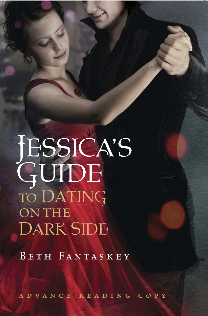 The model who represents Jess looks eerily like how I picture her in my mind - although I will say that Jess is heavier in my imagination. Readers comment on that, too, sometimes. (See different typeface on the ARC cover, right.)
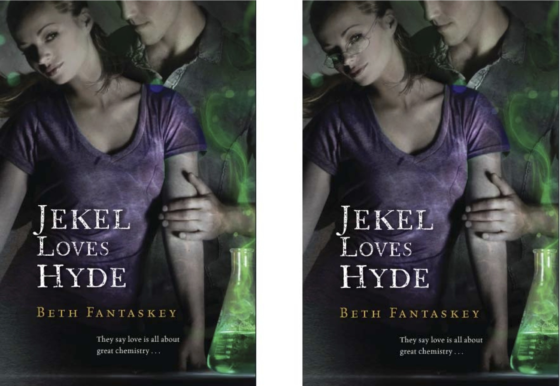
"The cover for Jekel Loves Hyde was created by the same artist, Cliff Nielsen, and this time I didn't even think to suggest anything - except to ask that Tristen Hyde's face be partially obscured, like Lucius's. I really like the idea of letting readers imagine the hero however they want.
"(Although I sometimes wonder if the male models ever see my books and feel cheated...)
"Anyway, from the first viewing, I liked the look of Jekel even more than Jessica's Guide. I love the unusual green-and-purple color scheme, the bubbling beaker, and the evil glint that's starting to form in Jill's eyes. And the way Tristen is holding Jill, which could be protective or menacing, really captures their relationship.
"However, I did ask for a few changes, because Jill - who's supposed to be a shy, mousy girl - was even sexier in the first rendering. The people at Harcourt agreed she needed toned down, and the artist de-glossed her lips, photo shopped out some cleavage - and gave her eyeglasses. (I asked for the plastic frames she wears in the novel, but you can't get everything, right?) The side-by-side images show subtle differences between a cover midway through the process and the final result.
The model who represents Jess looks eerily like how I picture her in my mind - although I will say that Jess is heavier in my imagination. Readers comment on that, too, sometimes. (See different typeface on the ARC cover, right.)
"The cover for Jekel Loves Hyde was created by the same artist, Cliff Nielsen, and this time I didn't even think to suggest anything - except to ask that Tristen Hyde's face be partially obscured, like Lucius's. I really like the idea of letting readers imagine the hero however they want.
"(Although I sometimes wonder if the male models ever see my books and feel cheated...)
"Anyway, from the first viewing, I liked the look of Jekel even more than Jessica's Guide. I love the unusual green-and-purple color scheme, the bubbling beaker, and the evil glint that's starting to form in Jill's eyes. And the way Tristen is holding Jill, which could be protective or menacing, really captures their relationship.
"However, I did ask for a few changes, because Jill - who's supposed to be a shy, mousy girl - was even sexier in the first rendering. The people at Harcourt agreed she needed toned down, and the artist de-glossed her lips, photo shopped out some cleavage - and gave her eyeglasses. (I asked for the plastic frames she wears in the novel, but you can't get everything, right?) The side-by-side images show subtle differences between a cover midway through the process and the final result.
 "Ultimately, I think the covers for both my books really represent the stories inside, and I guess that's about as much as an author can hope for!"
Thanks, Beth! I LOVE that Jill got her glasses. Hooray for girls with glasses--I'd love to see more on book covers! What do you guys think of these covers?
"Ultimately, I think the covers for both my books really represent the stories inside, and I guess that's about as much as an author can hope for!"
Thanks, Beth! I LOVE that Jill got her glasses. Hooray for girls with glasses--I'd love to see more on book covers! What do you guys think of these covers?