 The winner of last week's copy of Nightshade by Andrea Cremer is... Ariel Wilson! Send me your address, A!Rosemary Graham's Stalker Girl intrigued me instantly. I wouldn't quite use the "s" word about myself, but it wasn't far off at certain low points in my life, relationships-wise. Anyway, this isn't about me. It's about that compelling cover (and how you can win a copy of the book!).
Here's Rosemary:
The winner of last week's copy of Nightshade by Andrea Cremer is... Ariel Wilson! Send me your address, A!Rosemary Graham's Stalker Girl intrigued me instantly. I wouldn't quite use the "s" word about myself, but it wasn't far off at certain low points in my life, relationships-wise. Anyway, this isn't about me. It's about that compelling cover (and how you can win a copy of the book!).
Here's Rosemary:
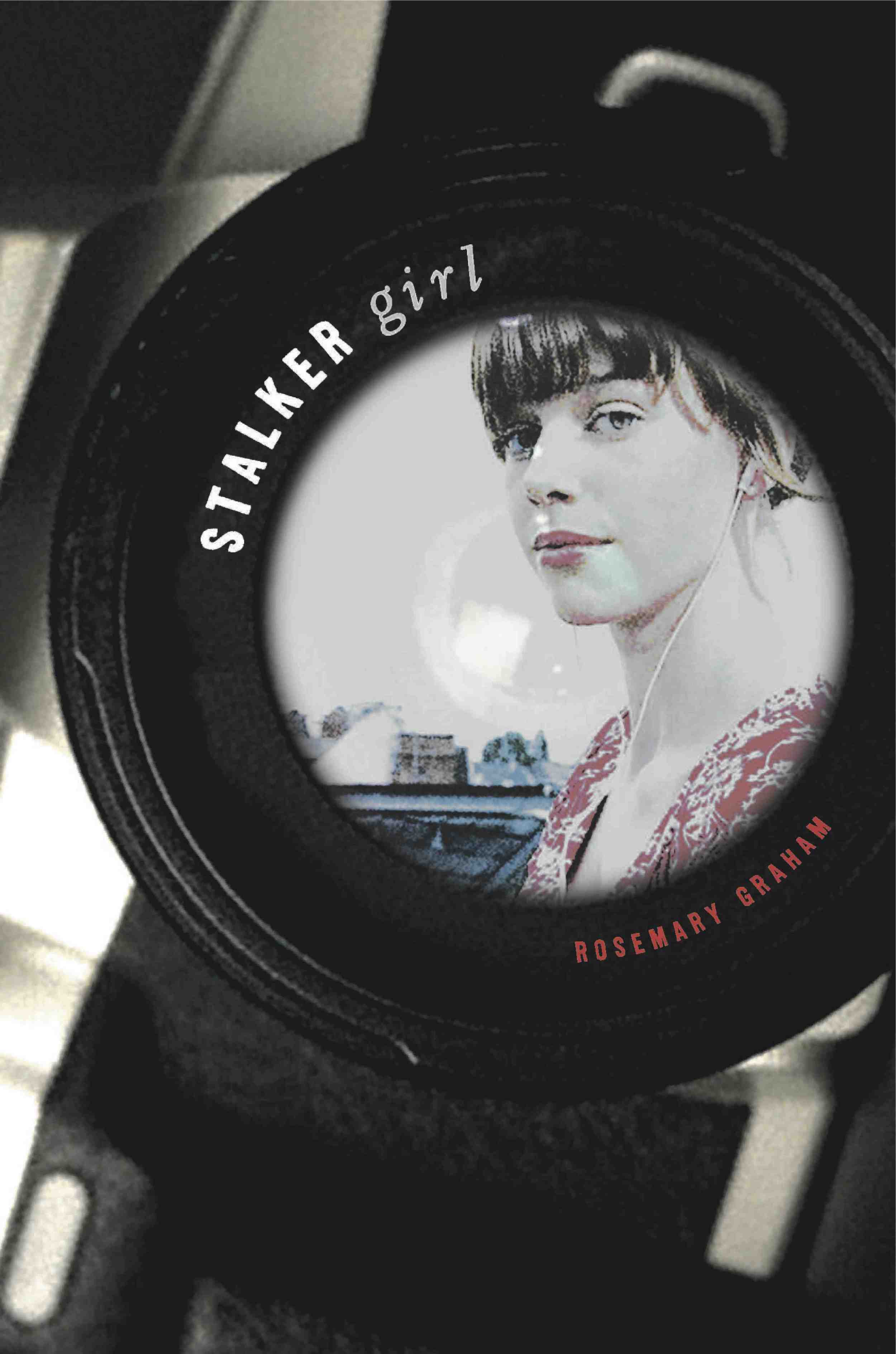 "There were three versions of the cover prior to the final one. Or maybe I should call it the final final one because the very first cover I was presented with was deemed 'final' (right). I absolutely loved this first one from the moment I saw it even though it didn't actually make sense in terms the Stalker Girl plot. I loved how it suggested a New York skyline. I loved the knowing look in the girl's eye and a really loved her dress.
"Two months after this cover was presented to me as final, my editor wrote to say that sales and marketing people were having second thoughts. They felt that the girl looking right into the camera was wrong for the story, that there needed to be a sense of people being watched without knowing it.
"There were three versions of the cover prior to the final one. Or maybe I should call it the final final one because the very first cover I was presented with was deemed 'final' (right). I absolutely loved this first one from the moment I saw it even though it didn't actually make sense in terms the Stalker Girl plot. I loved how it suggested a New York skyline. I loved the knowing look in the girl's eye and a really loved her dress.
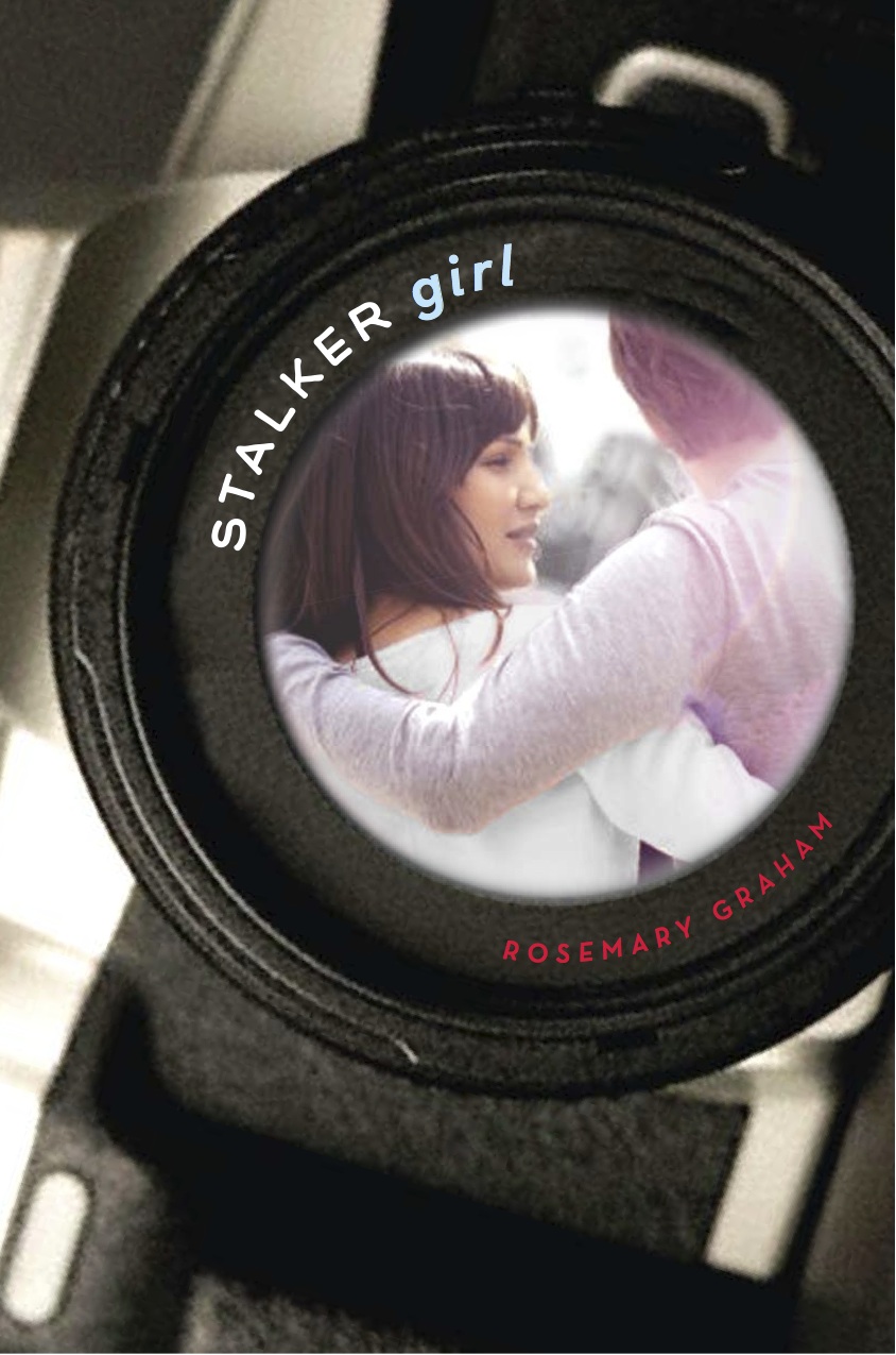
"Two months after this cover was presented to me as final, my editor wrote to say that sales and marketing people were having second thoughts. They felt that the girl looking right into the camera was wrong for the story, that there needed to be a sense of people being watched without knowing it.  They also felt strongly that there should be a couple in the camera lens because in the story the stalker is stalking her ex-boyfriend's new girlfriend. I completely understood and accepted the reasons for the change. However, I was not happy with the new image (left).
"For one thing, I felt like the urban feel of the first was lost. That couple might have been walking along Fifth Avenue, in front of Central Park, but there was nothing to strongly indicate an urban setting. Also? As a friend of mine said, it was 'a bit hair swingy.' Also? The girl was wearing a bright pink shirt and since my second novel's hardback cover had been very, very pink, I was hoping to avoid pinkness and the whole chick lit question this time around.
They also felt strongly that there should be a couple in the camera lens because in the story the stalker is stalking her ex-boyfriend's new girlfriend. I completely understood and accepted the reasons for the change. However, I was not happy with the new image (left).
"For one thing, I felt like the urban feel of the first was lost. That couple might have been walking along Fifth Avenue, in front of Central Park, but there was nothing to strongly indicate an urban setting. Also? As a friend of mine said, it was 'a bit hair swingy.' Also? The girl was wearing a bright pink shirt and since my second novel's hardback cover had been very, very pink, I was hoping to avoid pinkness and the whole chick lit question this time around.
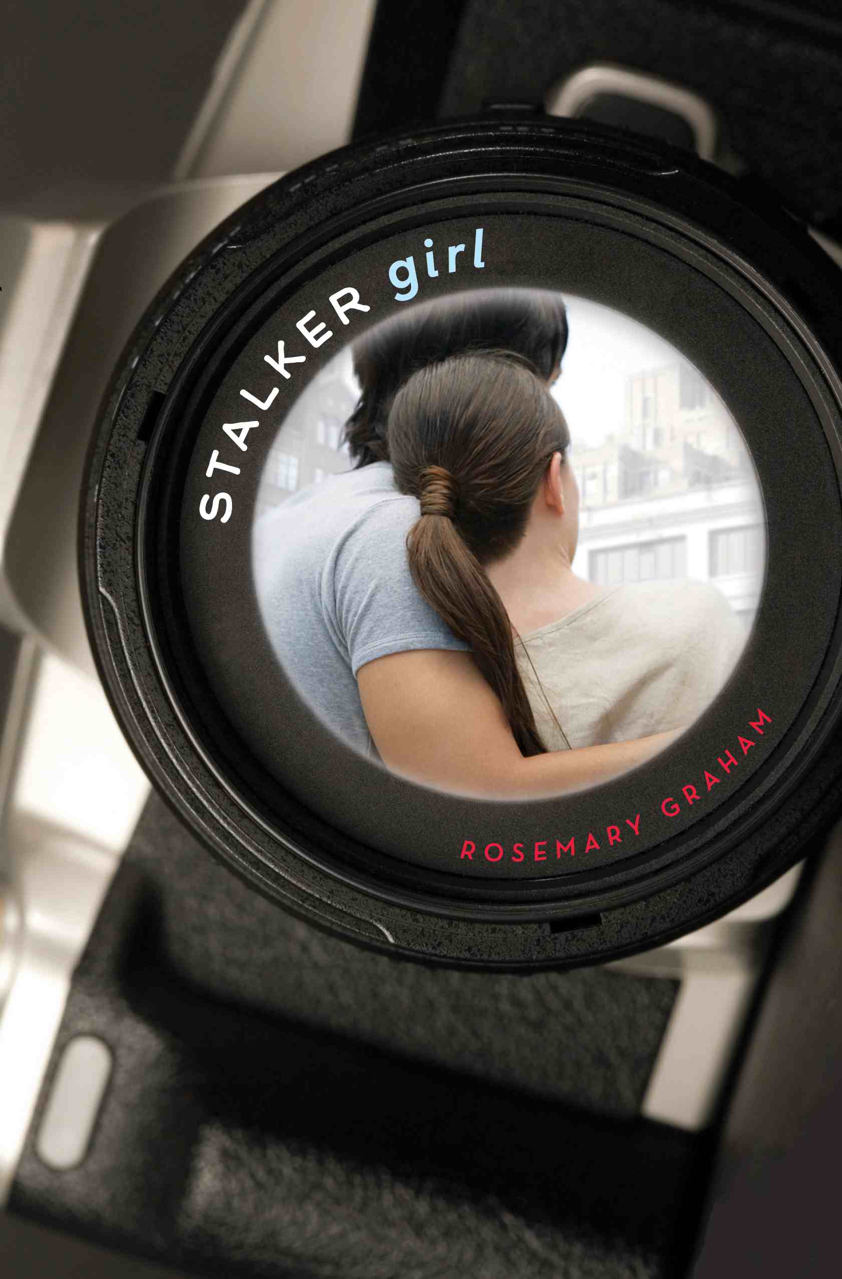
 "My editor and the art department were very receptive to my concerns but there was a limited budget, which ruled out a photo shoot. They'd have to work with stock images. The next version had the urban feel, but I felt strongly that the models were wrong for the book (right).
"They looked too old and too groomed. While my editor was still supportive, it was clear that we were running out of time and options. They were going to give it one more try. Then my editor sent the last option. I clicked on the attachment with a bit of trepidation. I was thrilled and relieved to find the existing cover. Everything was there: the urban feel, the right-aged characters, a sense of voyeurism.
"My editor and the art department were very receptive to my concerns but there was a limited budget, which ruled out a photo shoot. They'd have to work with stock images. The next version had the urban feel, but I felt strongly that the models were wrong for the book (right).
"They looked too old and too groomed. While my editor was still supportive, it was clear that we were running out of time and options. They were going to give it one more try. Then my editor sent the last option. I clicked on the attachment with a bit of trepidation. I was thrilled and relieved to find the existing cover. Everything was there: the urban feel, the right-aged characters, a sense of voyeurism.
 "I love the cover, and so appreciate the care that went into designing it."
Thanks, Rosemary! I think the final cover has a real crispness to it that the other options lack, and I agree that the protagonists look the right age in the final, too. Glad everyone kept trying!
What do you guys think of the cover, and the earlier versions? Each commenter will be entered to win a copy of the book.
PS-There's a great trailer too! Rosemary says, "To create the trailer for Stalker Girl, I must have looked at hundreds of images of New York on Flickr. The images I used--all Creative Commons licensed--really capture the mood of stalker girl. I feel like any one of them could also be used to create an evocative a cover for Stalker Girl."
"I love the cover, and so appreciate the care that went into designing it."
Thanks, Rosemary! I think the final cover has a real crispness to it that the other options lack, and I agree that the protagonists look the right age in the final, too. Glad everyone kept trying!
What do you guys think of the cover, and the earlier versions? Each commenter will be entered to win a copy of the book.
PS-There's a great trailer too! Rosemary says, "To create the trailer for Stalker Girl, I must have looked at hundreds of images of New York on Flickr. The images I used--all Creative Commons licensed--really capture the mood of stalker girl. I feel like any one of them could also be used to create an evocative a cover for Stalker Girl."
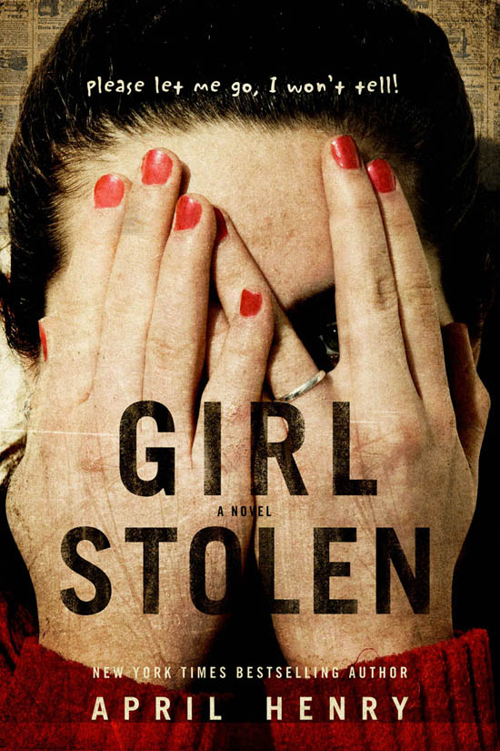
Cover Stories: Girl Stolen by April Henry
 April Henry's Girl Stolen is about a girl who's asleep in her mom's car when the car is stolen, with her inside. Also, she's blind. Stakes? HIGH.Here's April to talk about the cover:
"I have to confess that I am not good at visualizing covers for my own books. I love book covers and am also married to a graphic designer who asks for feedback, but that's more reacting than acting, so I did not give any input.
"My agent had a comp in hard copy and mine hadn't arrived yet. She told me she loved it. I was dying of curiosity! She managed to take a slightly blurry photo of it with her camera phone and then emailed it to me. When I saw it, I fell in love, too.
"My editor and I discussed little changes. For example, the girl is wearing fingernail polish on the cover. In the book there is no mention of her wearing fingernail polish, but I decided it was something Cheyenne might do to fit in, so I suggested adding a line about it.
"Initially, the polish looked a little uneven, so it was plausible that a blind girl had done it. Then they decided to scuff up her nails so that they looked more like she had been fighting (she's been kidnapped). The cover designer told me that all the fingernail polish, in whatever state, was added in Photoshop.
"We also discussed whether there should be any punctuation on the cover, and I was presented with two covers to choose from.
"The photo is of art director Rich Deas' neighbor. He told me has used her before for other covers. He also told me, 'When possible, I like to create images with my own photos and illustrations. It feels more natural than looking through a million images trying to find something that almost suits what I am looking for.'
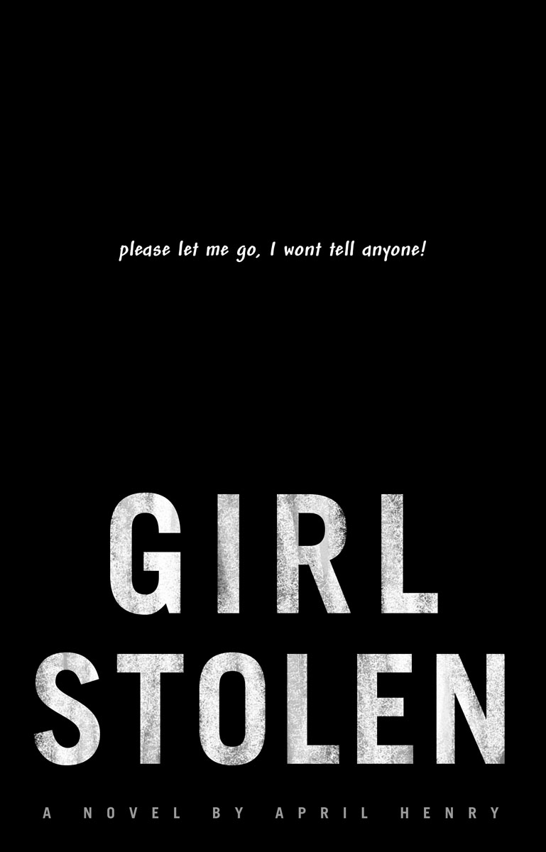
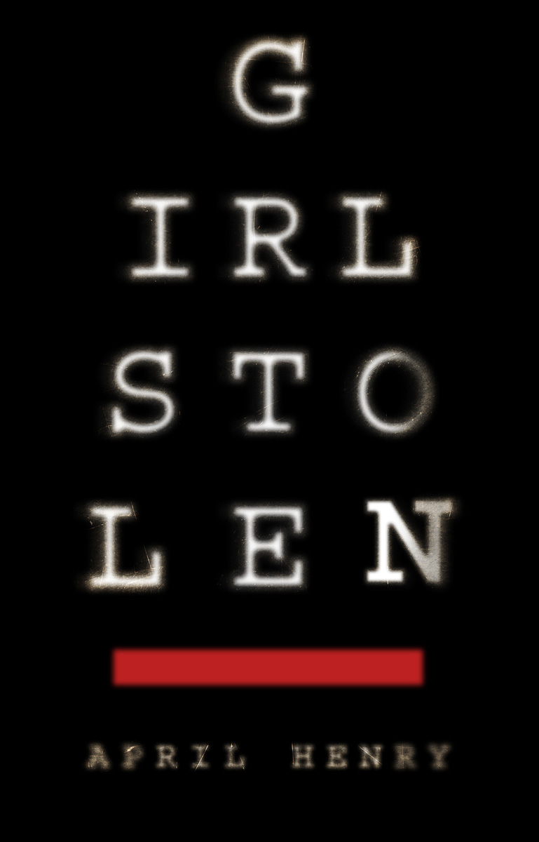
[Rich shared the below images with April, which include more of his ideas/mockups that got them to the final cover]:
April Henry's Girl Stolen is about a girl who's asleep in her mom's car when the car is stolen, with her inside. Also, she's blind. Stakes? HIGH.Here's April to talk about the cover:
"I have to confess that I am not good at visualizing covers for my own books. I love book covers and am also married to a graphic designer who asks for feedback, but that's more reacting than acting, so I did not give any input.
"My agent had a comp in hard copy and mine hadn't arrived yet. She told me she loved it. I was dying of curiosity! She managed to take a slightly blurry photo of it with her camera phone and then emailed it to me. When I saw it, I fell in love, too.
"My editor and I discussed little changes. For example, the girl is wearing fingernail polish on the cover. In the book there is no mention of her wearing fingernail polish, but I decided it was something Cheyenne might do to fit in, so I suggested adding a line about it.
"Initially, the polish looked a little uneven, so it was plausible that a blind girl had done it. Then they decided to scuff up her nails so that they looked more like she had been fighting (she's been kidnapped). The cover designer told me that all the fingernail polish, in whatever state, was added in Photoshop.
"We also discussed whether there should be any punctuation on the cover, and I was presented with two covers to choose from.
"The photo is of art director Rich Deas' neighbor. He told me has used her before for other covers. He also told me, 'When possible, I like to create images with my own photos and illustrations. It feels more natural than looking through a million images trying to find something that almost suits what I am looking for.'
[Rich shared the below images with April, which include more of his ideas/mockups that got them to the final cover]:
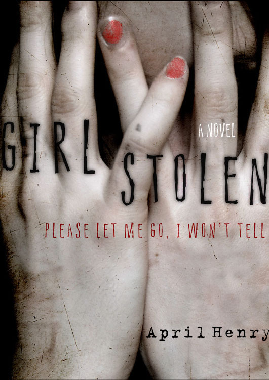

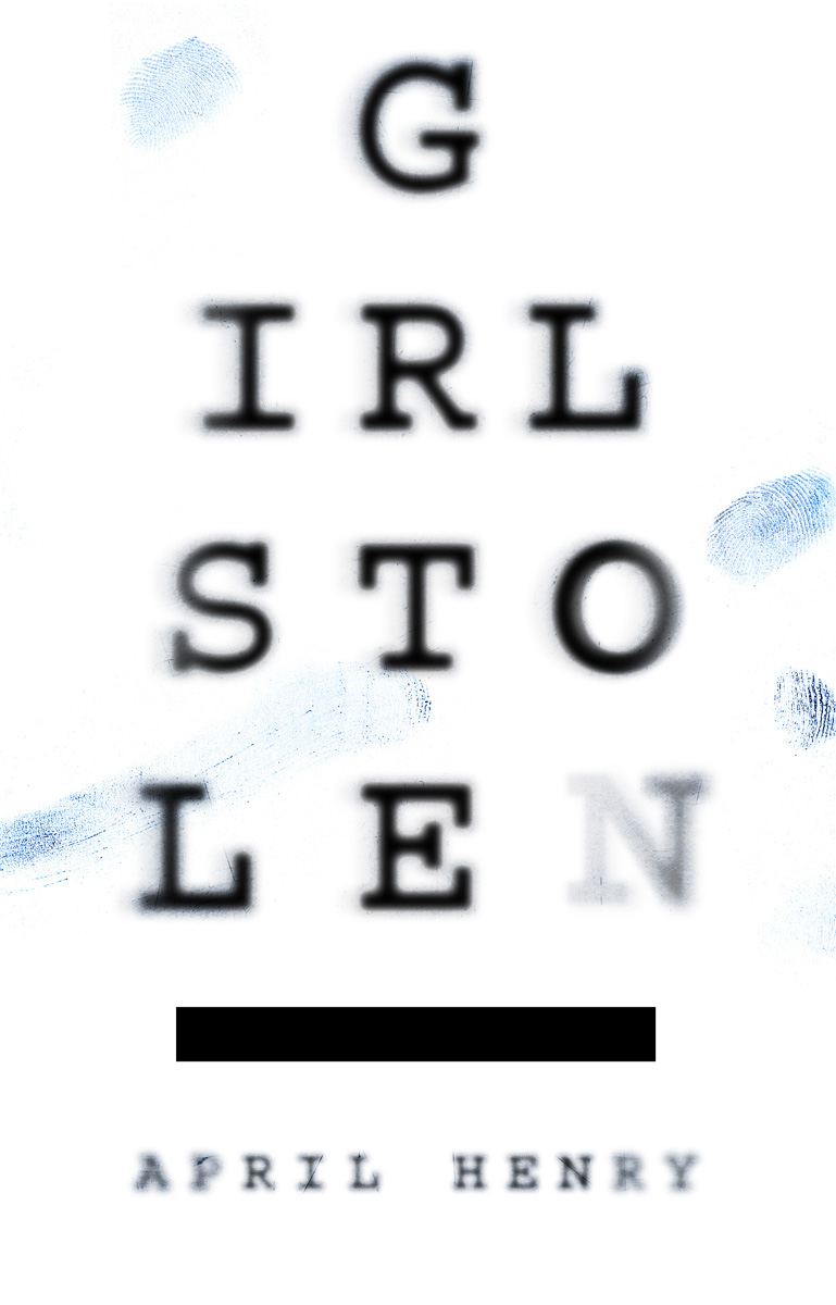 "I love everything about my cover -- especially the little sliver between two fingers where you can just see her right eye. I hope Rich works on my next cover."
Thanks, April! Girl Stolen is a part of The Contemps Challenge (which you should be accepting right about now, if you haven't already). Hello!
Read April's fascinating interview with Rich about this cover design on her blog. I think this final cover is chilling, and I love the details in it (nail polish, her ring, even the longish sleeves on her shirt, which looks like one of those knit undershirts I always wear in winter). I also love seeing the original ideas and the covers that Rich contemplated.
What do you guys think?
"I love everything about my cover -- especially the little sliver between two fingers where you can just see her right eye. I hope Rich works on my next cover."
Thanks, April! Girl Stolen is a part of The Contemps Challenge (which you should be accepting right about now, if you haven't already). Hello!
Read April's fascinating interview with Rich about this cover design on her blog. I think this final cover is chilling, and I love the details in it (nail polish, her ring, even the longish sleeves on her shirt, which looks like one of those knit undershirts I always wear in winter). I also love seeing the original ideas and the covers that Rich contemplated.
What do you guys think?
Photo Friday: Max the Dog
in Photo Friday
Dave and I are dogsitting for this guy. He's big but sweet.
Happy Friday!
He's big but sweet.
Happy Friday!
Win-It Wednesday: Nightshade by Andrea Cremer
The winner of last week's contest for Rosebush by Michele Jaffe is... Sarah, who was reading Dash and Lily's Book of Dares. Send me your address, S!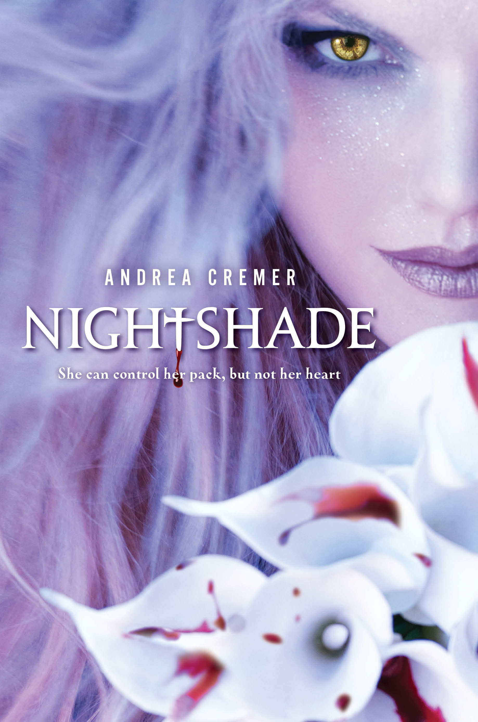 This week's prize: Nightshade by Andrea Cremer. Oh, how I love this cover (and its origin story), and now you know this: The book is fantastic, too! It's smart and well-paced and full of rich history. So, you know, you want to read it.
I have one lovely hardcover to give away, so if you'd like to enter to win it, leave a comment sharing your six-word memoir for the past week. (I love this game.)
Mine would be: Instead of working out, ate Cheetos. I really need to get back to yoga.
Tell me yours and you're entered! I'll pick a winner next week.
Happy Wednesday!
This week's prize: Nightshade by Andrea Cremer. Oh, how I love this cover (and its origin story), and now you know this: The book is fantastic, too! It's smart and well-paced and full of rich history. So, you know, you want to read it.
I have one lovely hardcover to give away, so if you'd like to enter to win it, leave a comment sharing your six-word memoir for the past week. (I love this game.)
Mine would be: Instead of working out, ate Cheetos. I really need to get back to yoga.
Tell me yours and you're entered! I'll pick a winner next week.
Happy Wednesday!
Cover Stories: Matched by Ally Condie
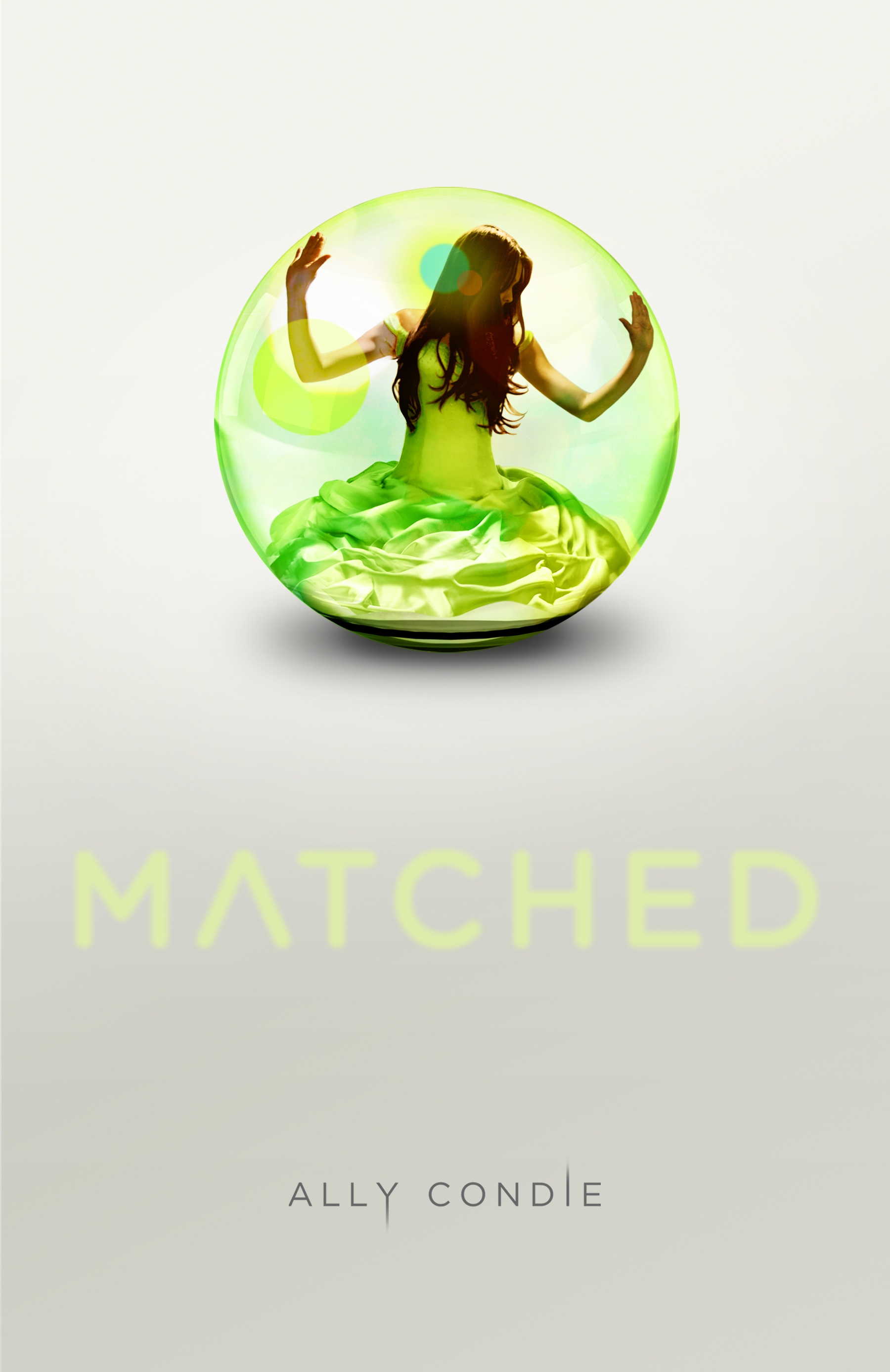 Ally Condie's Matched was just named #1 on the Winter 2010/2011 Kid's Indie Next List. And its cover is up there among the best of the year too, so I asked Ally to tell that tale, and here she is:
"I didn't have anything in mind for a cover. I'm not a very creative person visually. I certainly appreciate it in others--my mother is a professional artist, and I have grown up appreciating visual art in its many forms--but my mind doesn't seem to work that way. So, I was just excited to see what the designers had in mind!
Ally Condie's Matched was just named #1 on the Winter 2010/2011 Kid's Indie Next List. And its cover is up there among the best of the year too, so I asked Ally to tell that tale, and here she is:
"I didn't have anything in mind for a cover. I'm not a very creative person visually. I certainly appreciate it in others--my mother is a professional artist, and I have grown up appreciating visual art in its many forms--but my mind doesn't seem to work that way. So, I was just excited to see what the designers had in mind!
"My publisher asked for ideas, and I didn't really have any suggestions for them.
"Honestly, when I first saw the cover I wanted to cry. Tears of joy. I thought it was perfect. The model is just how I pictured Cassia looking, but I like that she's in profile so we can imagine her features. The dress is beautiful and has significance to the story, as does the bubble/glass world and the color green. And that particular shade of green they selected is beautiful. I am also a fan of very clean design, and this cover has that in spades. Theresa Evangelista was the designer for the cover and she is amazing.
"Before this cover, there was another concept that Penguin had that we didn't use. It was also beautiful, but this one is even better.
"The final cover was shot with a model. And, in this case, it was a self-portrait! The model and photographer are one and the same, a very talented young woman named Samantha Aide.
"I love my cover. It's a beautiful piece of art and I feel incredibly lucky that such talented people worked on the project. I did find one little piece of hidden meaning that I didn't notice at first. In the book, there are three important tablets that the characters take. The tablets are red, green, and blue. If you look closely at the bubble, you can see very subtle red, green, and blue highlights along the surface. I love that. I think the cover relates to the story in the book perfectly--Cassia is trapped in this beautiful, protective, but ultimately imprisoning world. And, in the end, it is a world that she can break, if she so chooses."
Thanks, Ally! I love the colors and the glimmering magic in this cover. I can't believe the photographer and subject are one and the same--what a cool trick. I also found this cover, which may be another version (UK?). I'm not sure... but it adds the tagline, a blurb and changes the title color.
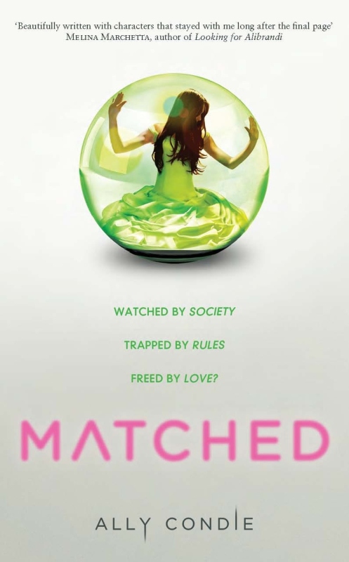 What do you guys think of the cover?
PS-Here's the news on Crossed, the sequel to Matched.
What do you guys think of the cover?
PS-Here's the news on Crossed, the sequel to Matched.
Photo Friday: Family
in Photo Friday
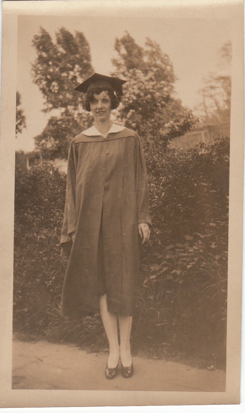
I promise that Photo Friday will not become "Old Family Photo Friday," but I had to just add these black-and-whites that I came across recently in a shoebox....My grandmother Carol at her gradution:
 My dad, center, on a ship (this was likely during his ROTC college years... love that hat!):
 Don't you just love opening up a box and finding treasures like these?
Happy Friday! I'm baking gingerbread cookies (in the most fashionable apron I own). You?
Don't you just love opening up a box and finding treasures like these?
Happy Friday! I'm baking gingerbread cookies (in the most fashionable apron I own). You?
Cover Stories: Dayling by Gabriel Madison
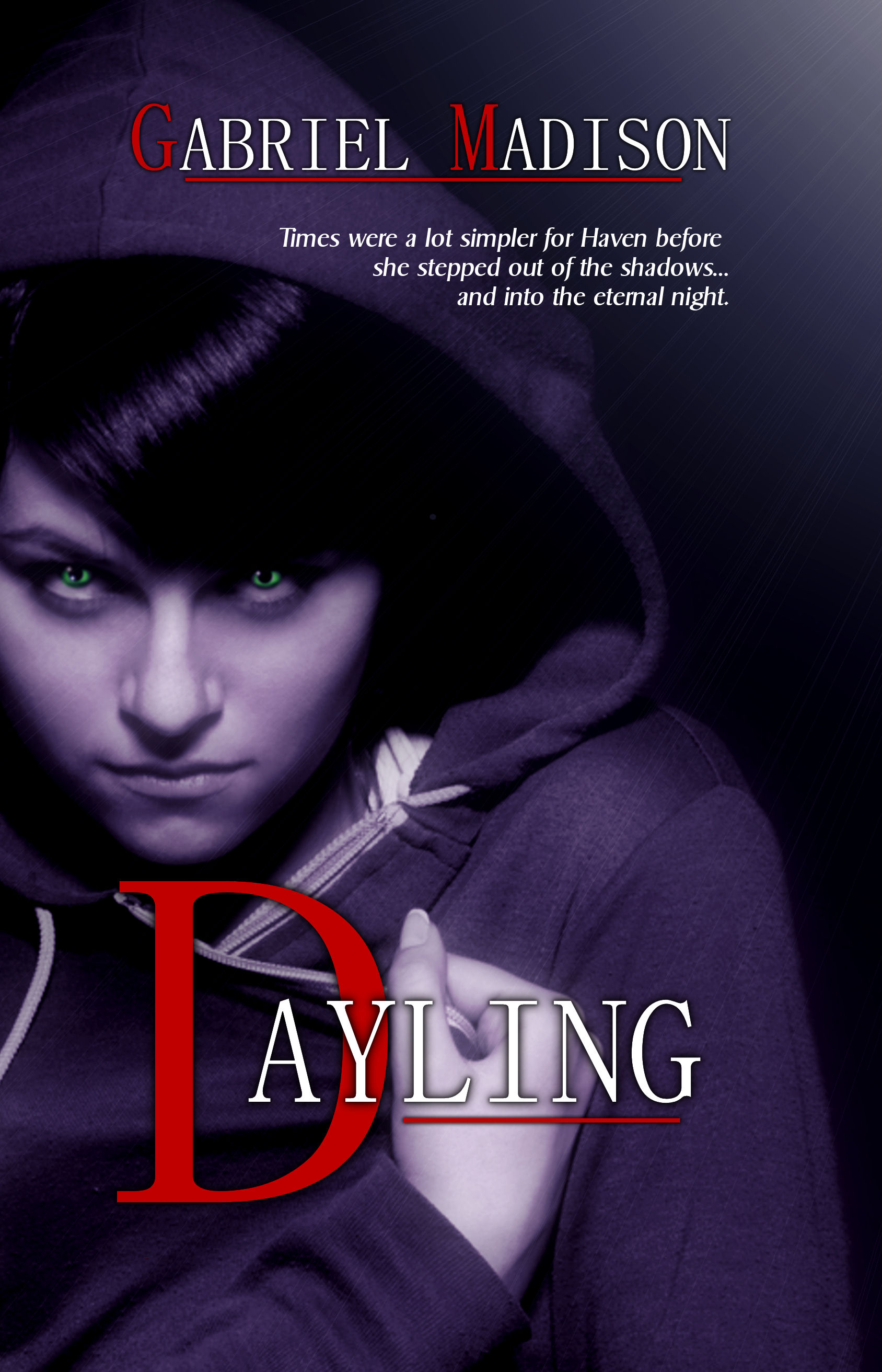 When I saw the cover of Gabriel Madison's Dayling (which was released yesterday), I couldn't stop staring at those glowing eyes. I had to find out more about the cover, so here's Gabriel to share:"I was going through a phase of reading YA Urban Fantasy books with the face of characters on the covers. I wanted that for Dayling. So when the publisher sent me a form to describe what I wanted the cover to look like. I sent them this: 'I see a teenage girl, with long curly black hair and emerald green eyes, wearing a Pullover Hoodie, with the hood pulled over her head. The girl is glancing to the left, as light comes from the top right corner. The rest of the cover is in black, except for the title.'
"I was blown away when I saw the cover. I loved it. I remember opening the e-mail and sitting there for a moment with a silly grin on my face. Even though I described what I wanted the cover to look like, I never thought it would look like that. The girl. The eyes. The title. The way the girl is clutching her Hoodie. Even how the light coming from the top corner of the book is barely visible looked amazing to me. After I stared at the cover for a moment in silence, I pumped my fist in the air a few times from excitement. I know that was a geek move, but I was in a geek mood!
"They wanted me to write a tagline for the cover. I wrote one and the publisher wrote one. They basically combined what we both wrote. Actually, the publisher wanted to use a line I wrote in my query letter. So they combined the tag I wrote after seeing the cover, with a line I had in my query to create the tagline: Times were a lot simpler for Haven before she stepped out of the shadows... and into the eternal night.
"The cover designer, Traci Markou, did a great job. The only thing that was changed a few times was the tagline. But the cover itself stayed the same.
"I loved the cover from the first moment I saw it. I have the cover as my computer Background. I haven't found any hidden meanings, and I think I stared at it for so long when I first opened the e-mail I noticed everything in the cover. It represents different aspects of the story. My main character, Haven, seen on the cover looking straight ahead with sunrays raking across her can represent how for most of Haven's life she had secluded herself from the world and how she now wants to be a part of it. She wants to go from being unseen to seen.
"The cover can also represent what she is. In my story there are two types of supernatural beings, Daylings and Nightlings (Daylings turn into Nightlings on their eighteenth birthdays). The light shining on her in the cover represents that she is still a Dayling, because Nightlings can't be out in the sun. So I think the cover represents both parts of Haven's journey... her desire to finally be seen, and her life as a Dayling."
Thanks, Gabriel! This is the most author involvement I've heard of -- a form describing what you see as the cover! -- so congratulations. I think it's a striking one.
What do you guys think?
When I saw the cover of Gabriel Madison's Dayling (which was released yesterday), I couldn't stop staring at those glowing eyes. I had to find out more about the cover, so here's Gabriel to share:"I was going through a phase of reading YA Urban Fantasy books with the face of characters on the covers. I wanted that for Dayling. So when the publisher sent me a form to describe what I wanted the cover to look like. I sent them this: 'I see a teenage girl, with long curly black hair and emerald green eyes, wearing a Pullover Hoodie, with the hood pulled over her head. The girl is glancing to the left, as light comes from the top right corner. The rest of the cover is in black, except for the title.'
"I was blown away when I saw the cover. I loved it. I remember opening the e-mail and sitting there for a moment with a silly grin on my face. Even though I described what I wanted the cover to look like, I never thought it would look like that. The girl. The eyes. The title. The way the girl is clutching her Hoodie. Even how the light coming from the top corner of the book is barely visible looked amazing to me. After I stared at the cover for a moment in silence, I pumped my fist in the air a few times from excitement. I know that was a geek move, but I was in a geek mood!
"They wanted me to write a tagline for the cover. I wrote one and the publisher wrote one. They basically combined what we both wrote. Actually, the publisher wanted to use a line I wrote in my query letter. So they combined the tag I wrote after seeing the cover, with a line I had in my query to create the tagline: Times were a lot simpler for Haven before she stepped out of the shadows... and into the eternal night.
"The cover designer, Traci Markou, did a great job. The only thing that was changed a few times was the tagline. But the cover itself stayed the same.
"I loved the cover from the first moment I saw it. I have the cover as my computer Background. I haven't found any hidden meanings, and I think I stared at it for so long when I first opened the e-mail I noticed everything in the cover. It represents different aspects of the story. My main character, Haven, seen on the cover looking straight ahead with sunrays raking across her can represent how for most of Haven's life she had secluded herself from the world and how she now wants to be a part of it. She wants to go from being unseen to seen.
"The cover can also represent what she is. In my story there are two types of supernatural beings, Daylings and Nightlings (Daylings turn into Nightlings on their eighteenth birthdays). The light shining on her in the cover represents that she is still a Dayling, because Nightlings can't be out in the sun. So I think the cover represents both parts of Haven's journey... her desire to finally be seen, and her life as a Dayling."
Thanks, Gabriel! This is the most author involvement I've heard of -- a form describing what you see as the cover! -- so congratulations. I think it's a striking one.
What do you guys think?
Win-It Wednesday: Rosebush by Michele Jaffe
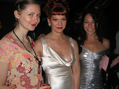
 Last week's winner of When the Stars Go Blue by Caridad Ferrer is... Em from Love YA Lit! Send me your address, Em.This week, I'm giving away an ARC of Rosebush (read a review from Forever Young Adult) by Michele Jaffe of Bad Kitty fame. I met her at a wedding last year (there's us with the gorgeous Dixie-bride, below right) and she is witty and fun and lovely all at once! Delightful. As are her books.
Easy question this week, but one I'm always wondering about: What are you reading? Right now! What book(s) are you in the middle of? I'm reading Room by Emma Donahughe (my first non-YA in a while), and I'm riv-et-ed.
Last week's winner of When the Stars Go Blue by Caridad Ferrer is... Em from Love YA Lit! Send me your address, Em.This week, I'm giving away an ARC of Rosebush (read a review from Forever Young Adult) by Michele Jaffe of Bad Kitty fame. I met her at a wedding last year (there's us with the gorgeous Dixie-bride, below right) and she is witty and fun and lovely all at once! Delightful. As are her books.
Easy question this week, but one I'm always wondering about: What are you reading? Right now! What book(s) are you in the middle of? I'm reading Room by Emma Donahughe (my first non-YA in a while), and I'm riv-et-ed.
 PS-One favor? Tweet or Facebook this. It is INCREDIBLE and every organization that needs books should know about it... "Amazing! Help @Readergirlz donate 125,000 great books to low-income teens http://su.pr/2bQ3Cz (Pls RT!) #novelgift"
Cover Stories: She's So Dead to Us by Kieran Scott
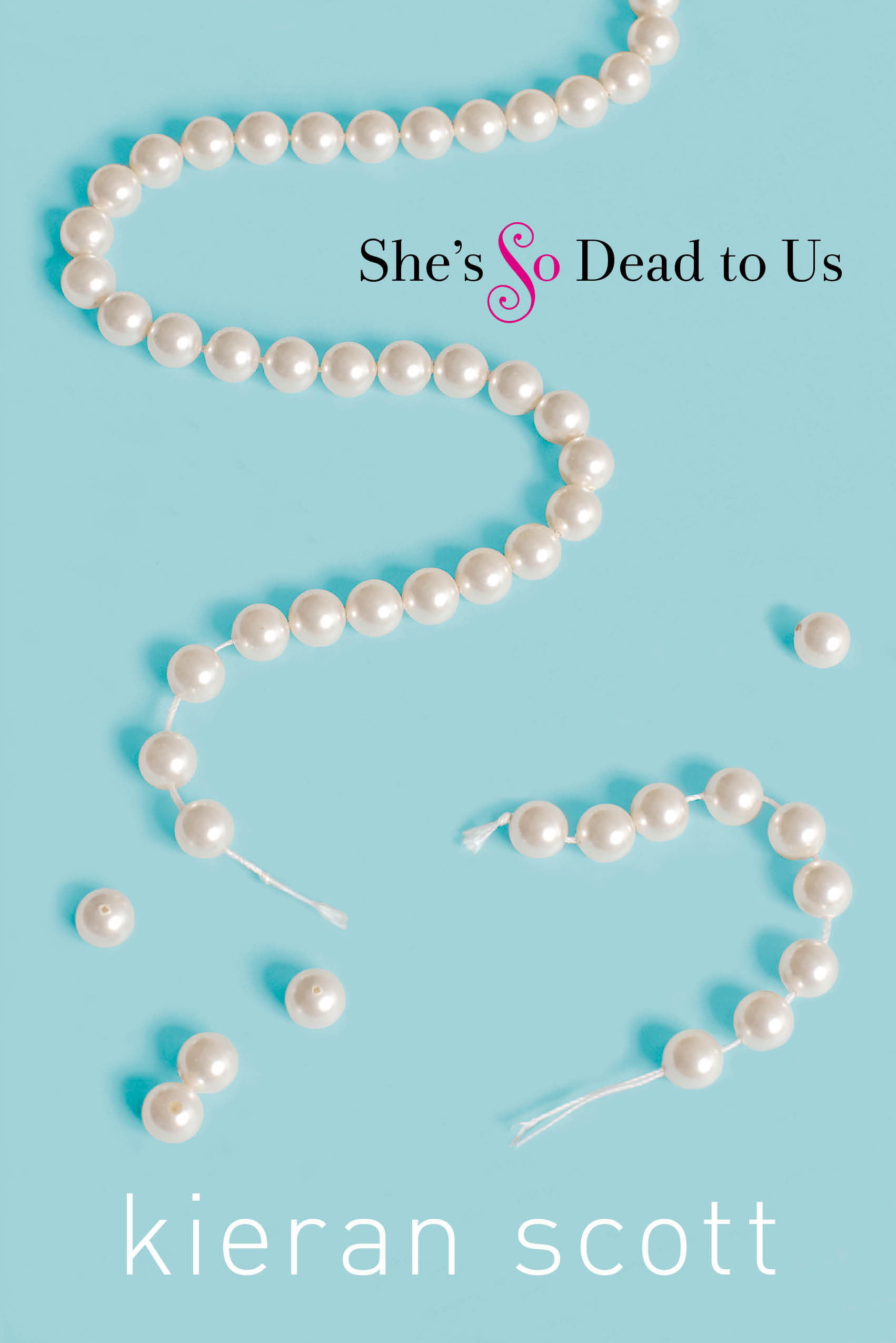 The fantastic Kieran Scott is here to talk about title changes, taglines and Tiffany blue on the cover of her latest novel, She's So Dead to Us (I've heard her read from it, and in case you're not familiar with her books, Kieran -- who also writes as Kate Brian -- pens a great novel).Here she is:
"The story of my cover is all tied up with the story of my title. When I first pitched the idea that eventually became SHE'S SO DEAD TO US, it was titled RETURN TO ORCHARD HILL. In my mind it was a coming-home story wrapped up in a romance. I had all these thoughts of Dawson's Creek-style, sepia-toned images of autumn trees and quaint neighborhoods. It was all very romantic and dreamy.
"Unfortunately, my publisher didn't love the title. It sounded too old-fashioned and literary. They wanted something more immediate. Something that would grab the reader, rather than lull them into a state of nostalgia. So I went back to the drawing board. I came up with lists and lists of potential titles. I brainstormed with my agent and I brainstormed with my editor. I even brainstormed with my sister and my best friend. But somehow, we couldn't all get on the same page. There was one title we all liked, but we already knew there were going to be three books, and we couldn't come up with accompanying titles that made sense. We went back and forth about this for weeks, until it was basically do-or-die time. Catalog copy had to be set. Covers had to be made. We were playing with fire.
"We wanted something that would evoke the idea of 'you can't go home again,' but we also wanted romance. It seemed impossible to have both. Then, one day, my editor sent me a mock-up that the talented Krista Vossen had put together. It was a light-blue cover with a broken strand of pearls and the title SHE'S SO DEAD TO US. The title had been the brainstorm of someone in marketing, I believe. And a brilliant editorial assistant (ahem, Julia Maguire), had come up with the tagline 'Born with a silver spoon, living with a plastic spork.' I took one look at the package and fell in love with it. The cover, in my opinion, is drop-dead gorgeous. And what female among us is not attracted to that Tiffany blue? The romance angle was, clearly, not present, but at this point I had resigned myself to the fact that I couldn't have it all. I had to hope that when readers opened the book and saw the alternating points of view, they'd see what it was all about.
The fantastic Kieran Scott is here to talk about title changes, taglines and Tiffany blue on the cover of her latest novel, She's So Dead to Us (I've heard her read from it, and in case you're not familiar with her books, Kieran -- who also writes as Kate Brian -- pens a great novel).Here she is:
"The story of my cover is all tied up with the story of my title. When I first pitched the idea that eventually became SHE'S SO DEAD TO US, it was titled RETURN TO ORCHARD HILL. In my mind it was a coming-home story wrapped up in a romance. I had all these thoughts of Dawson's Creek-style, sepia-toned images of autumn trees and quaint neighborhoods. It was all very romantic and dreamy.
"Unfortunately, my publisher didn't love the title. It sounded too old-fashioned and literary. They wanted something more immediate. Something that would grab the reader, rather than lull them into a state of nostalgia. So I went back to the drawing board. I came up with lists and lists of potential titles. I brainstormed with my agent and I brainstormed with my editor. I even brainstormed with my sister and my best friend. But somehow, we couldn't all get on the same page. There was one title we all liked, but we already knew there were going to be three books, and we couldn't come up with accompanying titles that made sense. We went back and forth about this for weeks, until it was basically do-or-die time. Catalog copy had to be set. Covers had to be made. We were playing with fire.
"We wanted something that would evoke the idea of 'you can't go home again,' but we also wanted romance. It seemed impossible to have both. Then, one day, my editor sent me a mock-up that the talented Krista Vossen had put together. It was a light-blue cover with a broken strand of pearls and the title SHE'S SO DEAD TO US. The title had been the brainstorm of someone in marketing, I believe. And a brilliant editorial assistant (ahem, Julia Maguire), had come up with the tagline 'Born with a silver spoon, living with a plastic spork.' I took one look at the package and fell in love with it. The cover, in my opinion, is drop-dead gorgeous. And what female among us is not attracted to that Tiffany blue? The romance angle was, clearly, not present, but at this point I had resigned myself to the fact that I couldn't have it all. I had to hope that when readers opened the book and saw the alternating points of view, they'd see what it was all about.
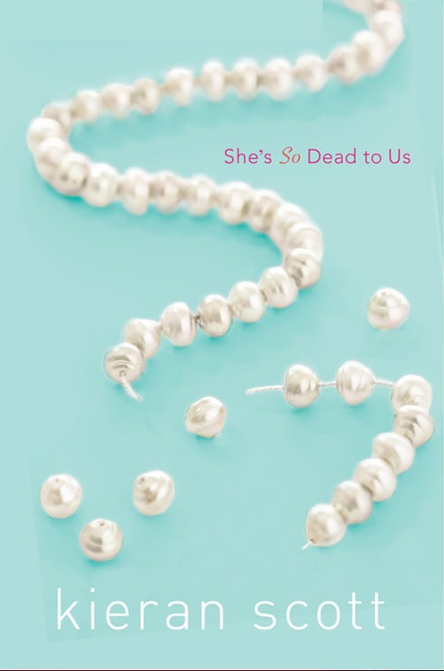
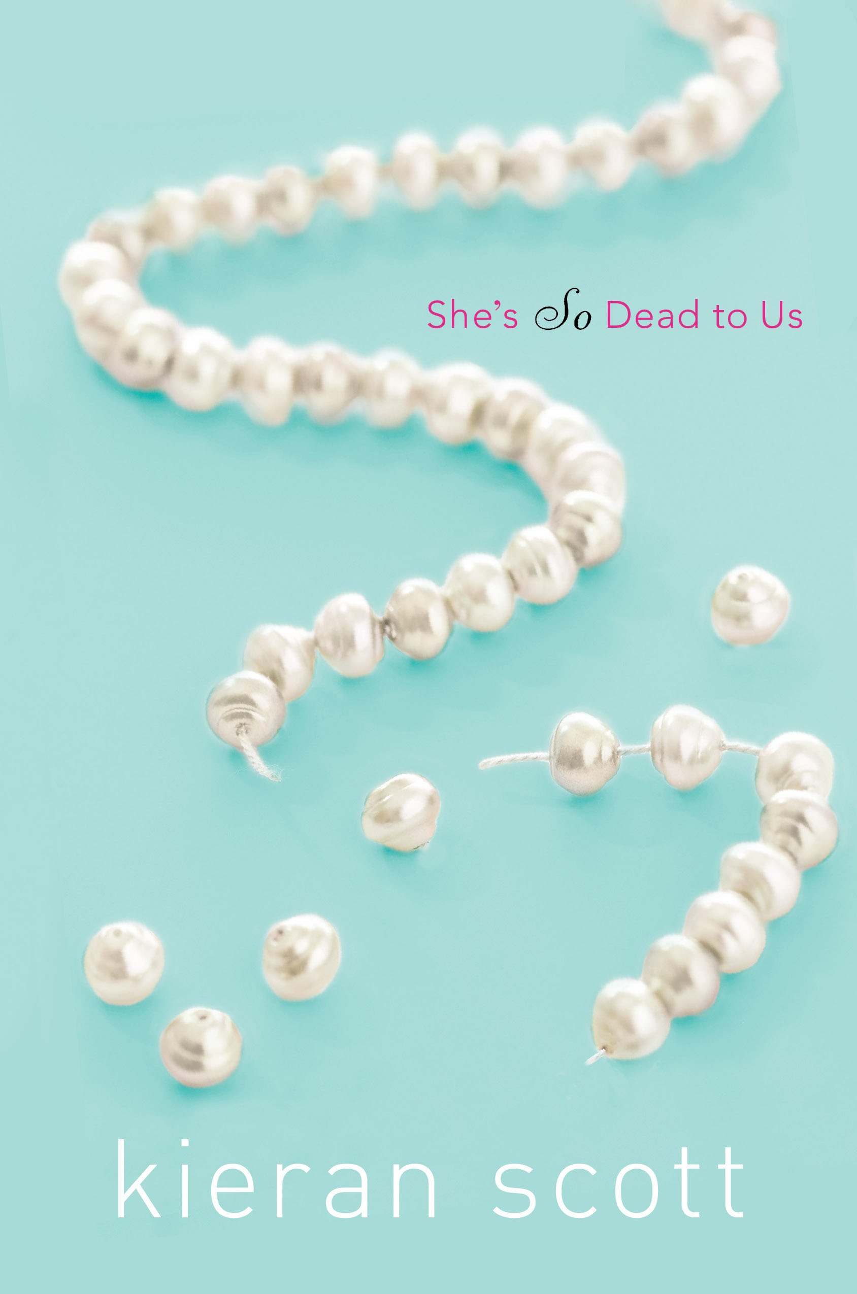 "The first cover I saw had a different font (above, see two earlier versions), but in essence the design remained the same from there on out. When I saw the final version I flipped over the embossed, raised pearls. The whole thing just feels so elegant to me, and you don't find a whole lot of elegant on the YA shelves. Some, but not a lot.
"The CODA to all this is that the cover is going to change for the paperback version. It's going to more editorial. I haven't seen the mock-up yet, but once I do, I'll let you know what I think!"
Thanks, Kieran! I agree... elegant. And the subtle tweaking of fonts and pearl placements really does make the final cover seem like a more polished version. Can't wait to see the sequel, He's So Not Worth It (another great title)!
What do you guys think?
"The first cover I saw had a different font (above, see two earlier versions), but in essence the design remained the same from there on out. When I saw the final version I flipped over the embossed, raised pearls. The whole thing just feels so elegant to me, and you don't find a whole lot of elegant on the YA shelves. Some, but not a lot.
"The CODA to all this is that the cover is going to change for the paperback version. It's going to more editorial. I haven't seen the mock-up yet, but once I do, I'll let you know what I think!"
Thanks, Kieran! I agree... elegant. And the subtle tweaking of fonts and pearl placements really does make the final cover seem like a more polished version. Can't wait to see the sequel, He's So Not Worth It (another great title)!
What do you guys think?
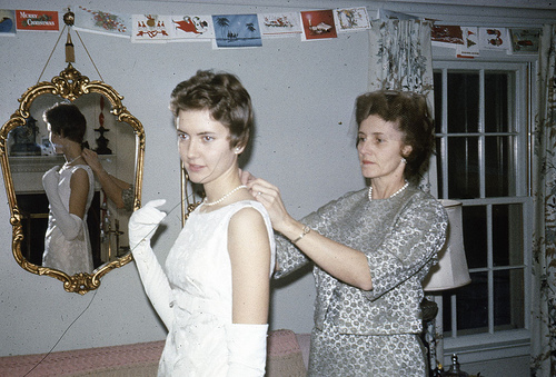
Photo Friday: Thankful for Mom
in Photo Friday
I'm home in Chapel Hill visiting my mom, and I've been meaning to share these photos from her first wedding. How lovely is she?!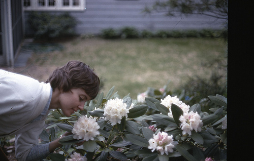 With my grandma, getting ready:
 And with me, at my wedding (because you guys know I use any excuse to post more wedding photos):
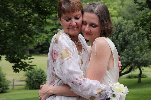 Happy Thanksgivings! Hug your families!