Cover Stories: Della Says: OMG! by Keris Stainton

OMG.jpg
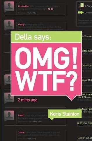
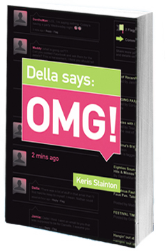
Keris Stainton's May novel has a cover that is filled with chat! I had to ask her how it came about. "The original title was Della Says: OMG! WTF? I wasn't a fan of this title and, as it turned out, neither were the retailers, so the WTF was dropped. Oddly enough--considering how opinionated I am about other people's covers--I didn't have an idea for mine. It took me such a long time to even realize it would be getting a cover (doh!) and then, once I realized that, I couldn't even begin to picture it.

"My editor asked me if I had any ideas and I said, 'Oh no... I'm sure it'll be fine,' and she looked startled. But my mind was completely blank.

Dellasays[2]-1.jpg"When I first saw my cover, I was horrified. As it turned out, it was just a 'cover concept,' but still. It was so PINK. And while I love pink it just didn't work for me. It looked like a textbook rather than a novel (right).

"My editor let me make comments. I'm a bit worried about sounding like Joey from 'Friends,' but the IM chat in the background was my idea.

"Now, I actually really love the cover. I love the pink and the green and I like the chat in the background and even the two colour spine. I particularly loved that it was mainly black. I was excited because there were hardly any black covers and I thought it would stand out.

"Of course, that was before all the vampire books appeared..."

Thanks, Keris! I definitely prefer the slick black final to the pink mockup, and I also think dropping WTF from the title was the right move (see the cover with WTF below). What do you guys think of these covers?

omgwtf.jpg

Who Loves Ally Carter?

I do! Have you guys read her books? If not, you are missing out.Seriously, I'm reading Heist Society right now and I'm amazed at her skill with all the characters and the twists. I love a good caper! rgz banner July 2010.jpg This month at readergirlz, we're talking with Ally about the fourth book in her Gallagher Girls series, Only the Good Spy Young. So far, we've hit on codenames, chameleons and different points of view. Also, the live chat? It will rule. It's on Wednesday. On twitter. Happy Sunday!

Photo Friday: The Best of Both Worlds

City life is fun--there are always a ton of parties in the summer. Here I am at the opening of the restaurant Covet with my friends Erin (left) and Kristine (right). Ramona Singer from The Real Housewives of NYC was there, but I missed her! Bummer.covet.jpg Yes, I love the city. But for the Fourth of July, some friends rented a farmhouse we'd been to in the summer of 2008, and I fell in love with the country all over again... Not to be all Miley Cyrus, but it does feel like the best of both worlds. On the drive up, Dave posed with Jacob at Burger King. This makes me laugh: jacob.jpg Reading on the front porch (in a swing that rocks. Seriously, like back-and-forth rocks): vogue.jpg Playing badminton: badminton.jpg Walking to the swimming hole: swimming hole.jpg The swimming hole itself, where I sat on that log and read an ARC of Robin Benway's The Extraordinary Secrets of April, May and June, though you can't see that I'm trying to hold it up here: swimminghole.jpg On the porch, there was a little baby swallow gearing up to leave its nest and we all watched it throughout the weekend. It felt symbolic or something, and I know it's flown by now! swallow.jpg There may have been some fireworks... fireworks.jpg And perhaps a little light beer pong before bed... beerpong.jpg Of course, there were also s'mores around the fire pit. firepit.jpg I heart summer! What are you guys up to this month? Happy July!

Cover Stories: Gimme a Call by Sarah Mlynowski

gimmeacall.jpgSarah Mlynowski's Gimme a Call is a magical summer read! When Devi drops her phone in the mail fountain, she fishes it out to discover that it only calls one number: her number. At age 14, three years ago. The back-and-forth between past and present Devi is quick and funny as she tries to figure out if her fate is changeable. Loved this one!And the cover is way cute, so here's Sarah to talk about how it came about: "Have you seen the hardcover of GOOD GIRLS by Laura Ruby? With the cool reappearing girl on the cell phone? [Right] goodgirls.jpgThat's how I pictured the GIMME A CALL cover. Except with alternating Devis--one at fourteen and one at seventeen. "When I first saw my cover, I loved it. I loved how clean it looked. Loved the type. Loved the glossy phone. It was a big departure from the Magic in Manhattan covers (which I think are adorable, below) but I thought it was gorgeous. magicbooks.jpg "There were earlier cover concepts, which didn't make the final cut. The art director (Kenny Holcomb) was amazing--he wouldn't stop until he got it right. Some of them included: earlygimmeacall.jpg- Two versions of the same girl, both holding cell phones, looking surprised and vaguely Disney-movie-esque. [Left] - Girl leaning back off bed while texting. Looked too much like a Verizon ad. - A very blinged-out cell on a hot pink background. This one was my second fave. "My editor asked for my opinion on the concepts, but since I don't always trust my own opinion, I forwarded them to my teen cousins. We all agreed that the iPhone cover was 'So Cute.' "In the original version of the iPhone cover the model was looking up with a knowing smile. It looked a little like a Yaz ad. In the end it came down to a brunette and a blonde. Brunette Devi won. She looks the most like the Devi in my head. And I'm kind of obsessed with her green eye shadow. "Well, the girl looks a lot like how I imagined Devi. And the type is fun and whimsical, which hopefully speaks to the book. And the iPhone...well, even though the magic phone in the book is a regular plain-Jane cell (no camera, no shiny touch screen) the iPhone on the cover represents the, um....um...um...aren't iPhones cool?" Thanks, Sarah! I love the final cover. The earlier version feels a little dated to me, but the final one is clean and crisp with great colors, and I just love Devi (she totally looks like Sarah, btw, adorable). What do you guys think of the cover? Sarah's Gimme a Call blog tour is in full swing. Visit her here: Yesterday's post with Little Willow. Sarah's next appearance will be on Chick Lit is Not Dead! The GAC Facebook Fan Page.

Win-It Wednesday: Suite Scarlett + Scarlett Fever by Maureen Johnson

Last week's winner of Not Like You is... Brenda C! Send me your address, B.suitescarlett.jpg This week, I'm giving away a copy of two lovely books by the effervescent Maureen Johnson... Suite Scarlett and Scarlett Fever. I just got to read these over the weekend, while in the country (Hence that green field! Love green fields! Forgive my weird toes.), and I was totally enchanted by every chapter. I love Scarlett Martin and her escapades, not to mention her hilarious siblings, her gorgeous Hopewell Hotel home and her eccentric and fabulous boss, Mrs. Amberson. You must, must read these books! So, to enter to win, just tell me what you're reading right now. Name one or more books that are on your nightstand, in your bag, by your favorite chair, wherever. Might as well tell me where you're reading them, too, now that I've brainstormed all those locations (those are where I read, and I'm currently reading Heist Society by Ally Carter--readergirlz featured author this month! I love a caper.) Good luck!

Cover Stories: Life, After by Sarah Darer Littman

finallifeafter_cover.jpeg.jpgSarah Darer Littman's latest novel, Life, After, came out last week. I've been looking at this gorgeous cover for six months, and I can finally share the story behind it. Here's Sarah:"Because one of the underlying themes of the book was that on 9/11, our country finally began to understand the kinds of terrorist threats that the rest of the world had been dealing with for decades, I wondered if they might incorporate the Twin Towers on the cover. The initial cover design did. "I wasn't sure I was that crazy about that first cover. It was very subdued and to be honest, a little depressing, which is more the mood of the first part of the book when Daniela, the main character, and her family are living in extremely difficult circumstances during the economic crisis in Argentina. But to me, it didn't capture the hope and the optimism at the core of the story -- that a terrorist act shatters lives, but we cannot let it conquer our spirit; that with courage, faith and love, we will prevail. "I was a bit uneasy about using the images of the Towers. I'd sent the cover design to Claudette Greene, to whom the book is dedicated. Claudette lost her husband on United 93 and she expressed concern. The other thing that didn't work for me was that the background image was supposed to be Buenos Aires, but there was nothing that made that apparent. As far as I was concerned, it could have been Queens. "Fortunately, my editor was very responsive to my concerns. I said that if we were going to use the Buenos Aires background, I thought there there had to be some recognizable landmark. I did some research and sent them a bunch of images from Google. But the problem is that Buenos Aires doesn't have a landmark that would be known to a world wide audience in the way that Paris has the Eiffel Tower or New York has the Statue of Liberty. The most major landmark, The Obelisk, looks too much like the Washington Monument. I could see that it was going to be problematic trying to create that distinction in a way that would be recognizable to an American teen audience. "I'm happy to say that the art department took my concerns to heart; the cover changed completely. Unbeknownst to me, they went back to the drawing board and did a complete redesign. I was absolutely thrilled with the result. It was a much brighter, cleaner and more inviting cover than the original design, and I love the way it's been carried through to the inside of the book, with leafy designs on each chapter heading. "The illustration is from IStock. I love it! I think it's a more hopeful and optimistic image than the cover than was first proposed. The cover image draws from an actual tree that's important to Daniela in the story but is also symbolizes two themes of the novel: roots, torn up when families are forced to immigrate from their native country to be replanted in new ground, and rebirth - after the devastation of a terrorist attack, and when starting life in a a different land and culture." Thanks, Sarah! I'm so, so glad this cover ended up where it did. The final version is beautiful. Here's the trailer for the book: What do you guys think of the cover? PS-You must watch this StoryCorps animation of Sarah talking to her son Josh. It's touching, funny and true.

Cover Stories: Pure and After the Kiss by Terra Elan McVoy

pure-hardcover.jpgTerra Elan McVoy has some of the best covers I've seen, and I had to ask her to stop by and share some stories. Here goes: "Honestly, I had no idea about my covers. I am a writer, not a graphic designer or marketing specialist. So I decided to worry about what was going in between the covers, and to let the amazing geniuses at Simon Pulse do their magic. It seems to have worked out pretty well so far!

"When I saw the mock-up of the hardcover for Pure (left), the first thing I thought was,'Gah!' and then 'Gorgeous!' Really, I couldn't believe how smart and pretty and amazing it was, and I loved that Cara Petrus (the designer) put in the details of the five rings along the spine. Everything was just so deliciously perfect--almost TOO perfect. I laughed, too, because I lead a book group for middle school girls, and anytime they see a book with a pink cover, they're like 'Ooooh I want to read that,' no matter what it is. So, mainly, I just thought how incredibly lucky I was. It was the same for the cover of After the Kiss. I hadn't really thought about the cover at all, and then I saw it and I was like, 'Yes, absolutely. Beautiful.'

"I'm sure my editor would have taken suggestions, but basically all I could do was drool on myself in every case.

purepaperback.jpg"I will say that while I LOVED the hardcover version of Pure, when my editor told me they were going to change the cover for the paperback, I did offer up some input. I worked at a children's bookstore at the time, and also had friends who had middle school aged girls; I had heard here and there that some people thought the cherry on the cover was a little too mature, especially considering that the content of the book was more about friendship. So I brought that up to my editor, and then she and Cara came back with the yellow version with the daisy on the cover. And I love it so much, because, as Meg Ryan says in You've Got Mail, daisies are such friendly flowers, and this is just subtle and perfect and wonderful. So, now I am doubly blessed, because I have got this gorgeous, glammy pink hardcover (that got nominated as one of the best covers of the year in a New York Times contest), and this delicious, sunshine-y paperback cover, too.

"I know that the hardcover of Pure was done with a model. The paperback I'm not so certain about, and I don't know about After the Kiss, either, though I do like to picture a photo shoot involving hundreds of Sweethearts candies.

afterthekiss.jpg"It's fun, with After the Kiss, to try to read the messages on the hearts and see if there's a prominent one that has special meaning, but I haven't quite managed to find one yet, really. I keep thinking there may be a secret message in there. And for the hardcover of Pure, I just dig that there isn't anything hidden about the message at all. If you get it, you get it, and if you don't it's still pretty."

Thanks, Terra! Pretty is exactly the word I'd use to describe the coves of Terra's books -- all of them! What do you guys think?

Courtney Summers on Unlikeable Female Protagonists

The amazing Courtney Summers just wrote a great post "on unlikeable female protagonists", and I had to share a bit of it here (though you really must go read the whole thing).Basically, when people responded to one of her novels saying they loved the guy protagonist, who was not exactly a sweetheart, but hated the girl protagonist, also not sweet (they couldn't connect with her, she was cold, etc). So Courtney says:

"I did a lot of navel-gazing soul-searching and I just kept getting annoyed because my thoughts decided to circle in this way: WHY DO GIRLS HAVE TO BE NICE ALL THE TIME THEY CAN BE MEAN AND ANGRY AND GENDER STEREOTYPING MUCH ARGH. Just. Like. That. I was bothered that the behaviours that are supported, loved, celebrated or romanticized in male characters would be, I thought, rejected in female characters because we have the perception that girls are sugar and spice and everything nice (er, not that I think wanting your significant other to DIE is an inherently male characteristic). "We are HARD on girls." The whole post is fantastic, and it reminded me of this video clip I filmed of Libba Bray last year discussing something similar. Let's let female characters be compelling -- must they always be likeable? Thoughts?

Win-It Wednesday: Not Like You by Deborah Davis

Thank you guys for the 100+ BRILLIANT entries in the Name That Boat contest! I will be sorting through, parsing ideas and choosing winners soon. I love, love, love what you guys came up with.This week, the lovely Deborah Davis has offered to give away a paperback copy of her book Not Like You! We did the Cover Story for the book here last fall (and I like the paperback better), so that will be the way you enter. Just tell me, in the comments below, if you like the hardcover (on the left) or paperback cover better, and why you'd pick that one up. Davis.Not Like You hi-res.jpg notlikeyou.jpg Next Wednesday, I'll pick one random commenter to win the book (this one's US and Canada only, guys--hope that's okay!). Happy Wednesday!