 Courtney Summers is awesome, as many of you guys know. She agreed to do a double Cover Story with me, so here's part one. It's about her debut, Cracked Up to Be. I loved this book, btw.Here's Courtney:
"When I found out St. Martin's was going to publish Cracked Up to Be, I was really eager to see what they'd make of the cover. I secretly wished that:
1) there would be a girl on it and her face would be obscured, because I like covers that leave character's faces to the imagination and
Courtney Summers is awesome, as many of you guys know. She agreed to do a double Cover Story with me, so here's part one. It's about her debut, Cracked Up to Be. I loved this book, btw.Here's Courtney:
"When I found out St. Martin's was going to publish Cracked Up to Be, I was really eager to see what they'd make of the cover. I secretly wished that:
1) there would be a girl on it and her face would be obscured, because I like covers that leave character's faces to the imagination and
 2) it would be awesome (what author doesn't want that, though!)
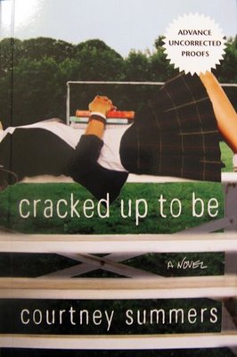
"When I got the first cover for Cracked Up to Be, I loved it. It had a faceless girl laying on some bleachers set against a field and I thought it was awesome, so I was 2 for 2! Unfortunately, *cue ominous music*, it was not meant to be. There was a hiccup with the stock image of the girl, so my cover was pulled (trivia: you can see the girl on the cover of Daniel Ehrenhaft's Dirty Laundry and Kimberly Brubaker Bradley's Leap of Faith--and she looks great on both!). I was a little bit bummed about this; no author is guaranteed a cover they'll love.
2) it would be awesome (what author doesn't want that, though!)
"When I got the first cover for Cracked Up to Be, I loved it. It had a faceless girl laying on some bleachers set against a field and I thought it was awesome, so I was 2 for 2! Unfortunately, *cue ominous music*, it was not meant to be. There was a hiccup with the stock image of the girl, so my cover was pulled (trivia: you can see the girl on the cover of Daniel Ehrenhaft's Dirty Laundry and Kimberly Brubaker Bradley's Leap of Faith--and she looks great on both!). I was a little bit bummed about this; no author is guaranteed a cover they'll love. 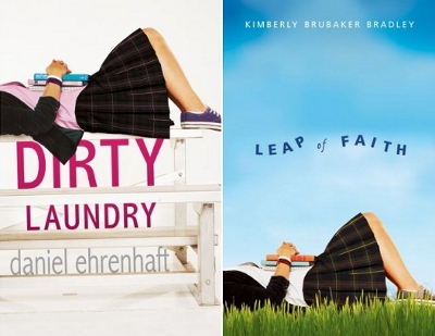 I really adored that cover and was slightly nervous the new version wouldn't capture my heart in the same way.
"St. Martin's ended up doing a photo shoot for the new cover, which was really exciting. They wanted to match it as closely to the original as possible. Pretty soon after, I got my new cover, which is as you see it today EXCEPT...
"The colours were different and I did not love them.
"I can't fully articulate why I didn't like them--I just knew that I didn't. I disliked the blue bench and found the red in the skirt very off-putting. A little too neon Christmas. My agent passed along my concerns and the art department and my editor were very receptive to them. The colours were changed to what you see now. When I saw the revision, I LOVED it without reservation. I think it's much stronger than the original. Green is my favourite colour, so it was neat that it was featured so prominently on my debut. (See both covers side by side):
I really adored that cover and was slightly nervous the new version wouldn't capture my heart in the same way.
"St. Martin's ended up doing a photo shoot for the new cover, which was really exciting. They wanted to match it as closely to the original as possible. Pretty soon after, I got my new cover, which is as you see it today EXCEPT...
"The colours were different and I did not love them.
"I can't fully articulate why I didn't like them--I just knew that I didn't. I disliked the blue bench and found the red in the skirt very off-putting. A little too neon Christmas. My agent passed along my concerns and the art department and my editor were very receptive to them. The colours were changed to what you see now. When I saw the revision, I LOVED it without reservation. I think it's much stronger than the original. Green is my favourite colour, so it was neat that it was featured so prominently on my debut. (See both covers side by side):
 "In hindsight, though I still heart Cracked Up to Be's cover muchly, some people commented that it didn't reflect the grittiness of the actual book, so when we started to work on my next book, Some Girls Are, my editor told me they were going to try for a gritty vibe and I was thrilled..."
UPDATE: the Cover Story for Some Girls Are is up on Barnes and Noble's Unabashedly Bookish blog.
Oh, and Alea did a great Lookalikes post on this cover (from which I grabbed the ARC photo -- thanks!).
Thanks, Courtney! I like the greens and the darker bench in the final cover, though I have to admit I didn't know this was a different photo shoot from the other books. I can see how readers would want the cover to be a little grittier, but I think it's lovely nonetheless... What do you guys think?
"In hindsight, though I still heart Cracked Up to Be's cover muchly, some people commented that it didn't reflect the grittiness of the actual book, so when we started to work on my next book, Some Girls Are, my editor told me they were going to try for a gritty vibe and I was thrilled..."
UPDATE: the Cover Story for Some Girls Are is up on Barnes and Noble's Unabashedly Bookish blog.
Oh, and Alea did a great Lookalikes post on this cover (from which I grabbed the ARC photo -- thanks!).
Thanks, Courtney! I like the greens and the darker bench in the final cover, though I have to admit I didn't know this was a different photo shoot from the other books. I can see how readers would want the cover to be a little grittier, but I think it's lovely nonetheless... What do you guys think?
Photo Friday: Snow Days!
in Photo Friday
I had a down and up week...First, I had to watch my Tarheels lose to Dook. Really, they threw away the game all on their own, but it was a BUM-MER. This is how I roll on game nights. My living room looks very fratty for some reason (I am not promoting beer, but I am promoting pizza):
 This is where Swayze goes when I start yelling at the TV during basketball games:
 Luckily, after that loss, I had lots of snow to play in at the park up the block from my house. Here are my friends Meredith and Anne, ready to sled!
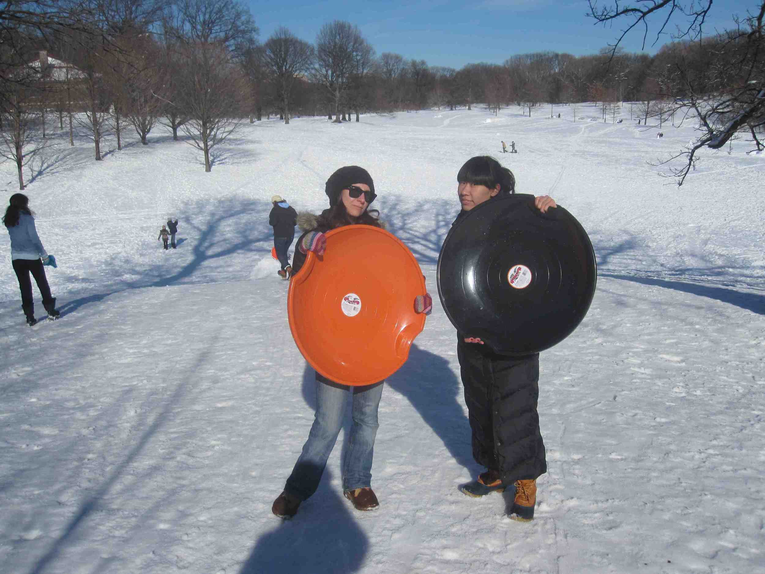 Whee!
Whee!
 Also, someone built an awesome igloo in the park, and Anne and I went inside and looked out the window:

 So the week was pretty fun after all. How was yours?
Cover Stories + Win-It Wednesday: Year of the Horse by Justin Allen
The winner of last week's contest for a signed copy of Lisa McMann's GONE is... Mitzy! Send me your address, M.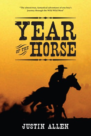 This week, author Justin Allen is here to share his epic Cover Story for Year of the Horse, and to give away a signed copy of the book! Read on, and give us your thoughts below--then you're entered!
Here's Justin:
"What many readers don't realize about cover designs is just how little input authors officially get. Heck, most times we don't even get final say in the book's title. Really! That's true! By contract, the cover and title are both part of the marketing of a book, meaning that final say goes with the publisher. Authors get to cast their two cents in, and I suppose you could cry and stamp your feet if you REALLY hated something. But the design is mostly out of your hands. More often than not, that's probably for the best...
"The story behind the cover of my latest novel, Year of the Horse, is sort of unusual. Overlook Press went through 5 - count 'em, FIVE! - completely different cover designs over the course of a year, searching for exactly the right image to hopefully make the book just leap off the shelves. Did they succeed? Time will tell.
This week, author Justin Allen is here to share his epic Cover Story for Year of the Horse, and to give away a signed copy of the book! Read on, and give us your thoughts below--then you're entered!
Here's Justin:
"What many readers don't realize about cover designs is just how little input authors officially get. Heck, most times we don't even get final say in the book's title. Really! That's true! By contract, the cover and title are both part of the marketing of a book, meaning that final say goes with the publisher. Authors get to cast their two cents in, and I suppose you could cry and stamp your feet if you REALLY hated something. But the design is mostly out of your hands. More often than not, that's probably for the best...
"The story behind the cover of my latest novel, Year of the Horse, is sort of unusual. Overlook Press went through 5 - count 'em, FIVE! - completely different cover designs over the course of a year, searching for exactly the right image to hopefully make the book just leap off the shelves. Did they succeed? Time will tell.
 "A lot of what goes into cover design is determined by whose eye your publisher is hoping to catch. This is the first cover design for my book, right. It is all my fault, I'm afraid (see, maybe authors SHOULDN'T get too much say.) Overlook asked me what I had in mind, and I described a gunfight in front of a saloon. They took this image from an old painting. It is exactly what I asked for, from the title (pay attention to that title!) to the scene, to the coloring... Does it suck? Oh, Lord!
"Fortunately, in their infinite wisdom, Overlook saw that the book just COULD NOT stay like that!
"A lot of what goes into cover design is determined by whose eye your publisher is hoping to catch. This is the first cover design for my book, right. It is all my fault, I'm afraid (see, maybe authors SHOULDN'T get too much say.) Overlook asked me what I had in mind, and I described a gunfight in front of a saloon. They took this image from an old painting. It is exactly what I asked for, from the title (pay attention to that title!) to the scene, to the coloring... Does it suck? Oh, Lord!
"Fortunately, in their infinite wisdom, Overlook saw that the book just COULD NOT stay like that!  So, they hired an artist to fashion a cover image depicting the main characters. Now this is more like it! Depicted are the protagonist, Lu (he's the boy on the right), and his friends Jack Straw (the gunfighter at center), and Sadie (the girl on the left). As the drawing was coming together I made lots of observations. For instance, I mentioned that Jack wears a blue coat (it originally came out gray). I also thought it was odd that Lu was carrying a stick of dynamite, but that didn't actually bother me much. And to me Lu and Sadie looked a bit young - in the book she's 16, and he's 15 - though again this was not really a huge deal to me. I also asked whether Sadie's hair couldn't look more blond. All in all, the artist did a pretty great job, I'd say. Unfortunately, a new problem crept up on us - The Title.
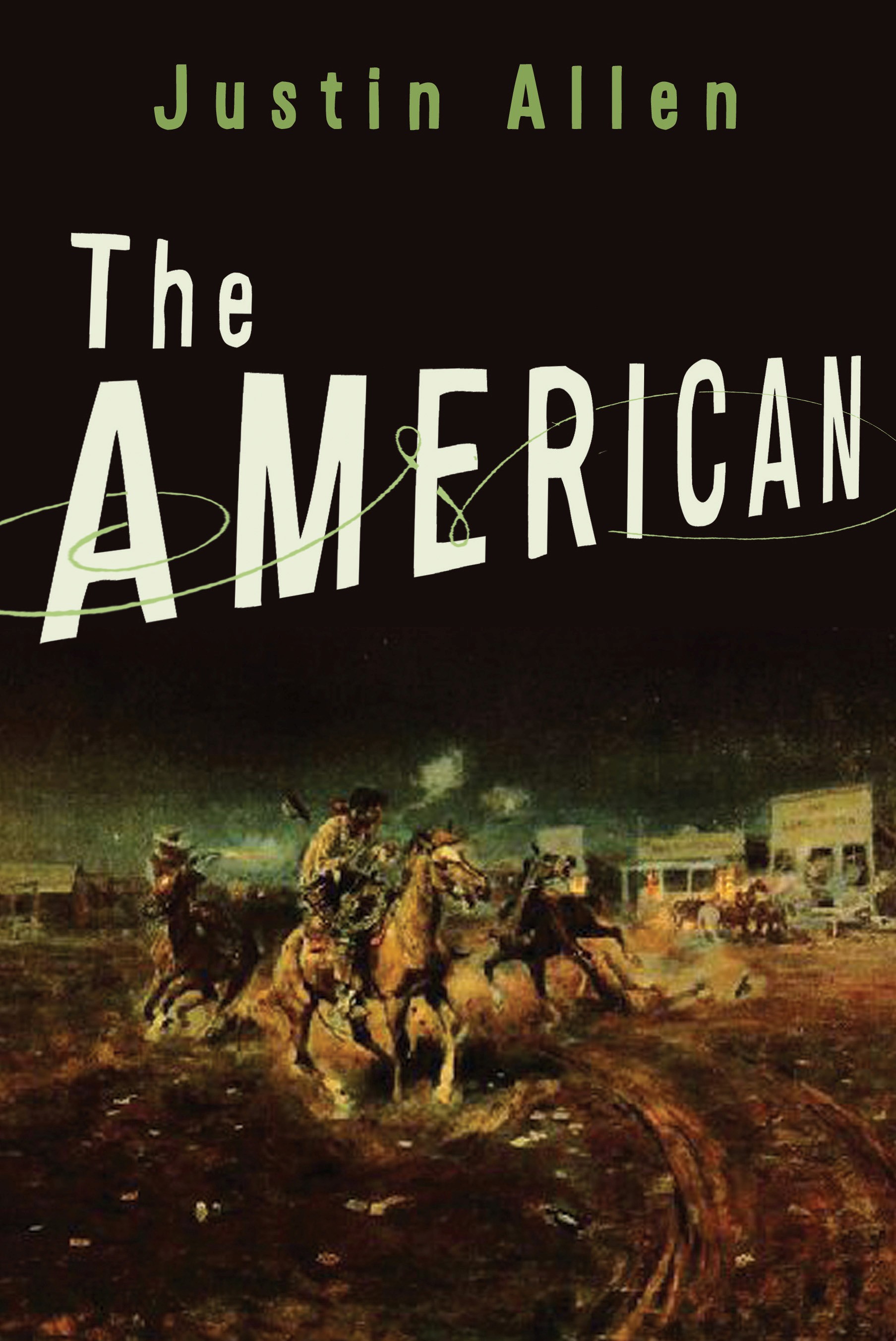
"Imagine you're looking for a book, but want to find out more information about it before you buy. What do you do? Me, I google it. You too? Small world! Now, just imagine what happens if you google "Justin Allen The American."
So, they hired an artist to fashion a cover image depicting the main characters. Now this is more like it! Depicted are the protagonist, Lu (he's the boy on the right), and his friends Jack Straw (the gunfighter at center), and Sadie (the girl on the left). As the drawing was coming together I made lots of observations. For instance, I mentioned that Jack wears a blue coat (it originally came out gray). I also thought it was odd that Lu was carrying a stick of dynamite, but that didn't actually bother me much. And to me Lu and Sadie looked a bit young - in the book she's 16, and he's 15 - though again this was not really a huge deal to me. I also asked whether Sadie's hair couldn't look more blond. All in all, the artist did a pretty great job, I'd say. Unfortunately, a new problem crept up on us - The Title.
"Imagine you're looking for a book, but want to find out more information about it before you buy. What do you do? Me, I google it. You too? Small world! Now, just imagine what happens if you google "Justin Allen The American." 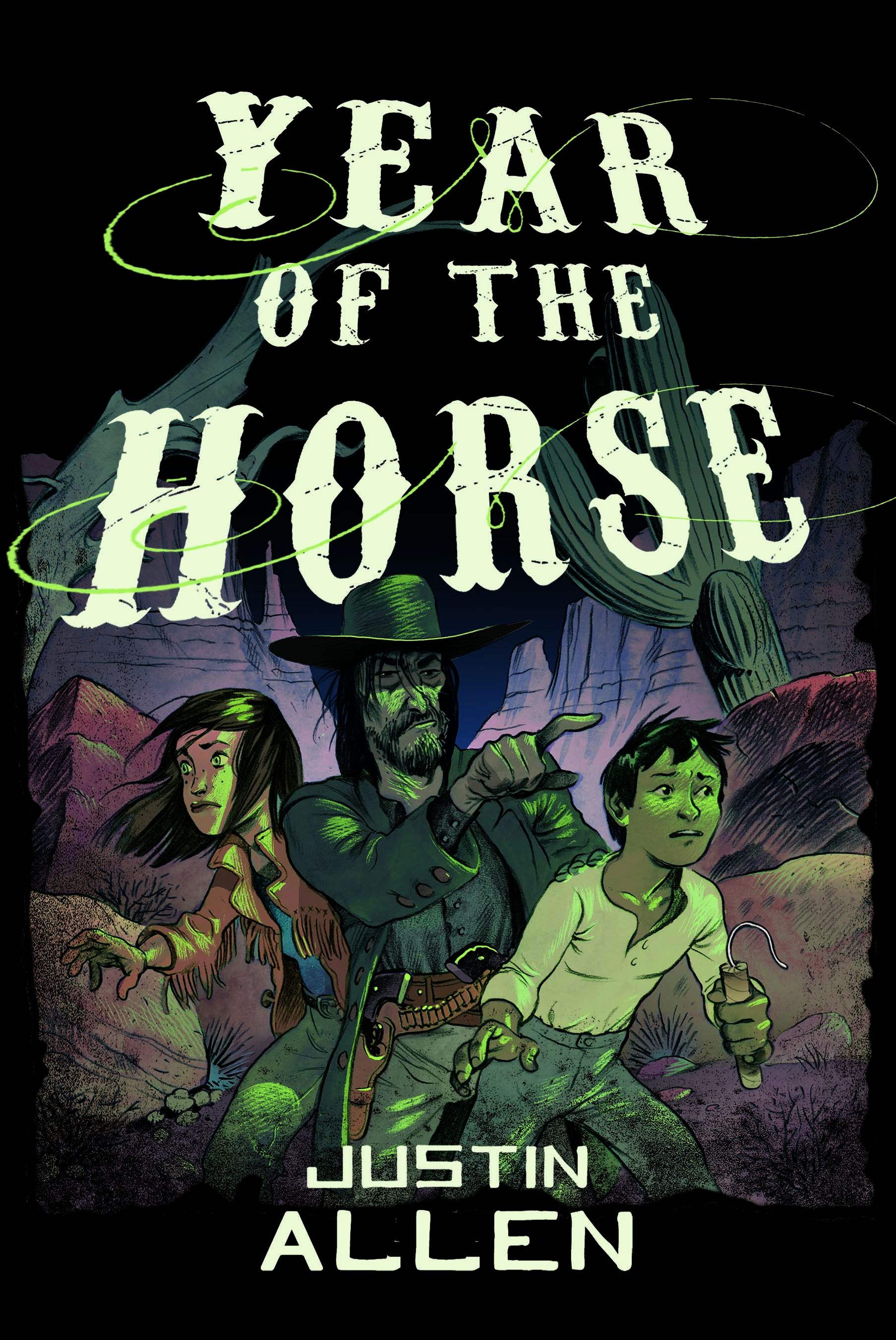 Do you think you'd get anything OTHER than my book? Go ahead, try it. We can wait. That's right, millions of unrelated hits. So another change had to be made. A NEW TITLE! We wanted something that would stand out just enough - without sounding completely made up - something that would refer to the main character's Chinese heritage, and hopefully add just hint of mystery. I suggested Year of the Horse. I suspect any number of you have seen the problem that was to follow. That's right, NO HORSE!!! You have a book called Year of the Horse, without a horse on the cover. Aiyeee! So, back to the old drawing board.
"Once again, a completely new cover idea was hatched. Saints be praised! Right? Right? There's the horse, right on top of that canyon.
Do you think you'd get anything OTHER than my book? Go ahead, try it. We can wait. That's right, millions of unrelated hits. So another change had to be made. A NEW TITLE! We wanted something that would stand out just enough - without sounding completely made up - something that would refer to the main character's Chinese heritage, and hopefully add just hint of mystery. I suggested Year of the Horse. I suspect any number of you have seen the problem that was to follow. That's right, NO HORSE!!! You have a book called Year of the Horse, without a horse on the cover. Aiyeee! So, back to the old drawing board.
"Once again, a completely new cover idea was hatched. Saints be praised! Right? Right? There's the horse, right on top of that canyon.  This is a fine image - and astonishingly, Barnes and Noble still features this image on their website, despite the fact that this is NOT what the book looks like. What's most astonishing about THAT fact is that Barnes and Noble is one of the reasons that this is NOT the cover of the book. For whatever reason, Barnes and Noble did not like this cover. In fact, they hated it. Maybe they didn't like the canyon, or the fact that the cover is mostly black. Maybe they were just having a bad day. I don't know. But I do know that they really hated this cover. I bet most of you out there didn't realize that bookstores have a say in all this, too... I know I didn't realize that. So why does Barnes and Noble feature the cover they hated on their website? I'll bet that even they don't know the answer to that!
 "So, at long last we get to the actual cover. Horse? Check. Nice and bright? Heck fire, it's yellow! Pretty girl with vampire? Not so much, but I guess you can't have everything.
"Do I like the final cover? You know, I really do. I have a poster-size image of it - one I used at some readings out west this winter - framed and on the wall next to my desk at home. I like that the horse is galloping, with streamers of dust behind him. I like the type-face and the teaser at the top. I like that the rider could be ANY of the characters, even Sadie. And I like the fact that the title is featured much more strongly than my name. I have always figured that a book, once bought, belongs to the reader. It's her imagination that will fill in the world, give life to the characters, and power to the words. The writer is no longer important at that point. It's the reader!
"Are there things I don't like about the cover? Well, let me put it this way. There are aspects of the book that this cover doesn't show. For instance, large parts of the book are actually fantastical in nature. It features sorcerers, fire-demons, a were-coyote, magical bullets, the headless horseman, and even the devil himself. But just imagine a book
cover that included all of that! I'm not sure it'd be on my wall.
"One last thing that has occurred to me about this cover, in the wake of Bloomsbury's white-washing fiasco of the past few weeks, is to note that the rider on my cover is race-less and sex-less. And you'll note that I LIKED that the rider could be ANY of the characters in the book, from the African-American Henry Jesus to the white Sadie MacLemore. I'm not sure what this has to tell us about covers, book sellers or book buyers, but I think it is at least interesting.
"I'd love to know what you all think about the cover. I bet Overlook would as well (This isn't rocket science, we can all learn more!). And if you have ANY pull at all with Barnes and Noble, and can somehow get them to switch to the actual cover of my book, 'Please! for the love of all that's holy, do so now!'"
Oh man, Justin makes me LAUGH! I really like his observation about how, on the final cover, the character could be anyone. How freeing! And I actually do think I like it best--there's action in the cover, but also a calm stillness to it because of the shadows.
Which cover do you like best? Leave your thoughts below and you're entered to win a signed copy of the book of 1000 covers, Year of the Horse.
"So, at long last we get to the actual cover. Horse? Check. Nice and bright? Heck fire, it's yellow! Pretty girl with vampire? Not so much, but I guess you can't have everything.
"Do I like the final cover? You know, I really do. I have a poster-size image of it - one I used at some readings out west this winter - framed and on the wall next to my desk at home. I like that the horse is galloping, with streamers of dust behind him. I like the type-face and the teaser at the top. I like that the rider could be ANY of the characters, even Sadie. And I like the fact that the title is featured much more strongly than my name. I have always figured that a book, once bought, belongs to the reader. It's her imagination that will fill in the world, give life to the characters, and power to the words. The writer is no longer important at that point. It's the reader!
"Are there things I don't like about the cover? Well, let me put it this way. There are aspects of the book that this cover doesn't show. For instance, large parts of the book are actually fantastical in nature. It features sorcerers, fire-demons, a were-coyote, magical bullets, the headless horseman, and even the devil himself. But just imagine a book
cover that included all of that! I'm not sure it'd be on my wall.
"One last thing that has occurred to me about this cover, in the wake of Bloomsbury's white-washing fiasco of the past few weeks, is to note that the rider on my cover is race-less and sex-less. And you'll note that I LIKED that the rider could be ANY of the characters in the book, from the African-American Henry Jesus to the white Sadie MacLemore. I'm not sure what this has to tell us about covers, book sellers or book buyers, but I think it is at least interesting.
"I'd love to know what you all think about the cover. I bet Overlook would as well (This isn't rocket science, we can all learn more!). And if you have ANY pull at all with Barnes and Noble, and can somehow get them to switch to the actual cover of my book, 'Please! for the love of all that's holy, do so now!'"
Oh man, Justin makes me LAUGH! I really like his observation about how, on the final cover, the character could be anyone. How freeing! And I actually do think I like it best--there's action in the cover, but also a calm stillness to it because of the shadows.
Which cover do you like best? Leave your thoughts below and you're entered to win a signed copy of the book of 1000 covers, Year of the Horse.
Bonus Cover Stories: Grimmer Tales by Erik Bergstrom
in Other Stuff
 I'm over at Barnes and Noble's Unabashedly Bookish blog again, sharing the Cover Story for Erik Bergstrom's GRIMMER TALES, a cracked fairytale cartoon book (which is undeniably hilarious, if a little dark). Some people have said they have trouble commenting on that blog -- it does require registration -- but swing by for the story in any case (he illustrated his own cover)!Here's a teaser: "We ended up going with the cracked Humpty on the wall with his brains pouring out. I think of Humpty as the naughty narrator throughout the book (he makes several appearances), and Penguin really liked the king and his horses eating his runny brains...." Read the full story.
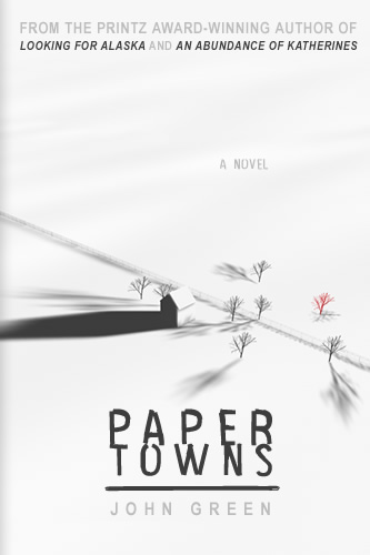 Also, just for fun, Little Willow sent me a Paper Towns cover I hadn't seen (left), so I thought I'd show it. I think I like happy/sad Margo better (below), but this third one is pretty in its own way, no?
Anyone know where the white cover comes from?
Also, just for fun, Little Willow sent me a Paper Towns cover I hadn't seen (left), so I thought I'd show it. I think I like happy/sad Margo better (below), but this third one is pretty in its own way, no?
Anyone know where the white cover comes from?

Cover Stories: Heist Society by Ally Carter
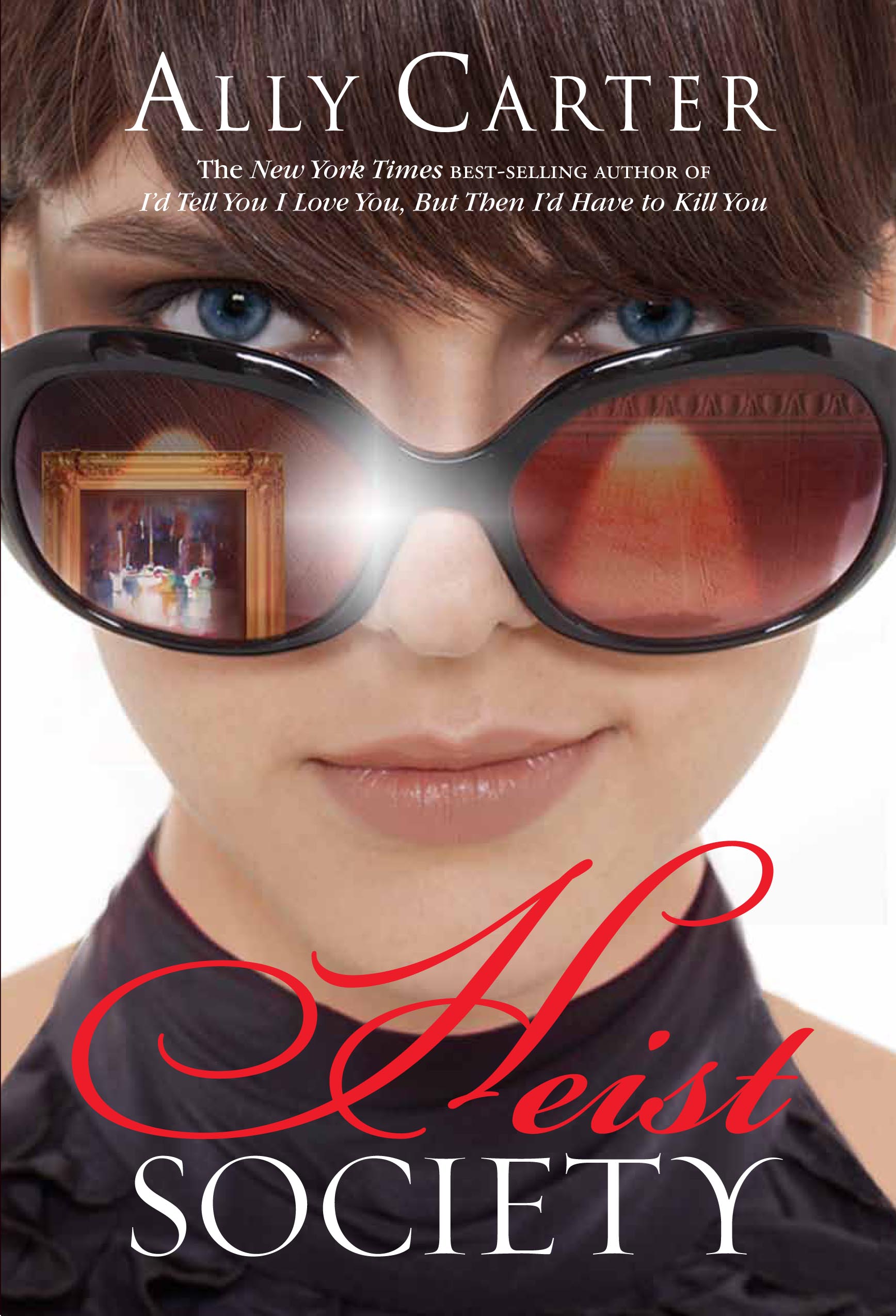 Ally Carter and I shared a cover model once! The model on the cover of Cross My Heart and Hope to Spy also posed as Violet on all three of my Violet covers! (Read that story here.)This week her latest novel, Heist Society, is out, and it's got a fantastic cover, in my opinion. Here's Ally with the Cover Story:
"I am not an artist -- not even a little bit. Plus, my wonderful publisher, Disney-Hyperion, has always blessed me with such fabulous covers before that I didn't spend a lot of time trying to come up with a specific concept. The only thing I felt certain of was that it should have a lush, rich feel and feature art in some way.
"When researching art and famous art heists I, of course, heard the story of the 1990 robbery of the Isabella Stewart Gardner Museum in Boston which many consider to be the largest single art theft in history.
Ally Carter and I shared a cover model once! The model on the cover of Cross My Heart and Hope to Spy also posed as Violet on all three of my Violet covers! (Read that story here.)This week her latest novel, Heist Society, is out, and it's got a fantastic cover, in my opinion. Here's Ally with the Cover Story:
"I am not an artist -- not even a little bit. Plus, my wonderful publisher, Disney-Hyperion, has always blessed me with such fabulous covers before that I didn't spend a lot of time trying to come up with a specific concept. The only thing I felt certain of was that it should have a lush, rich feel and feature art in some way.
"When researching art and famous art heists I, of course, heard the story of the 1990 robbery of the Isabella Stewart Gardner Museum in Boston which many consider to be the largest single art theft in history. 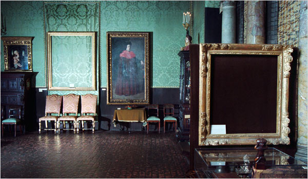 Twelve paintings were taken in that heist, but Mrs. Gardner's will indicated that the collection was to never change -- no paintings could be sold or added -- so the museum left the empty frames on the museum's walls, waiting for the missing paintings to be returned. That image (above) was always very vivid in my mind, and I shared the story with my editor.
When I saw my cover, my first thought was 'Wow!' My second was 'That's Kat.' The sunglasses and reflection were fabulous, but, to me, the best part is the little smile. That little smile says it all.
"My editor is Jennifer Besser with Disney-Hyperion and she's absolutely amazing (she's the powerhouse editor behind series like Percy Jackson and the Olympians by Rick Riordan and Bluebloods by Melissa de la Cruz.) She is always open to talk and brainstorm and do whatever we can to make things even better. But I have to say all my suggestions were little things -- trying to make the model's eyes the shade of blue I'd always imagined Kat's to be, tweaking the cover copy -- little things like that.
"This was a difficult cover to do because, in a way, Heist Society is my most complex book. It's (hopefully) a fun, funny book that takes place in a lot of glamorous, exciting locations, but it's also touches on some very serious issues. Those complexities were tough to summarize in one image, so my publisher tried many, many different treatments before finding the image that we all knew was just right. That final image changed very little from the first time I saw it.
"At first, they worked a lot with stock photos, playing with different ideas, trying to capture the perfect concept and, believe me, they went through dozens of them! I knew they were getting close when my editor started saying things like 'I think we may have one.... I think this might be the one....' At that point they sent me a very rough mock-up using stock photos and I immediately agreed.
"Next, they sent me shots of several potential models, and we all agreed on Olga, a Russian model living and working in New York. She simply was Kat. They did a photo shoot with Olga then, and the rest, as they say, is history."
"I absolutely love this cover. It does what I didn't think was possible: capturing the total essence of the story. Every time I look at it I find something else I'm drawn to -- especially that little smile."
Thanks, Ally! I love this cover, and I think the smile captures such mischievousness and the sunglass reflection works so well.
What do you guys think?
Twelve paintings were taken in that heist, but Mrs. Gardner's will indicated that the collection was to never change -- no paintings could be sold or added -- so the museum left the empty frames on the museum's walls, waiting for the missing paintings to be returned. That image (above) was always very vivid in my mind, and I shared the story with my editor.
When I saw my cover, my first thought was 'Wow!' My second was 'That's Kat.' The sunglasses and reflection were fabulous, but, to me, the best part is the little smile. That little smile says it all.
"My editor is Jennifer Besser with Disney-Hyperion and she's absolutely amazing (she's the powerhouse editor behind series like Percy Jackson and the Olympians by Rick Riordan and Bluebloods by Melissa de la Cruz.) She is always open to talk and brainstorm and do whatever we can to make things even better. But I have to say all my suggestions were little things -- trying to make the model's eyes the shade of blue I'd always imagined Kat's to be, tweaking the cover copy -- little things like that.
"This was a difficult cover to do because, in a way, Heist Society is my most complex book. It's (hopefully) a fun, funny book that takes place in a lot of glamorous, exciting locations, but it's also touches on some very serious issues. Those complexities were tough to summarize in one image, so my publisher tried many, many different treatments before finding the image that we all knew was just right. That final image changed very little from the first time I saw it.
"At first, they worked a lot with stock photos, playing with different ideas, trying to capture the perfect concept and, believe me, they went through dozens of them! I knew they were getting close when my editor started saying things like 'I think we may have one.... I think this might be the one....' At that point they sent me a very rough mock-up using stock photos and I immediately agreed.
"Next, they sent me shots of several potential models, and we all agreed on Olga, a Russian model living and working in New York. She simply was Kat. They did a photo shoot with Olga then, and the rest, as they say, is history."
"I absolutely love this cover. It does what I didn't think was possible: capturing the total essence of the story. Every time I look at it I find something else I'm drawn to -- especially that little smile."
Thanks, Ally! I love this cover, and I think the smile captures such mischievousness and the sunglass reflection works so well.
What do you guys think?
Photo Friday: Lisa McMann and Suzanne Young!
in Photo Friday
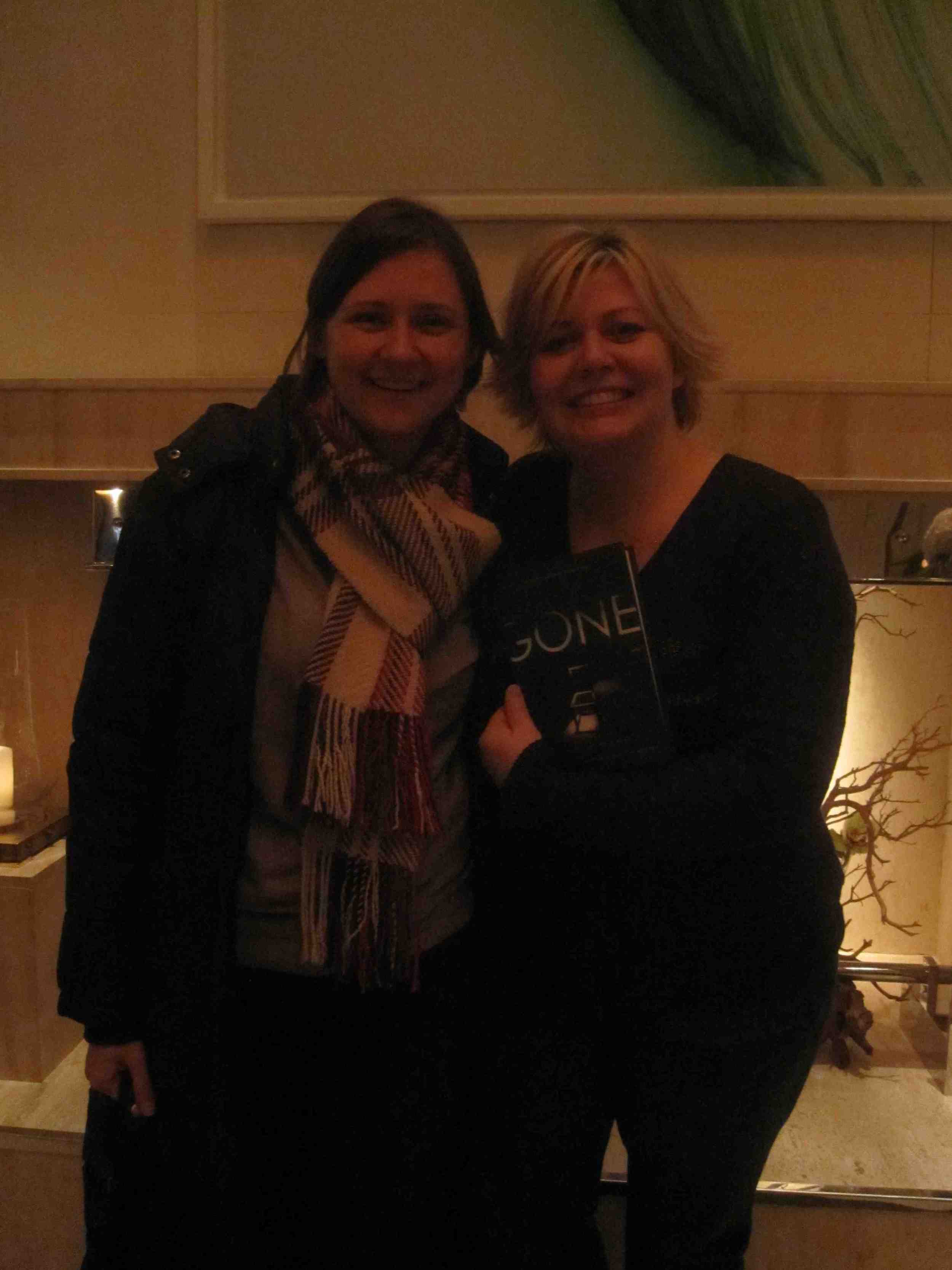
Got to see a couple of amazing authors this week. Unfortunately, my flash was acting up, so I got two really dark pictures.Here's me with Lisa, whose third book in the WAKE trilogy, GONE, comes out next week (enter to win a copy here!):
 And me with Suzanne, whose book The Naughty List came out yesterday!:
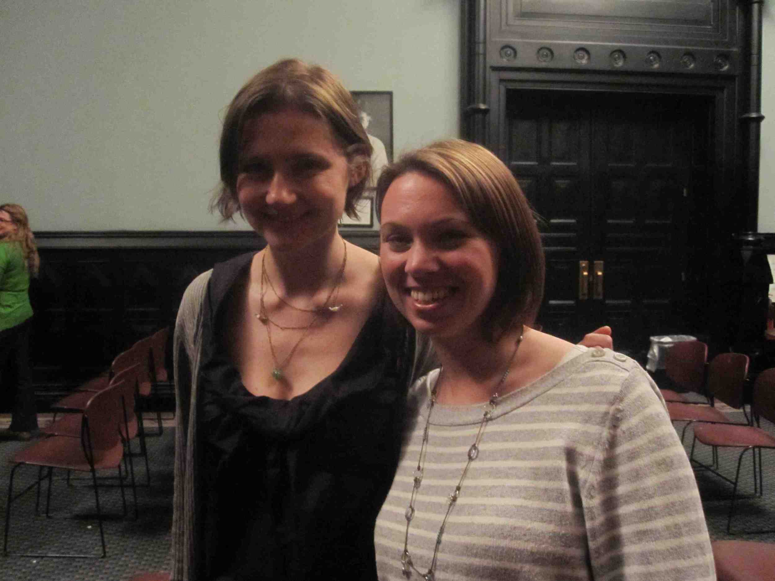 Suzanne even filmed a shoutout to readergirlz (see that here). And so did Lisa, but it's under wraps until GONE is out!
Again, sorry about the lame-o darkness. I promise next Photo Friday will be brighter!
Suzanne even filmed a shoutout to readergirlz (see that here). And so did Lisa, but it's under wraps until GONE is out!
Again, sorry about the lame-o darkness. I promise next Photo Friday will be brighter!
February on Readergirlz: Copper Sun by Sharon Draper
in Other Stuff
You guys, seriously, this book will make you cry and ache. And hope. It's amazing. Read it and join in the discussions on readergirlz, or just join in and plan to read it! That works too.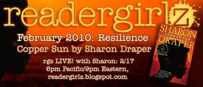
Win-It Wednesday: GONE by Lisa McMann (Signed!)
The winner of last week's Fashion Swag Bag + Fallen by Lauren Kate is... Lasha! Her unsung book was Coffeehouse Angel by Suzanne Selfors, which is now on my list too! Send me your address, L.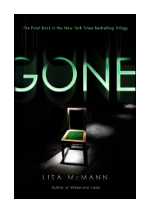 This week's contest is for a copy of Lisa McMann's about-to-be-released GONE. I was lucky enough to grab a drink with Lisa when she was in NYC this week, and let me just say, the girl rules. Also, I missed my subway stop on the ride home, because I was reading the SIGNED copy of GONE she gave me for Win-It Wednesday. It's that riveting!
So, to win your very own copy of GONE, just comment below and tell me which author blogs you read and love (besides this one, naturally, which you always, always read, right? Haha.). I'm curious -- and I'm feeling like traveling around the blogosphere a bit.
Oh, and +1 if you visit the lovely Nadine-Stella's Starry Night blog -- where she asked 21 Questions of me!
Happy Wednesday!
PS-More to win: A Valentine's Day contest over at Simple Life and Reading where you can win Lovestruck Summer and Perfect You by Elizabeth Scott! Sweet.
This week's contest is for a copy of Lisa McMann's about-to-be-released GONE. I was lucky enough to grab a drink with Lisa when she was in NYC this week, and let me just say, the girl rules. Also, I missed my subway stop on the ride home, because I was reading the SIGNED copy of GONE she gave me for Win-It Wednesday. It's that riveting!
So, to win your very own copy of GONE, just comment below and tell me which author blogs you read and love (besides this one, naturally, which you always, always read, right? Haha.). I'm curious -- and I'm feeling like traveling around the blogosphere a bit.
Oh, and +1 if you visit the lovely Nadine-Stella's Starry Night blog -- where she asked 21 Questions of me!
Happy Wednesday!
PS-More to win: A Valentine's Day contest over at Simple Life and Reading where you can win Lovestruck Summer and Perfect You by Elizabeth Scott! Sweet.
Bonus Cover Stories: Dirty Little Secrets by CJ Omololu
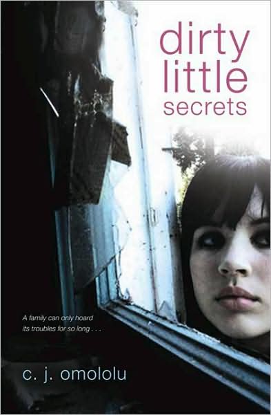 I have great news! Barnes and Noble's UNABASHEDLY BOOKISH blog has asked me to write some Cover Stories for them, and I'll be doing that every Tuesday. Today, I'm featuring CJ Omololu's Dirty Little Secrets (a.k.a. the YA Hoarder book!). Here's a teaser from the story:"When I thought about the cover for Dirty Little Secrets, I was actually thinking of something more graphic, although I had no idea what. We'd seen so many Twilight-esque covers that are cool -- books like The Dark Divine that are spare and striking -- so I thought it would be more like that. Good thing my publisher didn't ask me, because somehow, the image of a bag of garbage or a stack of National Geographics probably wouldn't be as eye-catching as what Walker came up with...."
Read the rest at Unabashedly Bookish, and I'll love you forever if you comment over there and make me feel popular. Thanks!
Happy Tuesday!
I have great news! Barnes and Noble's UNABASHEDLY BOOKISH blog has asked me to write some Cover Stories for them, and I'll be doing that every Tuesday. Today, I'm featuring CJ Omololu's Dirty Little Secrets (a.k.a. the YA Hoarder book!). Here's a teaser from the story:"When I thought about the cover for Dirty Little Secrets, I was actually thinking of something more graphic, although I had no idea what. We'd seen so many Twilight-esque covers that are cool -- books like The Dark Divine that are spare and striking -- so I thought it would be more like that. Good thing my publisher didn't ask me, because somehow, the image of a bag of garbage or a stack of National Geographics probably wouldn't be as eye-catching as what Walker came up with...."
Read the rest at Unabashedly Bookish, and I'll love you forever if you comment over there and make me feel popular. Thanks!
Happy Tuesday!
Cover Stories: The Naughty List by Suzanne Young
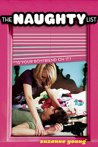 Suzanne Young is one of the most fun authors around. Proof: She does a dance when she gets a new book contract... publicly!
Her latest title is The Naughty List, and here's what it's about (summary from indiebound):
Suzanne Young is one of the most fun authors around. Proof: She does a dance when she gets a new book contract... publicly!
Her latest title is The Naughty List, and here's what it's about (summary from indiebound):
As if being a purrfect cheerleader isn't enough responsibility! Tessa Crimson's the sweet and spunky leader of the SOS (Society of Smitten Kittens), a cheer squad-turned-spy society dedicated to bringing dastardly boyfriends to justice, one cheater at a time. Boyfriend-busting wouldn't be so bad . . . except that so far, every suspect on the Naughty List has been proven 100% guilty!
When Tessa's own boyfriend shows up on the List, she turns her sleuthing skills on him. Is Aiden just as naughty as all the rest, or will Tessa's sneaky ways end in catastrophe?
And now, here's Suzanne with a little bit about the cover:
"I had a cover idea! I wanted a cheerleader peering over a fence. Or a cheer squad holding spy equipment behind their back. Instead, I got a sneak peek inside a window. It looks great for the entire series.
"Okay, truthfully, I laughed when I first saw the cover. It was way more scandalous than I envisioned. But I had a good friend that promised me it would be a popular cover. I hope he was right.
 "It is a stock photo and then they really wanted to make something special to tie the series together--that's the window pane (I adore it). It also comes in red and purple!"
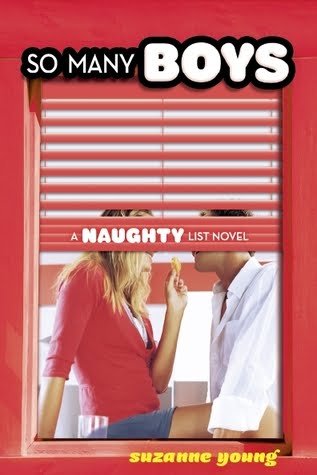
That photo is totally risquee -- I think it's the black bra that puts it over the top for me. And, I snooped around and found the cover for So Many Boys, #2 in The Naughty List series (out in June). It's great when a series has such a unifying icon, like the window pane, to ID it. What do you guys think?
PS-Update! Just found Cover #3 on Suzanne's blog: