Cover Stories: Pointe by Brandy Colbert

This. Cover. I've stared at it a lot. I think seeing both glowing reds/oranges and such strong black and white starkness enchanted me. So, I asked author Brandy Colbert a few questions about how it came to be. Turns out, she loves it too--even without blood. Here's Brandy:

"My editor (the indomitable Ari Lewin at Putnam) and I had casually discussed cover concepts while I was deep into edits on the book, but I mean casually. She mentioned bloody pointe shoes ('Like, a pair of pointe shoes just sitting in a pool of blood, yes?') and I was completely on board! I like dark, slightly disturbing covers, and that would have fit the theme of the book quite well. So I always sort of had that image in my mind, and had convinced myself that's what it would be. 

"My editor did ask, but I didn't have much besides bloody pointe shoes. I know what I like when I see it, but I'm not a particularly visual person. And I've worked as a magazine editor for quite a while, so I know when to leave the artistic vision to the designers. I love Penguin's covers (and my imprint's, in particular), but I have to say I was a little nervous about the possibility of having a face on the cover. I finally brought it up with my editor and we had a very honest discussion about whitewashing, which put me at ease. I was one hundred percent positive I was in great hands after that.

"The moment I saw my cover was actually really sweet. I was on my way out the door to run errands and stopped to answer a call from my editor. She told me to check my email, and I expected it to be another revision letter to talk out, but it was my cover. I was so happy I started crying and then my editor got teary and my first thought was that it was so beautiful, I couldn't believe it was the cover for my book.  

"My editor welcomed comments, but after I couldn't stop staring and gushing over it for a couple of days, I figured I had nothing to suggest. All of the elements worked so well together, I loved the surprising color of the font, and I immediately began thinking of the cover girl as my main character, Theo.

"As you can probably imagine, there aren't a lot of stock photos of black ballet dancers out there, but my designer (the very talented Lindsay Andrews) ended up finding the cover image on the site of an artist named Hwa-Jeen Na, whose photos are gorgeous. The silhouette was perfect to me, as I'm not really a fan of faces on covers (though there are some that work very well and that I love). You can see very clearly that she's a dancer, from the lighting behind her tulle skirt and the bun at the top of her head, but there's also a somber mood, which I like.

"I absolutely love the cover, and have actually grown to love it more the longer I've looked at it, which I didn't think possible. I've fielded a few questions about the soft white circles floating down from the top, but I'm still not sure what it is and I like the ambiguity. I think the cover ties in very well to the book. The black background immediately speaks to the darkness of the story, and the fiery reddish-orange color in the title hints at something startling or surprising within."

Add Pointe on Goodreads.

Cover Stories: Now & Forever

Susane Colasanti's Cover Stories always signal the start of summer for me -- hooray! Here's Susane with her latest:

"The hottest thing about the cover of Now and Forever might be that the models are a couple in real life.

"Or maybe it’s how the background image totally captures the excitement of a concert. And not just any concert. Now and Forever is about a girl whose boyfriend, Ethan Cross, is the world’s biggest rock star. So of course we had to do some kind of concert venue type design. I couldn’t wait to see which direction the art department would take.

"My contract says that I’m allowed cover consultation. When my editor sent me the first draft of the cover for feedback, something very obvious was missing in the audience. Screens. Not one hand in the air was holding up a screen. I suggested that a few screens be added for accuracy. Fortunately, the cover designers found a background stock photo with someone holding up a screen. There should probably be more screens to reflect how concerts (and life in general) are viewed in 2014. But showing only hands represents the old-school tone of my stories in a way that brings me right back to 1988. Madison Square Garden. Fourth-row floor seats. New Kids on the Block. Before we watched real life through screens, before we worried about getting the best pic to post on Facebook, before we could just go to iTunes and play whatever song we wanted, it was just us and the music. Immersed in the moment so deeply you never quite manage to emerge completely. Connecting in a profound, authentic way impervious to distraction. The elation of musical obsession was the best feeling for me as a teen. It’s a feeling I tried to evoke in Now and Forever, and a feeling the cover evokes as well.

"The cover didn’t change much from the initial design to the final. There was a photo shoot with the models. The initial cover had a stock photo of a boy and a girl kissing in the foreground to illustrate the concept. The background stock photo changed. The spotlights were blurred. That’s about it. I think the cover is gorgeous. I love the gold light on stage and how the book jacket has a shimmery effect that glitters gold in the light. The shimmery effect was something I asked for. I’m stoked that it worked out! Being the massive book nerd I am, I am also compelled to point out what’s happening underneath the jacket: a turquoise cover with pink foil text on the spine. Pink foil text rules.

"There is one thing that’s confusing about the cover. The boy model represents Ethan Cross. Why would Ethan be in the audience of his own show? Shouldn’t they be kissing backstage? I thought that would have been a cool concept for this cover: Sterling and Ethan backstage, looking out at a crowd of fans. But maybe they’re at someone else’s show. Maybe this was before Ethan became so famous he wouldn’t be able to go to a concert like this. Maybe there’s another story behind this cover story…"

Thanks, Susane! US residents can enter to win a copy of Now & Forever below. Good luck! (Also: Hot trailer ahead.)

For more information about Now and Forever, please visit Susane Colasanti's website: http://www.susanecolasanti.com/ Thanks to Ben Bowers and Lily Zahn for bringing Ethan and Sterling to life.

Cover Stories: Heiress, P.I.

Amanda Mahan is the author of Heiress, P.I., which she describes as "Veronica Mars meets Gossip Girl." She self-published this debut, so I was interested to find out how the cover design went. Here she is to share: 


"I started by going to the bookstore and seeing what jumped out at me. Obviously dystopian future and vampire books are very hot in YA now -- so there were a ton of moody, black covers. I looked for other books that were similar (contemporary or set in L.A. or had some comedic elements to them) and really liked the covers by Ally Carter and Lauren Conrad. I felt like thematically, that's where Heiress, P.I. fit. 


"To create the cover, I worked with a designer friend who lives in France and all of our communication was done online. Since I couldn't walk the aisles of the book store with Lucie (the designer, as opposed to my heroine Lucy), I created a secret Pinterest board for her with all the book covers that inspired me. Some, like Mindy Kaling's book, weren't even YA. This was a great exercise because I could start to see common elements, moods, fonts, textural bits, and imagery. I also added other pins -- movie posters (like Sophia Coppola's Marie Antoinette), pictures of young stars like Amanda Seyfried who I imagined looked similar to Lucy. Oh and Kelly Osborne's purple hair. There was just something about it that I liked.


"I realized that I wanted the cover to reflect the sense of humor in the book -- and also to help it stand out from all the moody, black, dystopian stuff. And I wanted one strong, unmessy, uncluttered visual because I knew it was going to be an e-book initially and seen in a rather small size on the web or mobile. There were a few elements of the story that I thought could be fun to play with. One is that Lucy goes to a costume party dressed as Marie Antoinette which seemed like an interesting territory to explore. 


"We didn't have money for a photo shoot, so we had to use stock. Stock images with Marie Antoinette themes were... strange. Lucie tried some illustration styles as well (see right). But ultimately we decided a photograph captured the modern story better. In one exploration we had a fan (which plays an important part in the story) covering part of Lucy's face. We both liked that because it underscored the idea of secrets and the mystery that Lucy was investigating. We also both liked having her hair in a Marie Antoinette-style bun, even though we had pretty much abandoned the costume party idea.


"One day I was searching through images and inspiration struck. I saw my favorite mug shot -- the one of Steve McQueen doing a peace sign. It's irreverent and has a sense of humor but communicates trouble. There is a scene in the book where Lucy gets arrested -- it felt like the right tone and concept. I found a mug shot background on iStock and Lucie made a few mock ups with different fonts, colors, placements and finishing touches. I was really into a rhinestone tiara for a while. Too froufrou! Same with feathers, fans, flowers and candy. We kept trying different things but in the end we both liked it a bit 'roughed up' because it had to appeal to older teens and women.


"I sent the mockups to a friend who has teen daughters and a few younger cousins for informal focus groups. The feedback was invaluable. They loved the star in the title text, for example, because they thought it made the book seem like it would be fun. They loved the pink color. They liked certain hairstyles over others. They liked certain girls over others who seemed 'nicer' or 'prettier' or had better hair. One crucial bit of feedback was that the girl on the cover was blond but the write-up I sent (which would be akin to the book jacket copy) talked about Lucy's frizzy brown hair. Total disconnect! I realized I needed a tagline and that's where 'madeover and undercover' came in. 


"In the end, we made a few more tweaks like adding black nails to show rebellion and the pop of pink nail color and hair streak to be more trendy. The cover is so important because it has to convey the trashy, tabloid, celebutante, pop culture, fun beach read feel - all while intriguing you to dive in. In the end, I'm super happy with it and all credit goes to the fabulous Lucie!"

Thanks, Amanda! Check out the book!

Win a Copy of Fast Fiction

Rather than doing a traditional interview-filled blog tour, Denise Jaden is celebrating the release of her new nonfiction writing book, FAST FICTION, by dropping tips about writing quickly at every stop of her blog tour, and offering some awesome prizes for commenting on any of these posts (including this one!) The more you drop by and comment, the more chances you have to win these great prizes:

1. Compliments of New World Library: They will be giving away A BOX of copies of FAST FICTION by Denise Jaden and GET IT DONE by Sam Bennett (US and Canada only):

2. Compliments of Denise Jaden, TWO BOXES of great fiction (US Only). Details on Denise's blog.

3. Audiobook copies of NEVER ENOUGH by Denise Jaden!

4. A critique of your first five pages, compliments of Denise's agent, Michelle Humphrey from The Martha Kaplan Agency!

See how to enter at the bottom of this post!

And now, here are Denise's Thoughts on the Cover of Fast Fiction:

Since I’m very new to writing nonfiction, I had no preconceived ideas for the cover of FAST FICTION. My publisher sent me a few ideas, all similar with different color schemes, and asked for my input.

Really, I was thrilled with all of them, but I suggested a few small tweaks and my first choice of color. They followed all of my suggestions, which felt really honoring to me (only slight changes of a “speed” look to the font). The finished cover changed very little from the original choices they sent, but I loved it so much, it inspired me to redesign the cover for my first nonfiction book, WRITING WITH A HEAVY HEART. Now I love to look at these books together on the shelf!


About Fast Fiction:

Writers flock to National Novel Writing Month (NaNoWriMo) each November because it provides a procrastination-busting deadline. But only a fraction of the participants meet their goal. Denise Jaden was part of that fraction, writing first drafts of her two published young adult novels during NaNoWriMo. In Fast Fiction, she shows other writers how to do what she did, step-by-step, writer to writer. Her process starts with a prep period for thinking through plot, theme, characters, and setting. Then Jaden provides day-by-day coaching for the thirty-day drafting period. Finally, her revision tips help writers turn merely workable drafts into compelling and publishable novels.


A portion of publisher proceeds will be donated to National Novel Writing Month (NaNoWriMo)


Where you can find Fast Fiction:

The giveaway:

Remember, all you have to do is leave comments to get lots of extra entries to win some great prizes.

Don't know what to comment about? Tell us the name of your favorite writing book!

Access the Rafflecopter giveaway here.

Cover Story: Firstborn

firstborn coverLorie Ann Grover, a co-founder of readergirlz.com, is an idol of mine. Her spirit, her love of reading and her writing... Well, let's just say I look up to her mucho. Her latest novel, Firstborn, already has a star from Kirkus. And she has this to say about it: "Firstborn originally sprang from an article I read on gendercide. Over 37 million girls are missing today due to China’s One Child Policy. Visit Global Gendercide Advocacy Alliance Project or All Girls Allowed to learn more and act." And now, her Cover Story:

"I’m so honored to be included in Melissa’s Cover Stories! I have to say, we authors usually sit at home holding our breath, waiting for our cover reveal from the publishing house. On rare cases we are able to interject a thought before the creation. In On Pointe I was able to ask for a specific type of toe shoe to be portrayed (read that epic Cover Story!). Even more unusual is the request for a correction after the image is designed. Upon seeing the cover for Loose Threads, I asked for embroidery needles to be replaced by knitting needles, in keeping with the story. My request was granted. But as I waited for the unveiling of the Firstborn cover, I prepared to give zero input. Zero. Like normal.

"What a delight to not have a speck of criticism. When I opened the cover file for Firstborn, I was blown away! I remember sitting in amazement that Mike Heath from Magnus Creative had caught the atmosphere, the character, the place with his art. The font itself conveyed the angst and aggressiveness I had hoped to convey within the story. There was my moment of awe, followed by chills, a prayer of thanks, a happy dance, and then a call to my family to see and share my first fantasy cover.

"When I’m working on a novel, at the start or shortly after, I’ll often create a vision board to help me capture those first impressions and hold onto them through the process to publication. I’ll tear out images of characters, the setting, and objects from magazines and books. Then I compose the pieces into a unified whole. This is the vision board I created for Firstborn:

100_5258

I believe the essence of my board lies in the Blink cover, which was created before I shared this image with the team. The trailer was in keeping with the collage as well:

"I’m incredibly blessed to be working with such a talented team at Blink. I appreciate that they have visually brought my story to the cover. It’s a perfect bridge to the reader."

Thanks, LA! Cannot WAIT to read this book (which is out tomorrow!).


My Fake Boyfriend... in Paperback!

Meg Cabot says of Kristina Springer's latest novel: “Irresistible as a fluffy kitten. I laughed out loud and so will you!" My Fake Boyfriend is Better Than Yours was a Scholastic Book Club Bestseller and a YALSA Quick Pick. Kristina calls her cover "perfect," and now the paperback is out, with not one single change. Here's the cover again, and her original cover story. MFBIBTY


KS is running a giveaway on her site through 1/15, and here’s what the winner will get: • A $20 gift card (Starbucks or Amazon, your choice!), • Autographed copy of My Fake Boyfriend is Better Than Yours, • Fake Boyfriend Emergency Kit, and a • Variety of bookmarks/stickers from all of Kristina's books

Check out the book here.

Self-Publishing: Little Chicken's Big Christmas

lcbc
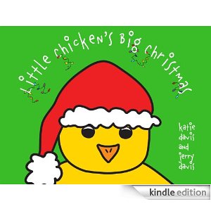
I am always curious about marketing and different ways to get attention for books of all shapes and sizes. Katie Davis does an amazing job with promotion for all of her titles, and her latest effort in self-publishing is especially timely and fascinating. I interviewed her about Little Chicken's Big Christmas, a companion to the traditionally published Little Chicken's Big Day, written with her husband Jerry, and she had some great ideas to share: MW: What made you want to go the indie route with Little Chicken's Big Christmas? Katie: Suddenly I started seeing Little Chicken in a Santa hat kind of almost covering his eyes. Just as suddenly in mid-October I told Jerry we should do a Christmas book with Little Chicken. You can only do an indie book that fast! And if we were going to publish that quickly, why not try to help other writers, too, and do it as a marketing experiment? It's a reciprocal opportunity. Other writers are learning how to launch their own books, learning from my mistakes, missteps, and successes, and it's a three-part process, as the first part in an effort that will be repeated for my next indie eBook, the second edition of How to Promote Your Children's Book: Tips, Tricks, and Secrets to Create a Bestseller. I've re-written it with new content, a bunch of additional chapters and information. I'm launching that on all my social media platforms: my SiteFacebookYouTubeTwitterGoogle+My Podcast and it will again have a limited signup time, just like this one did. (The third segment of the experiment will happen in the spring for my traditionally published young adult novel, Dancing With The Devil, published by Diversion Books.)

Jerry: The Christmas story is related to the indie route. We had to get an enormous amount of work done incredibly fast and we knew we'd make ourselves crazy getting it done. Now, Little Chicken has attitude and I love that. He does go along with his mom's running around and Christmas errands, but he *is* a kid and gets impatient! And from that kid point of view, the holiday season and all that hustle and bustle is crazy! The kids are focused on the presents. Little Chicken is impatient at times, but is enjoying the traditions despite himself. Spoiler alert: in the end we learn that Little Chicken's impatience is from a completely loving and selfless place so we get to underscore the importance of giving and expressing love and family during the holiday season, no matter how crazy things get. What better reason to make our own selves crazy getting that indie book out?

MW: Was it easy to upload/format? Katie: It was more important to get the book done than learn how to format it ourselves and since we were under the gun time-wise, we interviewed a bunch of places and finally I found a woman we paid to do it. Sometimes you need to hire people to do stuff you don't have time to do. My Launch Team will have access to the entire process, and so will the next team, which I'll open up when I'm ready to launch the next edition and vastly expanded How to Promote Your Children's Book: Tips, Tricks, and Secrets to Create a Bestseller. People can already sign up for that team by clicking here.

First I created a mailing list and within a week had well over 125 people signed up. I announced it on my blog and explained that I was having an e-book come out Thanksgiving and that sales would be over by December 26. I thought it would be the perfect marketing experiment in a bottle. My launch team members would learn all my methods and then be able to use them for themselves. They'd be able to use my strategies for their own launches, repeat my successes, and (bonus!) avoid my mistakes!

I sent each team member a review copy and ask them to post an honest review on Amazon. It was very important that it had to be honest or it would mean nothing. I asked them to social media-ize it, too. I, in turn, would show my appreciation by thanking them with awesome thank you presents. There will be a raffle for a guest spot on my podcast and since I get an average 2200 impressions per episode, it's good promotion for the winner. They could also swap that for an hour of my consultation services. There're also other thank you gifts that members received just for posting their reviews.

It's been a fascinating experiment, and one I'm still monitoring. I wanted to see how reviews - that is, social proof - effected buying. However, this experiment won't mean anything until the results come in from the second and third experiments, because this is only part one. This being a picture book, it will be a much different result from the guide mentioned above, and a novel (my young adult novel, Dancing with the Devil). And of course, this is still all kind of subjective, since the team members will be different (pb peeps v. marketing guide peeps v. YA peeps) AND they're all MY books and MY efforts. Someone else would have a different book to promote, do the promotions differently, have different ideas, and different outcome.

MW: What "creative marketing techniques" did you try? Which worked best, as far as you can tell? Katie: As I said, we won't know the true effect until later in the month when the sales figures come in and even later after parts one and two are done. And again, because this is a picture book I will only know part one of the results - rather, one aspect, really.

But basically the entire idea was to see the effect of social proof. When people see that you have over 100 reviews they may think that book must be really good book and perhaps decide to buy it. Social proof is kind of like the Good Housekeeping Seal of Approval. Imagine you're on the street and you see a crowd of people all hovering around something and you hear cheers and oohs and aahs - you want to go across the street and see what they're all looking at ... social proof is the same idea. That's why I went for the reviews.

Another creative marketing technique is The Write Your Own Coloring Book promotion. When a buyer submits his or her receipt to me at support@katiedavis.com, he or she will be sent a link to download the entire Little Chicken's Big Christmas in coloring book form - but without the text, so the child can create an entirely new narrative. This is very cool because not only will the buyer benefit by getting a gift with purchase, but the child receiving the gift will, too, as will I, by building my mailing list and know who is interested in my work, and I can keep them updated when more books come out.

MW: How did you decide on the price for the book? Katie: I simply looked at the prices of other books. I actually didn't do this for the money - that is for next year - this time I wanted to see what would happen if I did this or that. I wanted to sell a lot of copies, so I priced it low in the beginning. Every time I raised the price I offered an incentive, like the coloring book example, above. I've made some really stupid mistakes, too! The phrase "epic fail" doesn't come close! I will be sharing those and my numbers with my teams and I'll be comparing the numbers to the launches of the guide and of my young adult book, Dancing With The Devil. Because that one is traditionally published I won't have any say over the price but these are three such completely different kinds of books, so I think the comparison between them will make for a super interesting experiment in the end.

MW: What advice would you give to other authors who are considering this route with books, children's books especially? Katie: I try to coach my marketing clients to be creative, and fear no failure! There's nothing we can't do now. You're only limited by your imagination and your lack of trying.

Cover Stories: In the Blood

In the Blood - Hantz[1] Sara Hantz was here in 2008 to share the original cherry cover of her debut, The Second Virginity of Suzy Green. She's back with a very different book and a very different cover. In the Blood is the story of Jed Franklin, who has a normal life until his 17th year, the year when his father is charged with the abuse and murder of four young boys... and normal becomes a nightmare.

Here's Sara with thoughts on the cover:

"My publisher sends out a cover art form, though my input wasn’t very useful as I couldn’t think of anything other than I don’t like cartoon characters! I’m not a very visual person.

"When I first saw my cover, it brought tears to my eyes--it made me so happy. It was better than anything I could have imagined. I love the newspaper headlines on the body of the guy and also how dark and brooding he is."

Thanks, Sara! The shadow of the newsprint is my favorite part--so cool.

Bonus: Enter the giveaway on Sara's site to win a KINDLE loaded with a copy of In the Blood!

Cover Stories: Open Mic

open micOpen Mic: Riffs on Life Between Cultures in Ten Voices is an anthology in which ten YA authors use their own brand of humor to share their stories about growing up between cultures. Edited by acclaimed author and speaker Mitali Perkins, this collection of fiction and nonfiction embraces a mix of styles as diverse as their authors, from laugh-out-loud funny to wry, ironic, or poignant, in prose, poetry and comic form. Debbie Rigaud is one of the contributors to the anthology, and she's here to talk about the cover design.

"The title as an illustrated microphone is just perfection. I’m liking it! But that’s not the initial detail I noticed about the cover. First thing that jumped out at me was the color—as yellow as that early Coldplay song. It made me think of the cover for my romantic comedy PERFECT SHOT (read that Cover Story!), which was also unexpectedly of a yellowish hue. The funny thing is—ready for this?—that for generations in my family, yellow was deemed bad luck. I’m talking bad as the devil on Halloween! We think it all started back over a century ago when my great grandma wore a yellow dress on a day that turned out to be her very worst. Well, my obedient mom took the yellow-ban to heart and kept it going. Growing up, the worst thing you could do was hand her a yellow Mother’s Day card with a bouquet of daffodils. How wacky is that? But all along, I (the rebel that I am) was drawn to yellow, thinking it a bucket of cheerful golden goodness. So, it’s all good to me. Thankfully, with my generation it’s a new day for yellow. Currently, my favorite flower is the sunflower (they were the first flowers my husband gave me), I’ve been published in two yellow-jacket books and the experience didn’t sting (pun intended), and I’d welcome another sunny book cover on my author shelf in the future. Let the sunny shine on!"

Debbie also asked Open Mic editor Mitali Perkins about the cover, and she said that she loves that the cover image isn't a face that's tied to a gender or other identifier. And interestingly enough, Mitali tweaked the title to fit the artist's design. The original title was OPEN MIC: TEN RIFFS ON GROWING UP BETWEEN CULTURES.

I love these takes on the cover, which I think is simple and eye-catching and loud in a subtle way (not easy to pull off).

Debbie's short story, “Voila,” is the tale of Simone. Thanks to overprotective parenting, Simone’s elderly great aunt Ma Tante has more of a social life than she does. But one afternoon, Ma Tante’s social scene awkwardly intersects with Simone’s in the unlikeliest of places.

Check out the book!

Cover Stories: UnSoul'd by Barry Lyga

UnSould_smBarry Lyga's UNSOUL'D is about a mid-list author in his 30s who sells his soul to the devil for the promise of fame, fortune and fans. It's actually my life story but Barry changed the main character to a guy. KIDDING! But, um, I can relate to the protagonist's impulse. The book is also published by Barry himself, so he had complete cover control. Here's his tale:

"I tend to like very simple, stark covers. If you look at books like BOY TOY or I HUNT KILLERS, they really have single overriding images or big, potent type treatments. I love those covers. So for UNSOUL'D, I was always envisioning something incredibly simple: Just the title on a white background, to make you really think about that word. And then I screwed it up a LOT before I finally got it right.

"I know just enough Photoshop to be dangerous, so I sort of put together a quick mock-up of what I wanted. And I hated it. So, instead of text on white, I tried text on black. That looked a little better, so I tried adding some flames at the bottom. It still didn't look right, though. I realized that my poor Photoshop kung fu wasn't up to the task, so I talked to the woman who did the covers for I HUNT KILLERS and GAME, but we weren't going to be able to coordinate things in time.

"Fortunately, I had just met Lisa Amowitz at a bookstore event. She's a debut YA author, but also a professional cover designer. When I mentioned UNSOUL'D, she said she'd be happy to do the cover.

"I gave her my pathetic mock-up and said, 'But, you know, GOOD.' And she went to work.

"I was really stressed out. I've had input into covers before, but now, for the first time, I was 100% responsible. There was no editor to say, 'Nah.' No agent to tell me what worked or what didn't. No marketing people to offer suggestions. It was exhilarating to be out there on my own, but also frightening. If I said, 'That's it,' then that was it -- no one would or could overrule me, and the book would rise or fall on my tastes alone.

"Lisa did a slew of different variations on that original mockup (see two below), and they were all perfectly fine, but there was just something gnawing at the back of my brain and I couldn't figure out what it was. Then Libba Bray looked at the eight or nine mockups Lisa had done and said, 'You know, these are really dark. And your book is dark, but it's FUNNY.' And the proverbial light bulb went off.

Unsoul'dcompRound3.1  Unsoul'dcompRound4.1

"I called Lisa and said, 'Look, you've done some cool covers here, but I want to try doing one in white instead of black.' Which, you know was the original plan before I mucked things up by playing around in Photoshop. 'Can you try one like the words are burned into paper or something?'

"Within less than twenty-four hours, she sent me the final cover. And it was just perfect. I could have saved her a lot of work and me a lot of stress if I'd just told her my original idea from the start!

"I love the cover! Absolutely love it. It harks back to my very first idea, but Lisa took it in a totally new direction, making it tactile, giving it heft and dimension as opposed to just flat text on a white backdrop. Now it's simple and bold, but without being dull or generic.

"I don't know if it's my computer screen or my aging eyes, but for some reason the word 'UNSOUL'D' on the cover seems ever-so-slightly blurred to me. Just the tiniest bit less crisp than the rest of the cover. Which I actually think is cool for a book that's all about the gray areas of morality. I imagine it's just the way my eyes perceive the particular combination of colors and lines on the cover, but I'm a fan of it anyway."

Thanks, Barry! I love hearing how an author who had complete control navigated the process!

You can get UNSOUL'D in any ebook format you like! Want to read a big excerpt first? You got it.