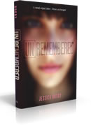
 Jessica Brody has been here before to talk about the covers for her previous novels (The Karma Club, My Life Undecided and 52 Reasons to Hate My Father -- click to read). This time, she made a video to discuss her latest book, Unremembered. Take a gander (you get to see the UK cover and some font adjustments!) and then download the first five chapters of the book for free!
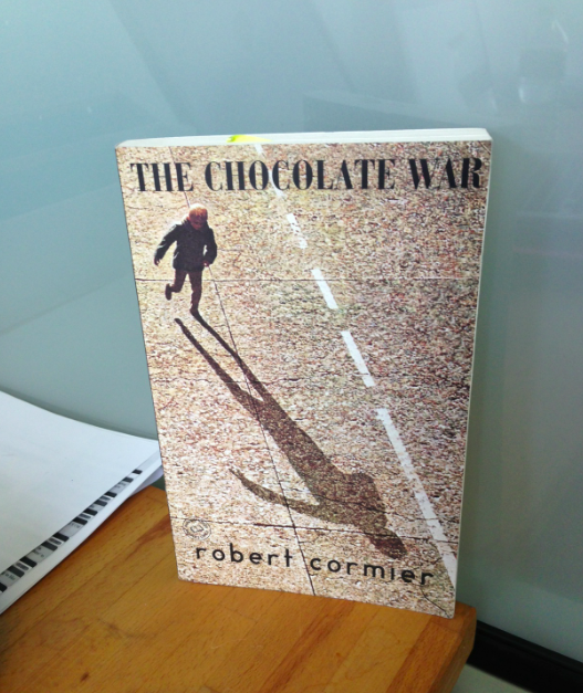
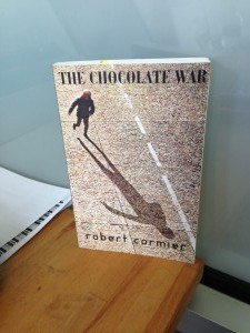
Win-It Wednesday: The Chocolate War by Robert Cormier
AHHH! Why did it take me so long to read this book? I have no idea. But that was so silly of me. Because this book is GREAT. You want to read it. So enter below in various ways and I'll pick a winner next week. On Weds, or Thurs (if I'm running behind like this week). xxM
PS-Last W-I-W MJ books winner was Jen P! And I'll totally mail them very, very soon!
Cover Stories: Imaginary Girls by Nova Ren Suma
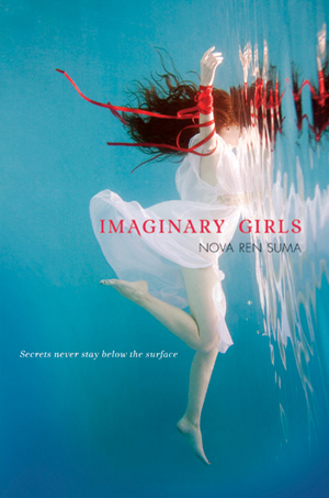 Nova Ren Suma was here last week talking about her cover and title changes for Dani Noir/Fade Out. This week she's back to discuss the cover that made her cry: Imaginary Girls.
"Discovering what the cover of a book will be is always a magical moment—and one that, every single time, has revealed itself to be something I didn’t expect. Maybe it’s because I don’t let myself think too much in detail about what the cover should be when I’m writing. I don’t like to picture the cover—I leave that for the people at my publishing house. I like to keep an open space in my mind for where the cover will be, once my editor sends it to me. I like to be surprised.
Nova Ren Suma was here last week talking about her cover and title changes for Dani Noir/Fade Out. This week she's back to discuss the cover that made her cry: Imaginary Girls.
"Discovering what the cover of a book will be is always a magical moment—and one that, every single time, has revealed itself to be something I didn’t expect. Maybe it’s because I don’t let myself think too much in detail about what the cover should be when I’m writing. I don’t like to picture the cover—I leave that for the people at my publishing house. I like to keep an open space in my mind for where the cover will be, once my editor sends it to me. I like to be surprised.
"I thought that the covers for Dani Noir and Fade Out both captured different feelings the story was trying to portray, and I count myself as lucky to have had both editions published. But there’s only one cover in my short history as an author that felt like someone had slipped into my secret fantasies and awarded me the thing I didn’t even know to ask for.
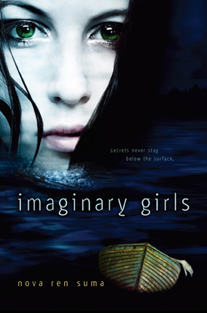
"Here it is, the cover that made me burst into breathless, happy tears (left).
"Imaginary Girls was my second published book, but my debut YA novel. It’s the story of two sisters, their strong bond, and the dead body that threatens to break it—and the story begins at the local reservoir, when the younger sister, Chloe, is dared to swim across the water by her older sister, Ruby, in the middle of the night, and something shocking stops Chloe before she makes it across.
 "The image that graced the hardcover edition of the book is a photograph by Elana Kalis, whose underwater photography is the stuff of legend. Truly—the images are so beautiful, I don’t even know how to contain myself. Here is the original image before it became my cover (right). And here is the exhilarated blog post I wrote when I first revealed this cover to the world.
"I really did cry when I first saw the cover. It was more beautiful than I’d ever imagined a cover for anything I wrote could be, and I felt like the image spoke to the voice of the novel, to the feeling I wanted to portray, even if it wasn’t a literal interpretation of Chloe swimming the murky reservoir in the deep night.
"Sometimes an author’s wildest cover dreams come true.
"…And dreams that come true don’t always last forever.
The New Face of Imaginary Girls
"Because when it came time to publish Imaginary Girls in paperback, I was told that this would involve a cover change.
 "The paperback version of the Imaginary Girls cover is quite literal. The water is dark, as the reservoir at night would be. The girl’s eyes are green, as they would be. And there’s even the rowboat with the hand reaching out of it, just as Chloe found when she was trying to swim across. I also really like how pointed the back copy is:
“Ruby said I’d never drown. I didn’t. But someone else did.”
[Full jacket below.]
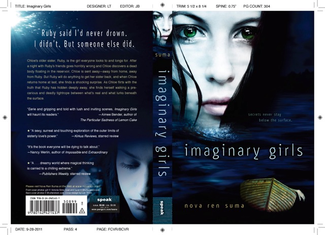
"Privately, behind closed doors, people have asked me how I could let this happen. Why change the perfect cover? But I’m sure many of you reading this post know that most authors don’t make these decisions. I have no idea what makes a book sell and what cover would draw in the right kind of reader. I do know that since the paperback of Imaginary Girls has come out in the summer of 2012, it seems that more readers have found the book, and this is what any author would hope for. Maybe the new cover tells a reader more of what to expect from this story. Either way, I feel like two sides of the book have been revealed by these covers, like it’s a story with two faces.
"And as I tell any passionate fan of the original version of Imaginary Girls, if you love the first cover as much as I do, you can still order the hardcover."
Thanks, Nova! I actually think you have hit the cover jackpot again and again. While the hardcover of Imaginary Girls remains top in my heart (who can get over such beauty?), your other covers are all lovely and evocative.
What do you guys think? Favorites?
Photo Friday: Unbreak My Heart paperback
in Other Stuff
It's here. It went through a few designs. And, voila!
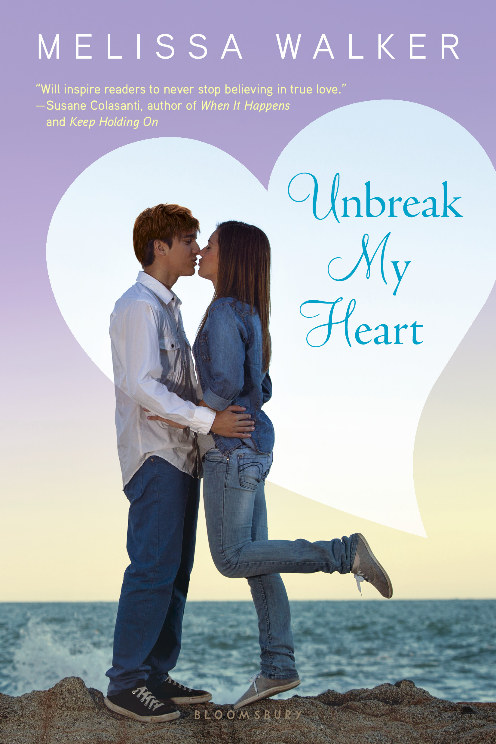
(In total honesty I loved the hardcover so much that it's hard for me to let it go. But I do have high hopes that the paperback will get in the hands of readers who want a love story!)
Happy Friday.
Cover Stories: Dani Noir/Fade Out by Nova Ren Suma
The astoundingly talented Nova Ren Suma is here with an epic Cover Story! So without further ado, here she is:
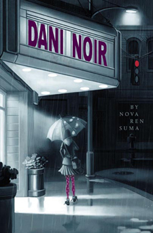
"My first published novel, Dani Noir, is about a thirteen-year-old girl named Dani who is obsessed with old noir movies and femmes fatales like Rita Hayworth. In the story, Dani uncovers a noirish secret in her small mountain town and sets off chasing a mystery girl who’s spotted wearing a pair of polka-dot tights. This book was written for a tween audience, and the cover that Simon & Schuster / Aladdin came up with for the book perfectly captured the voice and the mood of the story—as well as the mystery girl’s polka-dot tights. I felt like the illustrator, Marcos Calo, truly 'got' the character of Dani, down to the way she’s creeping behind the wall on the back cover, tailing the girl you see on the front.
(To see the stages the illustrator went through in coming to this final image, visit his blog to take a look at his sketches.)
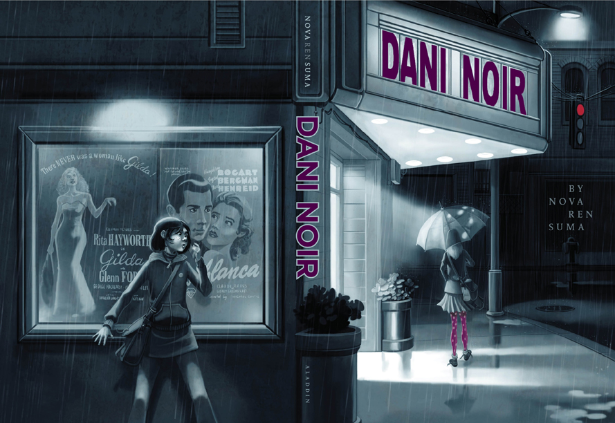
"I’d originally envisioned a black-and-white noir-style photograph, but when my editor brought me the final version of this image, which wrapped around to reveal Dani hiding on the back cover, I was excitedly surprised, especially that original art was commissioned. And it’s thanks to the illustrator’s vision, in fact—since the girl on the front cover is holding an umbrella—that I rewrote one of the fantasy sequences to take place in a rainstorm.
"Dani Noir came out in hardcover in 2009, and a paperback edition with the same cover was planned for the following year…
"…But then the paperback edition was canceled at the last minute. I was upset that the book wouldn’t make it to paperback, especially since readers kept asking me when the paperback edition would be out and saying they couldn’t find the hardcover in stores anymore. I was sad, but there wasn’t much I could do. One day I’d have a book that made it to paperback, I told myself.
"In fact, I would. Because the story of Dani Noir wasn’t over...
"Fast-forward about another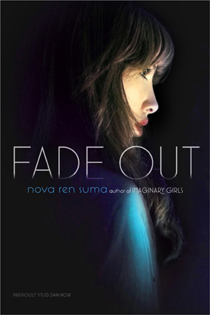 year to the day I got a phone call from my agent. Now having moved on and working on books with a new publisher, this was a call I absolutely wasn’t expecting. My agent told me that an editor at a different imprint at Simon & Schuster wanted to publish Dani Noir in paperback. Only… the imprint was Simon Pulse, which publishes only YA books. They thought the book would translate well to a lower YA audience—and it turned out they would even let me make some line edits for the republication. But they wanted to give the book a new cover, and they even had a new title in mind: Fade Out.
"I was thrilled. A book I thought was over now had a second chance at life! And yet… it wasn’t until I hung up the phone that I realized how strange it was to lose what felt like the perfect title for the book. It’s words that mean something to we authors, after all.
"I did want to keep my original title because it was one of my favorite things about the book, but Simon Pulse wanted to distinguish this book from the first version, since the new edition would be on the YA shelves instead of with middle-grade. I came up with a list of other title options, but editorial and sales and marketing and everyone who counted liked Fade Out, so Fade Out it stayed.
"When I announced Fade Out, I was contacted by numerous other authors who were happy for me… but confused. How did this happen? Why was I losing my awesome original cover? Why was I letting them change my title? And wouldn’t readers be confused?
"Well, fellow writers, if you had the sudden chance to have the novel you thought would never make it to paperback come out as you’d hoped… but looking completely different and called something else, might you do it, too?
"I felt like this was a gift I couldn’t pass up, and making it to paperback so the book would hopefully find new readers was the most important thing.
"When the cover for Fade Out was first sent to me, I opened it excitedly on the street, on my phone. And stopped. It was beautiful, arresting even. It was mysterious. And yet it felt like a cover for a completely other book to me. Who was the girl? It couldn’t be Dani… she’s thirteen years old. Was it meant to be Dani’s fantasy image of herself? Could I explain it that way? Did this look like too sophisticated of a cover for this story… and would it be misleading to readers? Would they pick up this cover thinking it was a certain kind of book and be disappointed at what they found inside?
"I was flooded with questions. I remember saying something like I loved the cover image, but this cover made me want to write a whole different story to merit it.
"The photograph wasn’t black-and-white, but, ironically, it was more in keeping with what I thought the original cover of Dani Noir would be. (I think my desire for photographic covers, just in general, is related to how I think I was meant to be writing YA over middle-grade/tween, but that’s a whole other conversation.) I found out later that the image is by a photographer named Ilina Simeonova—and it’s a self-portrait. (She’s created quite a few book covers—check out her portfolio!)
"The new, beautiful cover image stayed, as did the new title, and Fade Out came out in paperback in 2012 and, if the emails I get are any indication, it’s thanks to this second chance at life that the book found readers it may not have found before."
Thank you, Nova! This is an extraordinary story--I'm not sure I've heard of the title/cover/audience change before (anyone else?), but YAY for expanded readerships and paperback dreams come true.
What do you guys think of these covers? I think the original feels more unique to me, but the paperback YA is gorgeous, too, and I honestly like them both.
PS-Next week, Nova will be back to talk about Imaginary Girls, a book I adore.
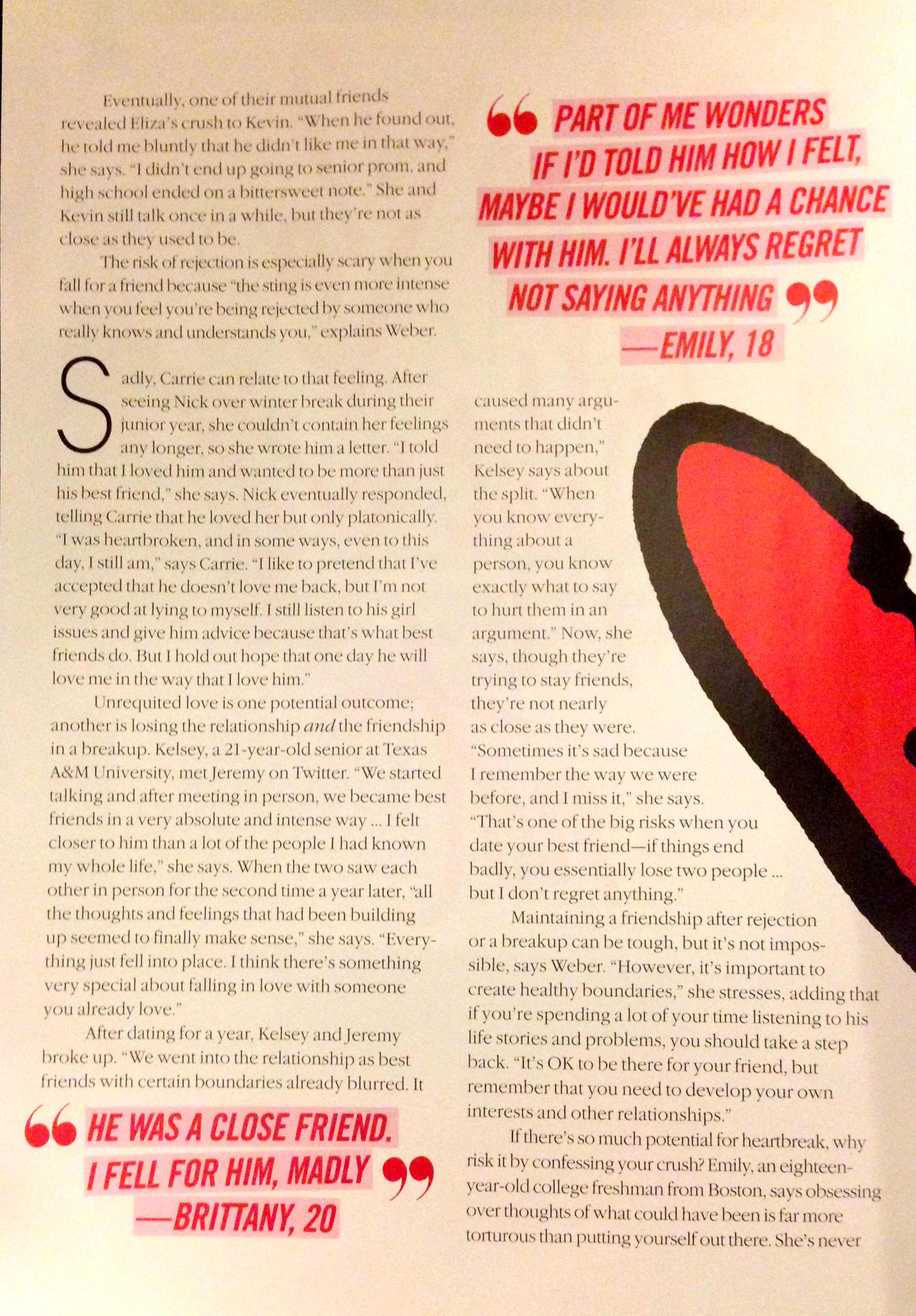
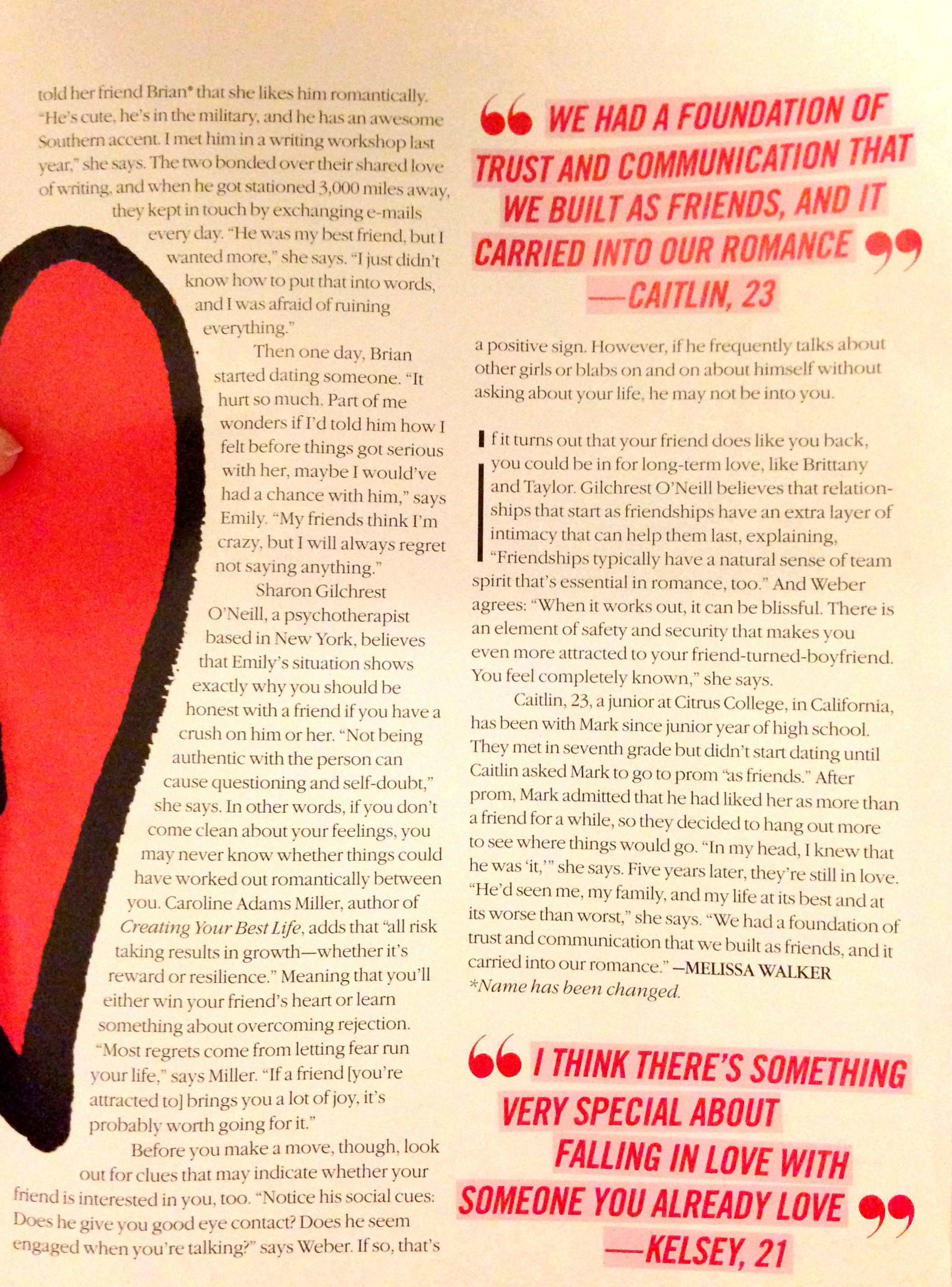
Photo Friday: Falling for a Friend
in Photo Friday
Another story I wrote for the February issue of Teen Vogue, also with quotes from readers of this blog, plus twitter and facebook friends (thank you!). Click to read in larger format. Happy Friday!

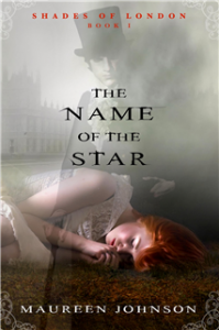
Win-It Wednesday: Maureen Johnson's Latest

The winner of the box full of books, chosen at random from the entries, is Brandy Graves! Thank you guys so much for the pics and tweets and fb love!
This week I have a super fun giveaway--two books by the effervescent Maureen Johnson. The prize is: The Name of the Star in paperback, and its sequel, The Madness Underneath, in matching hardcover design (see above).
To enter to win these books, go through the paces below. Extra points for comments, because I like to hear your voices, and if you're looking for something to talk about, maybe we discuss the redesign for these covers? The original hardcover of The Name of the Star looked like this (right), so what do you think of the change?
Cover Stories: 3 by Lauren Baratz-Logsted
Lauren Baratz-Logsted has a bunch of new e-books out, and with them come new covers! Here she is to talk about three: "Along with my husband Greg Logsted and our daughter Jackie, I created The Sisters 8 series (read some previous Cover Stories) for young readers ages 6-10 that launched in 2008. The ninth book was published this fall and even though the series has sold nearly 200,000 copies to date, the publisher has no intention of continuing at this time. And yet daily, I get emails from kids, asking for more books in the series; and those kids keep getting older with each day that passes. So, I decided to launch my own series, this time for 8-12-year-olds!
 Here’s the description of Book 1: GUYS AGAINST THE GIRLS:
There's trouble at Hat City Middle School! This first volume in an exciting new series by the author of the popular Sisters 8 series introduces readers to the six guys and six girls who make up a special class at Hat City Middle School. When a substitute teacher says something she shouldn't, the girls are outraged. Then their regular teacher makes matters worse, and everyone is outraged. Soon the guys and girls are facing off about everything, but will it end in victory or disaster? Told in alternating first-person plural viewpoints, GUYS AGAINST THE GIRLS is as original in its execution as any middle-grade novel out there today.
The cover for this was created by Griffin Ced. I said I wanted a red buzzer somewhere on the cover – because a red buzzer figures prominently in the storyline – and possibly some equations, since math is a great source of conflict in the book, and this is what he come up with. I love the way the school is literally splitting in two from the conflict and there’s my red buzzer, right over the entryway.
Here’s the description for Book 2 in the Hat City Middle School Series: ROBBIE KNIGHTLEY:
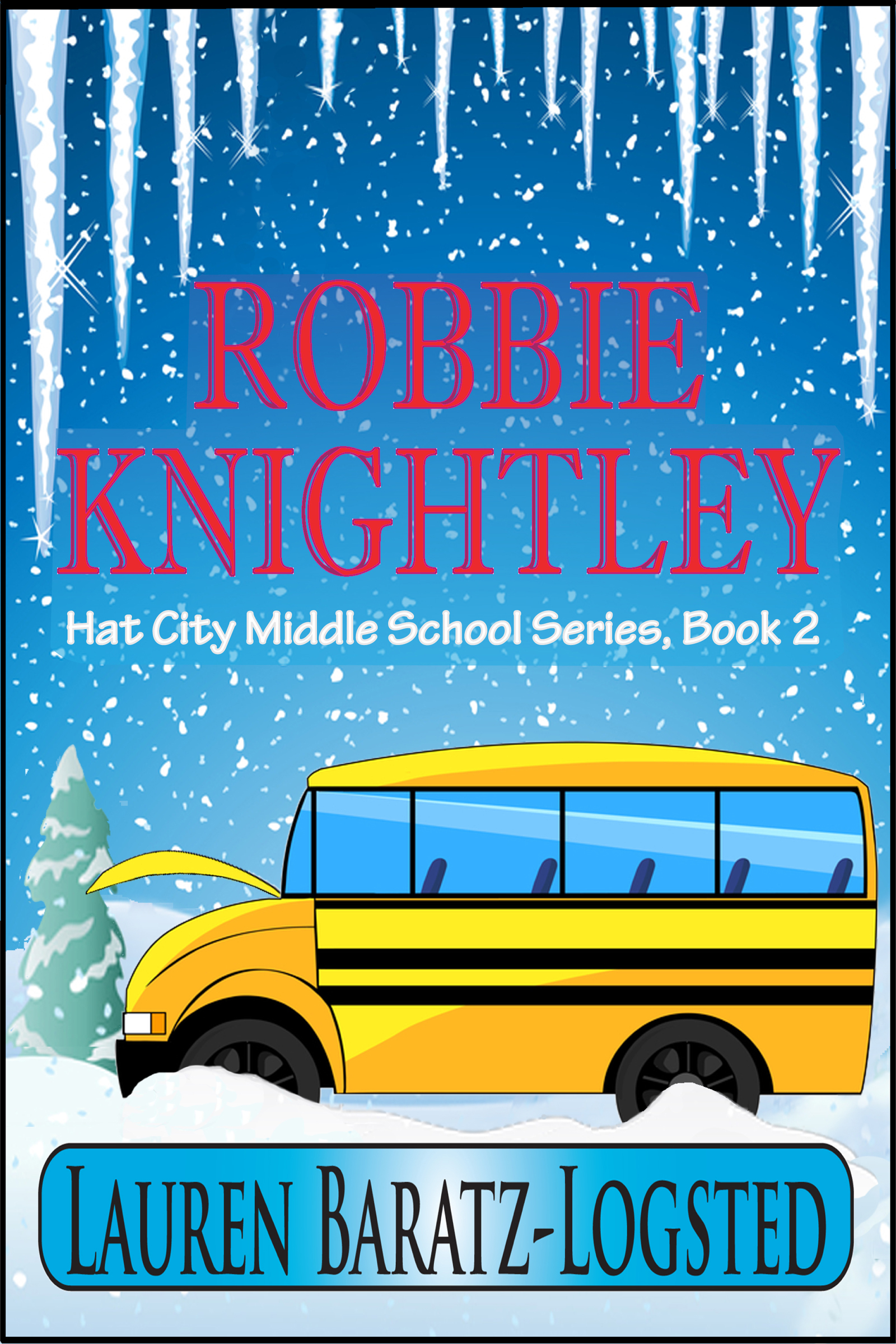 A modern-day Dennis the Menace, Robbie Knightley stumbles through life annoying the next-door neighbor, frustrating his teachers and perplexing his parents, who can't quite understand why he's so different than his six older sisters. When Robbie opens his Christmas presents prematurely without remorse for the second year running, his parents consult his therapist grandfather and Robbie hears his parents say they think there's something wrong with him, something missing. Robbie decides he'll get by in life by keeping his mouth shut and avoiding spending too much time with other people. But when a five-day class trip is unexpectedly moved up and he can't get out of it, Robbie fears the worst: that his friends will see him for who he really is, a boy with something missing.
"This time, I was a little more specific in my desires. I said I wanted a school bus stranded in a snowstorm and this is what Christiana Miller, working with Griffin Ced, came up with. Yes, I asked for a stranded school bus, but I never envisioned all these extras they gave me, like the icicles hanging from the top, framing it.
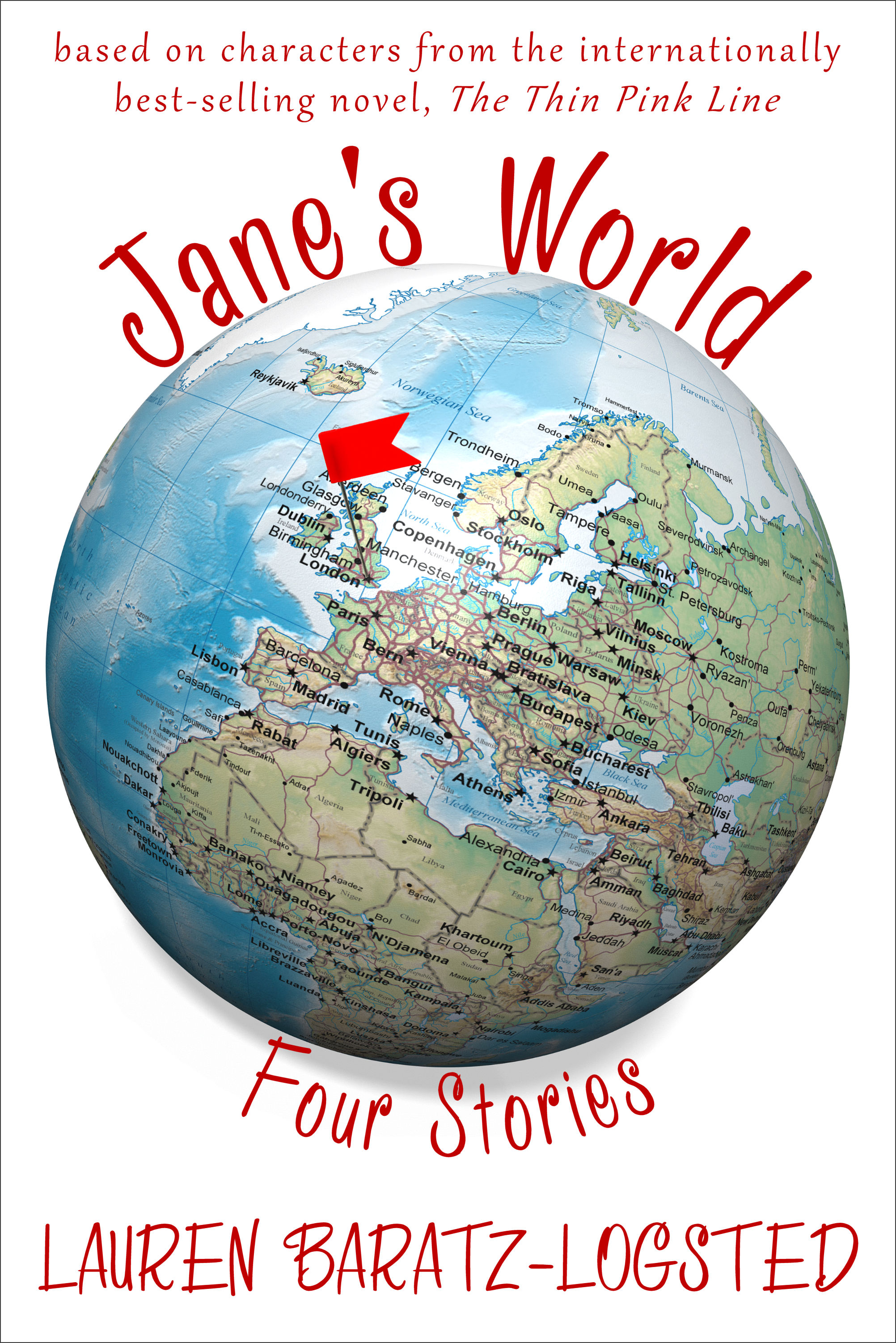 Last, but not least, JANE’S WORLD:
In 2003, The Thin Pink Line, a dark comedy about a sociopathic Londoner who fakes an entire pregnancy, was published. It was released in 11 countries and received a starred Kirkus review with Publishers Weekly calling it "hilarious and original"; a sequel, Crossing the Line, followed. Now, with the publication of JANE'S WORLD, four of the standout characters from those books - ditsy receptionist Constance; beleaguered blond bombshell editor Dodo; penny-pinching and bottom-pinching Stan from Accounting; and adorable baby Emma - all get to finally tell their sides of the story of what it's like being in the orbit of crazy Jane Taylor. No matter who's talking, it's always JANE'S WORLD.
"A couple of pieces of items you should know: The Thin Pink Line was indeed originally published in 2003 and, according to my most recent royalty statement, has sold over 172,000 copies worldwide to date. A few years ago, when Amazon had its Amazon Shorts program going, these stories were sold there as individual pieces. Then that program folded and they returned to living solely on my hard drive. But once again, through the wonders of e-publishing, they’re together, only this time as a single set. Back when The Thin Pink Line and its sequel, Crossing the Line, were published, I dreamed of doing a series of stories based on the characters. I wanted to call it Jane’s World and I knew exactly what I wanted it to look like. I told Rachel Cole at Littera Book Designs about my vision and this is what she gave me: exactly what I wanted.
"Three books, three different covers, three different designers. Through listening to what I wanted – and sometimes knowing what I wanted even when I didn’t know! – I ended up with all of this.
"So, I know what I think of these covers – love, love, love and love. Now what do you think?"
Thanks, Lauren! I always think it's interesting when authors work on covers themselves. Jane's World is my favorite of these three, maybe because I'm drawn to older-reader covers.
What do you guys think?
Cover Stories: Blaze by Laurie Boyle Crompton
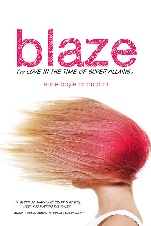 Laurie Boyle Crompton's book went through a cover and title change, from Fangirl to Blaze (or Love in the Time of Supervillains)! The final, left, reminds me of another one I love (Girl Wonder) but it's also wholly original. From font choices to that great feeling of motion, this is a great package, I think. Here's Laurie to tell its tale:
"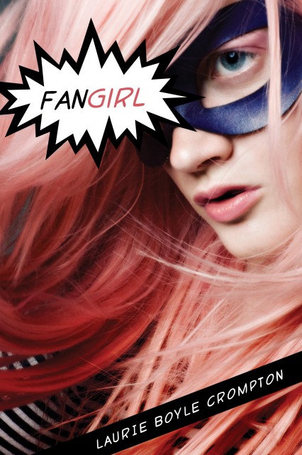 Seeing your new book’s cover for the very first time is one of the best parts of this (long!) publishing process. I still remember getting the email from my fabulous editor just a few months after Sourcebooks bought Fangirl. When I opened the attachment the image of a girl wearing a superhero mask with pink hair and the most intense look on her face flashed onto my screen. The girl looked like she was ready to kick some serious butt. It was like no other cover I’d ever seen. I was instantly in love. (Right)
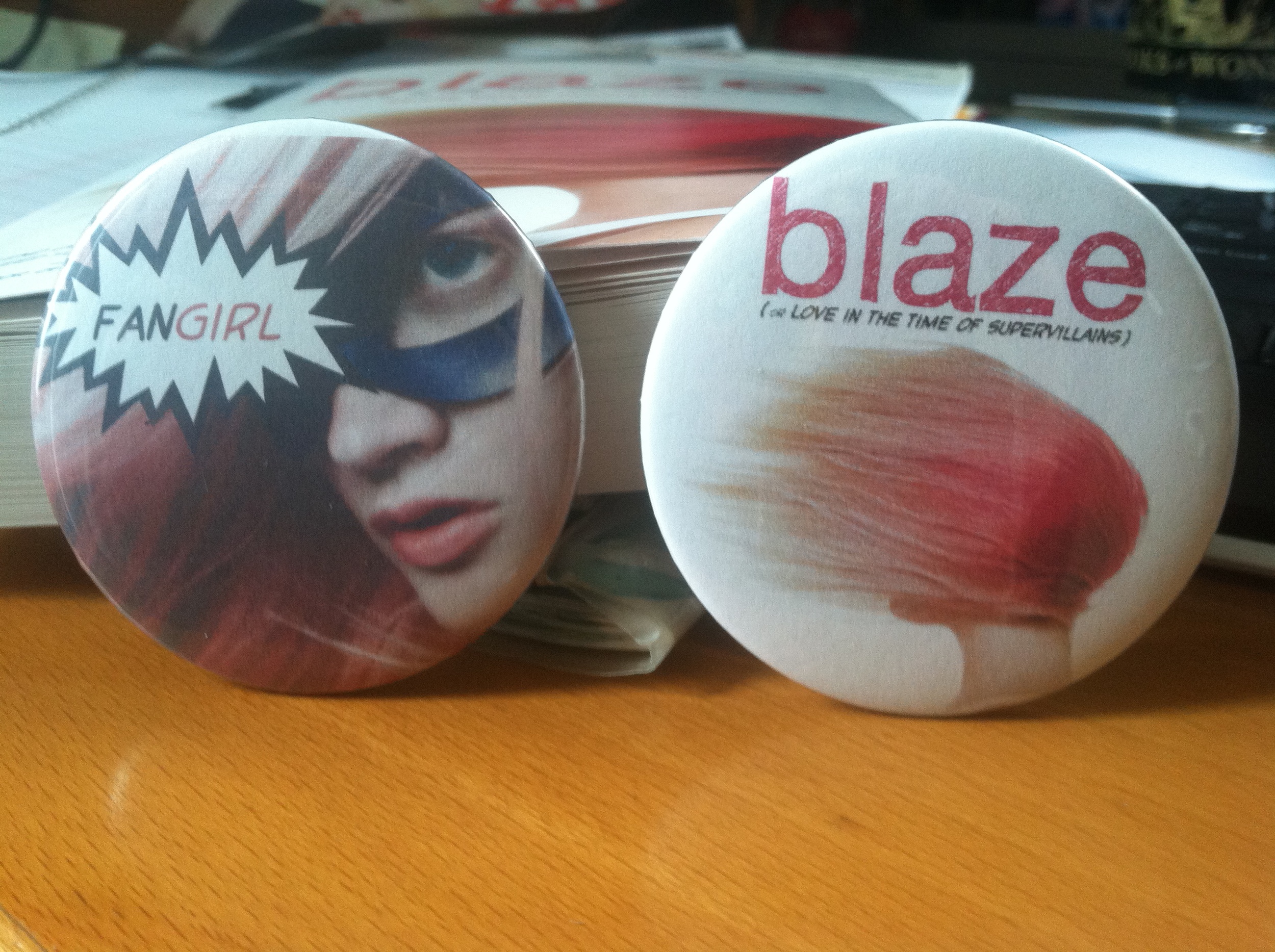 "I exchanged happy Squee-filled emails with my editor and was given permission to share the cover online. She did caution that it was non-final and said I shouldn't use it for any promotional materials just yet, but honestly, I couldn't imagine that fierce cover getting any better! Once I finished wallpapering the internet with it, I pulled out my old button-maker and got to work making the cutest buttons (left). Oh, how I loved my little Fangirl buttons. Perhaps they will be collector’s items one day because everything about my book changed.
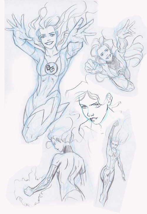 "The title, the cover, even the release date was pushed back in order to include interior artwork. I’d envisioned artwork from the beginning and so news of all the changes brought mixed emotions. Excited for the artwork, but mourning my beloved kick-butt cover. (See artwork on right by artist Anne Cain: ©2012 Anne Cain.)
"The design team wanted to move away from the comic niche of the original cover and title. While writing the book I worked hard to make it accessible to those who don’t speak comic geek so I agreed it would be a shame if nobody outside the comic realm ever opened the book. I had to trust that Sourcebooks would come up with yet another amazing cover. And boy did they!
"My new cover is just brilliant. Don’t tell my old cover, but I’m totally gaga for the new one. It still has the hint of comic book influence with the font and subtitle, but I think the overall image has broader appeal. The pure white background sets off the bold image of the model’s windblown hair perfectly. In the book Blaze dyes her hair pink using Kool-Aid and although realistically it might be pinker on the ends I love the way her blowing hair looks just like a pink flame! She is ablaze! And the way her face is hidden fits in so well with her feeling invisible and then later wanting to hide. I couldn't be happier with the way everything turned out and I must say - the new cover actually looks pretty cute on buttons, too!"
Thanks, Laurie! I think I've made my views clear: Great cover! The first one is also cool, but the second one feels more like it bridges the comic geek-real world gap really well.
What do you guys think?
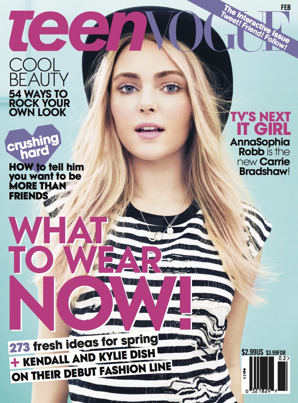
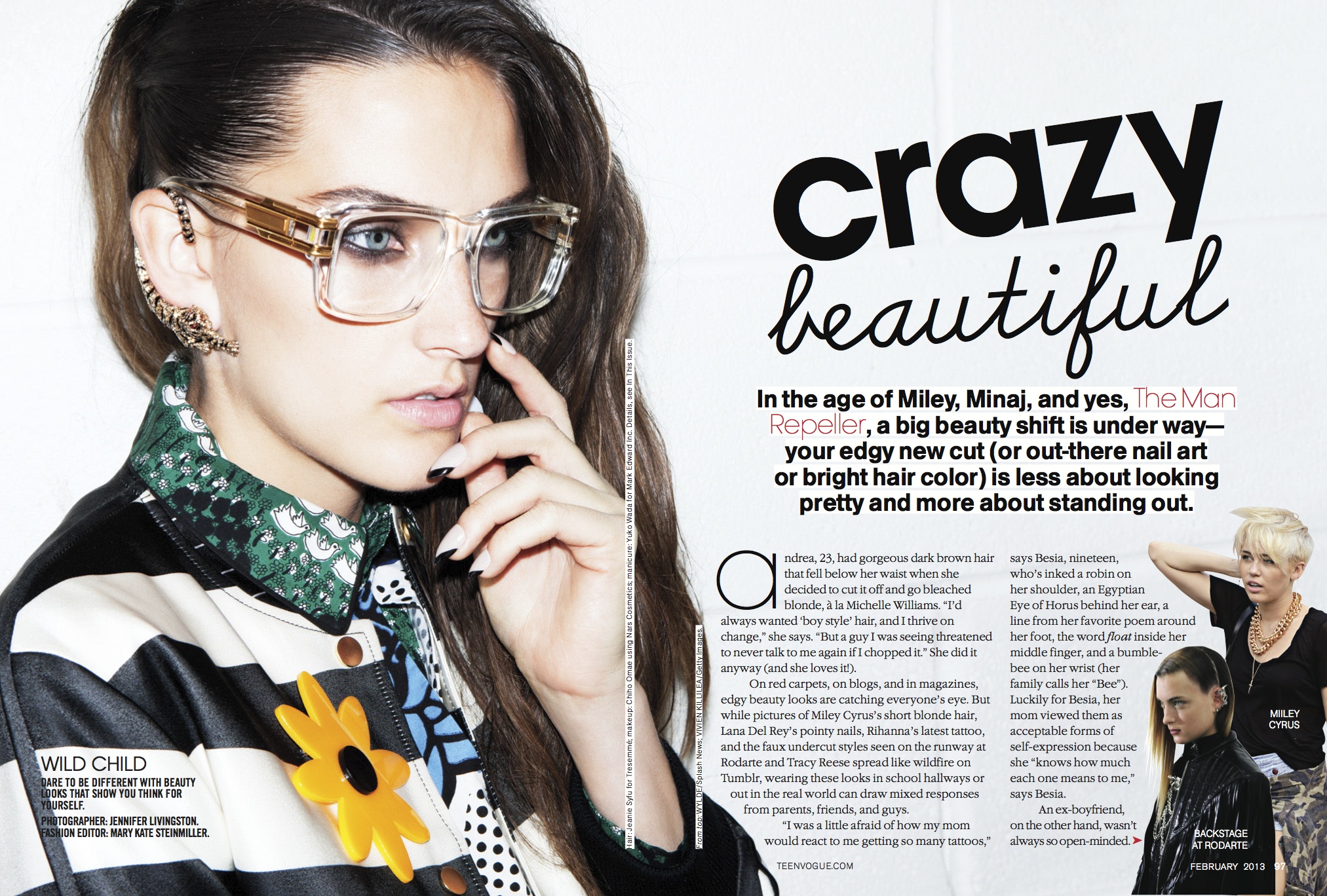
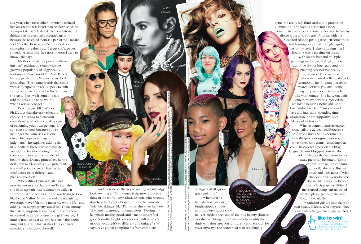
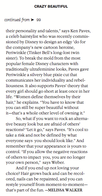
Photo Friday: Teen Vogue's Crazy Beautiful
in Photo Friday